10 UX Tips For Landing Page

I've been researching some best designs of landing pages and wrote some notes on the most important parameters that make it efficient (not only beautiful).
Digestible text
By digestible text, I mean actionable headlines with strong messages, sub-headlines for a better structure, and engaging copy text.
The copy text should have a goal and lead readers to a specific action. Each sentence written on the landing page should be easy to read, describe or compare your products and services.
The landing page title is one of the essential parts. In my practice, I've noticed if the title isn't right or it's hard to understand it within a couple of seconds, then people pretty much bounce out of the page.
Write your title short and sweet, with a strong offer.
The headlines of second and lower levels suppose to add value to the title and basically make it stronger. And the main purpose of the body text is to describe the details of your offer.
Also, it's better if you can use actionable words in your headline text. To give more clarity on what users will get or what they can do here. Sub-header can concisely describe the benefit of the offer.
Ideally, your text might require about 15 sec of reading time. A visitor should find a value proposition in 5 sec of scanning the landing page. It's an excellent sign if they go through the whole lading page and read all the text no matter how much it takes.
It's crucial to respect your visitors' time and allow them to find what they are searching for quickly. Actually, it's a win-win strategy for both you and your visitors. Because not only can they quickly make a decision, but your landing page can convert faster, which is good for you anyways.
First Scroll or Above The Fold
In today's web environment, we have plenty of landing pages that have a big height.
The point is that we should use the first scroll space for the most important message and elements to quickly make an offer and give a short description, plus navigation of this page if you want to expand on some details.
Give your visitors some important info about facts and benefits, show the value and action above the fold (they don't need to scroll to see it). The rest of the space can be used to give some additional information, details, related items, options, and packages, etc.
Things visitors can do without scrolling:
- Determine what is the product or service;
- Understand why it is valuable;
- What action to take in order to proceed or get a product.
Specific CTA
A text, format, and position of the call to action element can drastically change your conversion rate.
The better you utilize this opportunity, the better results you'll get from your landing page.
Be assertive and do not overwhelm your page with additional buttons, links, and other CTA elements. The fewer options visitors have to go outside, the higher probability they will go with your offer.
Having too many CTA elements can create a negative association for your visitors. For instance, they might think you are trying to sell them something intensively without giving enough information about your product or service.
Multiple blinking buttons and banners won't do much but distract and repel visitors from getting more information and making a decision.
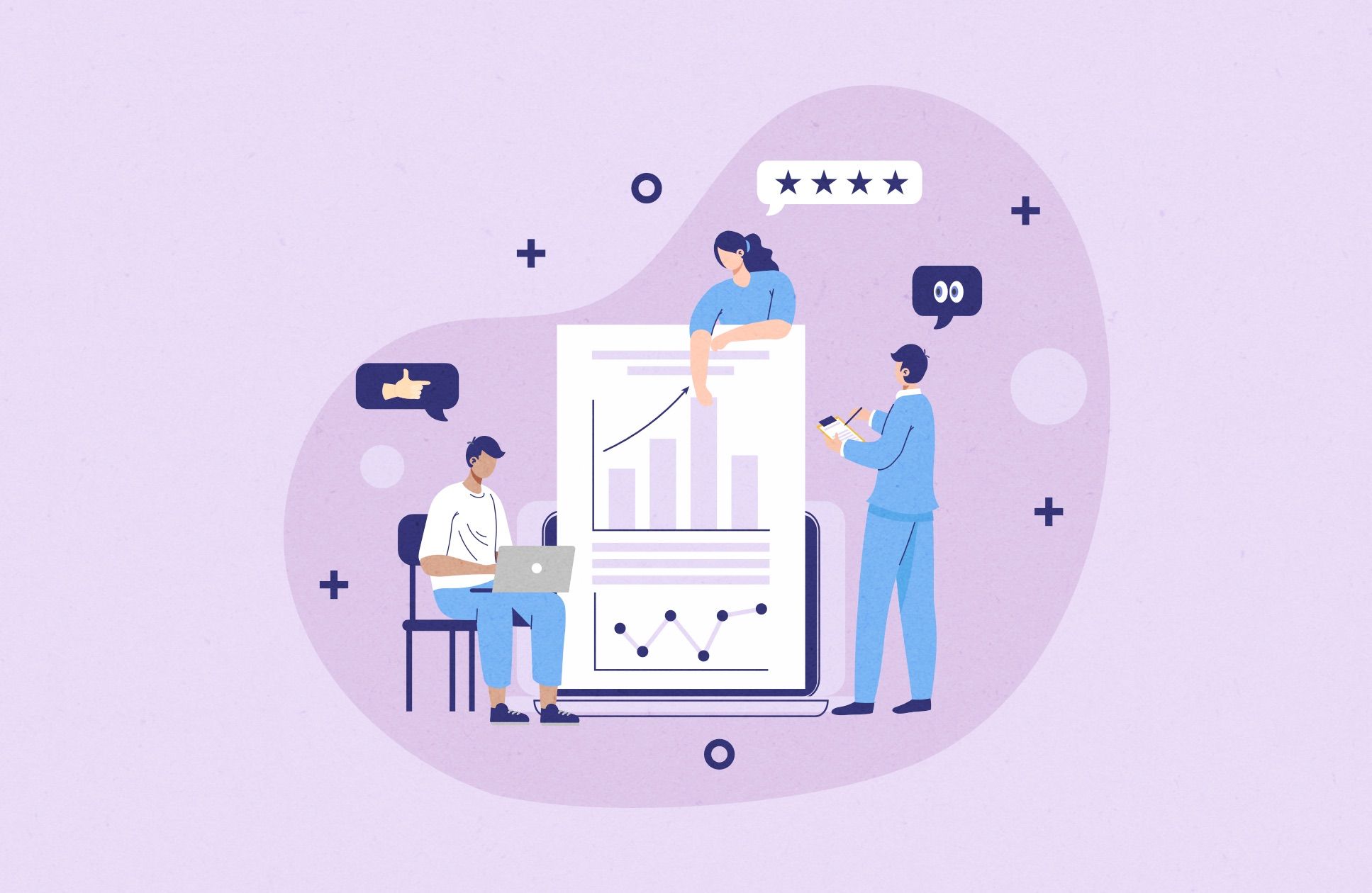
Presentation images of the product or service
A picture worth a thousand words. Use specific images, not general from stock libraries. All images and graphic elements should be in harmony with the strong offer and texts mentioned above.
A complex idea can be conveyed with just a single static image. For example, you can use illustrations of complex objects of your product from different perspectives to clarify a specific topic and allow you to understand it quickly.
You can use animation to boost the trick with an image. It usually gives a more complete understanding of their products. Thus, it helps to sell more.
Benefits and features
To make a perfect list of benefits, you need to write a fact sheet first. Try to get as many facts as possible about your product or service and then convert them into benefits and features. So the value is more clear within a limited time of a visiting session.
Sometimes, people search for them after reading the headlines, and it can be a good selling point. So, be sure that your benefits and features are also a part of your strong offer. It must supplement your main offer, give information, and explain the value of your offer.
Testimonials, press and partners
Two key examples of social proof here:
- The headline that points out how popular they are by virtue of the number of signups in a week;
- The personal testimonial from a customer, including a link to her company for added believability.
Other examples of social proof are:
- Customer testimonials;
- Social signals — publications in other networks and platforms;
- A counter of how many customers you have;
- Trust badges to establish the security of information;
- Awards and certifications from reputable organizations;
- Customer reviews - which are very powerful when prospects are comparison shopping.
Mobile friendly
It's not a secret that people surf websites whenever they want and sometimes even do some comprehensive actions. Approximately 40% of global traffic goes from mobile devices. The good news is that you can create one responsive landing page that looks fine on different screen sizes. So you don't need to create multiple versions if everything is done right and adapted for different use cases.
Loading speed
One critically important thing is that your page should load extremely fast and show up without any delays.
Sometimes you even have to sacrifice beauty and interactiveness if your landing page is loading slow and disrupts its primary goal.
Optimize your code and images to increase loading speed. Turn off unnecessary plugins and widgets that delay the loading of the main content, especially of everything located above the fold.
Ensure that your target audience is located in an area with an Internet speed that allows you to load your page immediately or at least within 2-3 seconds.
It's a high-priority task to present your offer before people close this tab and switch to another one.
"Taking page" is not the same as "Giving page"
Originally, you create a landing page to attract as many customers as possible or maybe generate sales for your company, or maybe some other ways of getting value from your landing page.
It's ok to think about the results that you want to get from your landing page. However, it's not less important to think about what value it will give to people that visit your landing page.
The rule of reciprocity says that before taking something, you need to give something. It's a law of nature that works really well.
Try to think about your landing page as a "Giving page." Give people value and ask them to buy your service or product. Observe your thoughts and make notes. That could be a good draft for your features and benefits section, and probably you can form a nice title and explain the value at the start.
Think about what you can give to people that visit your page. Try using attachments. You can add free samples of your product or offer a free consultation before they decide to use your service. Try to test as many options as you have in mind. You can always remove what doesn't work and focus more on what works.
Focusing on giving instead of taking might not be obvious in many cultures of the world, but in my experience, it creates more loyal customers. Of course, if everything was done genuinely with no strings attached.