15 Cognitive Design Patterns That Make Digital Products Successful

This post is the continuation of my series about Design Patterns. Here are the previous two posts that I highly recommend to read:
There are several categories of Persuasive Design Patterns such as Cognition, Game mechanics, Perception and memory, Feedback, and Social patterns. In this article, I’m going to focus on Cognition Patterns as the psychology behind users'' behavior.
This is a very powerful set of Design Patterns that can impact business metrics of a digital product such as website, web application, mobile app, any software, or a product that has a User Interface.
Cognition or Patterns of Psychological Tendencies
1. Negativity bias
We usually pay attention to negative more than positive experiences or other kinds of information. Mostly, this is because our brains built with a greater sensitivity to unpleasant news. We can learn to block and overthink this at least partially, but that was the initial mechanism and one of the first layers of how humans think to be safe and avoid danger.
How we can use this in our designs? You can pay more attention to what negative feedback is presented to the user. Is this feedback important? Does it help users to accomplish their goals or give them an understanding of what to fix in order to complete the process?
Make sure you don’t have more negative than positive feedback.
2. Loss Aversion
Some decisions can be framed as either a gain or loss. Psychologically, we are more willing to select risky choices when we believe we can lose something.
You can use it in design as a way to motivate the user to start, to continue or change his decision. Demonstrate a value that the user can potentially lose.
For example, the user might go through multiple steps filling out complex forms. The more time and effort he invests into a product the fewer chances you have that he quits the process altogether.
The same works with a request to create an account in order to save the work.
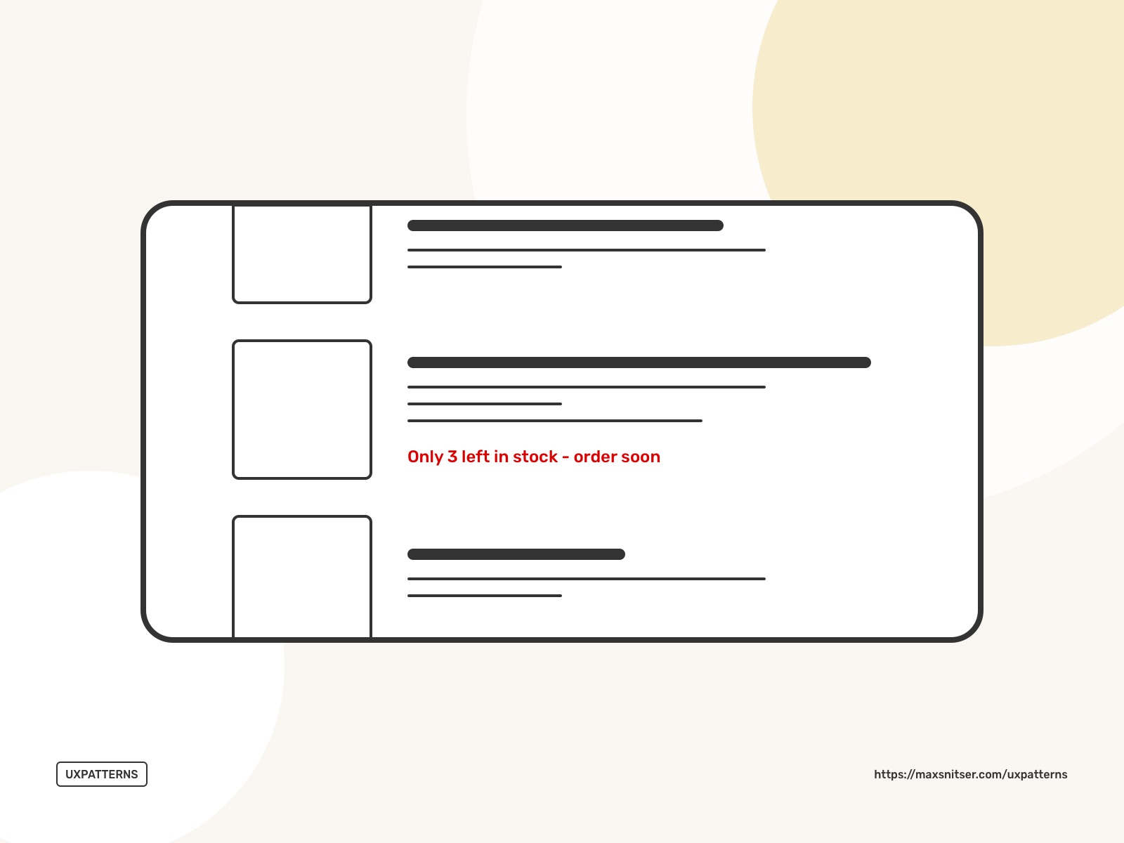
How it increases your desire to buy a product if there are only 2 or 3 left in stock and there are no other options?
3. Optimism Bias
We tend to overestimate our future success and downplay our future failure.
Make sure that you explain users the negatives that they can have and offer straightforward and safer alternatives.
4. Framing
The value of a particular item can seem very different in various situations, depending on the comparison. We tend to avoid risk when something framed as a positive experience, but seek risks when a negative frame is presented.
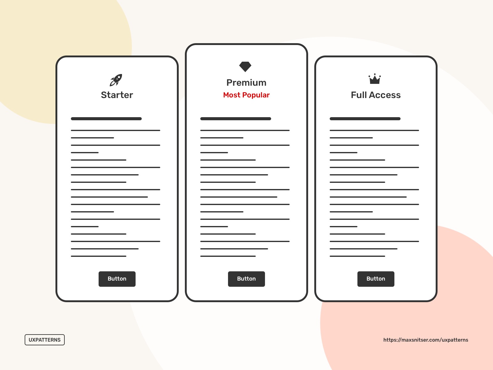
5. Status-Quo Bias
Stating what option is more popular is often enough to influence a decision. When you want the user to choose a specific option show it as the default.
It’s easier for us to accept the default options instead of comparing actual benefits (gain) to the actual cost (loss).
A good example here is price packages.
Another good example is a pre-filled form with default options.
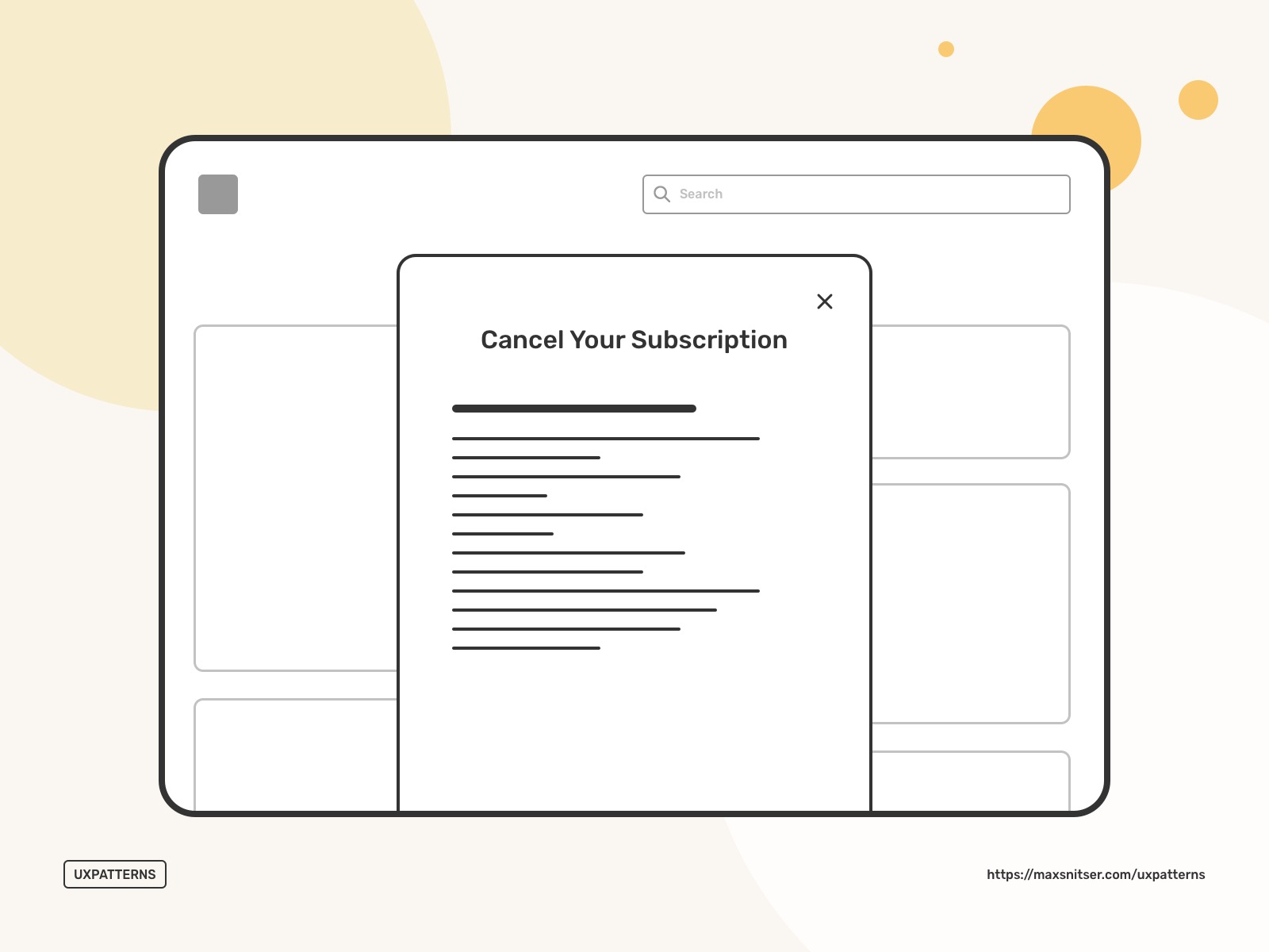
6. Endowment Effect
We place a higher value on the object we own over objects we do not. Ownership creates satisfaction.
As a user sign up and start creating their account it actually makes it theirs. Making wish lists, playlists, collections, libraries, membership badges, and more create the endowment effect. The value of a product or a resource is getting bigger.
As on the example below, if you cancel your subscription, you can see everything you will lose. This trick pokes to your sense of Endowment and uses Loss Aversion to make a loss of giving up your account seem greater than what you will save.
7. Illusion of control
We often believe that outcomes can be controlled, or at least influenced when they cannot. Moreover, it is a very common behavior when we think that we can control factors outside our reach.
The illusion of control can be a motivational factor for conducting certain behavior that is either unsafe or we think it will bring us closer to a goal. This gives us a sense of power and it’s harder to rationally analyze facts in order to make a decision.
We tend to be nervous when a website or an app doesn’t respond quickly. This can be the main precedent of why users don’t feel like they have control in the system which might lead to a bad User Experience.
A solution like a loading screen keeps us waiting and we understand what’s going.

The loading bar is a simple example that gives the illusion of control. Ideally, this needs to be implemented in a more interactive way where users participate in system activities. For example, you can create a wizard with a process of several steps and a progress bar.
8. Need for closure
As I mentioned in the previous design pattern about the illusion of control they need for closure can be a step by step process that helps a goal completion.
The main goal of this pattern is to motivate users to act. It’s important that you implement small bits of motivation. Small successes help your users to feel as they are working their way out of doubt towards completeness and certainty.
9. Peak-end rule
We often remember certain details of a whole experience; the peak and the end. Acceptable user experience is often not memorable and will not be what makes or brakes your product.
This pattern is very useful when you want to highlight a specific part of the user experience that users should remember. Also, it works in the opposite way when you want to make it easier to forget some of the losses that users might have in their experiences.
One more way it might be helpful in the design is who you want users to not focus on what is less important and instead focus on what brings the most value to the user’s experience.
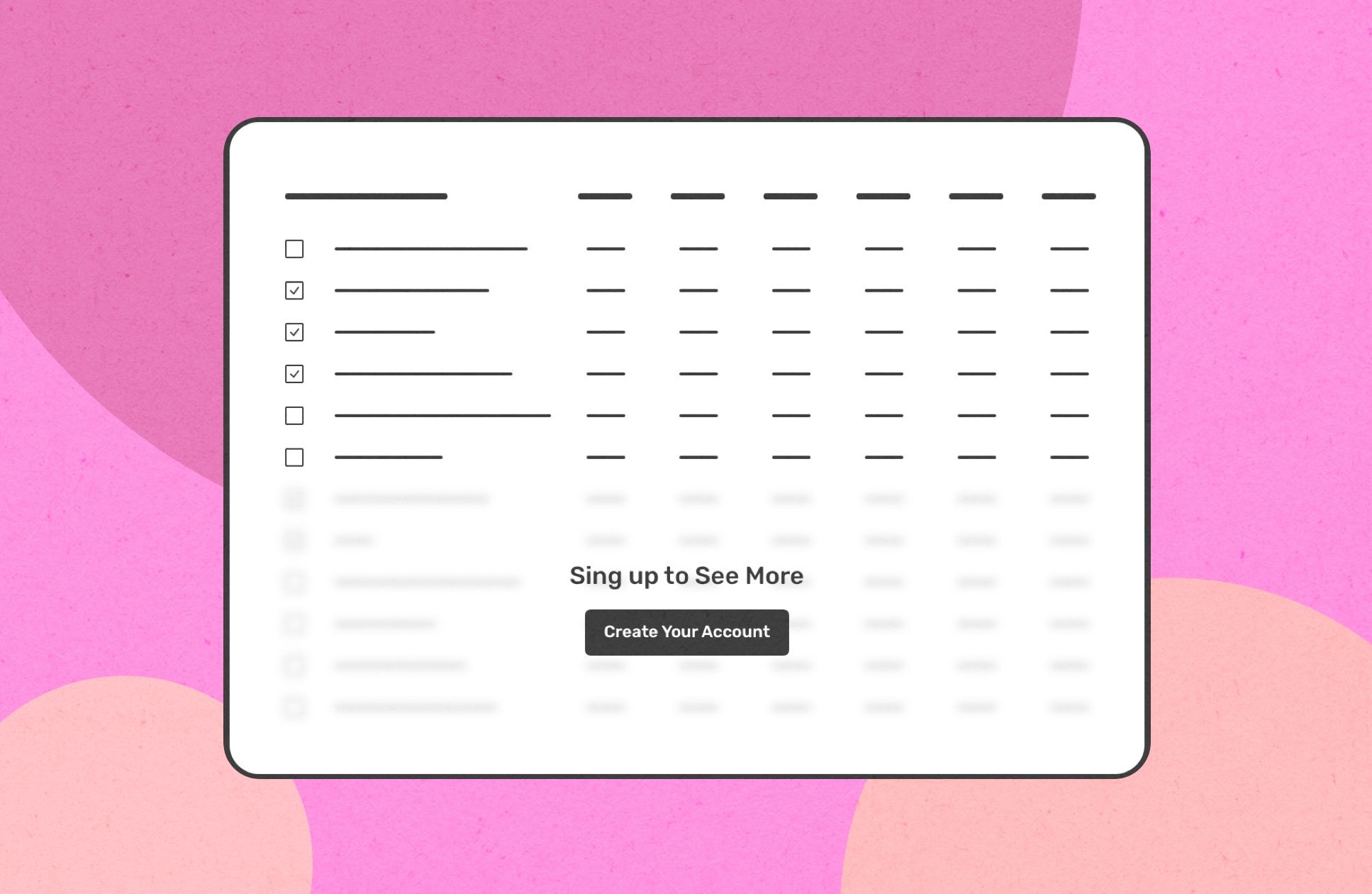
10. Curiosity
Showing small bits of information arouse interest and tease users into taking action to reveal more. It’s a common thing when users want to fill the information gap. The goal with the curiosity pattern is to delay this process of filling the gap for as long as you can without making it discomfort for users.
A good example might be a blurred page behind a signup pop-up or query results page that does not reveal all the results and users need to do an action such as an upgrade in order to proceed and see a complete list of results.

11. Set Completion
Completing a set of logically grouped tasks easier than completing a big list of things. Splitting tasks into sets makes your system more user friendly. Also, you let your users have small successes along the way. This is something that I believe improves interactivity and engagement in the product.
12. Value attribution
We have a tendency to attribute value, goodness, and other qualities based on what we know rather than objective data.
A high price may convince you that the quality of the product is very good if you didn’t see a similar product with a lower price
An attractive appearance of a product may make it seems that the product works better than others.
13. Scarcity
This feeling or mindset makes us believe about something that it’s more desirable and more valuable.
Exclusive products and features usually represented in a limited offer and have some properties that similar products and features don’t have. This knowledge makes us feel that this is something exclusive and more valuable than other options on the market.
Limited offers help to force users to rush their decisions.
Also, it can be a useful pattern to encourage users to make a purchase or subscribe.
14. Limited choice
It’s much easier to make a decision when there are fewer options to choose from.
I remember one study about jams where on a regular day at a local food market, people would find a variety of 24 different kinds of jams. Then on another day, at the same food market, people were given only 6 different types of jams. The second day performed better.
Think about a product User Experience. You can have less and more concrete price packages so it’s easier for users to choose one of them. This is also related to all kinds of offers within an app or a website. So one offer with limited time might perform better than a bunch of discounts based on different configurations or available features.
15. Limited duration
Speaking of time limitations. This is a super powerful pattern that’s been there for a long time. It helps to push users to make a decision now rather than later.
The coolest part of Persuasive Design Patterns is that this part of the design is invisible and if you're able to apply it then you have more control over your business.
I’m planning to write and post more content like this about design, user experience, and psychology. So feel free to subscribe below and check other blog posts related to this one if you’re interested.
Can’t wait to share another one with you!