7 Tips About Navigation In UX Design

Navigation - any action that takes a user to a new part of the interface. Or which requires him to locate objects, tools, or data.
1. Principles Of Good Navigation Design
We have a particular discipline called "Navigation design." Good Navigation design provides with the next 3 things:
Provide users with a means for getting from one point to another on the site.
Must communicate the relationship between the elements it contains.
Must communicate the relationship between its contents. And the page the user is currently viewing. Which of the available choices might best support the task or goal users are pursuing.
Users make little maps in their heads when they visit websites. Or when they use applications, just as they do in supermarkets, libraries, etc. Thus, we need to create a simple user experience for them. Since people tend to map and remember information that they understand. In a case when it's difficult for them, they don't understand your structure quite well. And they can't navigate properly.
2. Levels Of Navigation
We have several types of navigation for different levels of interaction with the interface:
Global navigation - anywhere you might want to go, you can get there eventually. This is works in the case of global menu areas where you can go on a different section of the website or application.
Supplementary navigation - provides shortcuts to related content. For instance, to open similar articles or pages with similar goods if we develop an eCommerce solution.
Contextual navigation (inline navigation) - embedded in the content of the page itself. This type of navigation that we use right in the content. You can see good use of it on the Wikipedia website. They have a strong Information architecture by using this type of navigation. But it does not work for any content and websites since we should consider our users' goals and goals.
Courtesy navigation - provides access to items that users don't regularly need (on feedback forms, privacy & policy, etc.).
3. Start Screen
A lot of start screens on websites, and mobile apps don't perform well enough. Most people use it as a marketplace. People place banners, content, or information that describes their company and business on the start screen. This information can often be useless for first-time visitors of your site or users who just opened your app.
Also, you might want to know how people open, specifically the start page of our website or an app.
The start screen should be a list of topics with links to relevant pages (screens) in an ideal case. Much like the index on the back of a book if we talk about websites.
In the case of applications, we can even avoid start screens. And load dashboard or log in and registration dialog (depends on the use case) if the user hasn't authorized in the system yet.
We can start with the guide to an application if it's necessary to educate first-time users.
4. Types Of Navigation
Navigation among multiple screens, views, or pages - perhaps the most disorienting kind of navigation for users. It involves a gross shifting of attention that disrupts a user's flow and forces him into a new context. Users can get lost in the interface and experience navigational trauma. Imagine that by clicking in the navigation area, you change the room in which you are located. That's how our brain reacts to this kind of navigation. We need to use this type of navigation properly.
Navigation between panes - can solve many navigation problems by reducing the navigation to almost zero. But putting parts of a single facility onto separate panes increases excise. And decreases users' understanding and orientation. Imagine a folder with several files. You can take one file and place it on top of others. At the same time, you can see that you have other files under the current file that are on the top now. It's a good metaphor. Using panes near to physical world experience.
The use of tabbed screen areas is a space-saving mechanism and is sometimes necessary. Tabbed panes can be appropriate where there are multiple supporting panes for a primary work area that are not a user at the same time.
Also, we can have navigation in a content area for scrolling the content in specific areas and jumping from one part to another. And we can zoom parts of the content as well. For instance, if we want to view a bigger photo to explore more details there. All these actions can be grouped in the so-called type of Navigation of information.
5. Improving Navigation
Reduce the number of places to go:
- Keep the number of windows and views to a minimum;
- Keep dialogs to a minimum;
- Apps/websites with dozens of distinct types of pages, screens, or forms are difficult to navigate;
- Keep the number of panes to the minimum number needed for users to achieve their goals;
- On web pages, anything more than two navigation areas and one content area begins to get busy;
- Keep the number of controls limited. Show only what is important to reach a goal.
Provide signposts
Signposts - points of reference.
- Persistent (consistent) objects help orient users;
- Making each page just like every other one may appeal to marketing, but it can be disorienting. Common elements should be consistent on each page, but by making different rooms look distinct, you will help to orient your users better.
Provide overviews
They help to rent users within the content.
- Images (graphics);
- Breadcrumbs.
Provide an appropriate mapping of controls to functions
I've had this type (figure below) of the stove in my apartment, and I often had navigation difficulties if I needed to turn on several burners at a time.
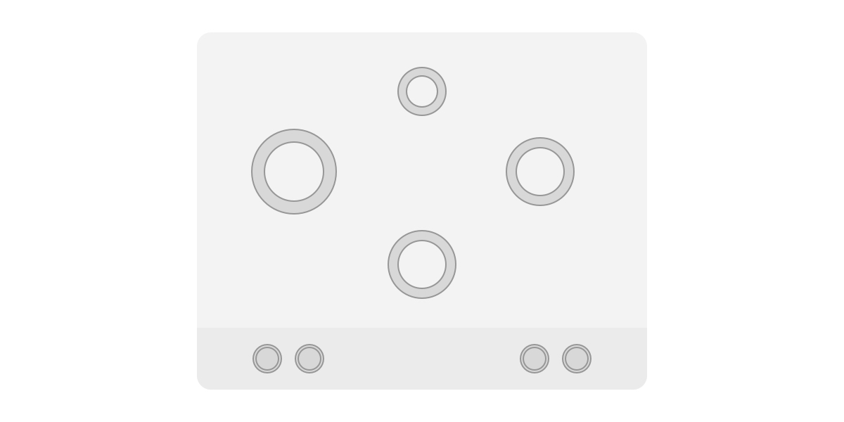
The problem with this specific layout is that users must figure out the mapping each time they use the stove.
It's not obvious that the second knob from the left side should turn on the central bottom burner. It's because of the poor physical mapping of controls.
Of course, I have small pictograms next to controllers that should guide me, but they are so small, and often I don't have time to learn them again and again. I make the first shot, and if it's wrong, I try again until I do it right.
In this case, we have a physical mapping problem.
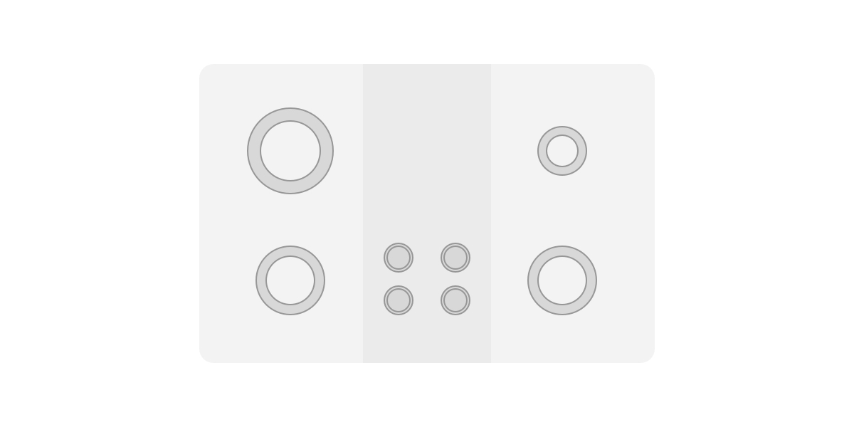
Please take a look at the next example where I tried to solve this problem of poor physical mapping.
On this stovetop, it's clear which knob maps to which burner. Because the partial arrangement of knobs clearly associates each knob with a burner.
Inflect your interface to match user needs
Inflecting - means organizing to minimize typical navigation. Placing the most frequent desired functions and controls in the most immediate convenient locations for users to access them. At the same time, pushing the less frequently used functions deeper into the interface, where users won't stumble over them.
6. Correct Organization
Controls and displays should be organized in an interface according to 3 attributes:
- Frequency of use;
- Degree of dislocation;
- Degree of risk exposure.
This priority list makes the navigation process smooth. People understand it correctly in many cases of use.
7. Avoid Hierarchies
The solution is to render the structure as a user imagines it - as monocline grouping. But to provide the search and access tools that only a deeply hierarchical organization can offer. In other words, rather than forcing users to navigate deep, complex tree structures, give them tools to bring appropriate information to them.
To avoid complex navigation mechanism we can use shortcuts and simple methods of navigation. Such as links to related content. Block with links on favorites sections or most popular sections.
Also, we can use hashtags or similar instruments if it works for your project and helps achieve user goals.