Balance In Design
Sometimes it makes sense to go deep in details of design that we are doing. Because design nowadays is more how it feels whether how it looks. And small minor things matters a lot.
"Attention to every detail is what separates a great product from a mediocre one."
We can form the whole concept of what kind of feelings people get from a design we create. One of these details is a balance that people usually do not see but they feel it. And I want to highlight this topic here. Not only in theory but and in practice.
Balance is equal to visual weight in a design. Our eyes require the visual weight to be equal on the two sides of a visual area. For example, we expect to see the equal visual weight on the left and right halves of a screen. If a picture that we see on a screen unbalanced then we feel that it's wrong. But if you are not an expert than you just don't know why. It's just similar feeling when you don't trust other people and you don't know why. It's just what your guts tell you at some point.
The most obvious way to achieve a balance is to create a symmetry.

Symmetrical balance
Looks formal, ordered, stable and quiet. Or you can say that it's boring. It is often used in architecture. Symmetrical balance usually can be achieved through repetition on both sides of an imaginable axis in the center.
Asymmetrical balance
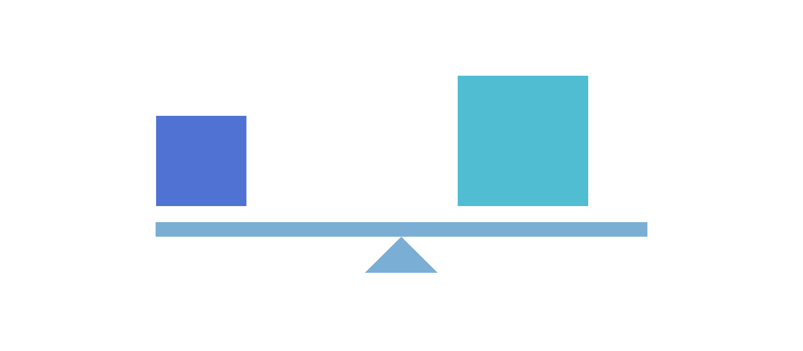
While symmetry achieves balance through repetition, asymmetry achieves balance through contrast. Asymmetrical, or informal balance, involves different elements that have equal visual weight. The weight is equal but the elements are not identical.

Asymmetrical balance is casual, interesting and more dynamic than symmetrical balance. So, if you want to create something interesting and not boring then this is your choice. However, it's not that simple to achieve well-balanced design solution. So, we need to pay attention to those parameters that were mentioned above.

Radial balance
We can also have a Radial balance that usually occurs when all the elements radiate out from a central point. And the visual weight is distributed equally. Radial balance creates a strong focal point in the center of the design. Clock faces and daisies are examples of radial balance. That's another concept that can be used.
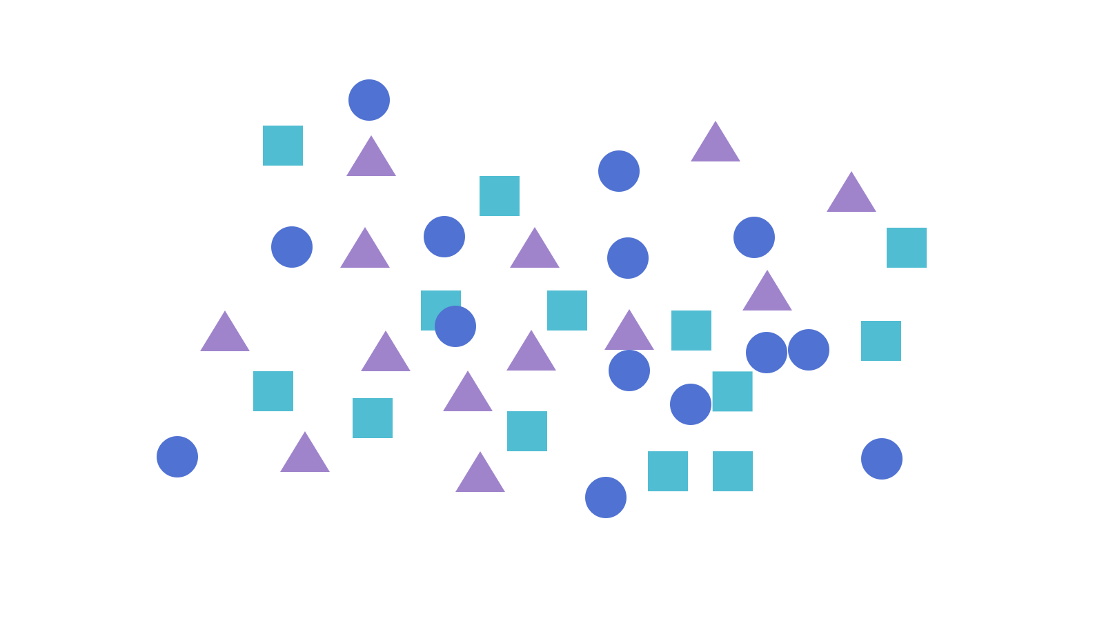
Crystallographic balance
And one more approach is a Crystallographic balance. That is created by repeating elements of equal weight everywhere. Emphasis is uniform; there is no distinct focal point. You can find examples of Crystallographic balance in Quilts and chessboards.
Visual weight
We need it to explain how we achieve a balance. Visual weight is a measure of how much something attracts your eye. Factors that are listed below will explain it in details.
Size
Larger objects appear visually heavier than smaller objects.
Shape
Objects of regular shape appear heavier than irregularly shaped ones. Objects of compact shape are visually heavier than those not compact.
Space
A large space can be balanced against a smaller positive form.
Isolation
Objects isolated in a space appear heavier than those surrounded by other elements.
Density
Packing more elements into a given space gives more weight to that space. Multiple small objects can balance one larger object.
Color
Red seems to be heaviest color while yellow seems to be lightest. In general warmer colors appear heavier than cooler colors. High-Intensity colors appear heavier than low-intensity ones. A small area of bright color can counterbalance a larger area of dull neutral color.
Value
A darker object will have more weight than a lighter object. The higher the value-contrast (between object and background), the heavier the weight of the object.
Intrinsic Interest
Complex, intricate, or peculiarly shaped objects appear visually heavier than objects not possessing these features.
Texture
An element with more complex texture is heavier visually than one with a simple texture or no texture at all. A block of text has the quality of a rough texture.
Volume
3-dimensional volumes carry more mass and visual weight than 2-dimensional surfaces.
Depth
The greater the depth of field of an area, the greater the visual weight it carries.
Perceived physical weight
An element that looks like a car will appear heavier than an element that looks like a feather.
Location/Position
The visual weight of an object increases in proportion to its distance from the center (or dominant area) of the composition. A large object placed near the center can be counterbalanced by a smaller object placed near the edge. An object in the upper part of a composition appears heavier than an object in the lower part. Objects on the right of the composition appear heavier than those on the left.
Orientation
Vertical objects appear heavier than horizontal objects. A diagonal orientation carries more visual weight than a horizontal or vertical one.
Practical Thoughts On Balance
First of all, I believe that design is a magical process and scientific point of view that above explains just what we can understand with our primitive minds. However, it's good to know as a first step for making balanced design solutions and start to develop more this direction. And, of course, push boundaries.
To achieve some level of feeling what is balanced and what's not we need a practice. Practice a lot, pay attention to details and overall picture at the same time.
As for real example of balanced design let's review some of them just in case if we need real evidence that this science above works.
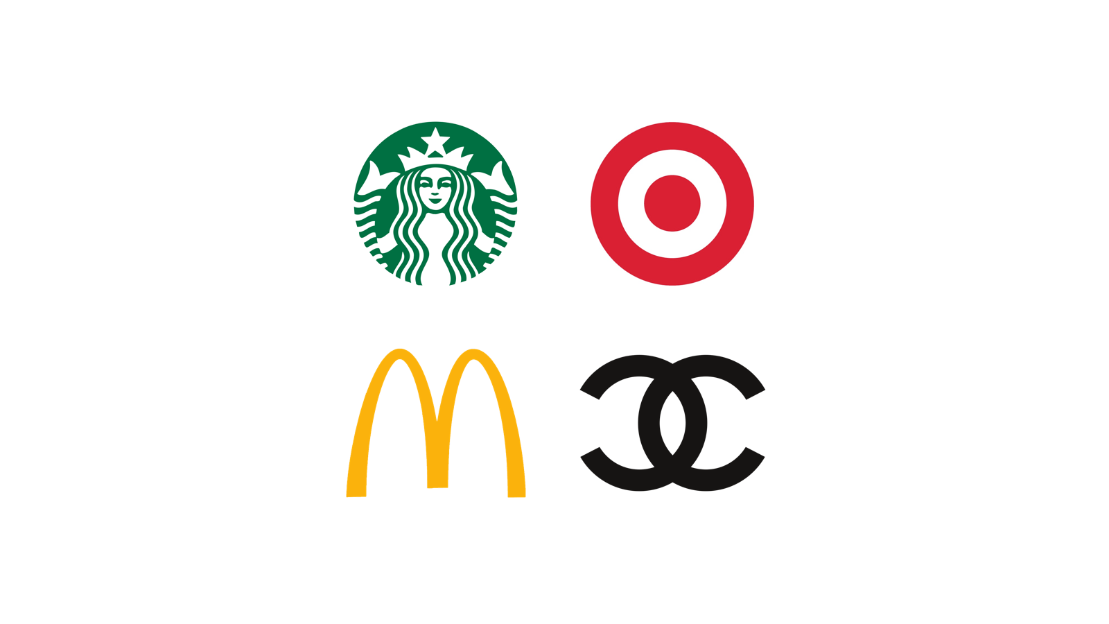
Symmetry is used a lot in logos in order to create a harmonious and balanced design.
On the next image, you can see an example of MailChimp Home page.

The new Starting page of Basecamp beautifully balanced as well.

Are you still have this question why do we need to pay attention to it and measure all the elements? Or why do we need to spend time that we usually don't have for this kind of things?
I think that tech world still lacks elegant and beautiful solutions. Not so far I found several studies on how good design changes a mindset of people in a good way. Basically, beautiful things work better. Simply, because, people who create them care more.
Thank you for reading,
Max
Credits:
http://nwrain.net/~tersiisky/design/balance.html
http://www.smashingmagazine.com/2015/06/design-principles-compositional-balance-symmetry-asymmetry/
http://www.smashingmagazine.com/2008/12/10-useful-techniques-to-improve-your-user-interface-designs/
http://www.smashingmagazine.com/2015/06/design-principles-compositional-balance-symmetry-asymmetry/
http://www.educ.kent.edu/community/vlo/design/principles/balance/index.html
http://vanseodesign.com/web-design/visual-balance/
Max Snitser
Whether it's website design and development, app design and development, digital product design, or luxury branding and upscale design, my goal is to create designs that are aesthetically pleasing, visually appealing, and functionally intuitive. With a mastery of user experience (UX) and user interface (UI), I craft solutions that bring ideas to life, produce high-quality work, and build strong relationships with clients.
Contact Max