Best UX Patterns for Navigation in iOS Apps

Navigation in apps and websites is one of the crucial things. You might have a cool idea, and everything is done right in the production process of the app or a website. In addition to that, the app or a website has great performance, but things can go south pretty quickly without proper navigation.
In this article, I'll cover all the navigation elements and patterns, including emerging technologies like voice control and having big screen resolutions that we can use smart to build seamless navigation within an app.
But also, those design patterns can be used in mobile websites and blogs.
Hamburger Menu
Since the massive emerge of mobile interfaces and apps, the hamburger menu concept has become a common navigation paradigm. This pattern has pros and cons.
I'll share my design experience for Android and iOS apps, thoughts on User eXperience, and the overall logic of this concept.
One of the big advantages of using the Hamburger menu is that you can put a large number of navigation options just because you're using most of the screen space for that kind of navigation, if not all of the screen.
Screen space is finite on mobile devices. Having hidden navigation in the left or right drawer panel is useful if you want your users to focus on the content area and call the navigation whenever appropriate.
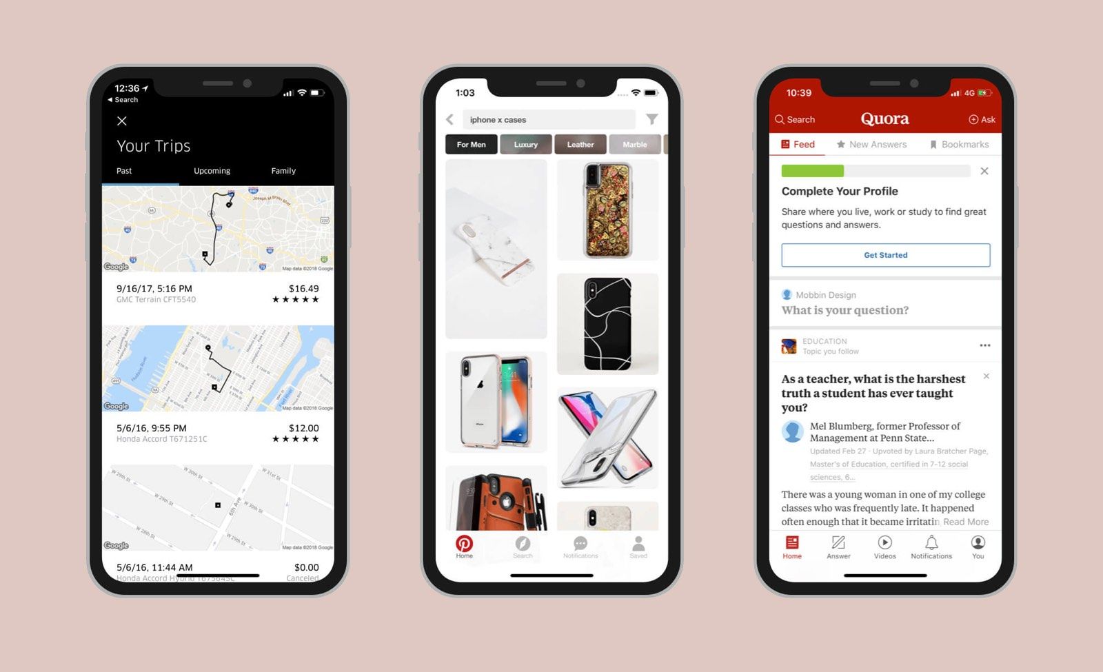
Take a look at the example below.
I've designed a web interface with standard header navigation that is always on the top, but I hide it in the drawer that shows when users tap on the hamburger button for mobile devices.
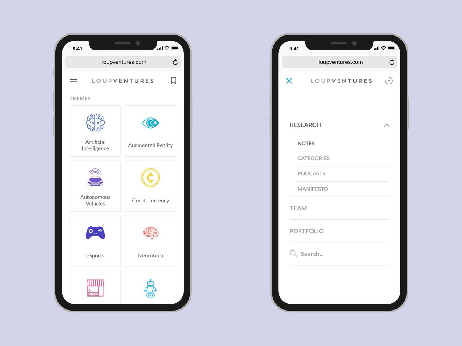
This use case proves the concept of focusing on the content area and call the navigation drawer when you need to navigate somewhere. It works on both responsive websites and apps.
However, this approach has its disadvantages. You can't see navigation all the time because it's always hidden behind the button. So it's always one tap away.
Also, the hamburger button doesn't indicate your current location in the app, and you can see your current location in the app only if you open the menu.
Let's look at another navigation pattern.
Tab Bar
It's a bar with several buttons (tabs) inside that is always visible and placed at the bottom of the screen.
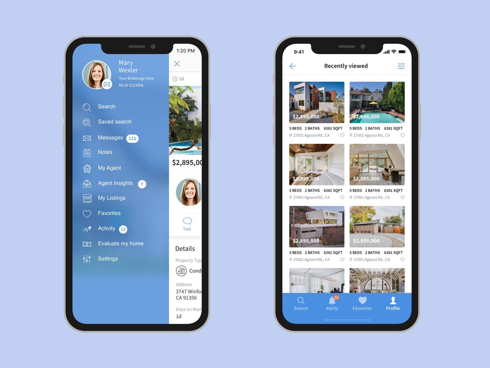
The biggest advantage of it is that it's always visible, and you can see where you are in the app and quickly switch to another section. Oftentimes, it's not even necessary to reload the existing screen or page, it works like tabs, and you can quickly move between areas of an app or a website, which is fast and productive.
It's easier to understand this kind of navigation right from the start because you can see everything as it is. Moreover, nicely designed icons make it self-explanatory which tab contains what.
Also, it's beneficial to combine some of the tabs with a notification badge since this bar is visible at all times.
As you can see, in the example above (right side), I show the most important parts of the app in the tab bar. Everything else goes under the profile tab. Since we have a limited width in this bar, we can hide more items behind the latest item. So you can have quick access to the most important areas and move the rest to a separate menu.
Studies and experiments show that you can place 4-5 tabs max. So that's the navigation usable.
Those items that are on a separate screen can have more administrative purposes. Something similar or literally settings account details, profile, support, terms of use, policies, etc.
Although it requires a more advanced design approach to make this navigation tab work, it's a nice way to create a seamless user experience for your users.
Humans don't like to use complicated tools and apps — it makes us dumb, which is a bad start for any app or a website.
People tend to look for shortcuts as much as they can. They want to use an app without thinking too much about how to use it.
The tab bar limitation forces you to think about possible use cases of the app.
It should be designed as one of the first things in the app because it will be challenging to add something later, which is not the case with the design pattern like the hamburger menu.
Action elements should be big enough to tap on them easily
Mobile navigation is slightly different from web navigation regarding the size of objects. Mostly we use fingers to interact with buttons, menus, tabs, and other input elements.
It can be difficult to tap on a link or a small element like a checkbox, radio button, small button (not optimized for mobile screens and resolution). Those elements should be easy to click on.
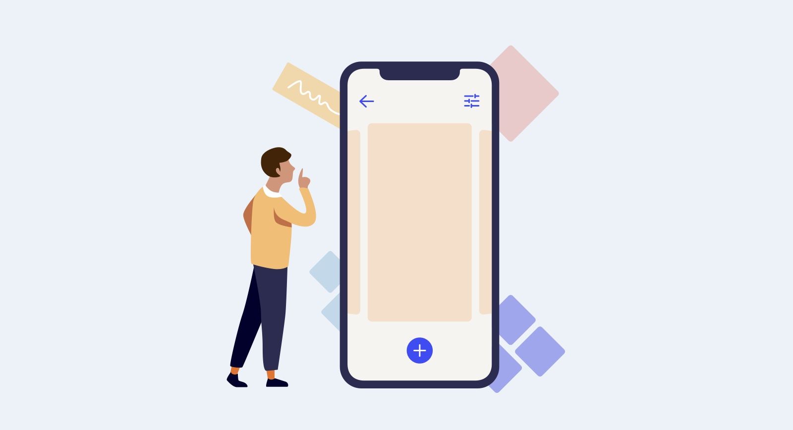
Floating Action Button (FAB)
Even though it came from Material Design, it's being used in some iOS apps and mobile versions of websites.
Ultimately, nothing is stopping you from using a FAB. Still, you should probably expect that users do not know what it is or how to use it because it's not so common to use unless it's used in apps crafted in a specific way to clear what can be behind this button.
A good example here is the Notes app, which hides the formatting toolbar behind FAB.
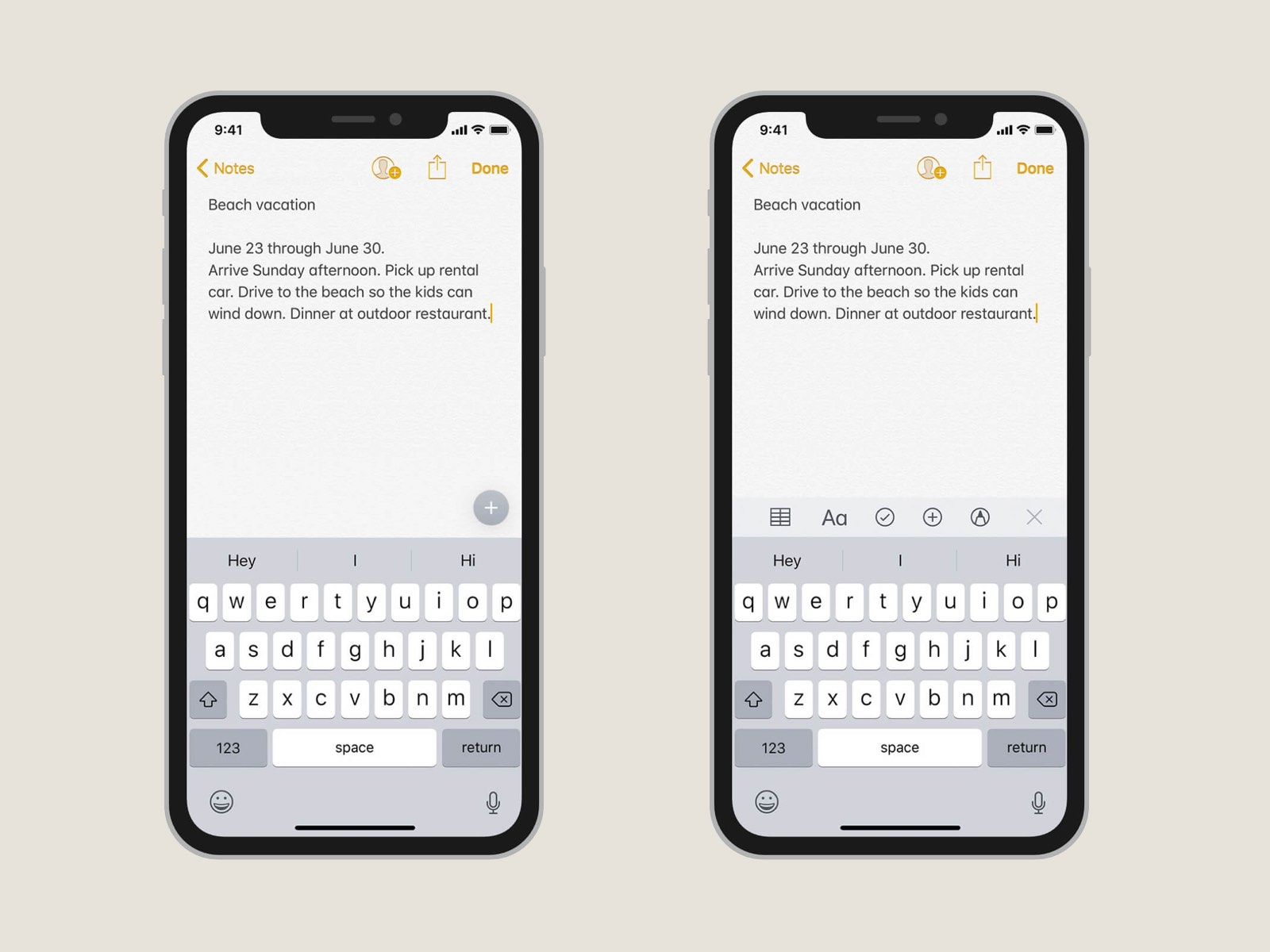
Floating action helps to achieve a more elegant and minimalistic look, and at the same time, it allows us to supercharge apps and websites with advanced features that shouldn't be visible at first sight anyway.
FAB is useful in certain use cases, and it adds interactivity to apps. Similar to the Plus button in the Notes app above.
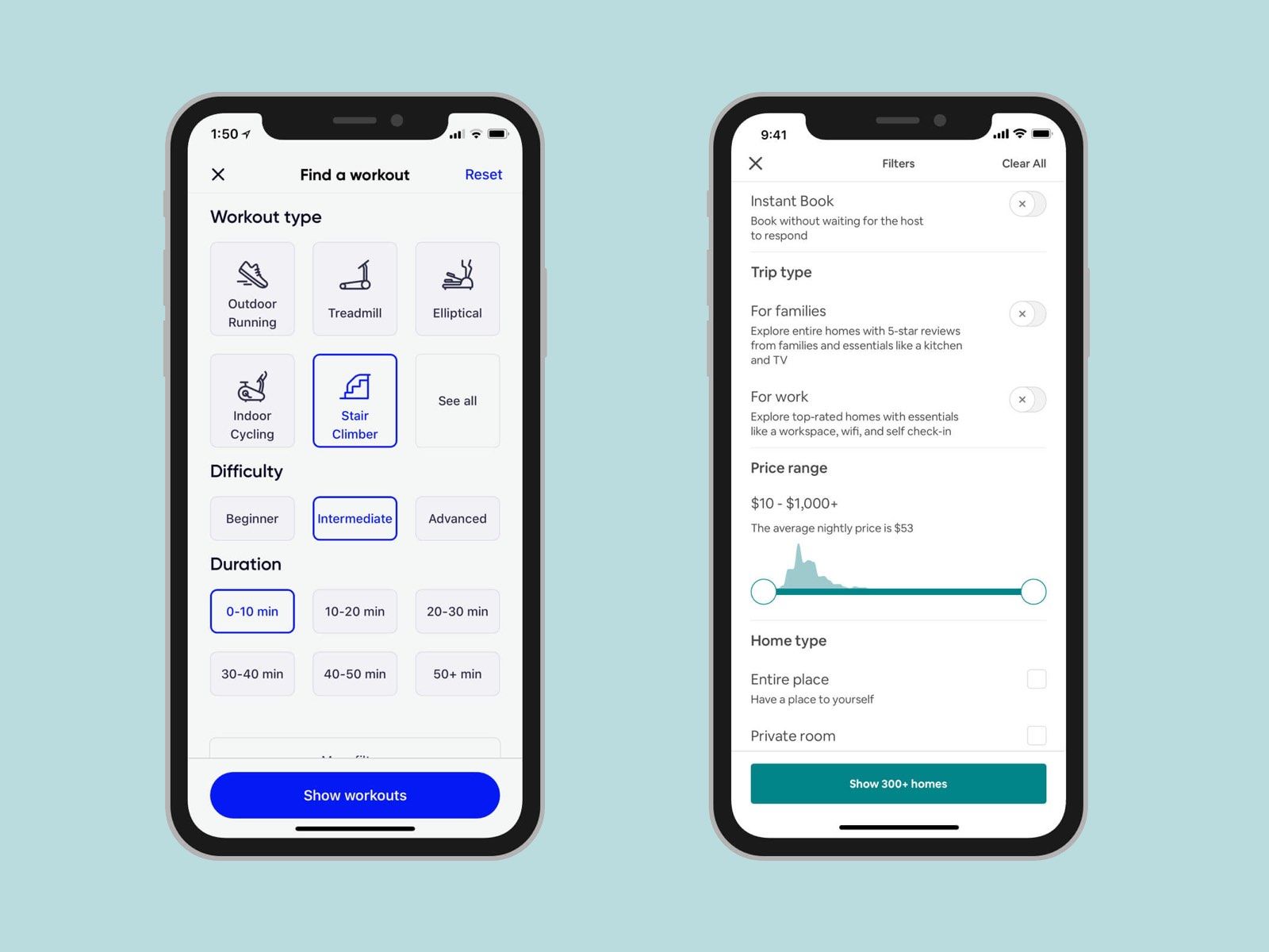
Tabs
It's a good idea to distribute content by tabs not to overload the screen with a lot of information.
Search
It's a massive part of the navigation, and sometimes it's very convenient to have it in apps with too much data or options to process before making a decision.
It was easy for many of us to find something in Settings in early versions of iOS, but it's quite an overwhelming experience Today. But when you start searching and type the first one or two letters, the task is getting much easier because you see fewer settings options which is much easier to process.
In addition to that, splitting items into sections or categories allows minimizing the time spent on navigation.
I believe it's a huge part of user experience, and it's often underrated for some reason.
A well-thought UX including search capabilities adds great value to the app or a website. Of course, if that's necessary and you have lots of data or options to choose from.
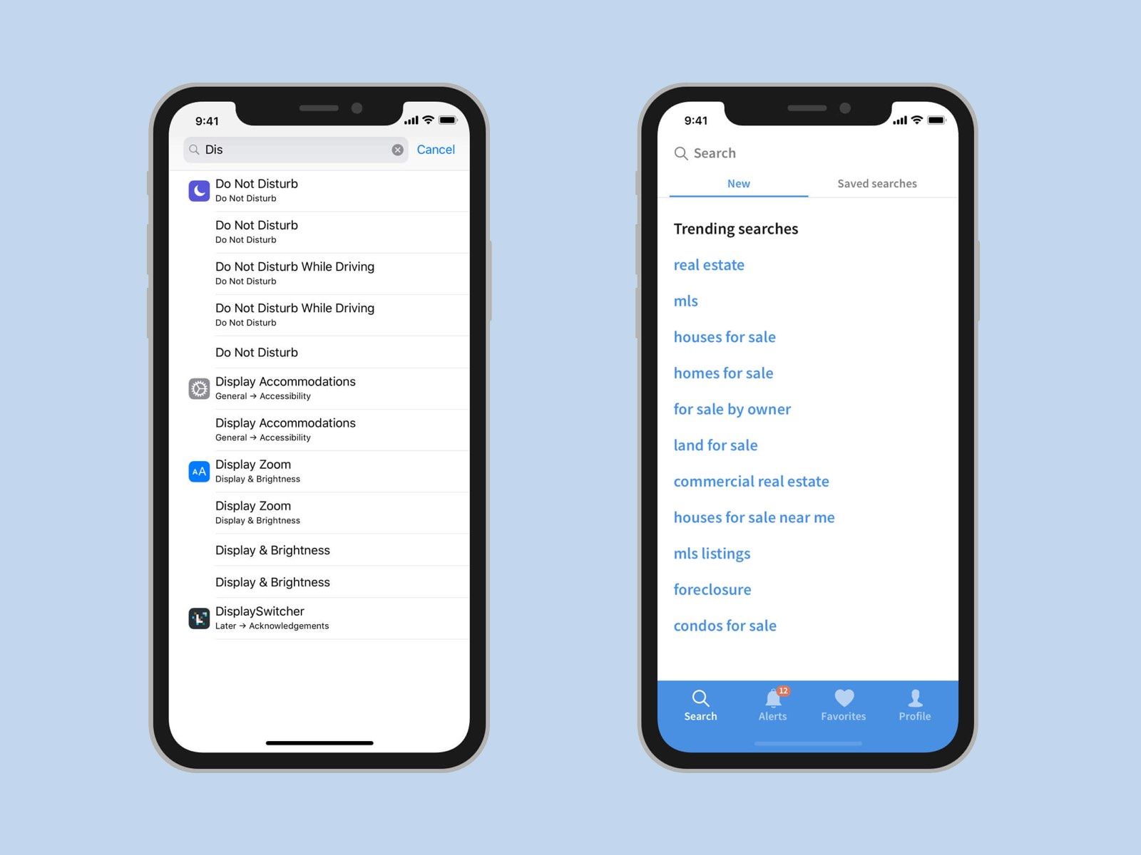
One use case of searching even better is to have examples of search requests or trending searches instead of showing an empty screen (page).
Another great example is a categorization of search results with the ability to perform searches that you did earlier. It could be wise even to add some parameters like price range, location, and more in some cases.
Gestures
We have had this from the very beginning of using touch screens, and it's getting more and more common when Apple removed the Home button.

You can swipe up from the bottom to go to the home screen or swipe up and hold to see all your currently running apps. Swipe down from the middle of the screen to search.
Gestures became more of a standard. Because once users understand the mechanics of essential gestures like going to the Home screen or calling the Multitask menu, basically swiping, it's easier to learn and use more complex gestures within different apps.
Again, gestures should be intuitive and easy to learn or not learn at all. This should be obvious so people can expect to make certain gestures because they've used them before, or this experience somehow mimics experiences from the real world.
Cards and Navigation
Card navigation is based on the card deck metaphor. Particular card deck manipulations such as stacking, swiping, flipping, and discarding are common in the real world and can be efficiently implemented in apps and websites.

I found examples of cards in the next apps: Books, Podcasts, and Agora. I think it's a great idea to use this pattern for navigation between instances or even related pieces of content.
This interaction feels like you don't go to an entirely new section in the app. It remains the same place but allows users to go deeper into details to explore more options or additional information.
It seems like a natural way of doing things especially, on mobile devices. It's easier to implement because now we have bigger screens and higher resolution and refresh rates on mobile screens.
Popover Navigation Elements
In most cases, it looks in the same way as cards that appear on top of a screen, but sometimes it can take fewer spaces and use a small fraction of screen space.
It's not necessary to dim down the main screen. This concept is similar to drop-down menus that we have on the web, and if we aim for mobile screens with a high resolution, we can confidently implement this pattern in mobile designs.
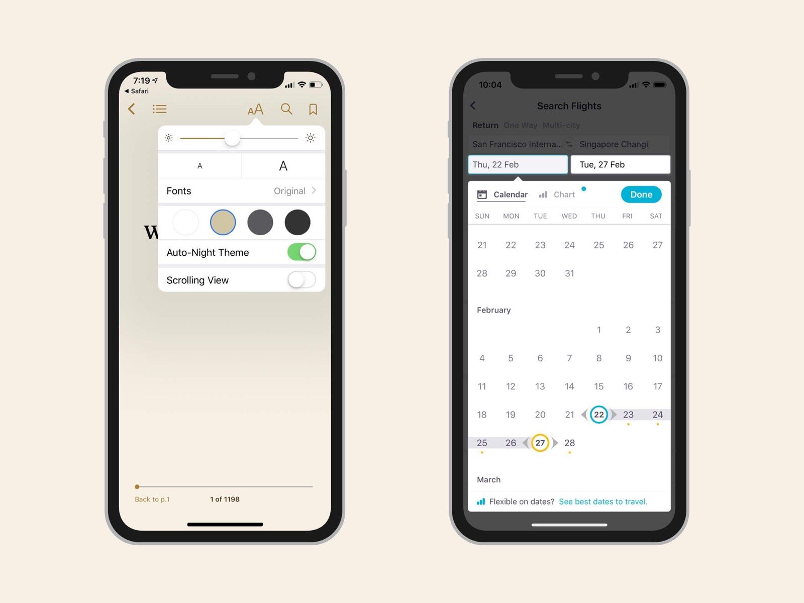
Great examples with popover menus are Books and Skyscanner apps.
Using this type of navigation allows you to stay on the current screen but explore more options or change the content using another view criteria.
Force Touch or 3D Touch
One more layer of navigation that is completely invisible unless you know how to activate it — the 3D touch of Force Touch.
There are two common 3D Touch use cases: quick actions or sneak peek of the content.
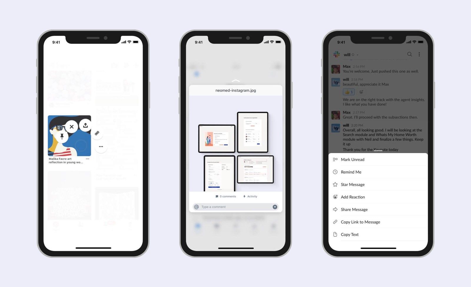
With the 3D Touch, it's possible to save mental energy and go straight to what you need right now. Apple has many actions for their native apps, like quickly setting a timer right from the control center drawer or going straight to Wi-Fi or Bluetooth settings from the Home screen.
Some of the apps like Pinterest successfully use the 3D Touch for quick actions on pins. You can do operations with files and folders in the Dropbox apps without opening them, but just pressing hard on them and then swiping up.
However, in some cases, the 3D or Force Touch shows itself as a confusing experience, and some apps and even new versions of iOS got rid of it completely and replaced some of the use cases with the long-press action.
Long-press works in the same way, and it's an alternative to opening things in a new screen to perform quick actions or have a quick look at what's inside.
No matter what, Long press or 3D Touch can be quite frustrating for users.
Most people are not aware of these interactions when they start using an app unless they experienced it earlier in other apps and are willing to learn and try new things.
Sometimes, it's even necessary to educate users in a help section or use onboarding experience.
Moreover, there are rumors that this is a sunset technology. Meaning it can be removed from devices and technologies that will emerge in the nearest future. Or maybe we'll figure out a better way of implementing it, so it's more intuitive for us.
Trends come and go, and what we can do is to test things out and make sure it's sustainable. Otherwise, be prepared to remove or replace it with something else.
Voice Queries
With virtual assistants as Siri, Google Assistant, and other people can start using an interface from different entrance points.
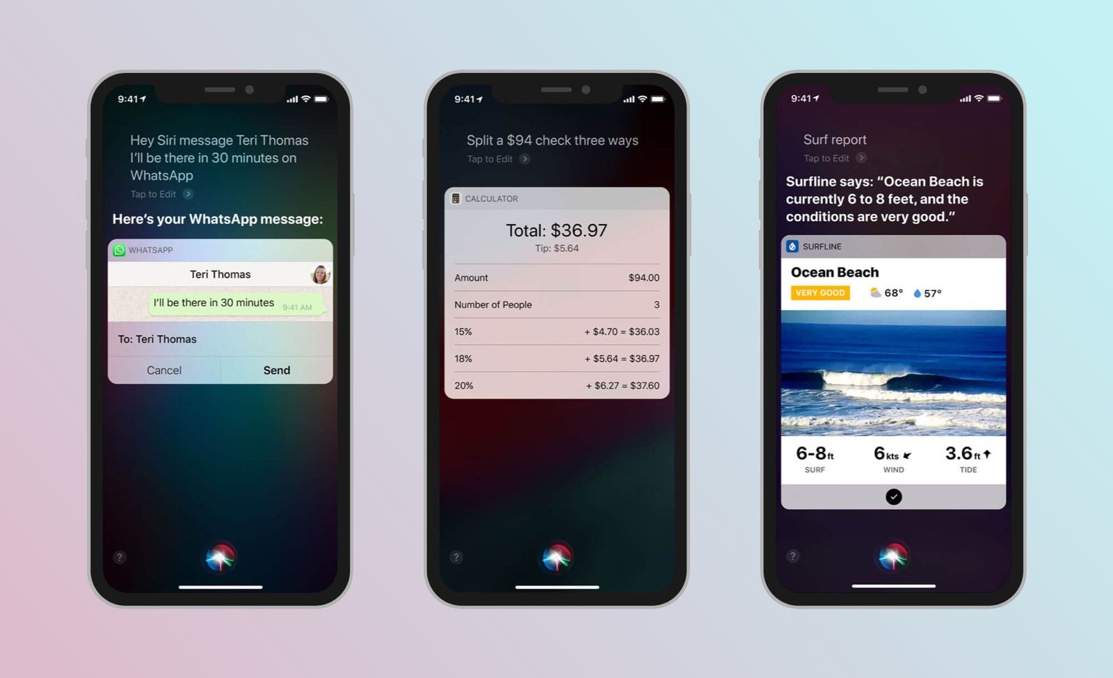
Voice control is still an emerging technology, but that's something that I believe will be improved soon.
Sooner or later, we'll be able to control more things with a voice. Moreover, some tasks can be done without even interacting with an app, websites, and computers as we got used to it.
That is something I think is worth paying attention to.
Conclusion
As a good design, good navigation is intuitive and does not require users to learn it unless it's necessary. Helping users to understand navigation should be a high priority for almost every app. The more natural it is for people to use and navigate a product or a website, the more likely they will be your returning and high-value customers.
Max Snitser
Whether it's website design and development, app design and development, digital product design, or luxury branding and upscale design, my goal is to create designs that are aesthetically pleasing, visually appealing, and functionally intuitive. With a mastery of user experience (UX) and user interface (UI), I craft solutions that bring ideas to life, produce high-quality work, and build strong relationships with clients.
Contact Max