Color Theory

Color can play a great role in any type of design. Sometimes we can use similar types of design, but with different color palettes. And we can experience very different feelings regarding them.
Another point of view is that color in design is very subjective. What colors one person likes doesn't like another. Sometimes it's more personal opinion and question of taste.
In different cultures something that looks happy and uplifting in one place can be depressing in another place. Thus, web designers should take it into account when we are defining a color palette for the design project.
Technically, color doesn't exist. Color is created only when our brain tries to make sense of light signals it receives from the outer world. In other words, it's all in our minds.
There are two ways to create colors.
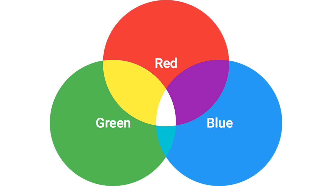
1. Additive Mix
Additive color works with anything that emits or radiates light and based on red, green, and blue - RGB for short.
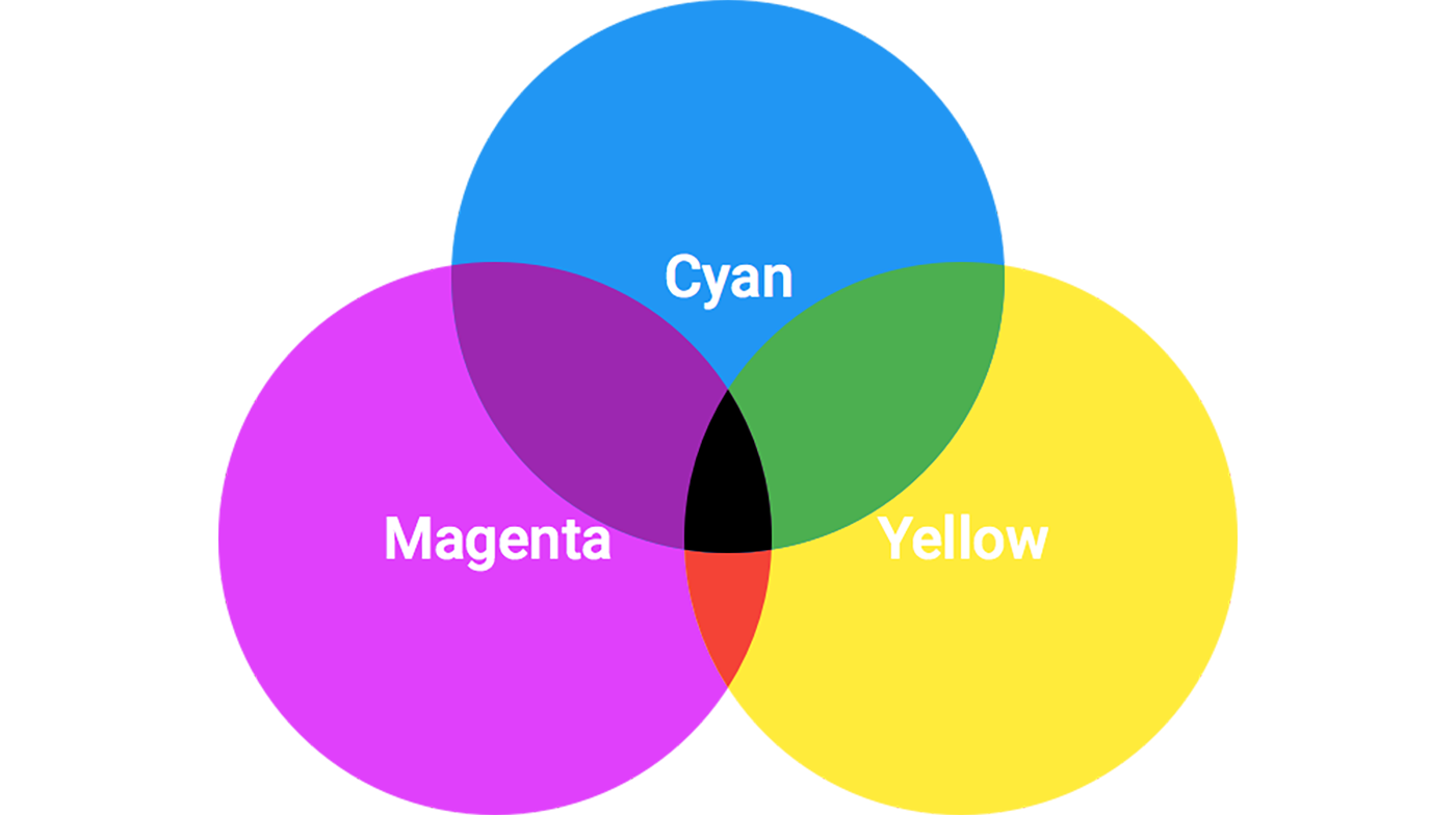
2. Subtractive Mix
Subtractive color works on the basis of reflected light and based on cyan, magenta, and yellow - CMYK for short. K is the last letter of "Black" that appears from the mix of the first 3 colors. As well, black is considered here as the Key color. Thus, the K letter can be taken from the word "Key".
Natural Color System
As well, we have a color theory that states that the human visual system interprets information about color in an antagonistic manner. The opponent color theory suggests that there are three opponent channels: red versus green, blue versus yellow, and black versus white. Responses to one color of an opponent channel are antagonistic to those of the other color.

By the way the colors of the Swedish flag are taken from NCS model. This is because this model was published by the Scandinavian Color Institute of Stockholm, Sweden.
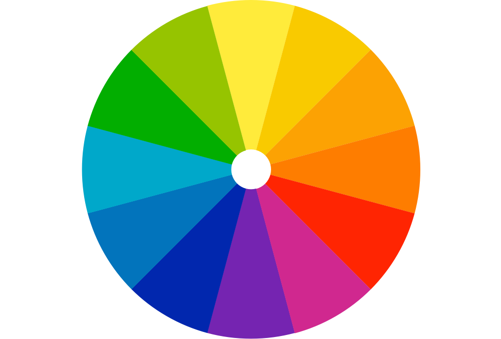
Color Wheel
It's the best way to think about colors.
Color Harmony
In visual experiences, harmony is something that is pleasing to the eye. When something is not harmonious, it's either boring or chaotic. The human brain rejects what it can not organize, what it can not interpret. The visual task requires that we present a logical structure. Color harmony delivers visual interest and a sense of order. Harmony is a dynamic balance.
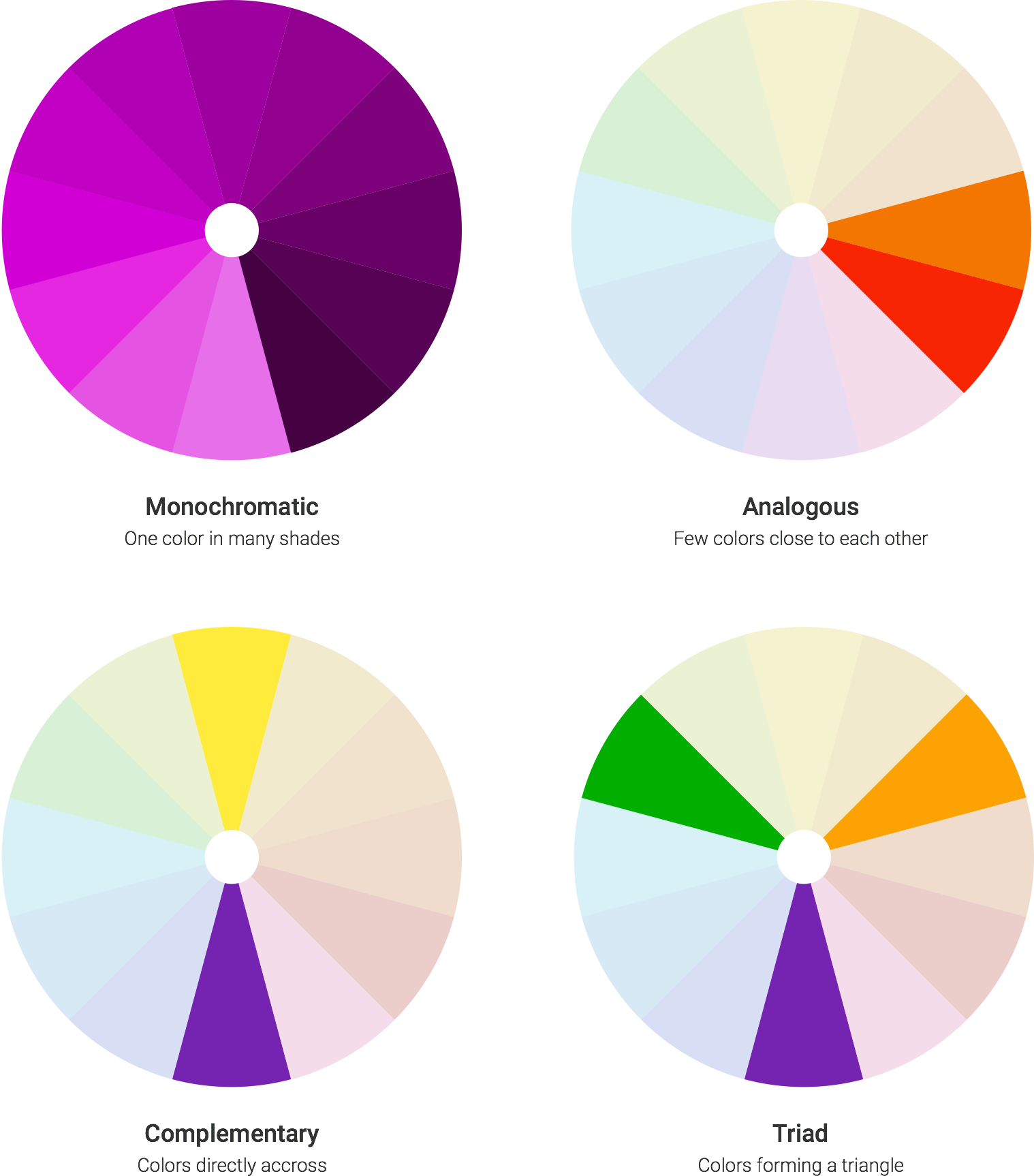
How To Make A Beautiful Choice Of Colors?
We can use one of the rules of color harmonies.
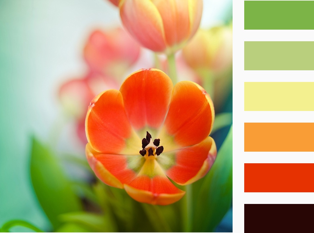
A color scheme based on nature
Nature provides a perfect departure point for color harmony. That's why it's so easy and calming to look at objects of nature.
Colors Should Help Us To Recognize But Not Vice Versa
To save time and let people focus on needed elements of design and prevent unfocused states is the most important task in the design that can be partially solved by colors. For instance, if you use complementary colors in your design then they should be separated from each other by other colors. To make the whole picture more readable.
I have my own theory that we should use in design only several colors to make it simple for peoples' minds. Color processing begins at a very early stage in the visual system of our brains and if load it with a big bunch of information it will take more energy and time for understanding design. Subconsciously our brain would reject spending time and energy on this kind of design. Thus, the potential user of the design can reject it at an earlier stage before even start using it.
I caught myself that I spend several seconds watching on the screen of my iPhone just to look at beautiful icons and maybe wallpaper. Sometimes I spend some time finding an app if it's not on my first screen. It is because I'm unfocused and in this very small time frame I forgot what I'm looking for by analyzing lots of colors and icons on the current screen. And this is not the only problem. We have a bunch of similar minor problems and I'm sure we'll solve them in near future.
If talk about futurism then I visualize our future with monochrome interfaces on transparent screens. I'm sure we'll get to this stage and design solutions would be more focused and effective for us.
I'm sure I'll come back to this topic in one of the next articles. I have a bunch of good ideas regarding this futuristic design conception.