Discover The Most Popular Navigation Design Patterns

Hamburgers, sandwiches, menus, snack bars… Wait a minute. This post is about Navigation! Your users need it to locate specific features and content on your website or in your app. It seems simple on the surface, but it’s not that simple when you want to build a very efficient user experience in your product or website.
Here are the most efficient navigation patterns and the best ways to apply them to your product or website.
Navigation Tabs
With tabs, you can separate your content by sections. When a tab is selected, the relevant content is shown or loaded inside the content area.
Often, long content needs to be separated into sections and accessed using a flat navigation structure to see the current location.
Tabs mimic the real-life experience of a folder with documents, an organizer with marked pages, and similar physical objects.
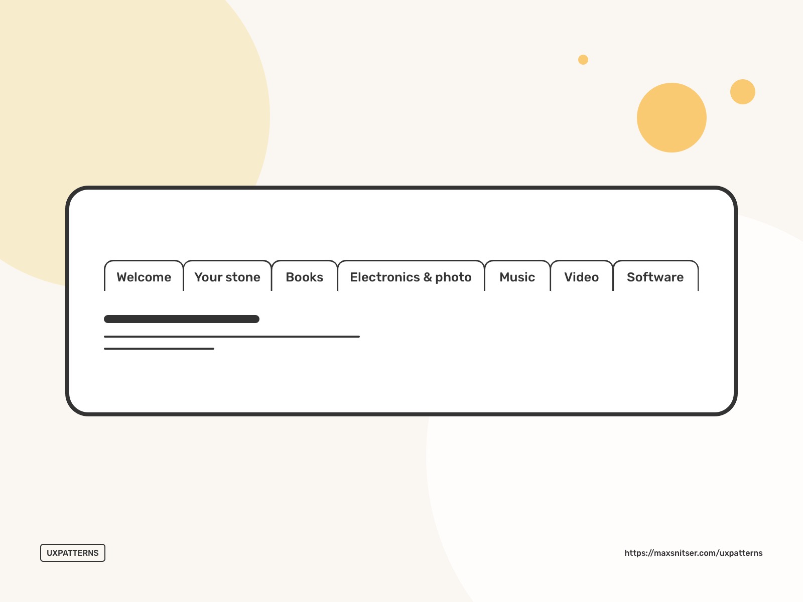
It’s wise to use tabs when you have 2 to 9 sections of content. The names of tabs should be short, so it’s easy to read them and navigate quickly. Also, if you have many sections, you need to make sure they fit into the maximum allowed width.
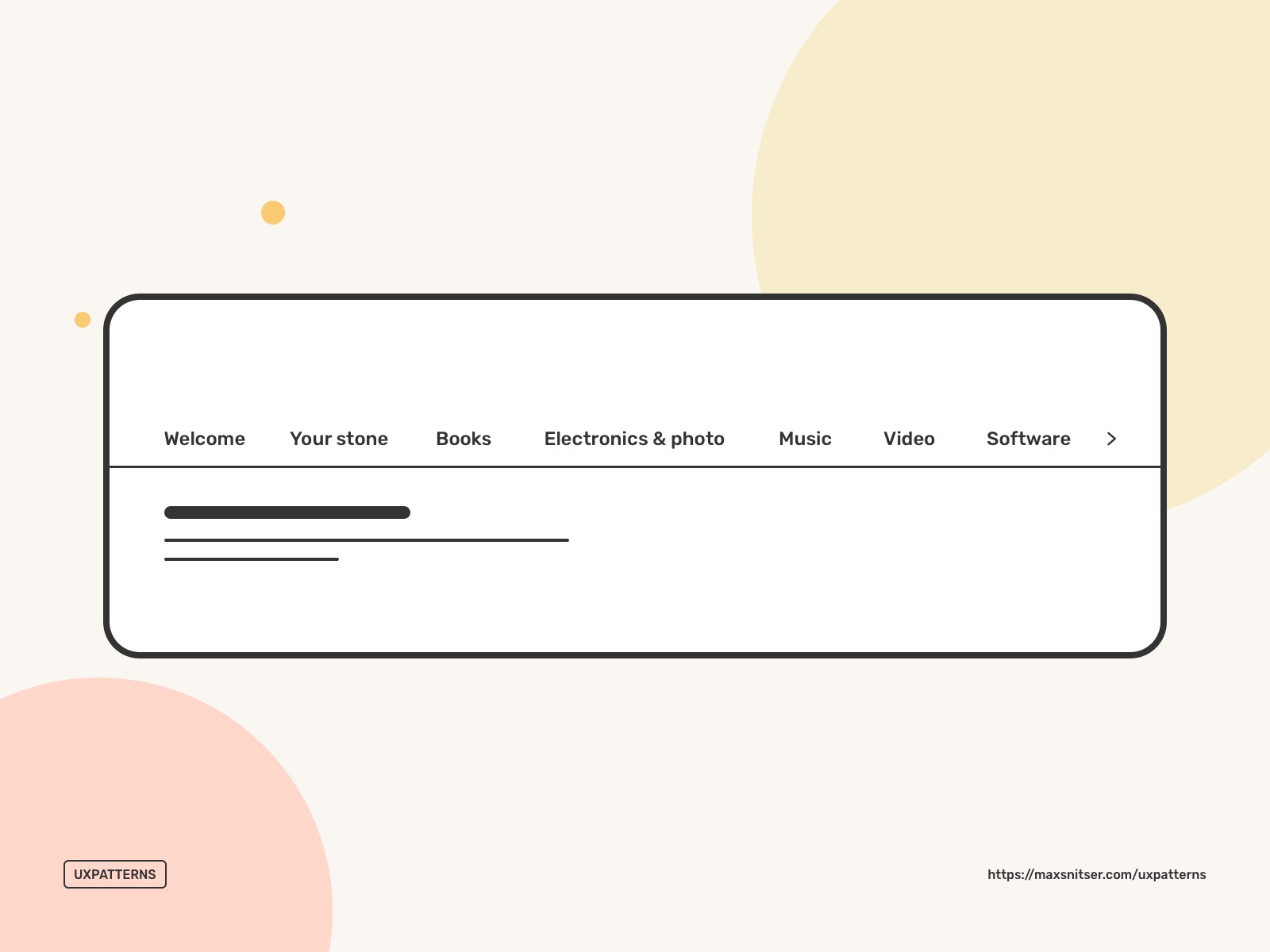
If the tabs' names do not fit, you can try to wrap them into a second line. Alternatively, they can go over the available screen or container width, and you can provide users with a visual indicator explaining that more tabs outside of the screen or container. One important thing here is that tabs should be in one row only.
In some cases, you can supplements tabs with icons or use only icons if they look self-explanatory and don’t make it difficult for users to understand what content can be accessed in each tab.
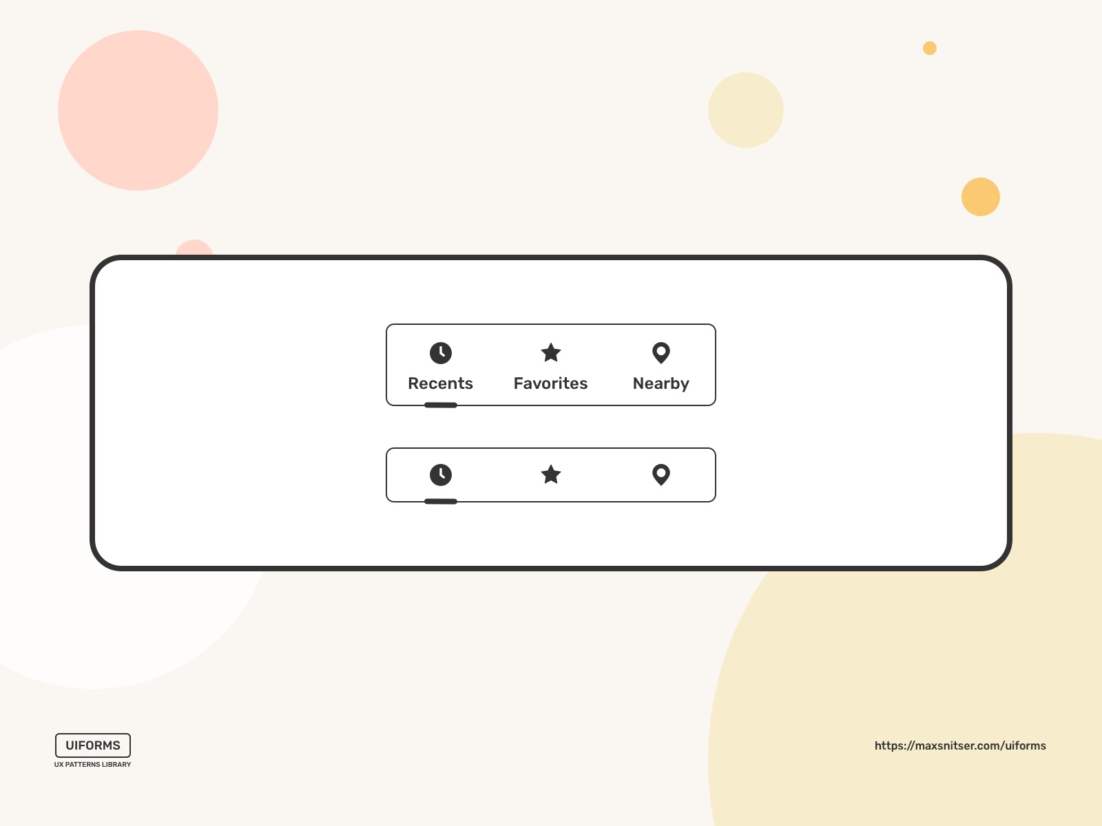
Ensure that the active tab is distinctive from other tabs so users can see where they are located.
Do not use tabs if you have sequential content that needs to be read in a particular order.
Menus
Vertical dropdown
It’s a good design practice to have a drop-down menu if the user needs to navigate among sections of a website, but space to show all navigation options is limited.
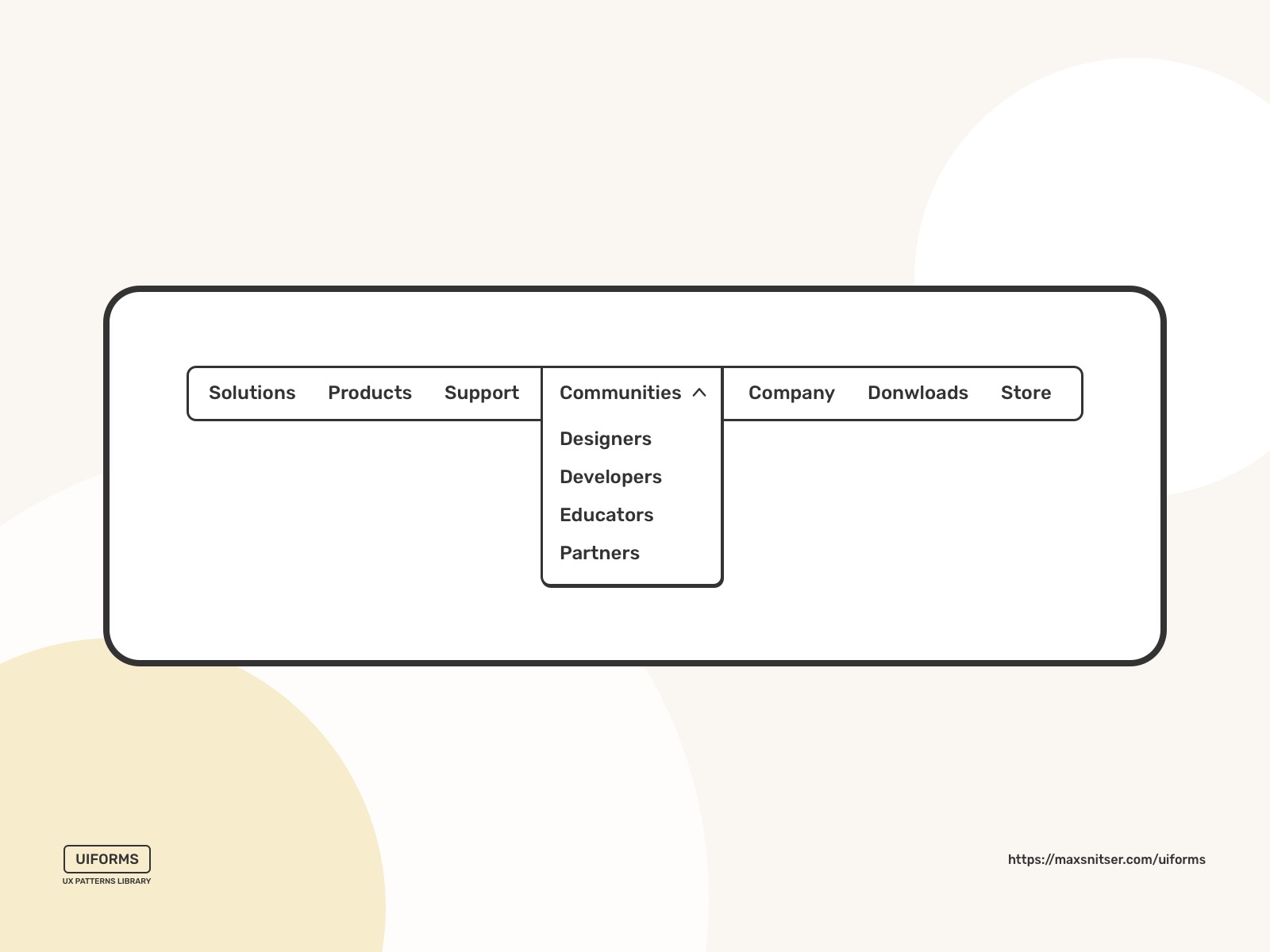
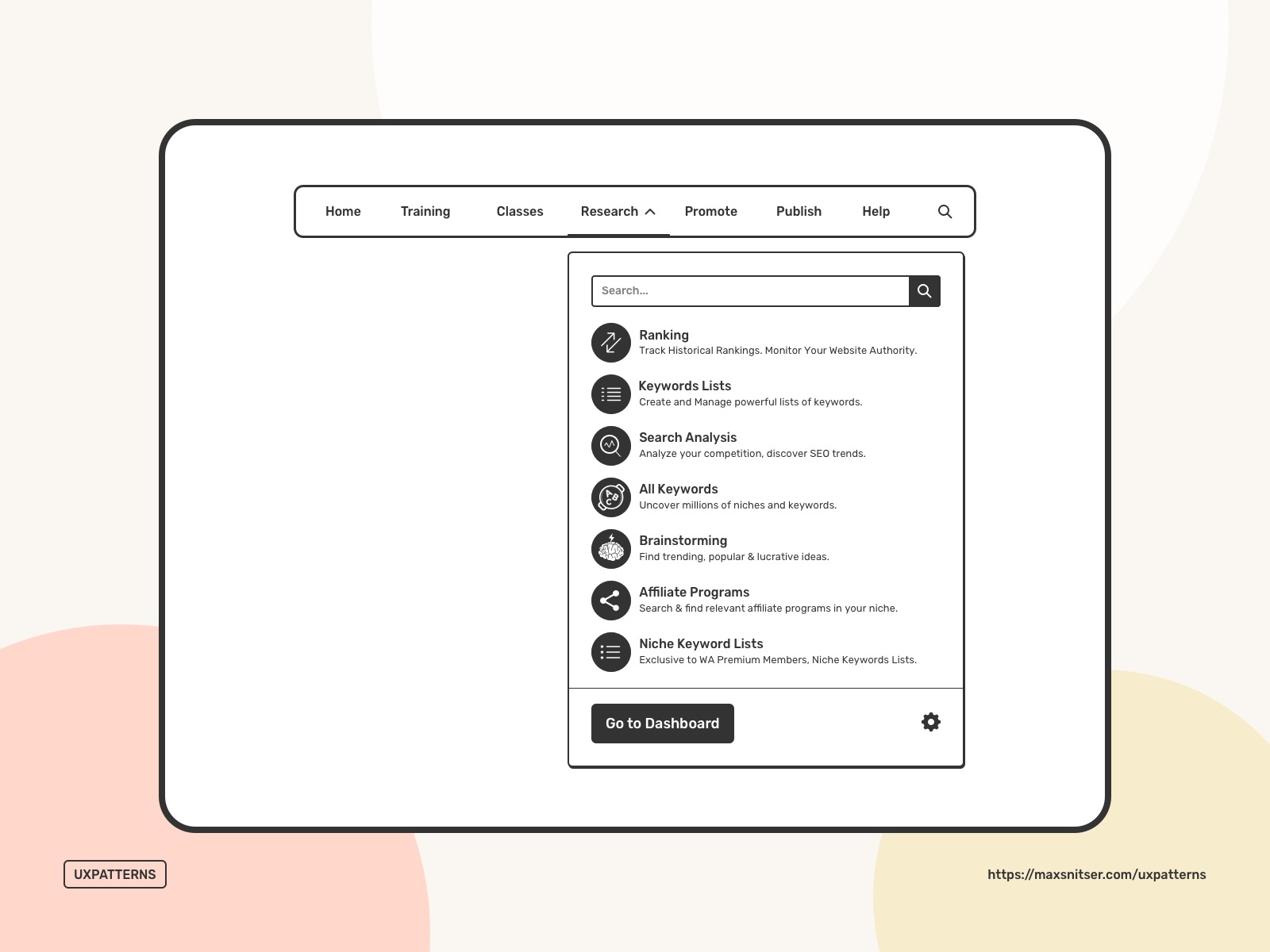
You can make your dropdown menu options more interactively and even give access to some features.
A dropdown layout can be complex rather than simple to improve interaction and engagement with your users.
Horizontal dropdown
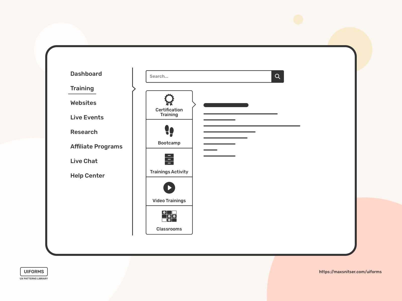
Sometimes you can have a sidebar menu, and some sections can contain subsections or some additional content. Of course, it should be used only in case if you have multiple directions from the section (multiple levels).
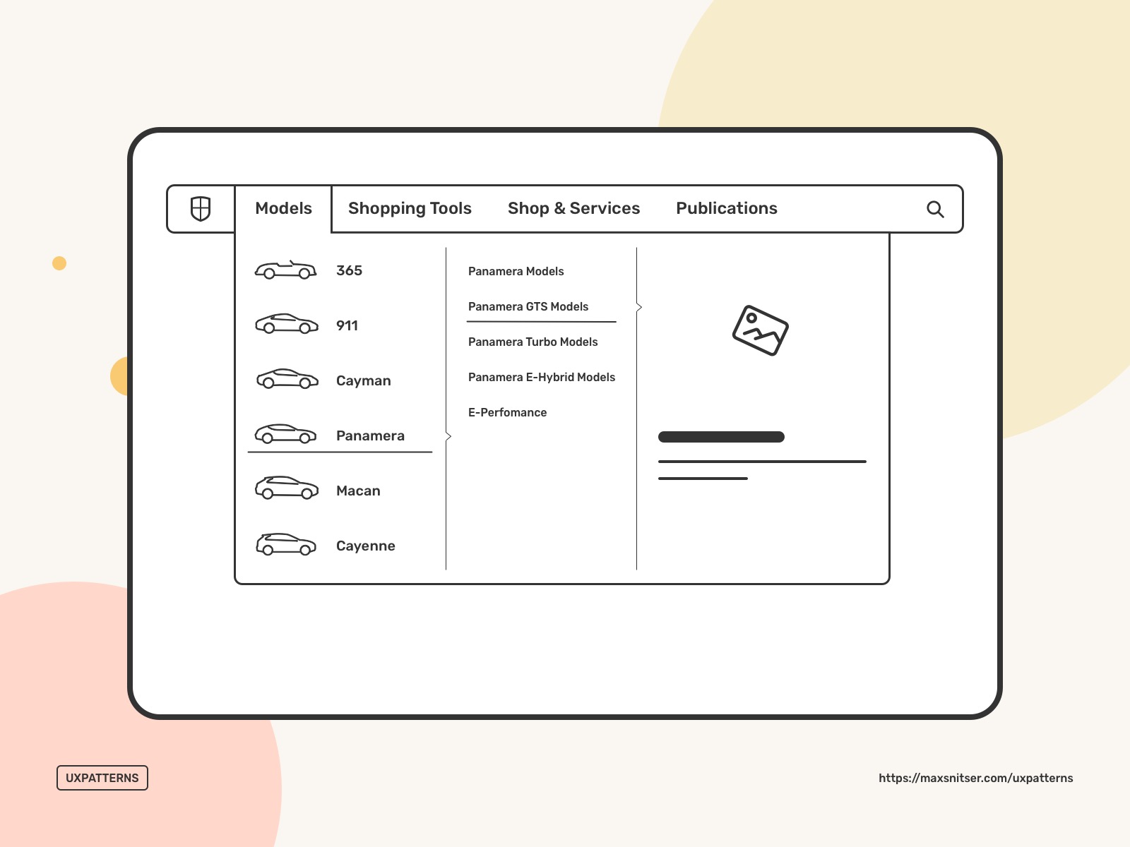
You can build your sidebar bar menu and utilize a horizontal dropdown menu more interactively. Of course, it depends on a product, website, and app. It can be easier and faster to interact within the menu to perform some actions or have some starting points than going into the full section of the product.
Accordion
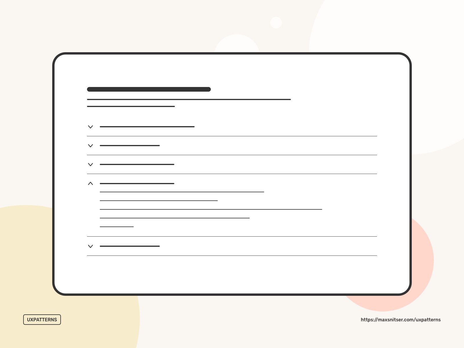
It used to be a popular design pattern on websites to show the menu subsections menu, but this case is common on mobile screens.
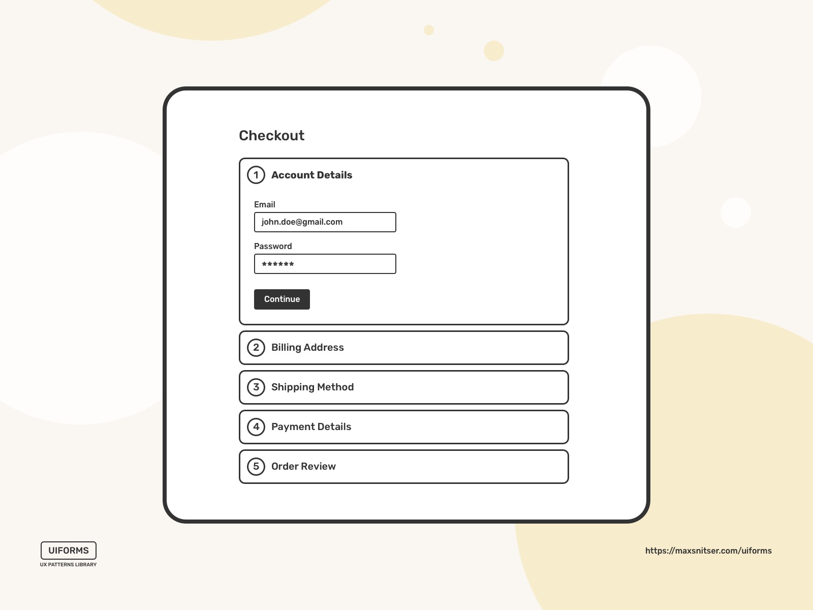
Collapsing each step under an accordion can effectively convey the form workflow to the users without overwhelming them.
The same works in the case of simple content consumption. The accordion element can be very lengthy, and if readers decide to quit reading it and jump to another subtopic, they can close the current accordion and quickly move on to the next one.
If we explore a broader aspect of Navigation, then we can find a few other use cases.
It can be efficiently used for top to down wizards and step by step processes.
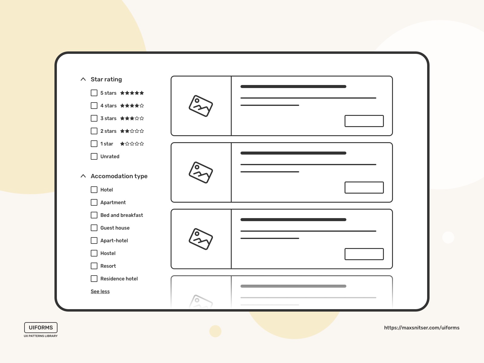
It’s also a good pattern that you can use for filters in the sidebar if you want to show only limited options for each filter so people can see all their filters at first.
Hamburger
This navigation design pattern has a funny name, and for those you who don’t know, it’s called this way just because often icon for this menu button looks like 3 lines that. So yeah, you can call it a sandwich or something like this, but it seems like “hamburger” stuck there as a conventional name.
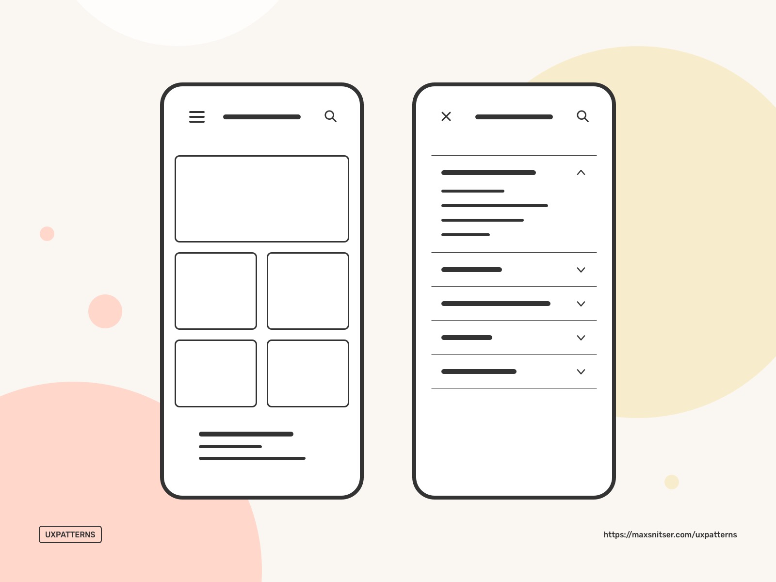
I’m aware that there are many examples of websites with this type of menu, but mostly it’s done for aesthetic purposes and sites that don’t have much content. In cases like this, there are not many valuable menu items or info. Often you can scroll websites like this and use effortlessly without even using navigation. I highly recommend using a hamburger menu if you don’t want to hide your menu and create this extra step for your users to access it.
As for the mobile screens, if you have hidden navigation, it's beneficial due to the screen space's economy. However, there is an alternative design pattern that can be used instead of the hamburger. You can read more about Hamburger here in this post: Best UX Patterns for Mobile Navigation.
Quick Actions and Shortcuts
Notifications
These design patterns should be used when the user wants to be informed about important updates.
Of course, it should notify users about information that’s outside their current flow or screen.
One important rule here is to minimize interruptions. Do not notify users about technical operations or system errors that do not require any user action. Otherwise, all of this will be redundant.
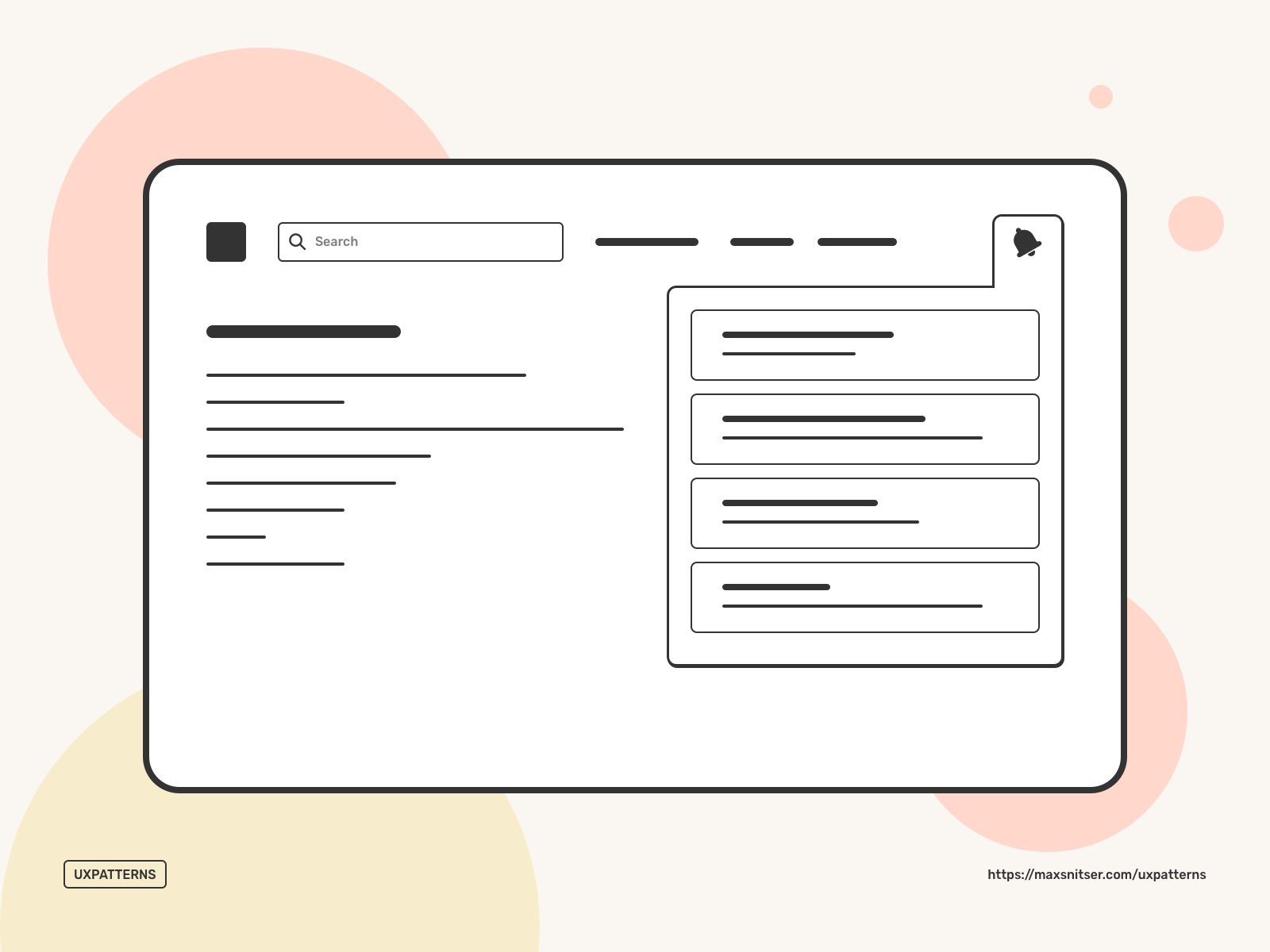
You can provide your users with certain actions within the notification dropdown. This allows us to do quick micro-interactions and not be distracted too much from the current flow or task.
You can make notifications dismissible and let users disable or quickly change how a specific group of notifications will be delivered to them in the future.
It’s a good practice to give users control over notifications. They need to have the ability to choose what notifications important for them and how often they want to receive them. Of course, there are exceptions as important system updates that can be shown to users despite their settings with a single goal to prevent bad experiences with the system in the future.
Breadcrumbs
This is an important navigation design pattern that helps users understand their current location within a website's hierarchical structure.
Breadcrumbs are usually represented as a trail of links at the top of the page, usually just below the global navigation. It’s a good practice to use breadcrumbs together with main navigation.
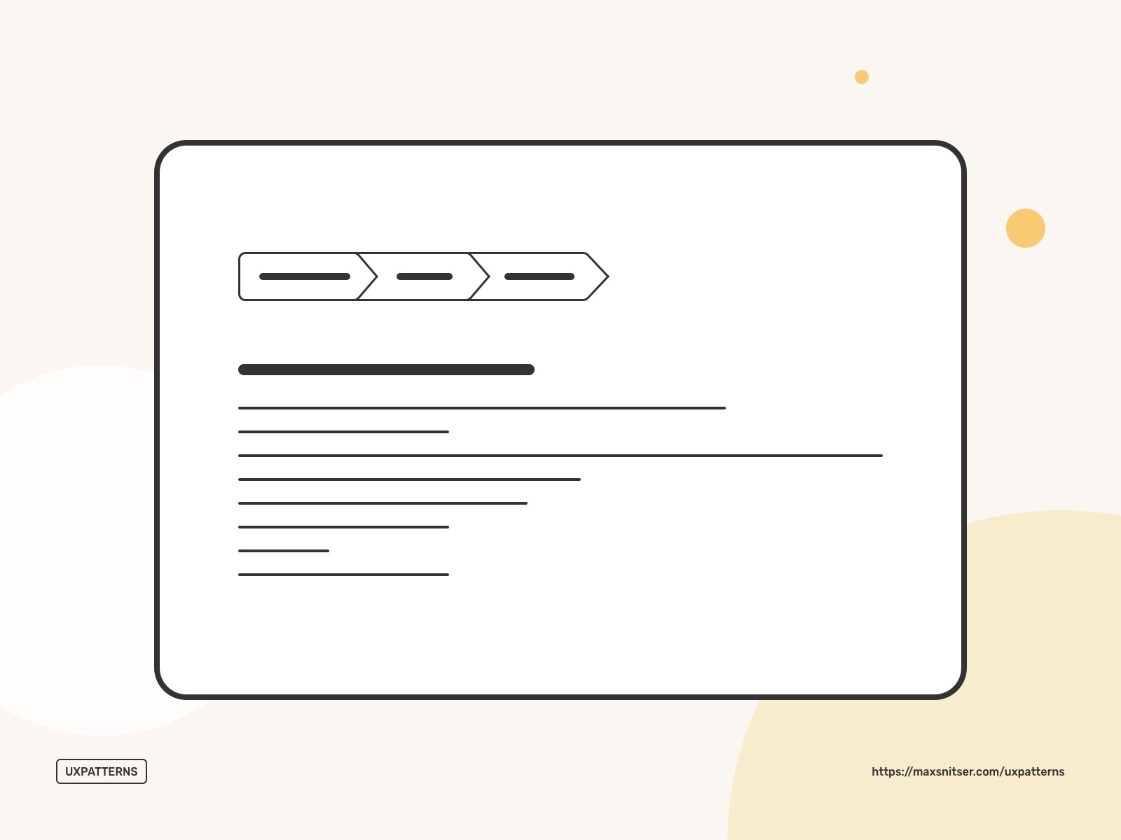
If users reach a deep page after traveling through the pages, they will have a fairly clear understanding of where they are.
Breadcrumbs are useful when a user has landed on a page from an external source (another website, resource, banner ad).
Search Navigation
Basically, Search can be the main navigation starting point, and users might not need any navigation type at all. However, there are cases where users don’t know where to start and what to search for. Such traditional navigation patterns like a menu, tabs, and similar to them help users understand where they can go.
Search is one of the most popular design patterns in eCommerce, news sites, and blogs.
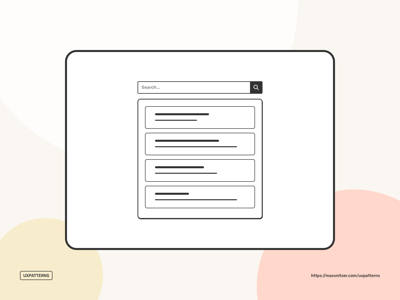
Even though the search bar looks like a simple design element, the most difficult part of the whole search experience is the next step, where the user sees the results related to his request. It’s important to design it specifically for your target audience and regular users. So they can get most of it.
Shortcut Dropdown
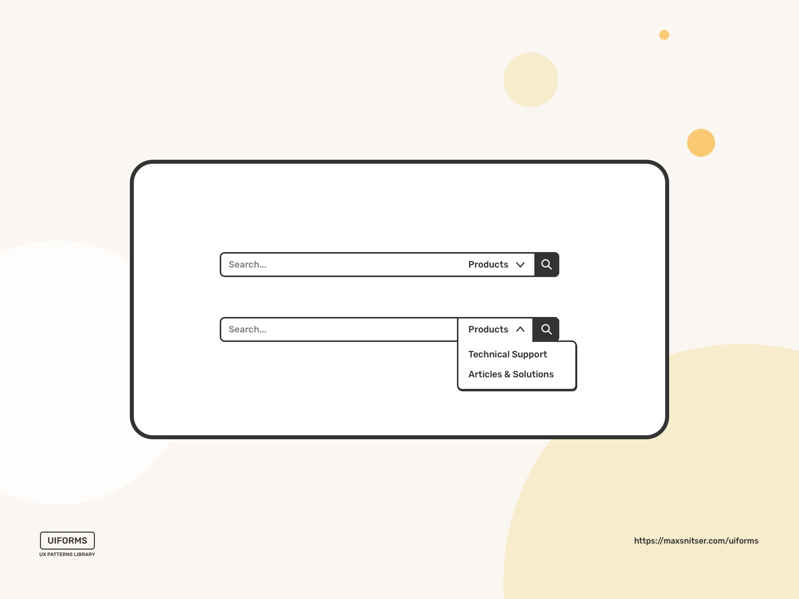
A dropdown menu as a navigation design pattern can be useful when you need to provide shortcuts to the specific functionality of a website or an app. Sometimes, it can be used as navigation when you don’t have enough space for a more traditional navigation bar or visible menu, but I recommend to do so only if you don’t have any other choice.
A good use case is when you have a search bar as a part of navigation, and you need to specify your search queries by categories or specific types. See the example below.
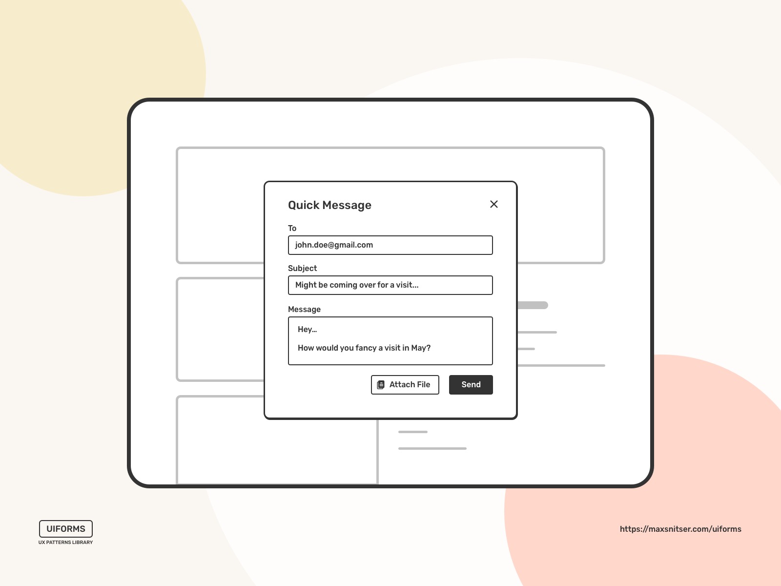
Modal window (pop-up)
A window that prevents the user from his interaction with the original interface (website or app). It’s an effective way to force your users to focus their attention on a specific task outside the original flow.
The main downside of it is that it’s a pure interruption, and if it’s not helping users in any way to proceed with the main task, it leads to a bad user experience. Otherwise, it might be a very efficient pattern that helps to accomplish the main task and avoid mistakes. For example, if there is a case when the user needs to delete a product from their shopping cart, then a modal window can be a way to make sure that they don’t do it by mistake and that the user is 100% sure about this decision. However, this is not something that works for any case like this. You need to be sure that it’s beneficial for the business and users to create this type of interruption.
In most cases, there is no need to force users into specific actions. As a result, modal windows add unnecessary pain points for your users. However, in some cases, modals might add a specific piece of information that requires several steps to do so, but you don’t want users to leave the current screen or section of the website. You can make it possible with a multi-step modal window. That way, users can stay on the original screen and perform this specific task without leaving the main interface. One good example is the Profile user interface. Let’s say the user wants to add a photo to his profile. A modal window might be a short term wizard with such steps as upload photos, crop, and edit, save changes.
Fat Footer
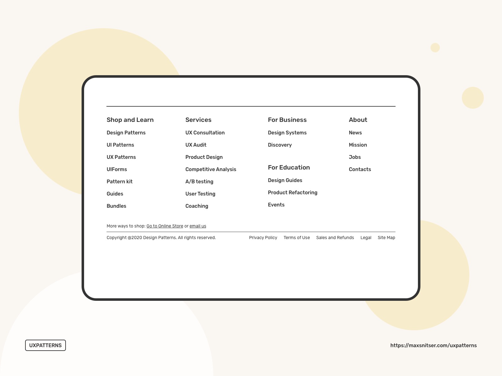
Sometimes, a website's hierarchical structure can cause delays for users to navigate to specific pages or features. Adding links for quick access to other sections is an easy and natural way for users to continue their journey.
I recommend using footer space for shortcuts to the most frequently used pages and functions. This way, you can shorten the path and decrease the confusion moments for your users. It’s also a good way to keep visitors on your site for longer, which is very good for your resource's reputation.
I’d say navigation or shortcuts below the main content is an easy and natural way for users to continue using your website. This way, they can end one experience by starting a new one.
Of course, using a fat footer is not a panacea, and it’s something that you need to implement with the experience of your users in mind. To make it work the best, consider asking these four questions when creating a footer:
- What is the next thing my user might be interested in?
- What is the next logical step in the user journey?
- What is relevant to the content on the current page or the main function on the screen?
- How can users continue their experience beyond the content on this page?
Home Link
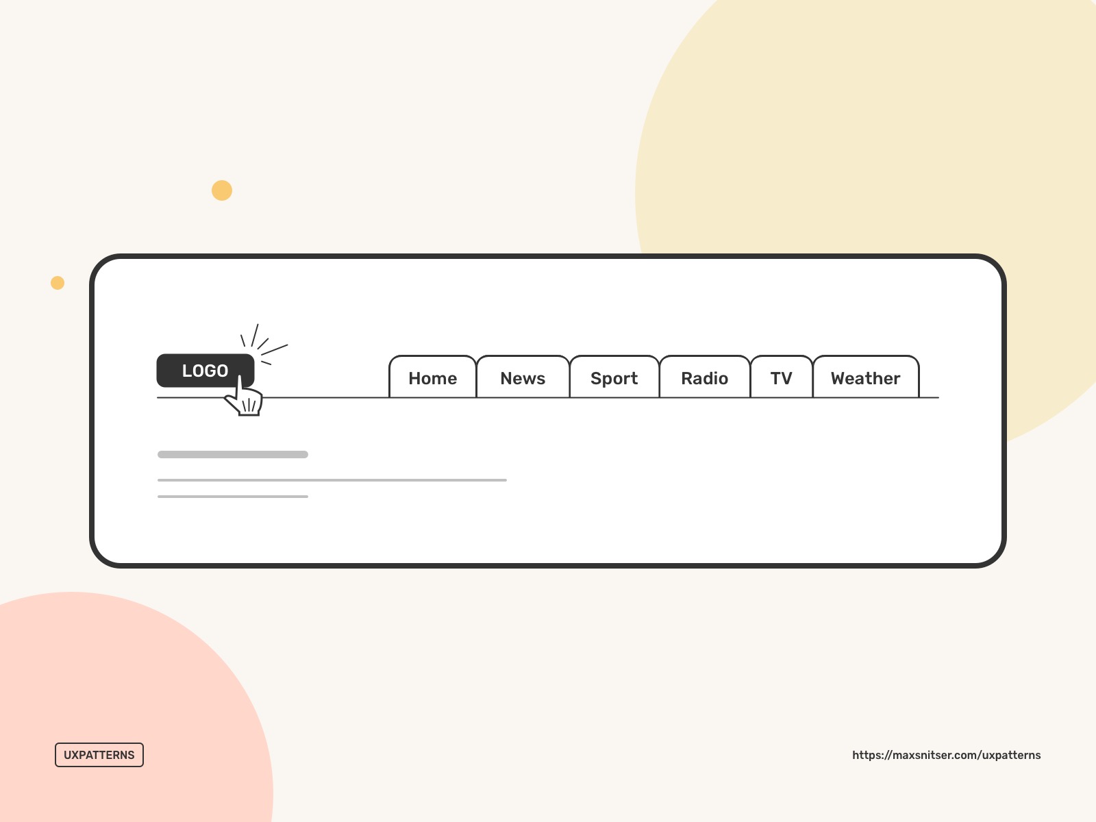
Often, you need to provide your users with the way to go back to the start location of your website or application. Usually, you can do that by making a logo as a hyperlink, but sometimes it’s not obvious for certain users. So it makes sense to add a menu option called “Home” or “Dashboard”.
These were the main navigation design patterns. I hope this is useful, and your next project will benefit from this article.
I'm preparing a couple more posts related to design patterns. So stay tuned by subscribing below on future posts. And I'll catch you in the next one!