Does Software Matters In The UX Design Creative Process


The user experience should always be the end goal of every design process. And it doesn't matter what tools do we use. We can create a successful UX by code or even by hand on paper.
Sometimes I receive requests where people want me to work on their mockups in PSD format and improve their UX. Usually, it doesn't make sense to take on board this kind of project. Since these people have their strong opinion on a project that they are working on. And any adjustments can be useless. Also, the software that's being used is not an essential part of the UX creation.
Initially, software like Photoshop wasn't created for interface designers. It was everything about photos, images, and illustrations (not an interface design). Creating UI using it doesn't make much sense, of course, if you have any other alternatives.
I used to work in Photoshop before I switched to Sketch. And the main reason for it is that UX and UI designers didn't have a lot of options at that time. Some designers used Illustrator because of the vector. But it has a problem with the correct sizing and scalability of UI elements and mockups in general.
Every user experience starts with a discussion about business goals, target audience, different technical aspects. It's a complex question. User Experience is mainly not about design layouts and templates. UX is about the relationships of people with the interface you create and the end product that they use.
User eXperience is quite a broad area if you look at it outside screens and specific design solutions. Obviously, you can have experiences pretty much anywhere if you interact with people and systems. You can even notice UX on simple examples in everyday life. Here are a couple of examples.
The shopping experience in the supermarket
You can find out lots of processes in supermarkets and similar shopping experiences that are usually hidden from regular customers. But this experience influences a big part of people. It means that your user experience starts when you step into the supermarket and ends when you go out with groceries that you bought.
Each step, each time when you notice something on shelves, is designed with a purpose.
Do you know why fruits and veggies are often positioned in the first place where you enter the store? The reason is to fill your groceries basket with healthy food and, at the end of this process, be more open to unhealthy foods that you can usually find at the checkout area. However, it's the opposite in some places, fun foods first and healthy goods later on. So it's not always the case.
Transportation system
Commuting is another user experience that pretty much everyone has at least once in life. This is also the case where transportation companies pay attention to details and shape the habits, produce and modify guidelines for working staff, study, and make commuting experiences easy and predictable.
Of course, I'm talking in this description. I'm thinking about well-developed transportation systems, places where the transportation system works well.
For example, when I was the first time in Stockholm, I was amazed at how easy it's to commute in the city and that you have many options.
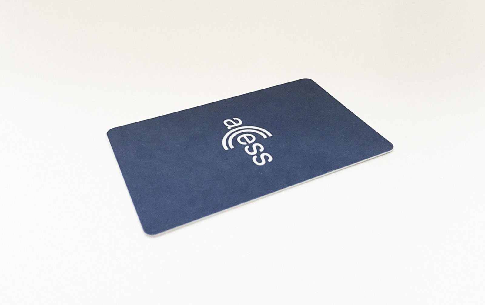
The whole experience feels like a well-oiled machine. You can go to the subway, then go up and change for a tram or a bus and the coolest part is that you can use a single access pass to use all types of transportation.

These passcards simplify the way you pay for transportation services. You don't need to deal with the cash except maybe the point where you buy and top up the card. After that, you wave the card above the scanner, and you're good to go. I found this very easy to understand and less hustle throughout the commuting experiences.
I figured out that before coming to Amsterdam, I could buy the whole package that includes transportation and museums for several days. Including several types of transportation such as tram, bus, metro, etc.
So, basically, you can buy the package in several days, months, years and don't think about cash, ATMs, exchanging money if you're using a different currency, and wasting time on it (that was written before the global rollout of Apple pay and broad acceptance of other contactless payment options).
When I was in Sweden, I noticed that any transportation has a timetable and, for example, a bus or metro almost always arrives on time. It was surprising to me.
Not every country in the world has this, and even if so, it's not working properly or not working at all.
And if we talk about Sweden or most European countries, you don't have to pay each time for transportation services on the bus or buy tickets in a metro. Use the transportation pass you bought earlier and check-in when you enter the bus, tram, or metro link.
Another example is a simple solution with a button that notifies the driver that you want out on the next station. So, you don't need to shout from the back of the bus to notify him about it or do it in any other barbarian way.
Guess what transportation companies in Sweden decided to do about women with a baby carriage? They've made an exception and allowed them to use buses and other types where it's suitable for free.
They've decided to make it comfortable for mums and dads, so they don't need to leave the baby carriage in the middle of the bus where there is a dedicated area. A simple gesture, but it changes the experience in a way to keep customers loyal and keep coming and pay when the time is right. Simple and user-friendly.
I assume that for people who are reading it and living all their lives in a well-developed country, these things seem normal. But these are just examples of a user experience that mostly benefits anyone who participates in it.
You can spot more similar examples pretty much everywhere. We can say that in the first two examples, people designed experiences for other people. And they took into account business goals and users' needs.
One more example is a...
Shower gel
I used to buy different shower gels, and they all had the same basic problem. When you use more than half of the bottle, it becomes hard to squeeze the gel from the bottle. The more gel you use, the more difficult it is to squeeze it from the bottle.
Once, I bought another brand with a different design of the bottle. And to be honest, this was the first thing that I noticed. The difference is that it's designed upside down. And it doesn't matter how much gel did you use. It always stands on its cap, and you always can easily squeeze gel even if you use 95% of it.

I believe that this problem was solved not with Photoshop, Illustrator, Sketch, or any software. This is not the key point here. I assume that people that work for this company did some research and opened their minds to make people's lives better with just only one simple thing.
As a user of this design solution, I can tell you that I respect people who decided to create a bottle this way. It doesn't make me struggle any time when I take a shower, and in some way, it turns my mood to a positive side, at least a little bit. I think it's a nice achievement for the producer.
It's not a big deal and not rocket science, but it's a good start in the right direction.
Similar studies and experiences can teach us how to create great user experiences and pay attention to details—even small details matter.
You can always think about the software later.
I believe that the essential part here is to be open-minded to new ideas and people's feedback.