How To Align Text In Buttons And Other UI Elements
I've struggled for some time about the right way of aligning text in buttons and not only this. So I want to share the results of my research and practical thoughts on it.
As the interface designer, we need to achieve balance in UI elements. And in a whole layout that we use, whether it's in a web or mobile environment. That sounds obvious. But let's go into specifics to highlight some of the things that I deal with all the time in my work. And what I found that other designers struggle with.
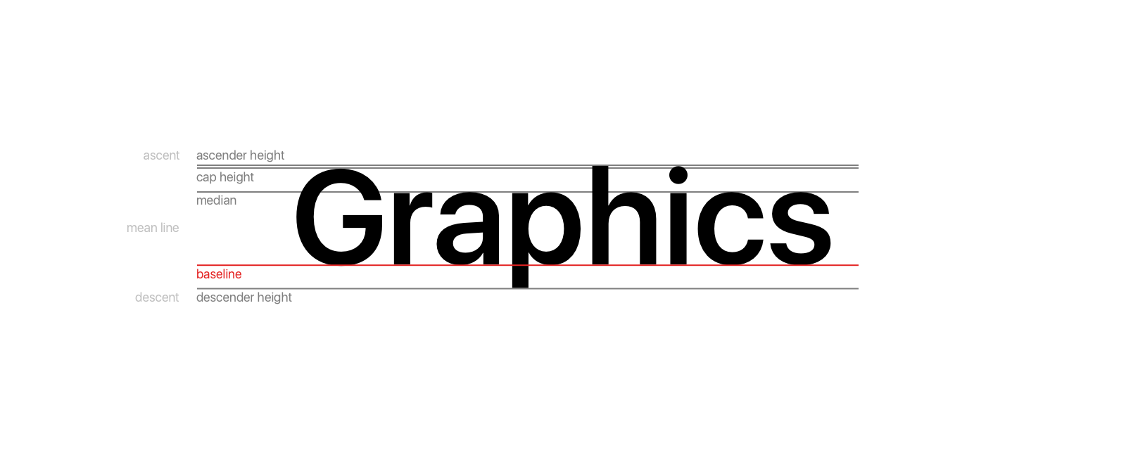
But first, let's see what rules and terms do we have about typography.
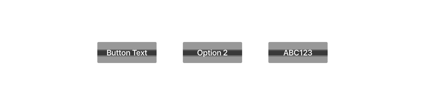
There are different options for placing text in buttons.
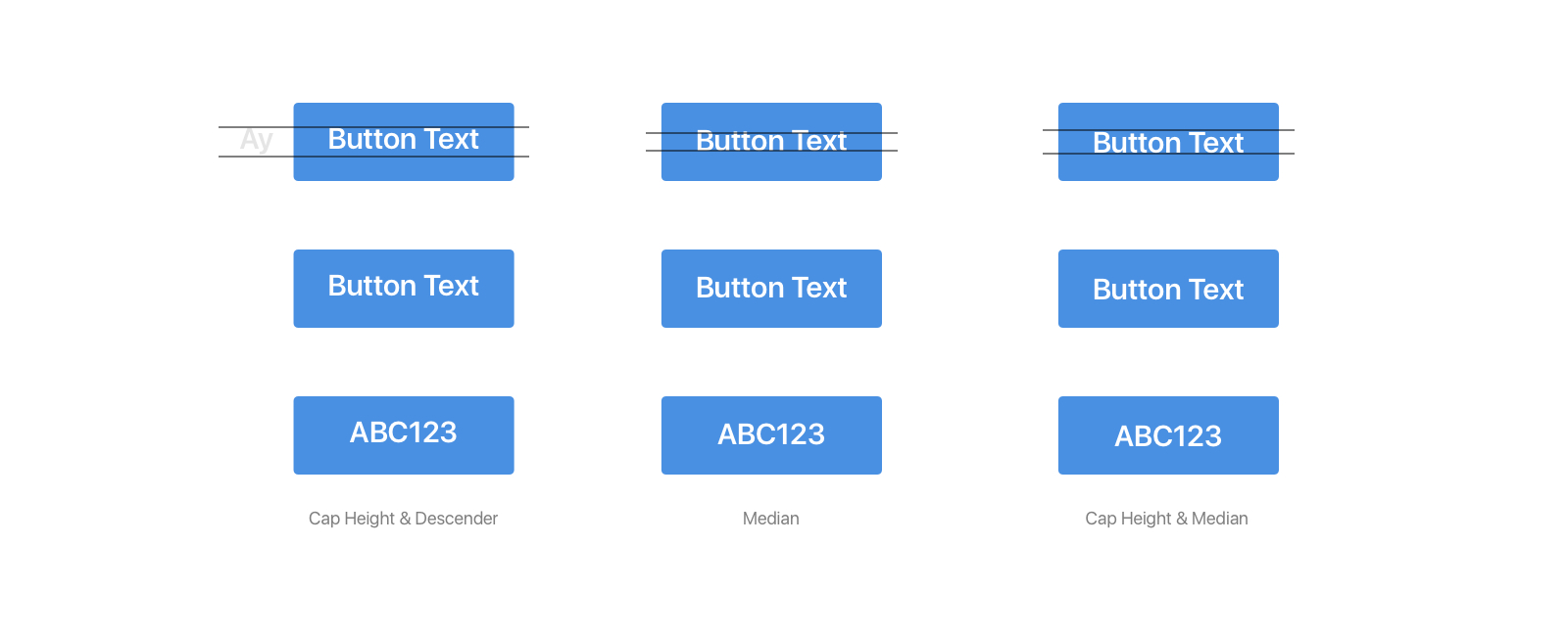
Some people say that we need to take into consideration capital letters and descenders. Some people are on the opposite side, and small caps are more important for them. Both of them might be right. And the solution here is to pick one rule. Consistency is a king in this kind of thing.
But what about the case if we want to make a balanced solution for the most common case? What rule from these 3 should we pick?
To solve this systematically, I created the alphabet. And tried to figure out how many descenders ("g", "j", "p", "q" and "y") and ascenders ("t", "d", "f", "h", "k" and "l") we usually have.
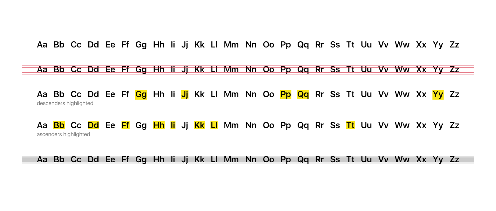
On the last line, you can see that the darker area, the more weight it has, taking into account all the letters we might use. So the area between median and baseline is usually filled out with small letters. Ascenders plus big letters are commonly used than descenders. So, it's obvious what takes more space. This logic explains that to align text correctly for most people, we need to use the 3rd approach.
Descenders are used rarely, and usually middle and upper part fills more space. That's why we can use this approach in general.
Don't forget to make it consistent throughout all the UI. It's that type of consistency that you can find only in details. Again, people don't see it, but they feel it.
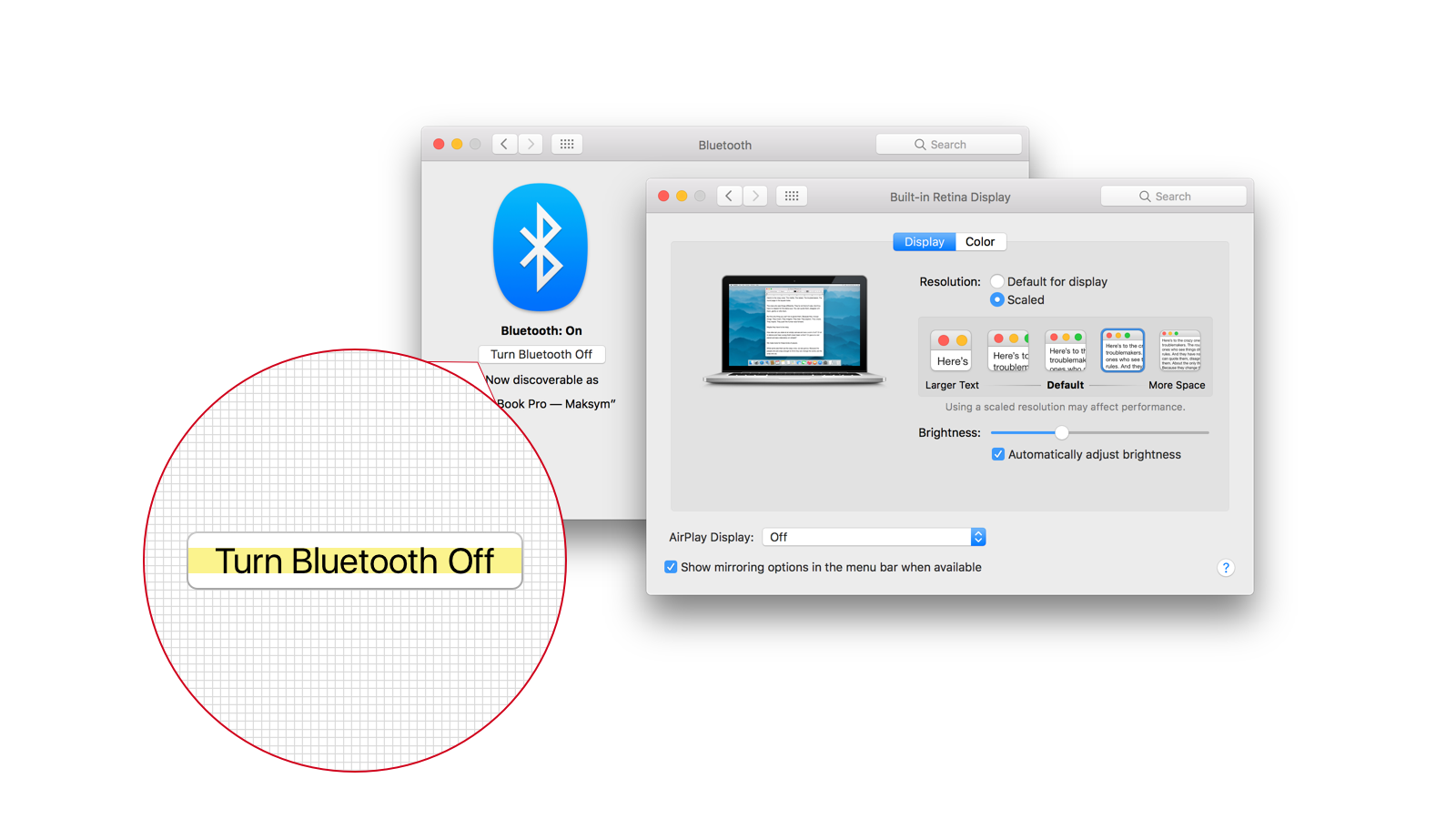
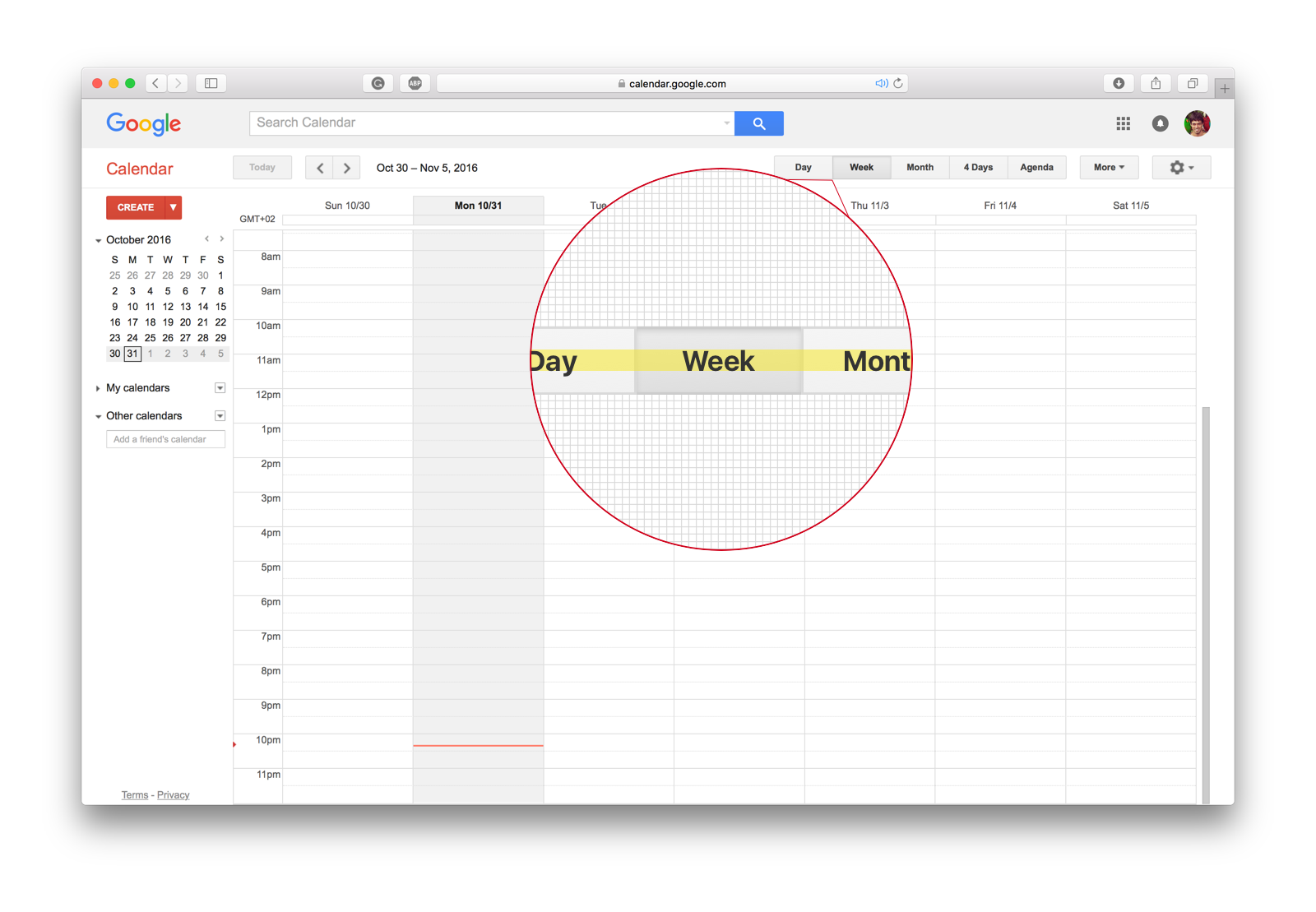
Let's take a look at how top companies that create digital products align text in their UI.
I took buttons as an example to focus on the logic of alignment. But let's look at how it works with other UI elements like select boxes, checkboxes with labels, etc.
The same approach that I figured out on buttons.
If the amount of small capital letters dominates against descenders, it makes sense to align icons with this part of the text.
But what about placing bigger icons and smaller texts in one line. I've done the research and measured the navigation area of the most popular companies.

Usually, we achieve balance-centering text in line with a graphic element that has more weight or is bigger than others. The only exception here is Amazon. They just aligned the logo and search bar by the top. Which is also looks balanced and creates a certain harmony in the navigation area.
You can see that horizontally, these examples are also balanced. If we have a logo on the left side, we have an action button or navigation elements on the right side in most cases. What equates weights on both sides.
There are a lot more examples of a balanced organization. And the most common pattern that I usually see is that well-organized interfaces have rules. But rules are so boring you can say... Agree with this statement. I don't want to create bureaucracy around this magical creative process. But still, if we want to create a great design that feels great and people trust it, we should learn to notice things like this. And practice until we can make it right intuitively. Sounds fair?
You'll learn to do it automatically after some time when you pay attention to this kind of thing for some time.
...and do not forget about consistency.
Thank you for reading,
Max
Max Snitser
Whether it's website design and development, app design and development, digital product design, or luxury branding and upscale design, my goal is to create designs that are aesthetically pleasing, visually appealing, and functionally intuitive. With a mastery of user experience (UX) and user interface (UI), I craft solutions that bring ideas to life, produce high-quality work, and build strong relationships with clients.
Contact Max