How To Improve UX of Web Forms


Forms are like conversations between people. They help automate things and reduce bureaucracy if done right.
By creating forms, you build an interface where dialogue happens. So, the goal here is to make sure that the form asks the right questions at the right time.
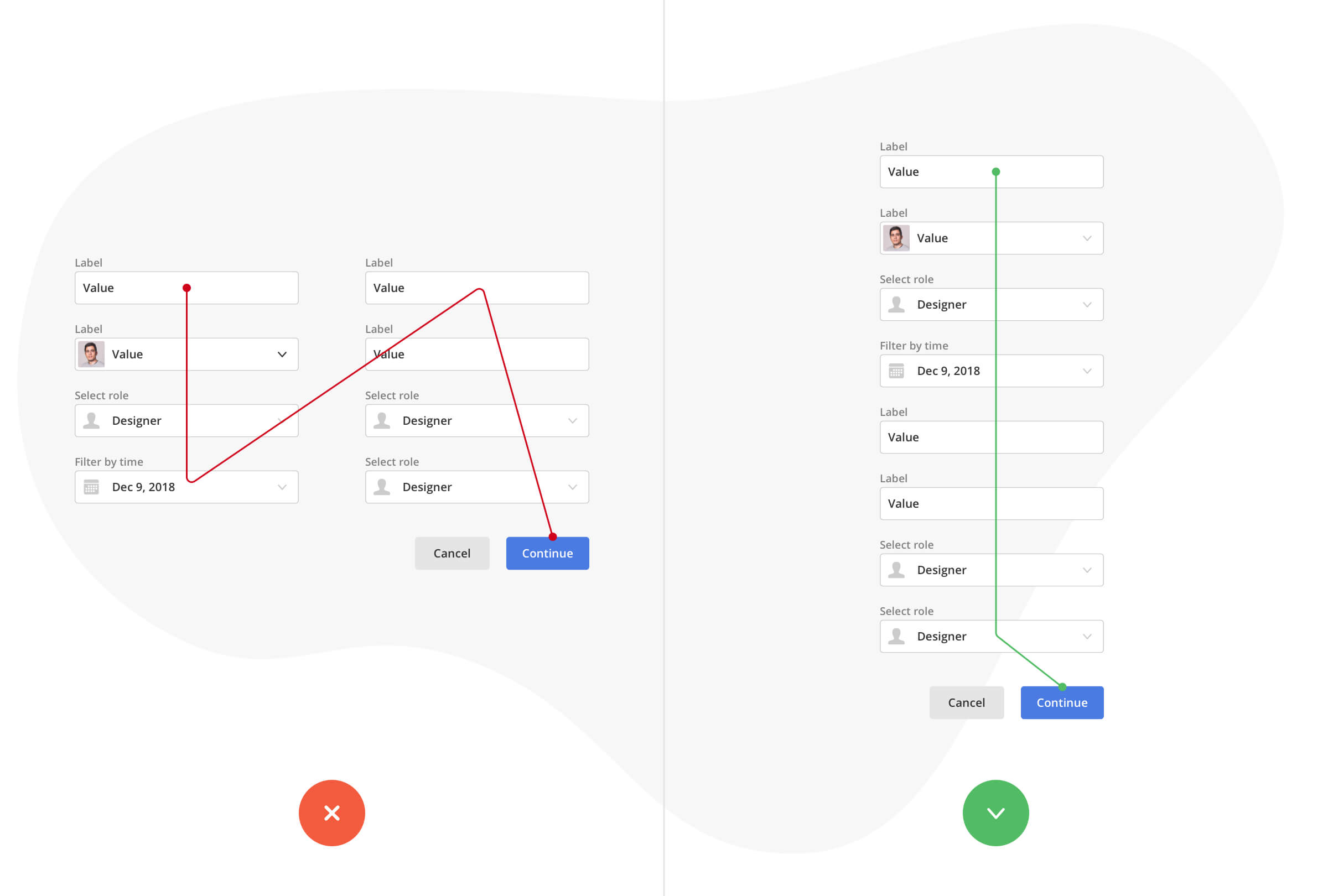
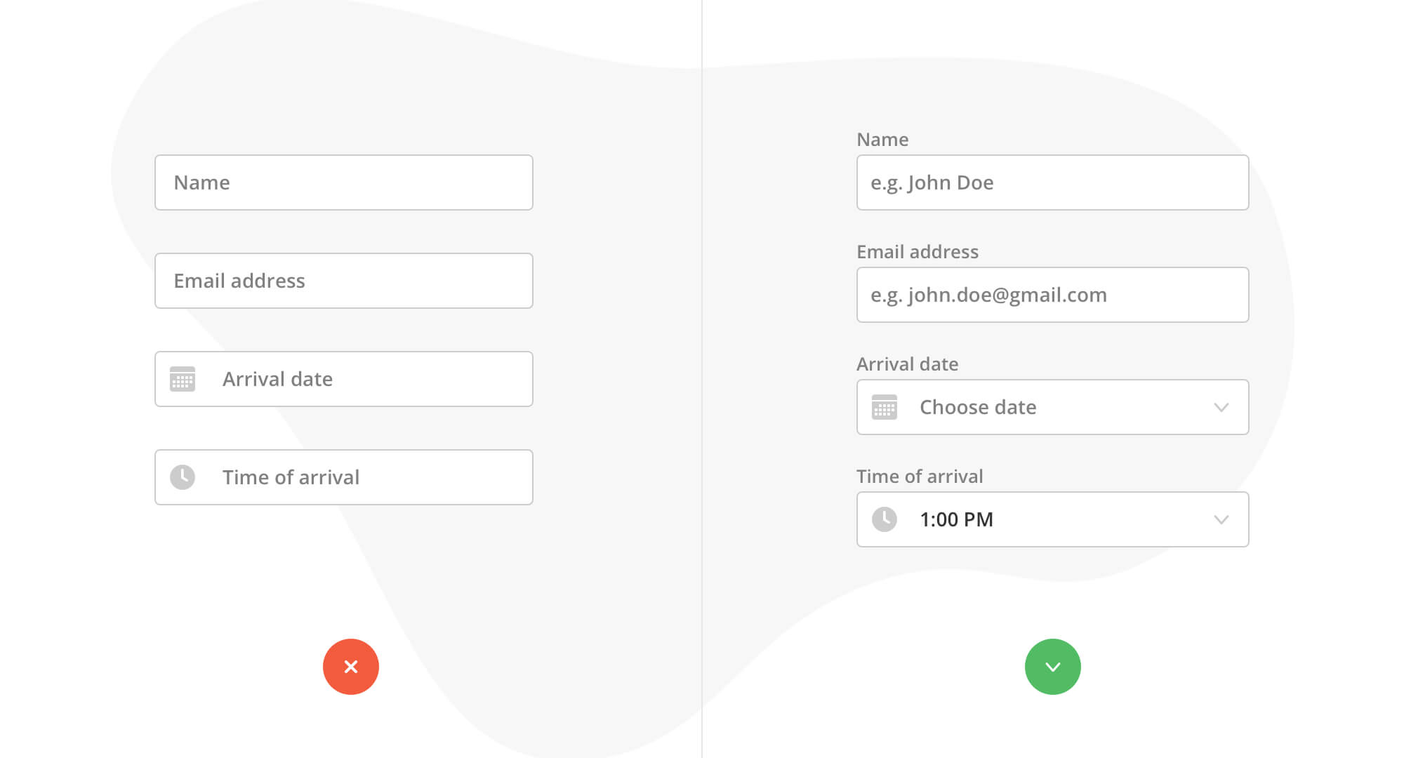
One Column vs. Multiple
There are many debates on whether a form should fit one screen, even if we have to design it in multiple columns. Of course, it depends on the case, and sometimes it can be beneficial to use all the space on the screen, but it's a bad practice in a general case.
People must scan forms designed in multiple columns in a Z pattern. If a form is in a single column, the path to completion is straight to the bottom. So it's hard to do it wrong and skip mandatory fields or fields that are beneficial for a user after completing the form.
Order the Form Logically
It's unusual to ask for someone's address before their name.
Reduce The Number Of Input Fields To A Minimum
Hide optional fields in an expandable box below the form, or move them to an additional panel on the side.
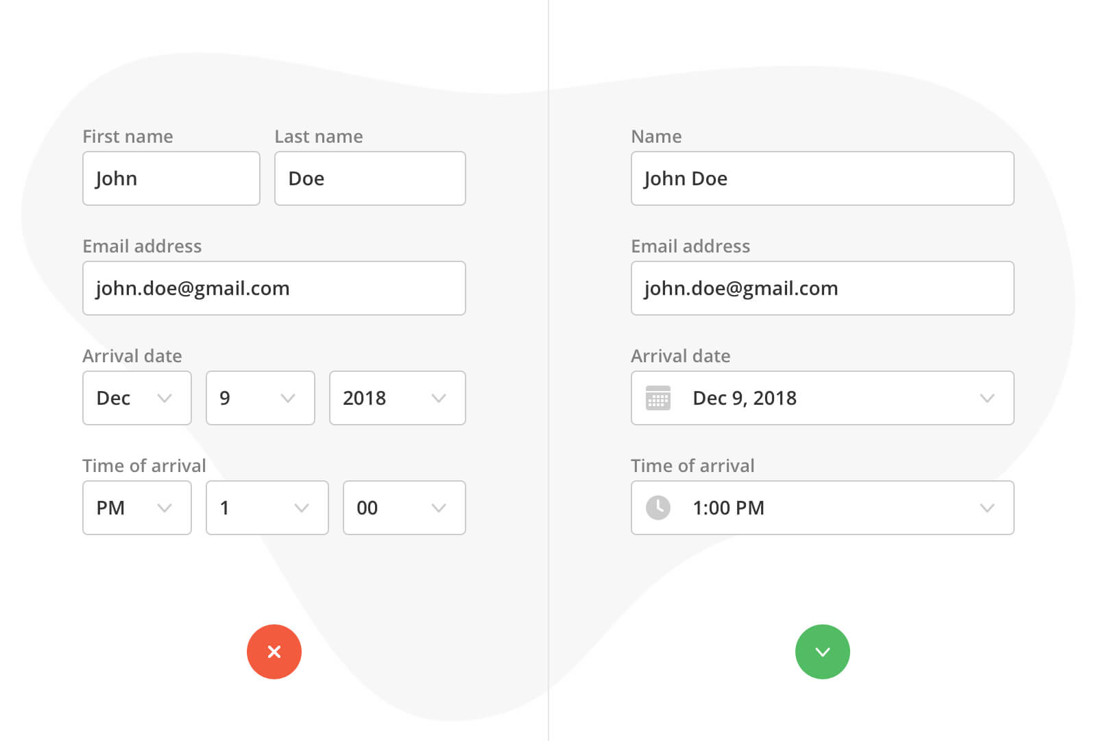
Remove fields that are unnecessary or can be combined with others.
To make your forms simpler, you need to combine several input fields into one if possible. For instance, if you have a date into three fields, like a day, month, and year.
Complex Forms Can Be Split Over Multiple Pages
A step count helps with navigation and shows the user where they are in the process. Huge forms lead to cognitive overload and demotivation of completion. Simplify and split it using tabs or expandable blocks/steps on one page to break big forms into smaller chunks.

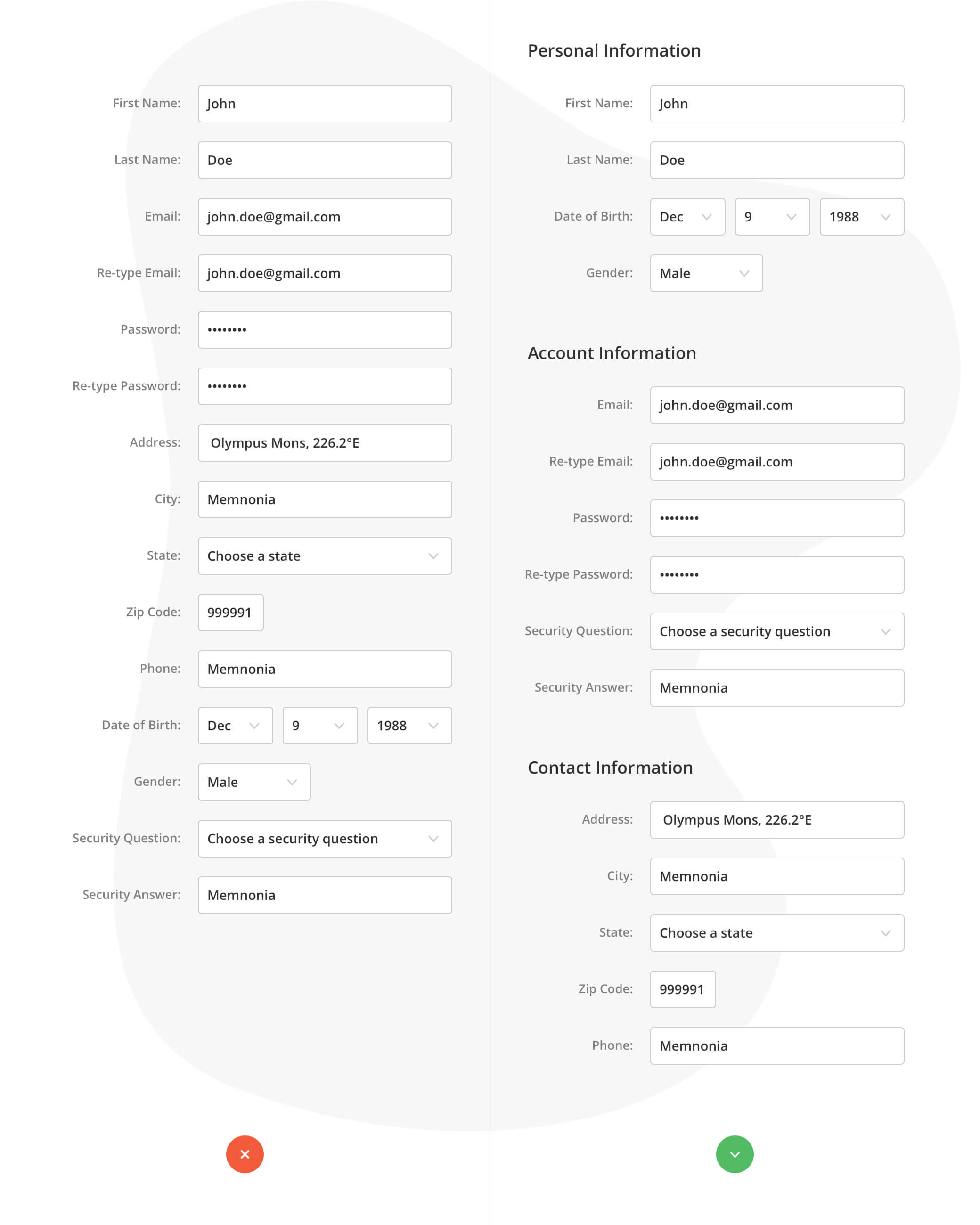
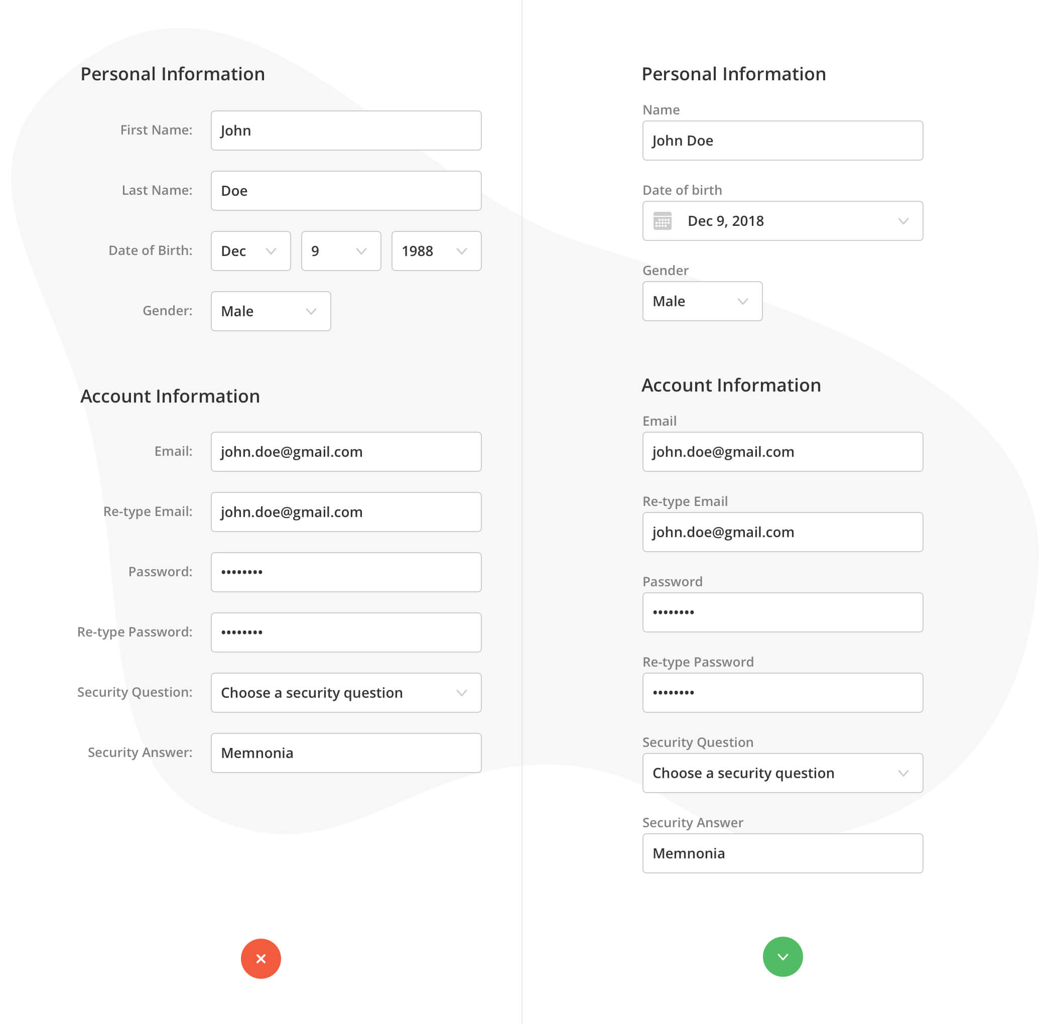
Forms Grouping
Group fields to make the process of completion done by batches. For example, you can create a group with personal information, another group with payment details, one more for shipping details.
Labels
Place labels on the left of fields in case of large forms and on top for smaller forms.
Make label texts short. Leave big sentences for explanation text below or near an input field. Leave only essentials. Always try to reduce the number of words and get to the point right away. People don't read it; they quickly scan.
Use sentence case instead of title case. We shouldn't focus on each word on a label, and there is no context there. Sentence case is slightly easier and thus faster to follow grammatically than title case. One thing is for sure: never use all caps, or else the form would look unprofessional and be difficult to scan.
Be consistent and keep vocabulary in place. Use common words related to the product.
Placeholders
It's an excellent solution for small forms like login, leaving your phone to call you back, or something like that. However, they work poorly in big forms with lots of data.
The problem is that people fill out many different data, and at the end of this flow, you don't remember which field means what? You can guess or double-check. However, if you want to check what it meant, you need to remove the data to see the placeholder again.
A good solution for it is floating labels. They look like placeholders, but when you click on them, the placeholder becomes a label on top of the value that you enter.
We can use both labels and placeholders. However, each one has its purpose. For example, labels ask for data, placeholder shows the example of this data, and you already know an approximate answer or a format in which you need to enter asked information.
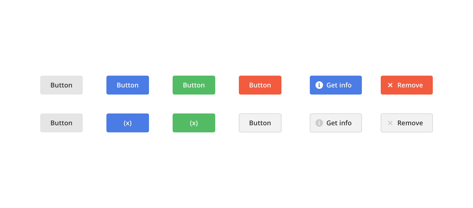
Buttons
Don't forget to distinguish primary from secondary action. Make these buttons visually different. Moreover, if one of the buttons is about going back or canceling, then make sure that it's on the left of the primary action, such as confirmation or submission.
The confirmation button should be right below the last input field. So, it's like a continuation of the form and end of it at the same time.
Be specific with names. Don't use general naming like "Submit" or "Done." Let people know what action they are doing by pushing this button and even know what is next. That helps to build confidence and make it look professional.
Default values
Almost all people who use forms that you create select values. We should have some by default there. Alternatively, it can be pre-defined information that users already dealt with previously, and it can be taken from his profile or somehow calculated.
Automation
Avoid as much filling in as possible. Allow pre-population from existing records with duplicate/copy functions.
That is relevant to the growing trend of machine learning. So a modern interface can help filling up forms taking into account previous experiences. For example, a tax form can be calculated automatically, taking data from different sources like financial accounts, transactions, previous submissions.
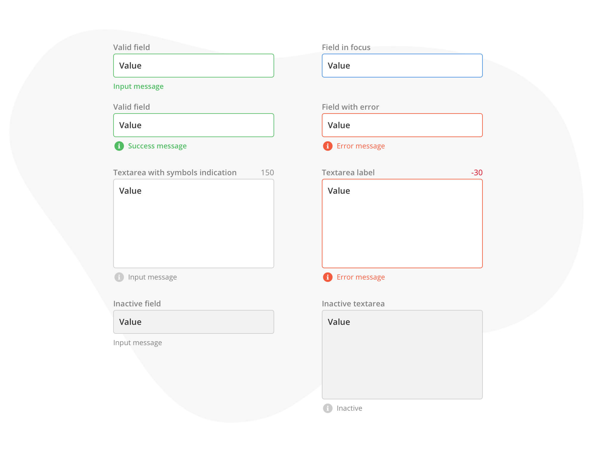
Feedback
Leave space for feedback on the field entries. That should help provide users with quick verification for field entry data. Complex and usual fields might also benefit from advice. That helps balance the screen with useful information.
Give users an undo function to roll back changes or reset a form to its default state.
Immediate field validation adds points to confidence and professionalism.
Provide a visual indicator of the current field. It allows us to concentrate on a current field and return to work faster after interruption or break.
Use predictive search for fields with lots of pre-defined options.
Autocompletion is also very helpful when you have huge lists of options in select boxes.
Additional things
For desktop, forms make sure that you have autofocus on the first input field when you open a particular form. Moreover, it's good if you can move between elements with the Tab key.
In mobile experience, it's good to match keypad type with the type of data you're going to enter.
I hope that was useful. I'll be updating this article with more thorough information and examples. So if you want to be up to date, please use the small form below to subscribe to updates.