Influence Of Color On User Experience

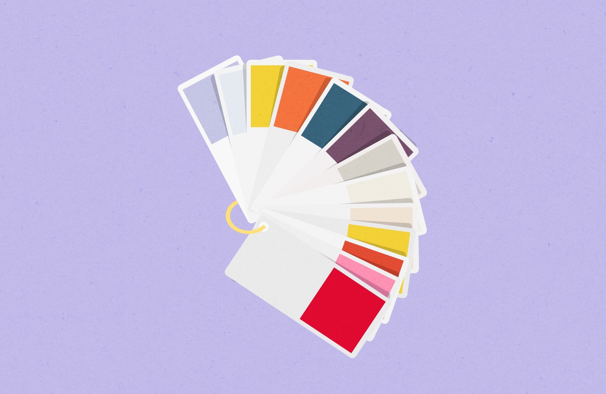
Colors have a strong impact on design solutions that we produce. Moreover, it plays one of the most valuable roles in User eXperience.
First of all, we start building relationships with users of our product from the first impression. And it means that the color palette can increase success as well as decrease it. The first impression is important for building further relationships and project the right expectations.
Also, I think that the color palette creates an atmosphere. And if this atmosphere associates with a better feeling, then we can influence the time users spend on our digital products. The more time people spend with our products, the stronger indication that the product has a valid color palette that makes it perform in the best way possible.
Colors And Their Meanings
With the meaning of colors, yellow is the color of the mind and the intellect in color psychology. It is optimistic and cheerful. However, it can also suggest impatience, criticism, and cowardice.
Internet Movie Database (IMDb) uses yellow color. And it's the largest database of movies on all Internet. So, it's about the mind.

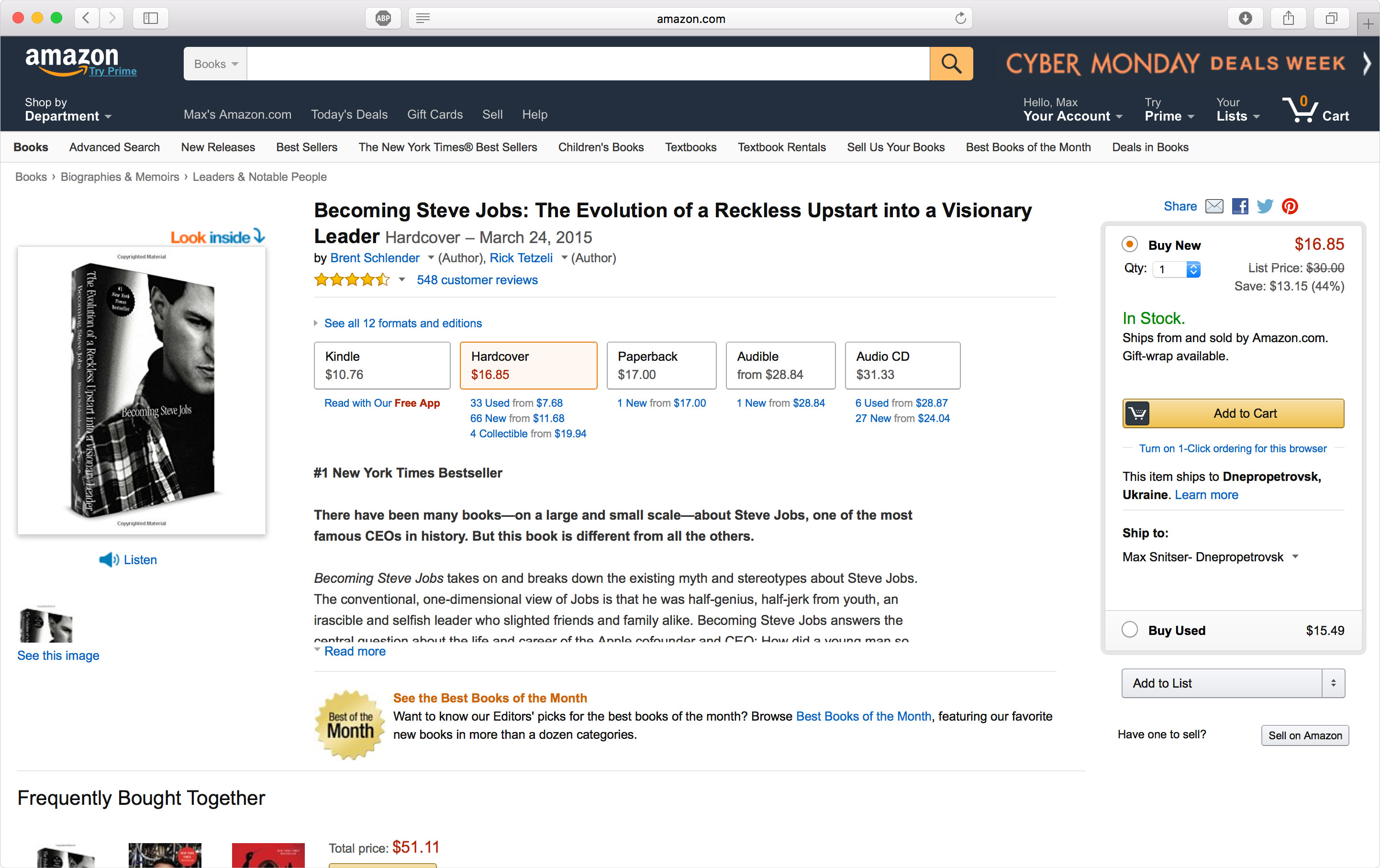
Orange is aggressive color, creates a call to action. We can use it for subscription, "Buy" or "Sell" buttons. In most cases, this color works with impulse shoppers.
Direct mail marketers tend to use orange in email marketing campaigns to draw attention to a product they are selling. Orange is best known as the color for sexuality and creativity and is associated with affordability. This color is also an attention grabber but is best used sparingly or as an accent color.
I think that it is a successful selection for eCommerce solutions. Amazon uses orange color in combination with a dark, almost black color.
Also, orange is the color of social communication and optimism. However, we use orange rarely for social networks. You can notice that the most popular social networks are designed in blue colors.
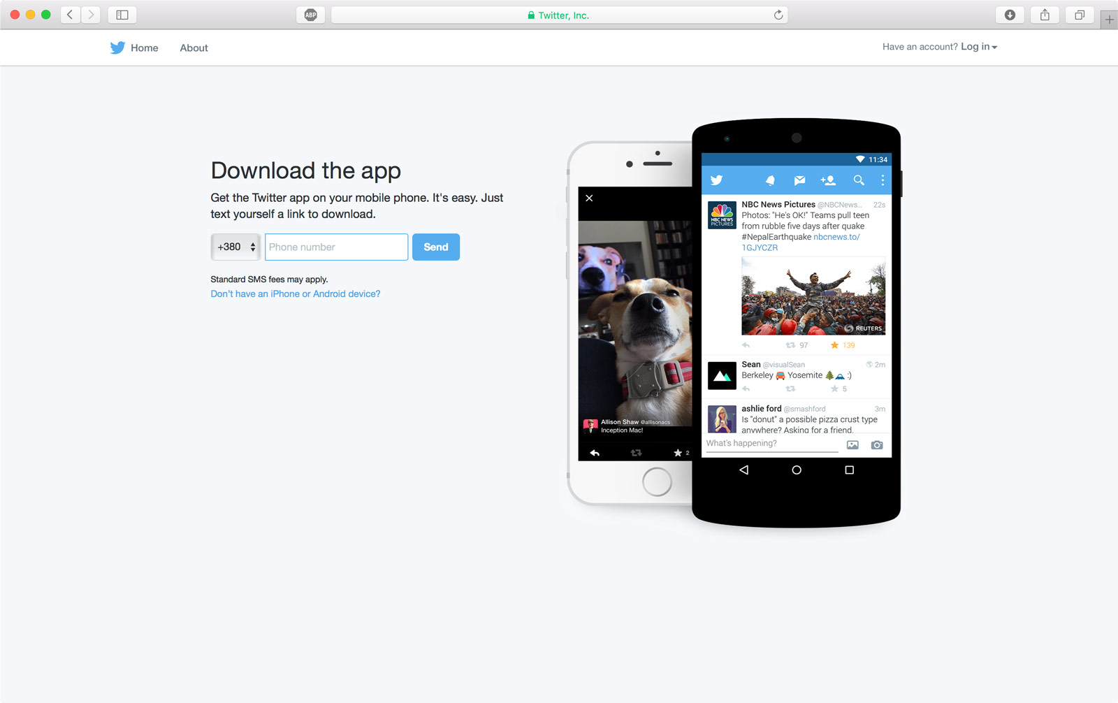
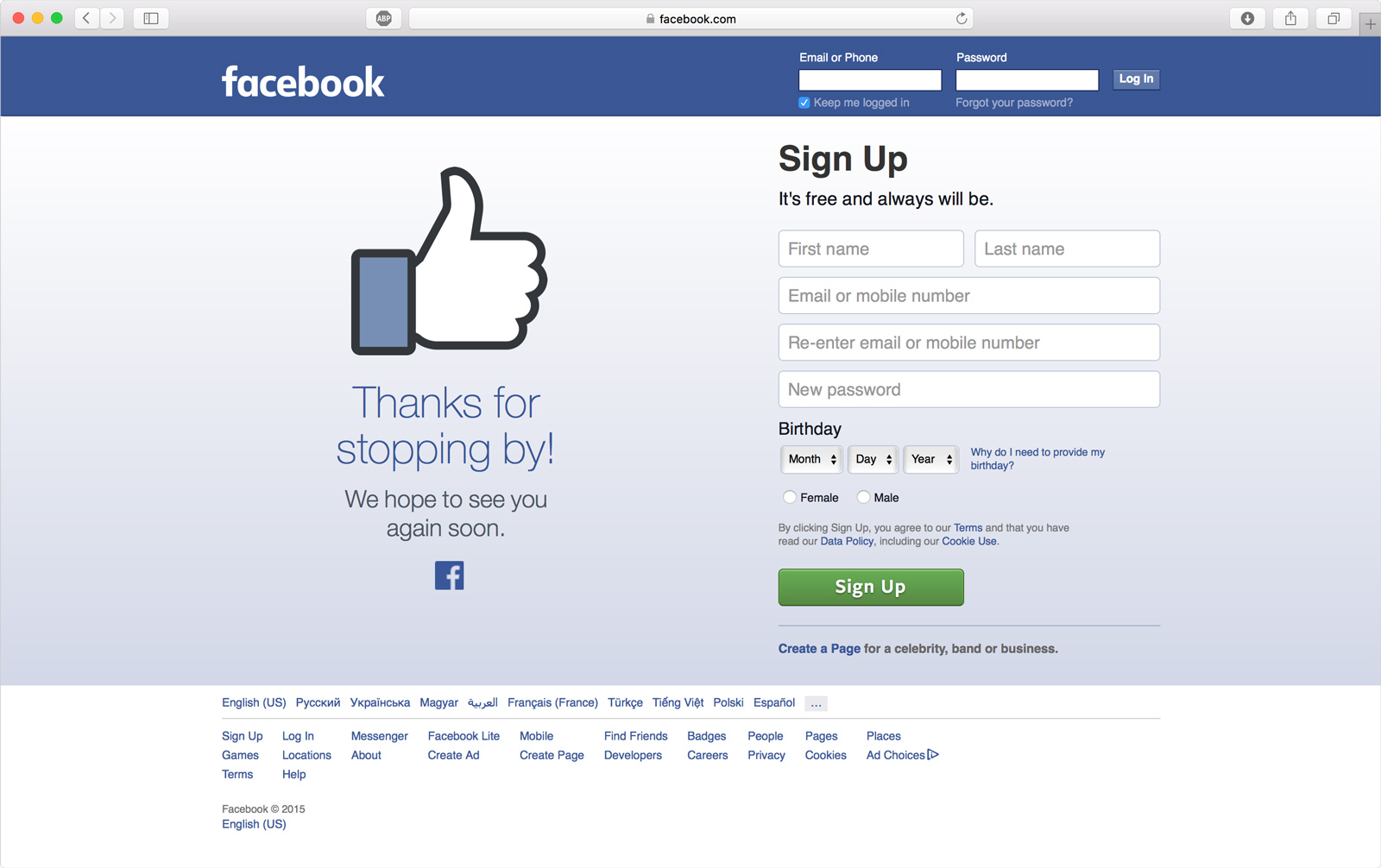

Blue is a calming, relaxing color that accompanies red and yellow as primaries. Blue symbolizes comfort, sky, water, sleep, the mind, trustworthiness. And safety (think Police Officer uniforms). Most importantly, blue represents communication � which makes sense in regards to websites designed for communication.
Think about your associations with this color. Blue is the color of trust and peace. It can suggest loyalty and integrity as well as conservatism and frigidity.
A lot of business websites use blue color. Social networks and messaging applications are often painted in blue as well.
Indigo is the color of intuition. In the meaning of colors, it can mean idealism and structure as well as ritualistic and addictive. This is one of the seven colors of the rainbow: the color between blue and violet.
Indigo stimulates the right brain or creative activity and helps with special skills. We often can notice this color on creating websites.
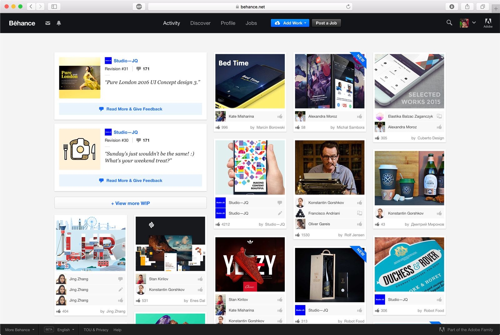
Behance is a creative website where you can explore many artworks of graphic designers, photographers, illustrators, etc. You can see that they use light indigo on attractive web interface elements.
Also, you can find this color on musicians' and artists' websites. Or in promotional materials for appropriate events.
Purple and turquoise belong to blue family colors as well. Purple is the color of the imagination. It can be creative and individual or immature and impractical. The color meaning of turquoise is communication and clarity of mind. It can also be impractical and idealistic.
Red is the color of energy, passionate love, seduction, violence, danger, anger, and adventure. Our prehistoric ancestors saw red as the color of fire and blood � energy and primal life forces. Most of the symbolism of red today arises from its powerful associations in the past.
Red focuses behind the retina, which forces the lens to grow more convex to pull it forward. Therefore, we perceive that red areas are moving forward. This may explain why red captures attention.
That is why we use this color for error notifications or emergency actions that we need to do immediately in most cases. So, we should focus only on one part of the interface to do this action right away.
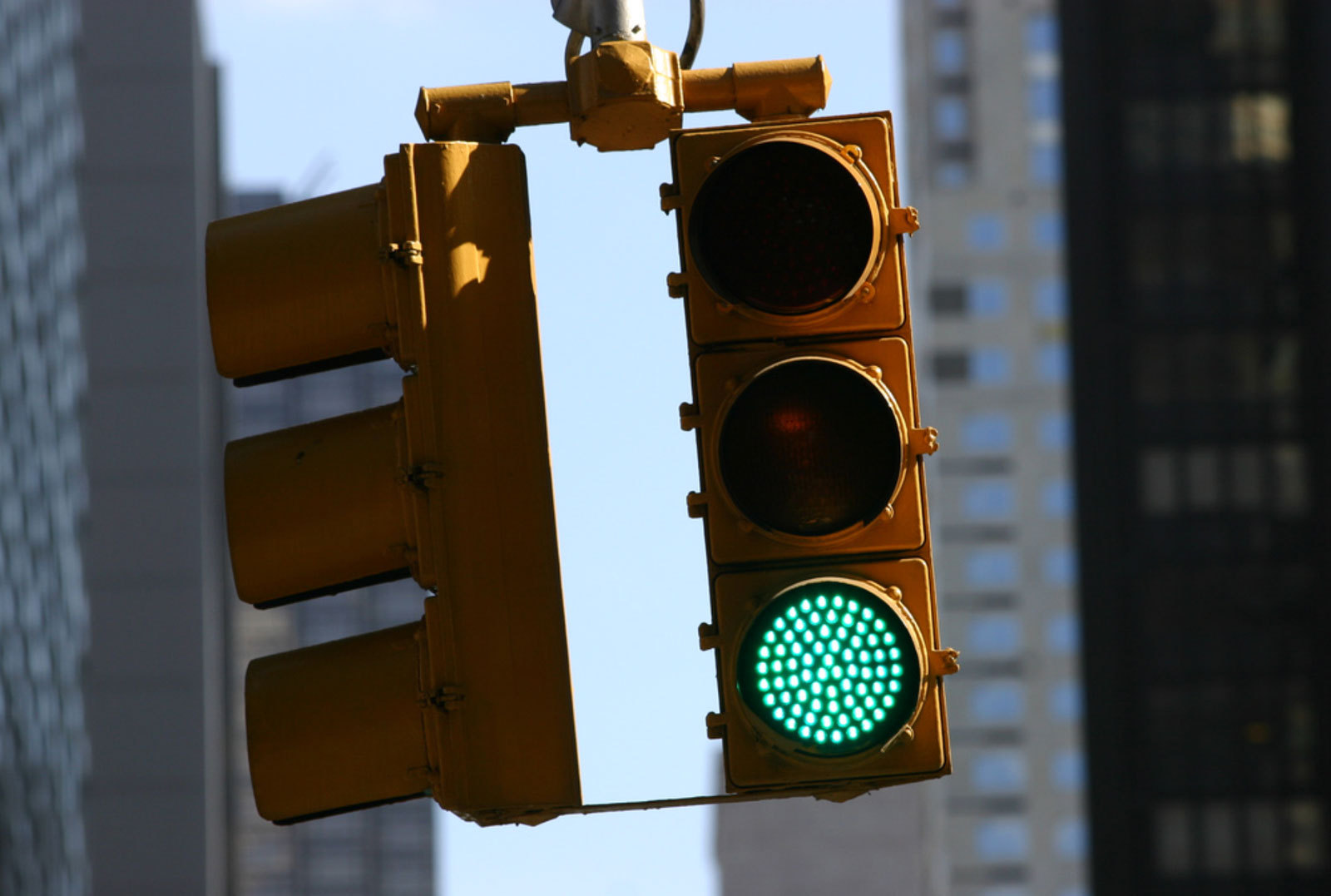
Green is the color of balance and growth, life and nature. Greed is life. Abundant in nature, green signifies growth, renewal, health, and the environment.
The most common understanding is that green is the color of money and business. Take a look at financial interfaces, websites, applications. I will not even mention that dollars in cash are painted in green. Many corporate websites are painted in green color.
It's helpful to use green in call-to-action elements. Many designers reveal that their call to action section/button receives more clicks and attention if these elements are green in color.
From the User experience design perspective, the green color works well when it's good to start something. For example, Envato websites use green. And it is their dominant color in places where they have key actions.

Starbucks brand uses green, and usually, it's a good color to start a day.

Also, it is a good sign to go to crossroads.
The color psychology of pink relates to unconditional love and understanding and the giving and receiving of nurturing.
Pink is feminine and romantic, affectionate and intimate, thoughtful and caring. The deeper the pink, the more passion, and energy it exhibits.
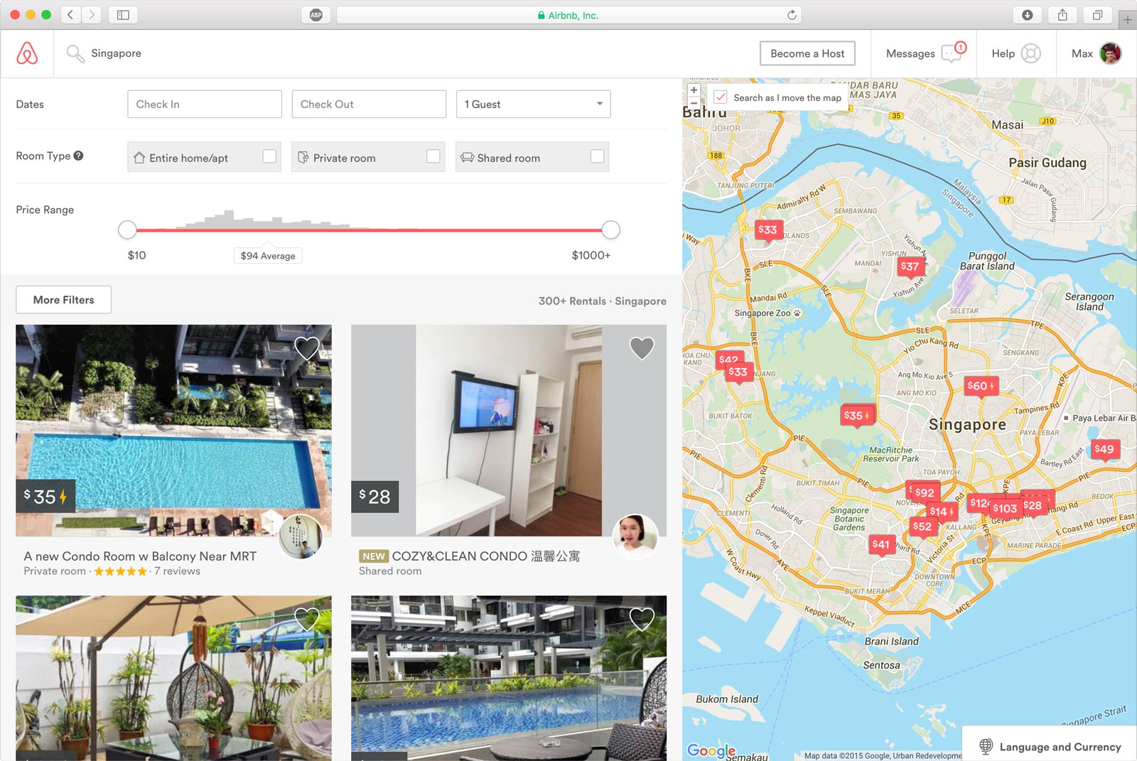
Airbnb (Air Bed and Breakfast) uses pink color. Since they care about their users, you can find a hero video with a calm and cozy atmosphere on their home page. Deep pink color complements interface with noticeable action elements that underline their brand and purpose according to customers.

The brown color is a friendly yet serious, down-to-earth color related to security, protection, comfort, and material wealth. Brown takes its obligations seriously. It encourages a strong need for security.
From a color psychology perspective, gray is the color of compromise - being neither black nor white. It is the transition between two non-colors. It is unemotional and detached and can be indecisive.
Please don't use it too much. Because it can create sadness and depression and a tendency to loneliness and isolation, mix it with some other colors to change this.
Silver and Gold are hard to show in web environments or mobile screens. I recommend avoiding this color for interface elements. However, you can use it in your images and photo materials to create an appropriate atmosphere. For instance, you want to sell jewelry. And your interface should be calm to highlight the gold and silver colors of products. It allows creating an atmosphere associated with abundance and prosperity, luxury and quality, prestige and sophistication, value and elegance.
White is color at its most complete and pure, the color of perfection. The color meaning of white is purity, innocence, wholeness, and completion.
Black is the color of the hidden, the secretive, and the unknown, creating an air of mystery. It keeps things bottled up inside, hidden from the world. Sometimes we can invert white design conception to create something opposite. This allows creating a starting point for further brainstorming of different ideas.
It is important to choose the right color palette for your business. Since you create appropriate associations and interactions with your customers in the way, you want. Thus, you can create the User experience that you need.
Of course, all the solutions should be tested. It is easier to start with a thoughtful hypothesis. And choose the right direction for the development of your project from the starting point.
Color Principles That I Found Useful For Interface Design
Too many colors - Adding one color to distinguish important items in a set significantly reduces search time. Adding more colors still improves user performance, but at seven or more, search performance degrades significantly.
Avoid the use of saturated complementary colors - it is hard to focus on this kind of solution because it has a "vibrate" effect.
Excessive saturation - moderately saturated colors can be appropriate in small swatches to capture the user's attention. When multiple saturated colors are used together, chromostereopsis and other perceptual artifacts often occur.
Inadequate contrast - objects and background should vary in brightness or saturation, in addition to hue.