Left Aligned Websites And Proper Use Of Space In Design

Designers no longer focus on one form factor during their work on interface design approximately since 2016. It became common to think about different screen sizes when you create a website. Design thinking became broader, at least in web and apps design. We no longer can ignore mobile and tablet screens or desktops (the other way around) if we design an interface.
I've already written about the solid user experience concept for different platforms in one of the previous articles. And here, I'd like to focus on the left-aligned website design paradigm.
It leads to some questions, like...
- Where can we use this design paradigm?
- How can we change the existing design to fit on mobile screens?
- Why should we use this design paradigm anyways?
Let's quickly go through possible layouts and their benefits before going into detail about the left-aligned design.
Fixed width
A quote from Smashmagazines:
"Always center the layout. When working with a fixed width design, be sure to at least center the wrapper div to maintain a sense of balance. Otherwise, for users with large screen resolutions, the entire layout will be tucked away in the corner."
Of course, we have a big advantage when we use fixed width. It's easier for both the design and development stages. Also, we can avoid a bunch of mistakes that can emerge on different screen resolutions. But there is an issue...
A completely fixed layout won't work for mobile devices with small resolution displays. And if you resize your browser below 800 pixels wide, you will have to scroll left and right to view all the content that, for example can be located in multiple columns so something can go beyond the screen or browser size. And, commonly, fixed-width designs have just one font size, mostly work for one resolution it was designed for — that would be hard to read on screens with a smaller resolution. So, in addition to scrolling everywhere, you'll have to zoom in and zoom out.
Elastic design
The elastic websites and interfaces go in full width and sometimes height no matter what resolution or screen size you're using.
The problem of this design paradigm is that we need to think about shrinking or expanding certain areas of an interface, taking into account different resolutions and form factors. It can be overwhelming and sometimes even impossible if you have, for example, a limited design budget. This kind of design layout can consume many resources and production time both on the design and development sides.
There are also design issues in case if your concept can't support a lot of use cases.
For instance, when your website has items that are placement-sensitive, you might have situations that parts of the design don't match with each other, and that might break the composition and fundamental design idea. Imagine that some words in one column need to match up with either a picture in another column or other content parts.
I'd recommend you to use a fixed-width layout instead to avoid this and similar issues.
When you use an elastic or liquid layout, you have less control over the appearance of your page. But of course, the main benefit of using the whole space remains.
A case study, portfolio, or promo website might be better to create using the fixed-width design layout so that you have more control over the design and placement elements.
Especially if you're goal to make your visitors or readers scan your content in a top-down approach like in case studies.
For example, you can have an intro with hand lettering or even a hero video on top of the page (screen). And you want to present your work in a good way and non-standard grid or even with effects like parallax... to make your work more outstanding, so to speak.
You can find a lot of examples on Behance. A lot of case studies there were created as artworks or long-form top-down case study pages.
It can be much more entertaining and fun to scan pages like this with facts and examples that are put in a non-ordinary way than going through a dry description text with screenshots.

That example from Behance, and this one down below is based on the fixed-width layout, but images and certain elements go beyond the 1000px fixed grid. This simple change can create a more immersive experience when scanning content on the page. Also, bigger photos allow to present a product better and show more details if that makes sense.

Sometimes it might look unbalanced and empty, but that's not a bug — it's a feature if done right. For example, if you have this style elsewhere in other materials and even branding guidelines. Or it's just the best way of presenting your content, and photos should be a big as possible, but as we know from the elastic design, we can't properly read too long lines of text due to our physiology and psychology.
Let's take a look at the centerfold of Vogue magazine. Of course, it's a different medium, and the size of paper is usually fixed, but the space is used more wisely than in cases described above. And the ratio of centerfold here is similar to 16:9 that we use for desktops, laptops, and landscape orientation on tablets.
Perhaps, we can take it as an idea and try to apply this design approach for screens.

Let's take a look at other mediums that we have. Street banners and similar advertising showcases usually use the whole space dedicated for them. Ok, it's more about marketing... But, still, we can use empty space properly. In the same time-space that we use for design shouldn't be overwhelmed. And elements shouldn't compete for much to not make people crazy about it.
Responsive Design
This kind of design looks good on both desktop and mobile screens. Typically responsive designs are built using a mobile-first approach. Often, it's easier to design an interface for smaller screens first and then expand it to larger screens and resolutions. This approach is commonly used for applications that should support most of the capabilities on all the platforms so the user experience is seamless and it's easy to perform tasks using different devices.
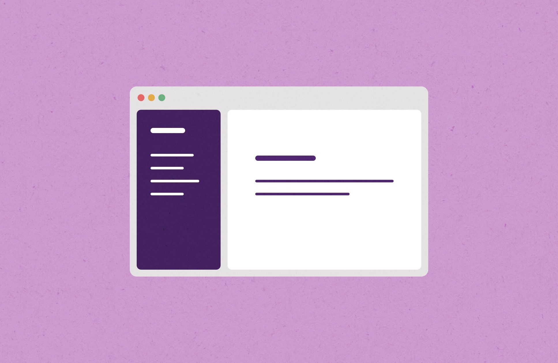
Left-aligned Design
The left-aligned layout is the design paradigm where websites and interfaces unfold from the left to right side. Basically, you can have the main menu on the left and when you start interacting with it expands more and more options and details, every each step is the next column to the right of the menu.
Pros
You can use the space of wide screens properly—especially desktop screens with ratio 16:9 which is common and even with 4:3 or 3:2 in some cases.
If you put navigation on the left side, you can free up the top area, and your content starts from the very top. As a result, you can use more space in height. Sometimes this approach can drastically improve user experience. And it's helpful in a way of focusing users on one step a time, of course, if everything done right.
Cons
The main problem of left-aligned interfaces is a lot of free space on the right side of screens at least at the start. You can have this issues in couple of cases like you don't know what to put there as a starting point, or your content format doesn't not require that much of a width.
Also, if your target audience includes Arabian and other countries where people read from right to left - simply, they'll not understand your design or interactive states of it. So, you probably need to create a right-aligned version for them and from that point it might significantly complicate things for designs and/or developers.
When Left-Aligned Design Is Appropriate
Since the cards design paradigm has become more and more popular, it makes sense to think about left-aligned design and use space on the right side for cards with content or catalog items. Also, we can have different levels of the menu on the left side implemented in several columns. And on each next level (column), go deeper and get more detailed info.

Adapting This Type Of Design For Mobile Screens
You can re-arrange blocks in the way that they will work for portrait orientation screens (vertical view).

One thing that is logically and intuitively right is that we need to make the design in a way that every pixel works for us not against us (except negative space that can be necessary in some situations).
Think about it from another perspective. We can burn white pixels on the sides of the screen, or we can place a helpful information, navigation or tips of how to perform a specific tasks using this interface.
Conclusion
Of course, we still need to think about prioritization of the information on the screen and avoid any mess. Using the space smart is not simple at times, but if you invest a little bit more time in trying out different design paradigms and layouts you can find a sweet spot for your app or a website to perform in the most efficient manner possible. Believe it is worth the time and resources...
You can successfully re-arrange information on the screen and let's say build a better structure or navigation.
As you can see, there is no one ultimate solution for each app or a website. You can have some issues by using one design paradigm and and another set of issues using a different solution. The right decision lays somewhere in between of unique parameters of the design for your specific project and real world use cases.
So, we should be wise here and understand all pros and cons of different approaches.
Hope that was useful. Subscribe below if you want to read more of articles like this.