Shapes, Geometry And Space In Design

Shapes
Shapes are used in areas of two-dimensional space that can be defined by edges. They can be geometric and organic. Shapes can be defined by line, form, space, value, color, and texture.
Whether in 2D or 3D design, shapes and forms greatly affect our subconscious and are used to great effect by designers to convey the right messages.
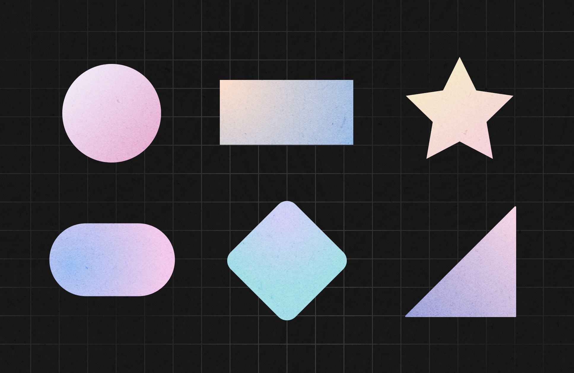
Circles associates with friendship, love, care, support, protection.

Squares, rectangles, and pyramids associates with stability, strength, power, balance, reliability.
Vertical shapes and lines associates with strength, masculinity, power, aggression, courage, brutality, dominance, menacing.
Horizontal lines associates with tranquility, calm, rest, weak, peaceful, composed, silent, still.

Soft curves
- associates with rhythm, movement, happiness, pleasure, generosity, femininity.

Sharp angled lines associates with energy, lively, young, explosive, violent, anger, rapidity, dynamic, movement.
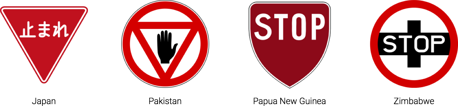
However, the interpretation of shapes can be different in different countries. For instance, octagons mean stop, especially when combined with red, but that same meaning doesn't apply in countries where stop signs are not shaped as octagons. For example, Japan, Pakistan, Papua New Guinea, Zimbabwe, etc.
Geometry
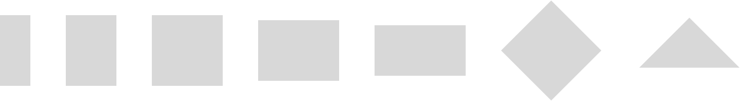
Geometric shapes are structured, often symmetrical, and often contain straight lines.
People naturally tend to align objects to the horizontal and vertical. This is based upon instinctive interpretations of the world around us, where gravity holds objects "flat" to the earth's surface.
Similar elements will be perceived as part of the same form. Even the Gestalt principle of continuity and proximity are affected by similarity.
Nature likes balance and symmetry, but perfect symmetry in natural objects is rarely seen.
Fractals
Fractals are often used in nature. We can find examples everywhere: water, grass, flowers, etc.
The point is that it's less energy-consuming to see natural objects. We often feel light when we look at the grass or water, and our state changes into the opposite when we start watching on the road, buildings, or other artificial objects.

To understand how it works, we should understand the sequence of fractals. They basically build from one element that repeats itself many, many times. Thus, our brain puts in memory one element and duplicates it automatically. So, this process does not require a lot of energy. For instance, to define each element and interpretation it.
I think it's reasonable to think in the direction of how we can use fractals in user interfaces.

Space
Space is an area that can be used in design for a particular purpose. Space includes the background, foreground, and middle ground and refers to the distances or area(s) around, between, and within things.
There are two kinds of space:
- Negative space is the area in between, around, through, or within an object.
- Positive spaces are the areas that are occupied by an object and/or form.
Important advice. Use as few as possible types of the distance between objects in one design. This will help you understand your design solution more clearly and reduce time scanning information or user interface elements. You can see that here works the same principle of similarity.
Closure
Humans tend to visually close space by completing a contour and ignoring gaps in the figure. When something is left to the imagination, people tend to find visual images more interesting than when the entire image is "complete." People naturally fill in the missing information.
We can use this to make graphics more interesting or purposefully close space to make objects more simple for understanding.
Symbols and Icons in User Interfaces
Cultural symbols can evolve to become universal symbols once their use saturates a majority of societies throughout the world.
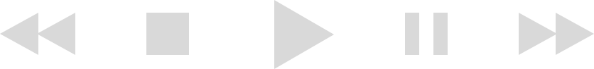
For instance, old generations of people had different symbols like triangles and a combination of triangles. Still, in today's electronic interfaces, triangles can mean play, action, and next. As technological symbols become mainstream, they also become more universal.
Applying This Knowledge In User eXperience
This knowledge is valuable in creating a purposeful user interface.
We should always know or figure out what shapes and symbols work best with the product's target users and what does not. Please take into account the location of the target audience and their cultural habits to prevent them from using unsuitable icons in control elements.
Experienced UX designers should know what symbols and conventions they use in designs. Each stage of work with shapes and symbols should be aimed at interface effectiveness. We should avoid using old-fashioned icons like floppy disk icons to save data or even hard drive icons. Stay up to date with main tendencies to not be failed at this stage.
Use methods of unity and harmony
- Perspective;
- Similarity;
- Continuation;
- Repetition;
- Rhythm.
We'll talk more closely about them on a separate topic.
Always try to find a balance of elements in the design. One element shouldn't overweight another. Design should be balanced to create a good impression in the first several seconds of watching it.
People should understand hierarchy in the product that they start using. Otherwise, they will leave it after a couple of mistakes. Use shapes, geometry, and spaces to show the sequence in which people should use it.
Objects should be proportionally correct to each other. Sometimes it's a big mistake to use a large element near a tiny element. It looks like a large object will eat a small object. However, it can be done on purpose if you consciously want to show a big difference in proportion. Thus, the proportions of objects should be clear in design.
Use the rule of similarity and contrast.
Shapes can be simple or complex, beautiful or ugly, whole or broken. We can use only simple shapes or only beautiful shapes regarding the similarity principle.
To create a contrast effect between design elements, we can use a formula: simple versus complex objects or beautiful versus ugly.
The same can be applied regarding the structure (organized or chaotic, mechanical or hand-drawn) and size (large or small, deep or shallow, fat or thin).