The 27 Most Important Data Input Design Patterns


This article is focused on the practical side of product design. I will go through some of the patterns and how they can be used to make websites, web services, and apps smart without breaking the bank.
I figured out that it’s more common to talk about Design Patterns in the software development area. As a visual designer, I think it’s also related to the product design area, especially when the creative and user experience parts are now developed more systemically.
Mostly, digital products today are built based on already existing design systems. Even the things that were created from scratch are also components based.
Designers tend to create a library of components and even a hierarchical library with simple and complex components. I’ll explain the benefits later in this article.
The term design patterns nowadays do not only belong to software development. It’s definitely a design term, and it has become so for the past 3-4 years.
As a Product Designer myself mostly, I’ll be writing about patterns related to user interfaces, user experience, and interactive design. Those, I think, play the main role in customer relationships.
Design Patterns Make Things Easier
- Use a pattern from another app to quickly solve your own problem.
- Design patterns have a common language being used between designers.
- Using well-known design patterns makes it harder to make design mistakes and create a bad user experience.
- In some cases, you don't need to hire an expert designer to start building your product if you use a detailed library of design solutions or a UI kit as a guideline.
- It's usually quite easy to stuck in the development process and bloat your scope of work. Pre-made solutions make it easier to stay on track and not switch your focus on minor details.
- A good library with configuration abilities can be a good base to build your own components and solutions.
Uses of Design Patterns
- Speed up the process.
- Tested, proven development paradigms.
- It helps to prevent subtle issues that can cause major problems.
- Patterns help to communicate using well-known, well-understood names and interactions.
- Elimination of inconsistencies.
- Optimization of design processes and a product user experience.
Types of Design Patterns
There are a few UI Patterns, some of them are well known, and you might be using them almost daily. Some – almost invisible.
I’ll list here 5 the most popular types.
1. Navigation Patterns
Well known and commonly used to locate specific features and content of a website or an app.
2. Persuasive Patterns
This is more about psychological patterns of using digital products and services online.
3. Dealing With Data
Things users can do with data like filtering, sorting, formatting, interacting with it, etc.
4. Social Design Patterns
All related to achievements, social interaction within products and services, chat, following, etc.
The main topic of this article is…
5. Design Patterns for Forms and Data Input
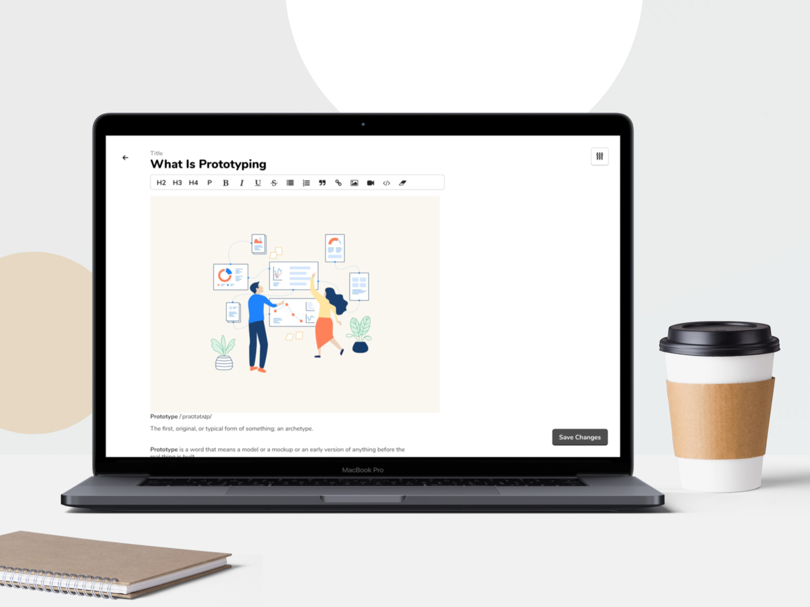
WYSIWYG
What You See Is What You Get component helps create content containing rich media and formatted text and doesn’t require users to know HTML code or a markup language.
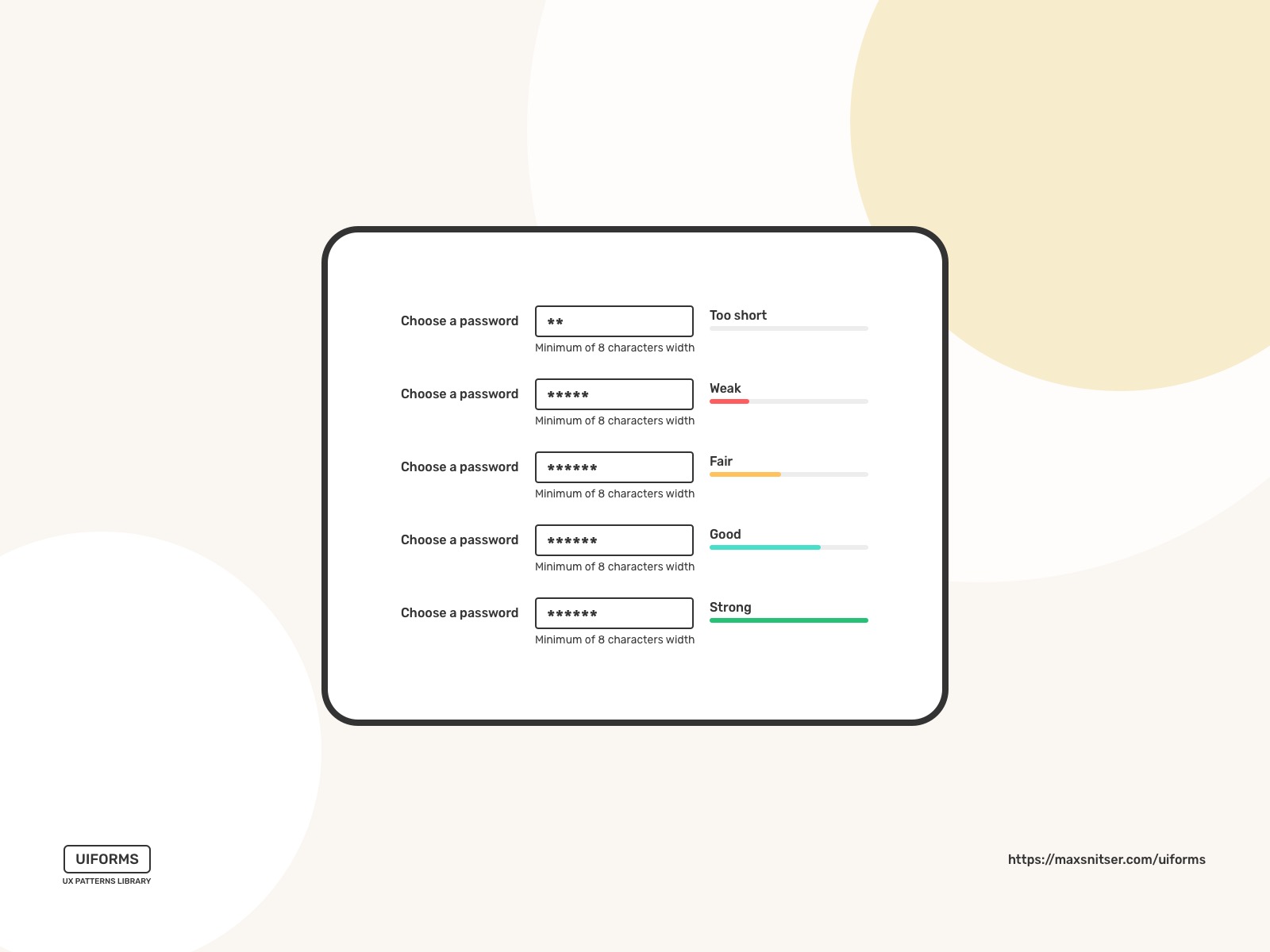
Password Strength Meter
You want your users to choose passwords that are hard to break or guess. The password strength meter's visual aspect helps users know what a good password is and if their chosen password follows such guidelines.
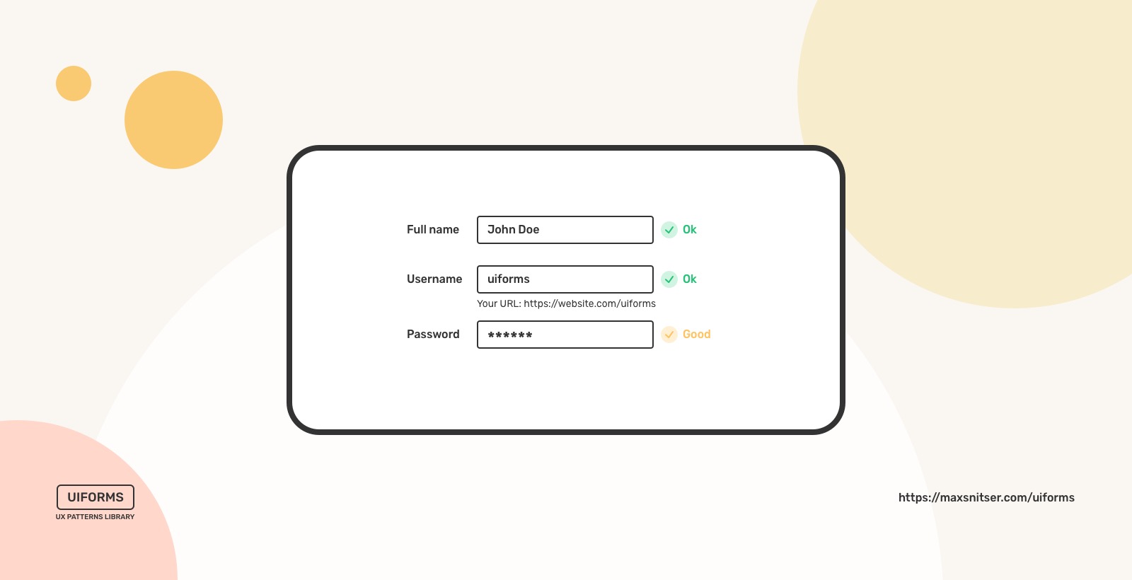
Input Feedback
It helps users to see feedback on the data they’re entering. So they can see and understand either errors or fields that were filled out correctly.
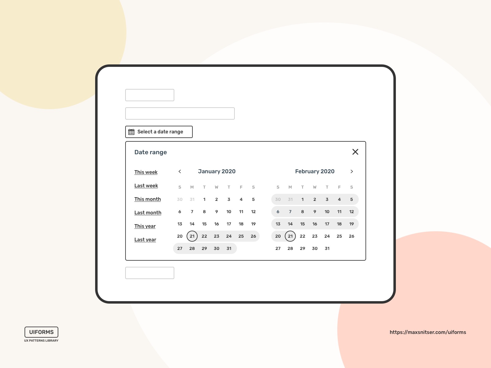
Calendar Picker
An easy way to choose a date or date range to submit, sort, or filter data.
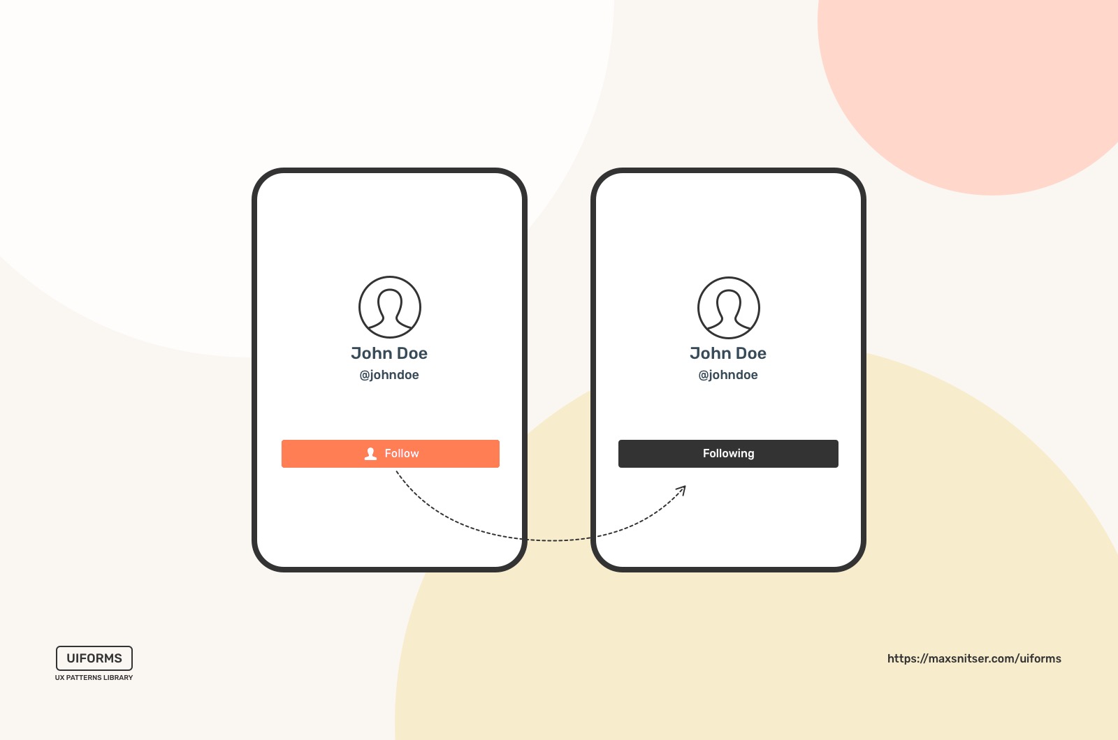
Morphing Controls
You don’t need to show all of the controls in one view. Some of the buttons and other UI elements can be different depending on the screen and its purpose. User experience can contain several modes like play, pause, on, and off.
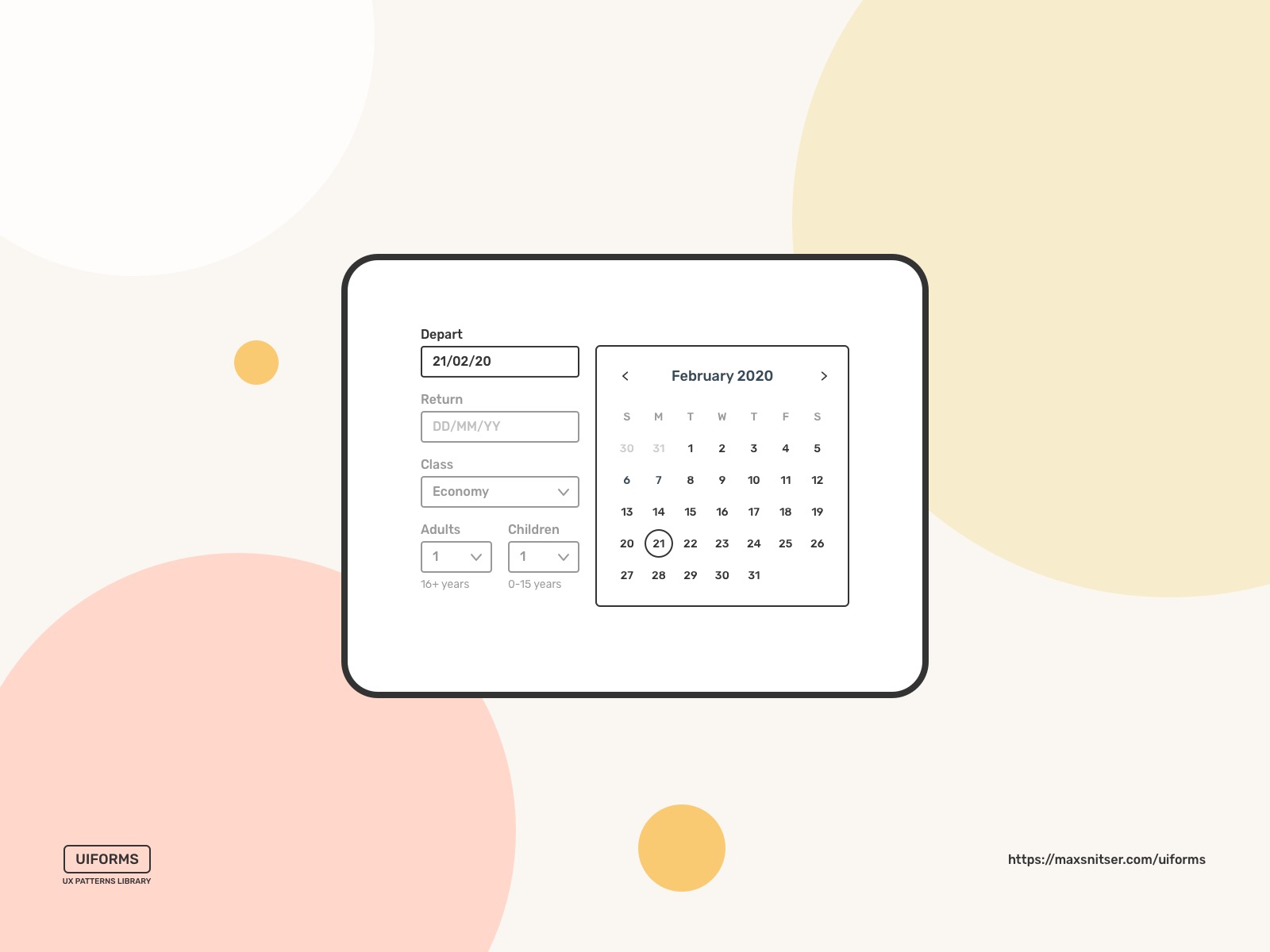
Structured Format
It’s mostly used when the input you want to collect is a specific data type, like a zip code, date and time, or a phone number.
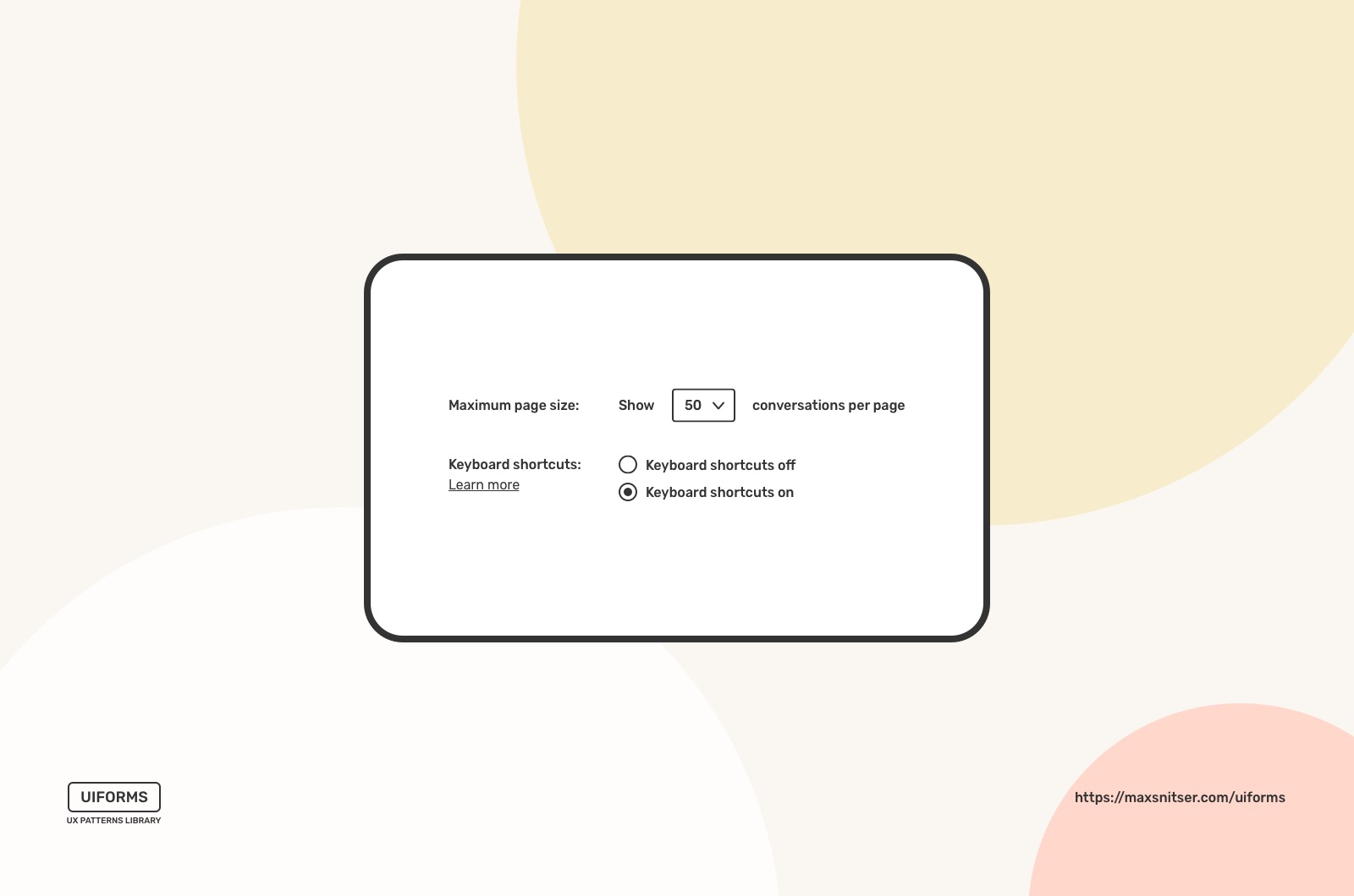
Fill in the Blanks
This pattern mimics real physical forms and sometimes looks more friendly than one-column forms. Also, it’s better to use this form when you have long and complicated labels for input fields, making it hard for users to understand. You can place a field in a sentence and express the context of the input field. However, it’s better to use it for short forms with a small number of input fields.
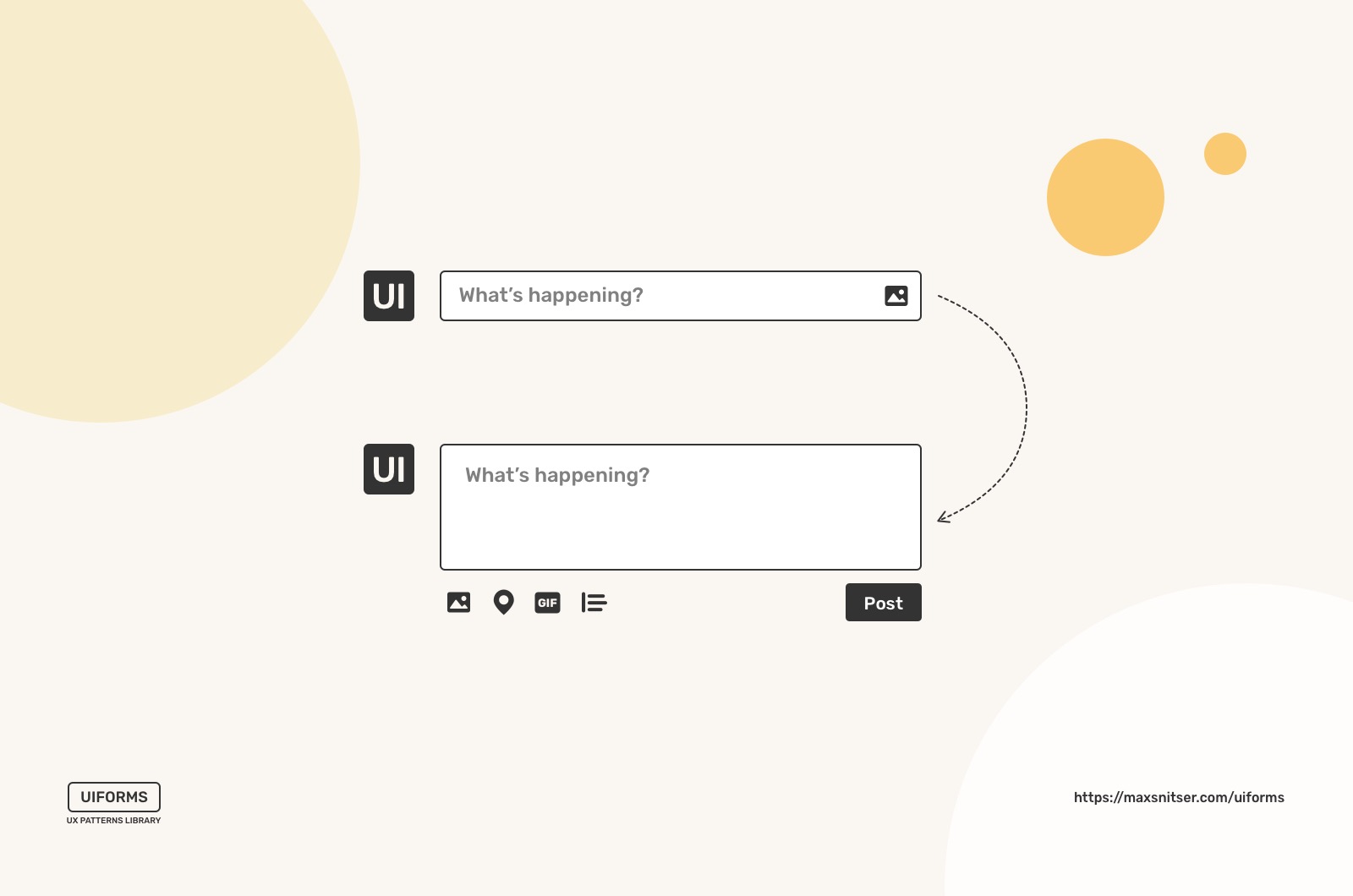
Expandable Input
All your users want to accomplish their tasks using your interface easily. It’s important to design a UI that has a minimum amount of distractions. An expandable input makes it possible to clean up the main interface and show necessary controls only when users activate it.
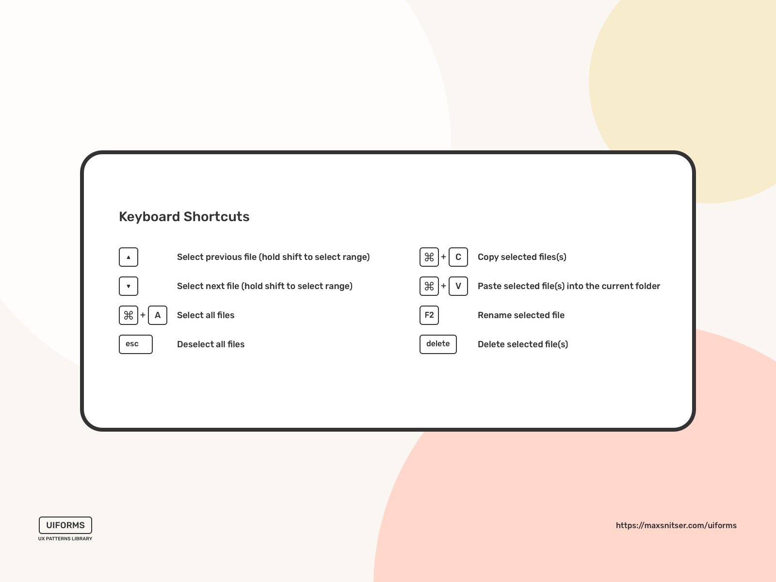
Keyboard Shortcuts
You can implement it in your interface when users have repetitive tasks such as save changes, search, copy and paste data, undo the action, etc.
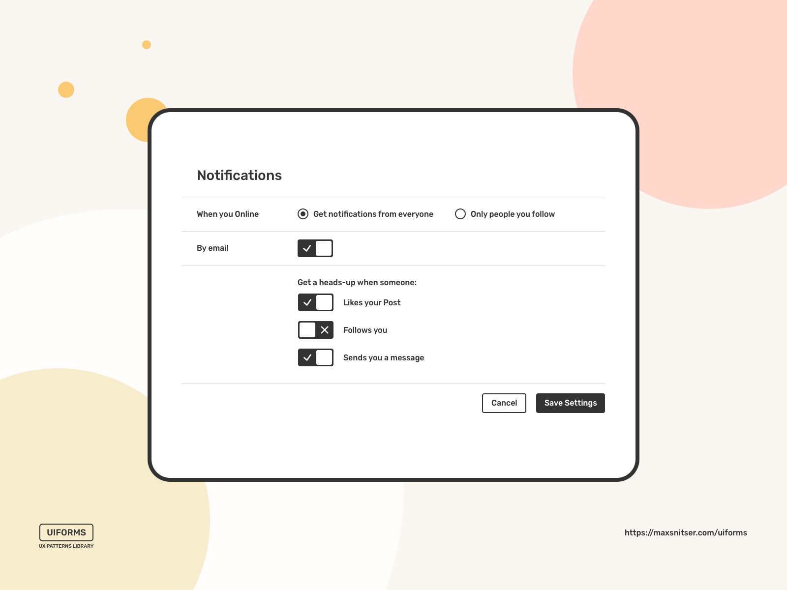
Settings
One dedicated place where users can adjust preferences for the app or service they’re using. Usually, Settings - is a screen or a view where you want to put infrequently accessed preferences used by a minority of users but essential for their needs. Otherwise, it’s better to use a toolbar or quick actions that can be accessed on the spot.
Drag and drop
This pattern is more interaction between a user and an interface in cases like uploading a file or multiple files. It’s a visual approach of adding files to a form to submit them.
Preview
Real-time preview of information a user wants to submit.

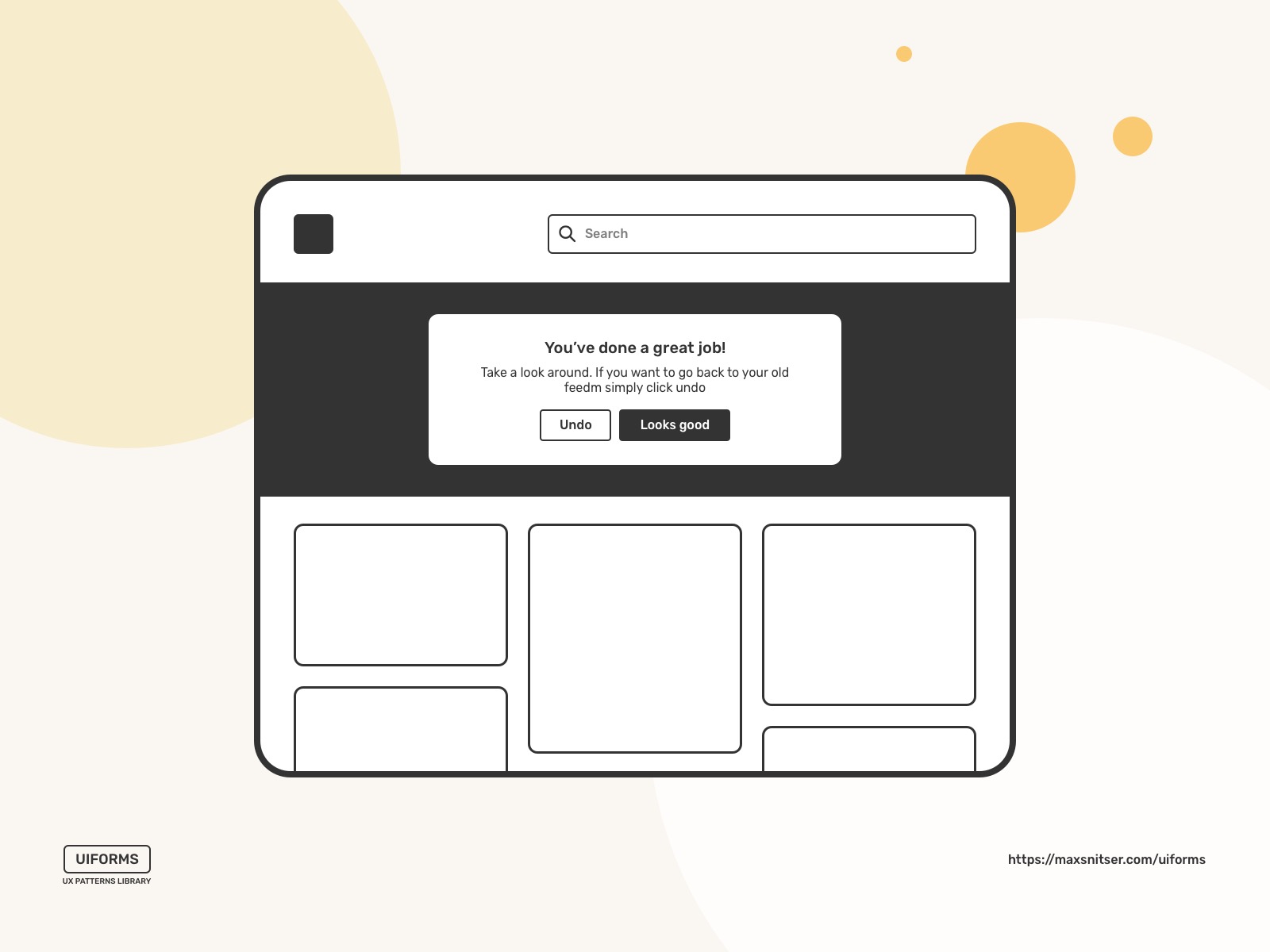
Undo
This is a way to revert actions that the user has taken. This design pattern provides users with more confidence using your interface.
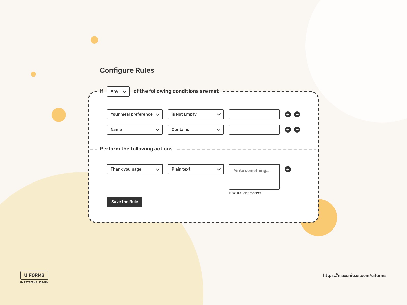
Rule Builder
This design pattern aims to provide users with a solution to conduct detailed requests like searches based on a custom set of rules. Basically, it helps to request information or lists using several conditions.
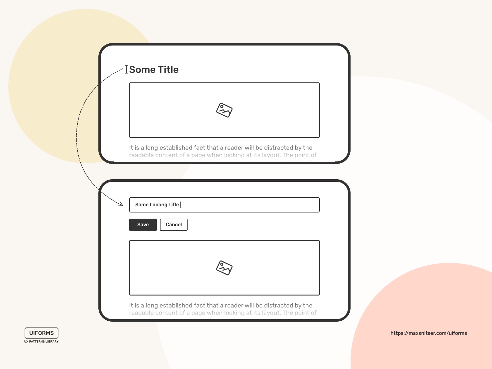
Inplace Editor
Mostly, it’s used when a user needs to edit a value on a page quickly. The main benefit of this approach is that a user doesn’t need to go to an administration page or any completely different screen (page) to edit a value.
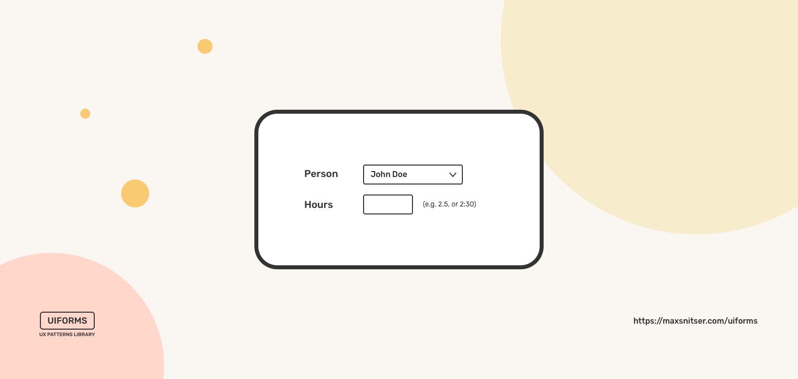
Forgiving Format
When entering a value, the input fields accept more than one format. This makes the interface more flexible and harder to make a mistake using it.
Good Defaults
It’s beneficial when a website or an app can make educated guesses and present the user with Good Defaults. A set of predefined options can be based on what browser settings users have and the location they’re browsing from. It can be easily changed later. So it’s not forcing users to think about it on the first steps of interaction with a service.

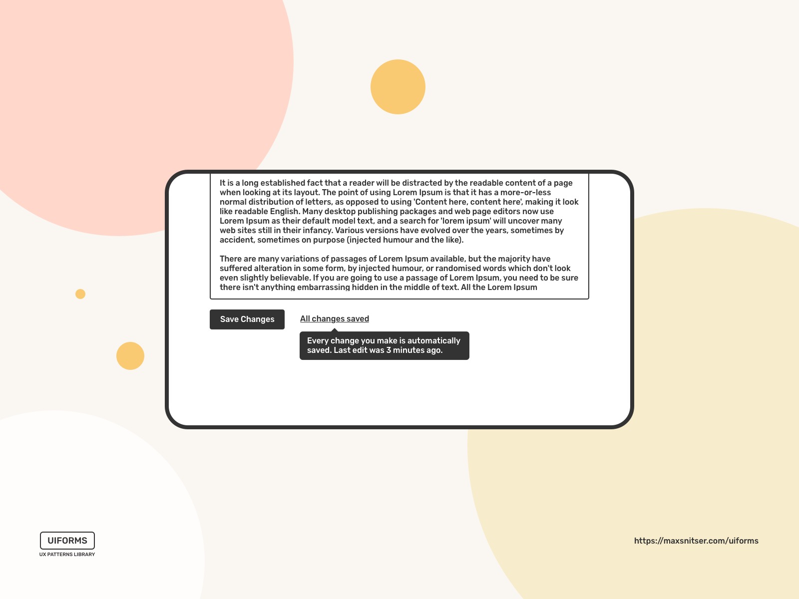
Autosave
Every user wants to keep their data safe. Autosave feature helps a user focus on their tasks (i.e., producing content) without worrying whether their data is safe and saved.
Wizard
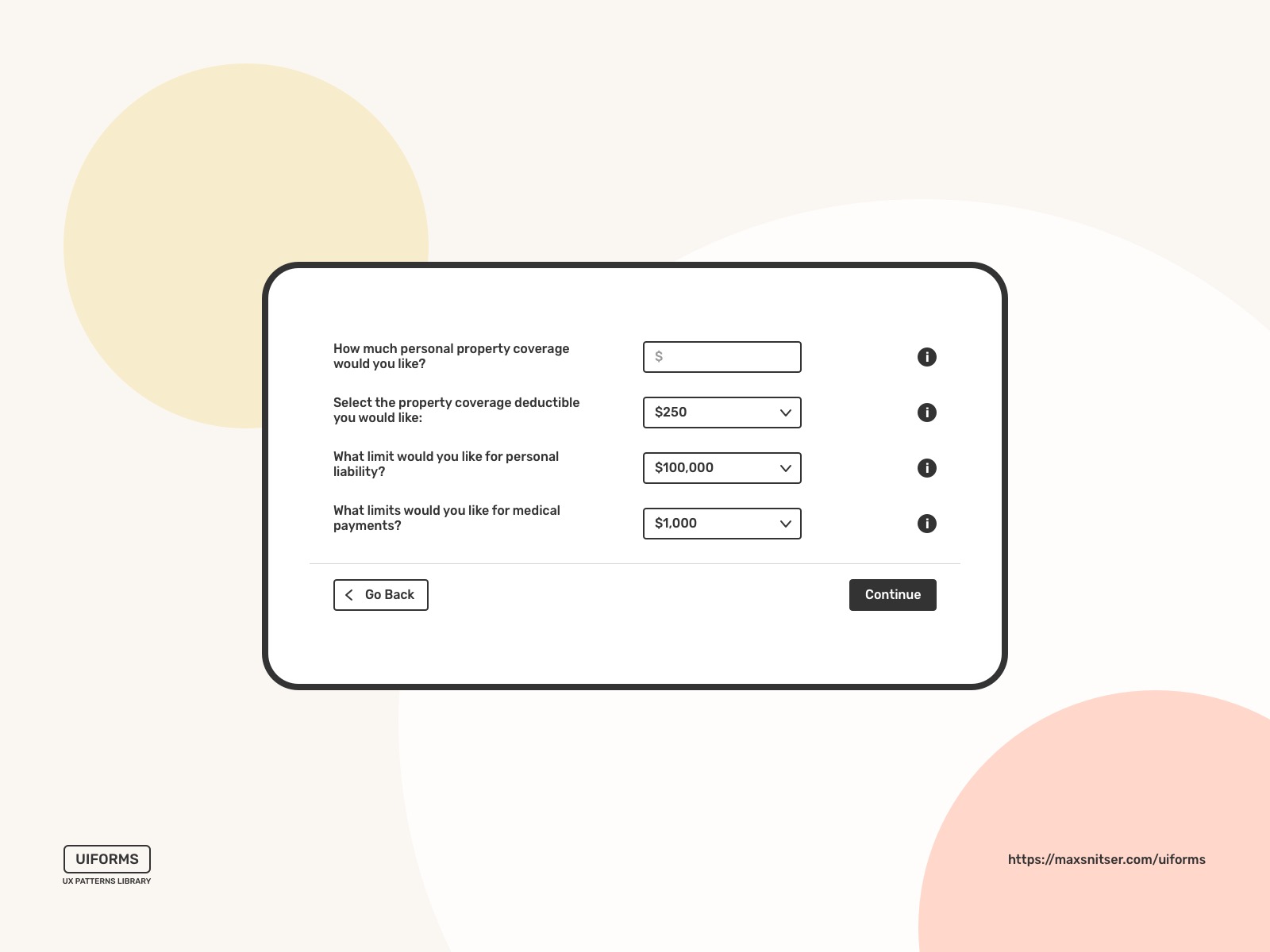
Complex tasks can be broken down into sub-tasks to simplify user interaction. I recommend using a wizard design pattern when users need to input complex data into a system. The main task is more easily achieved by splitting the process into a series of smaller and simpler steps.
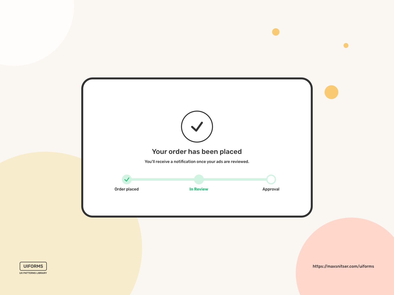
Steps left
A guidance or progress bar that shows the process of filling in data over several steps. I recommend using more than 2 steps, or the process feels so long that the user might feel that it will go on forever without the guidance steps.
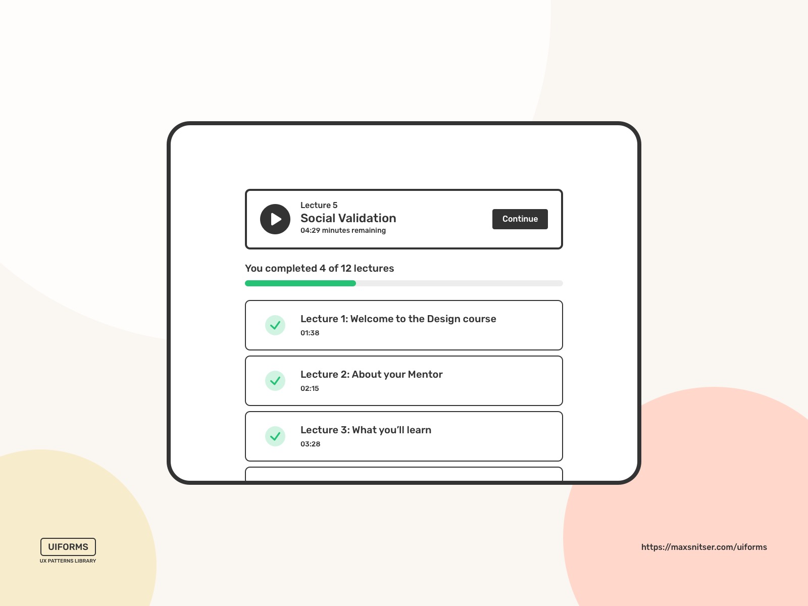
Completeness meter
Unlike the Steps left pattern, the completeness meter is used for a series of non-sequential tasks. It keeps users on track when completing a specific goal and completes a set of minimum tasks related to a specific goal.
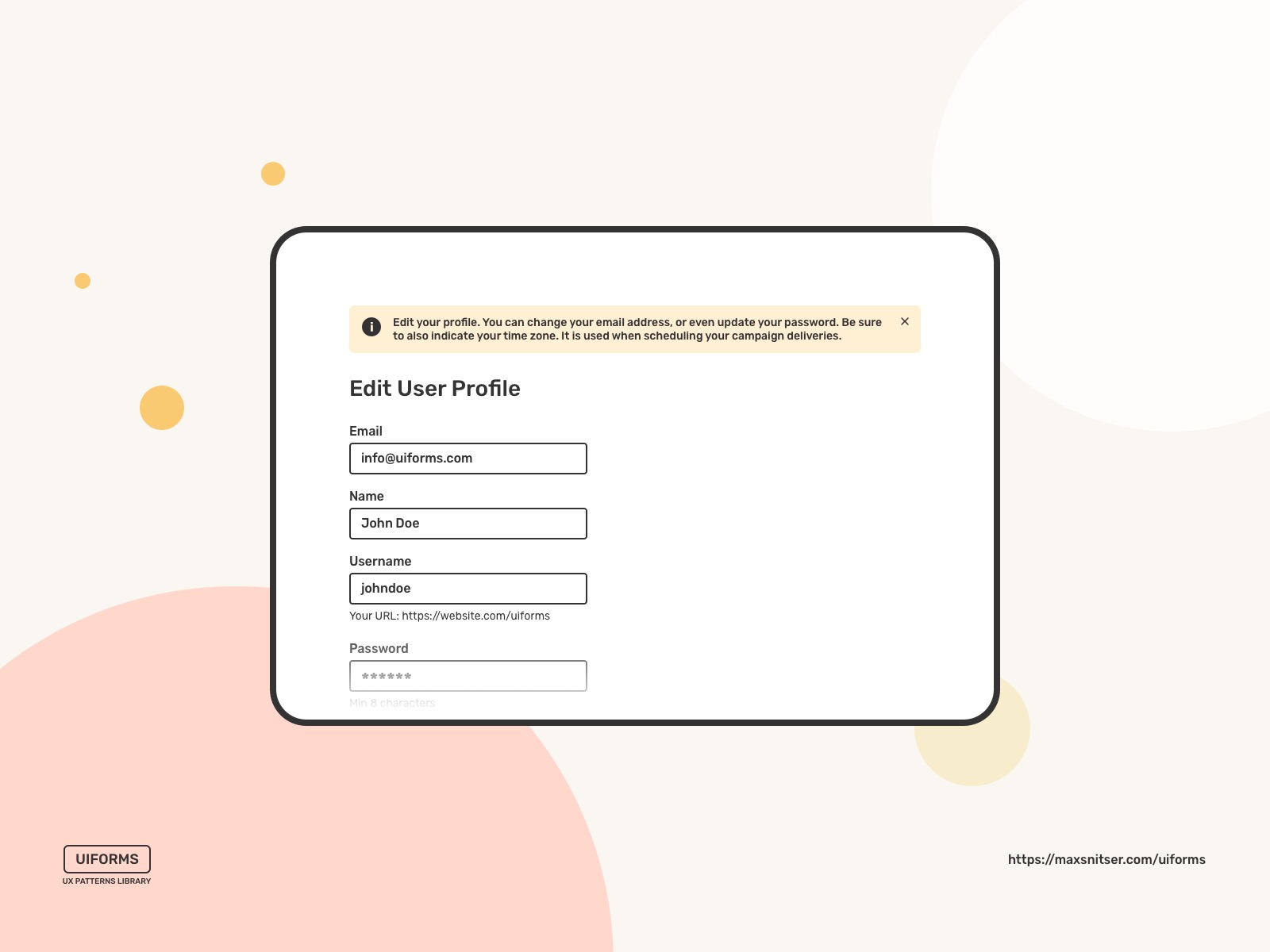
Inline Help box
A piece of assistive information is located close to the interaction users are about to perform. You can use it as inline tips that help using your interface or when you want to motivate the user to accomplish certain tasks.
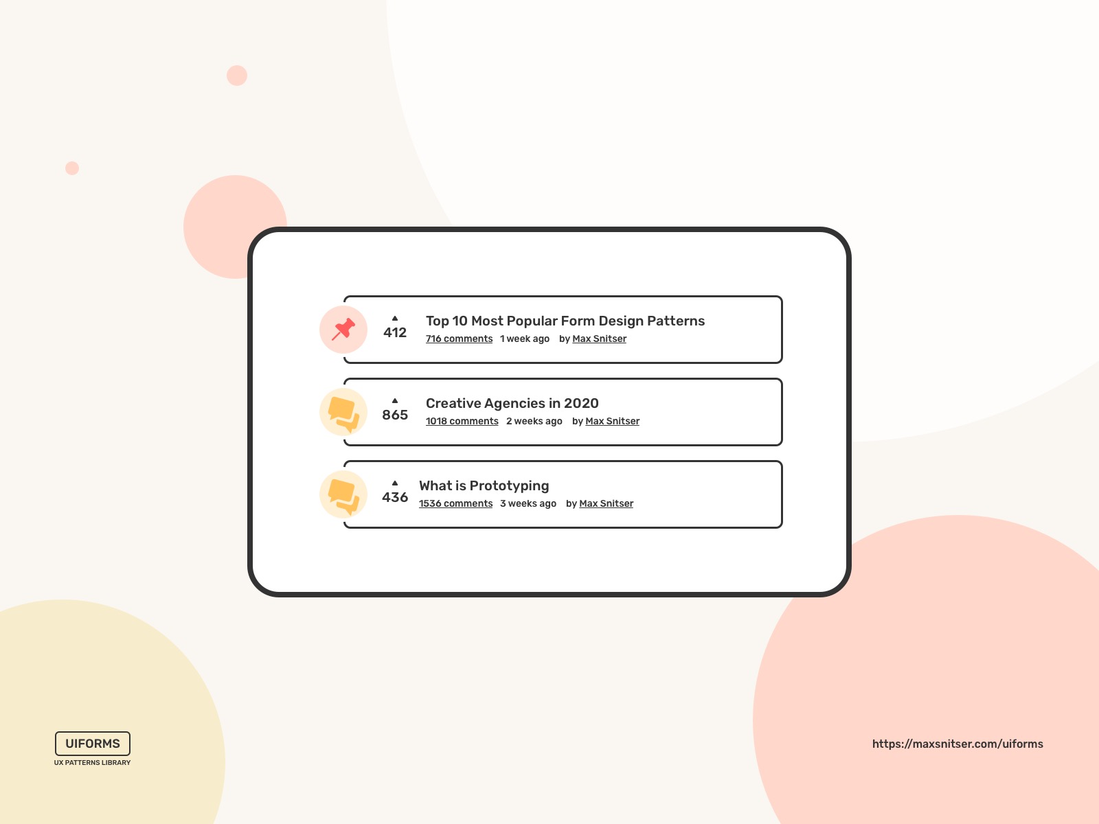
Upvote
This design pattern helps users to make a specific piece of content more popular. It’s mostly used on websites with a large audience and a strong community. So that a sufficient amount of votes can be generated, and a meaningful comparison can be made.
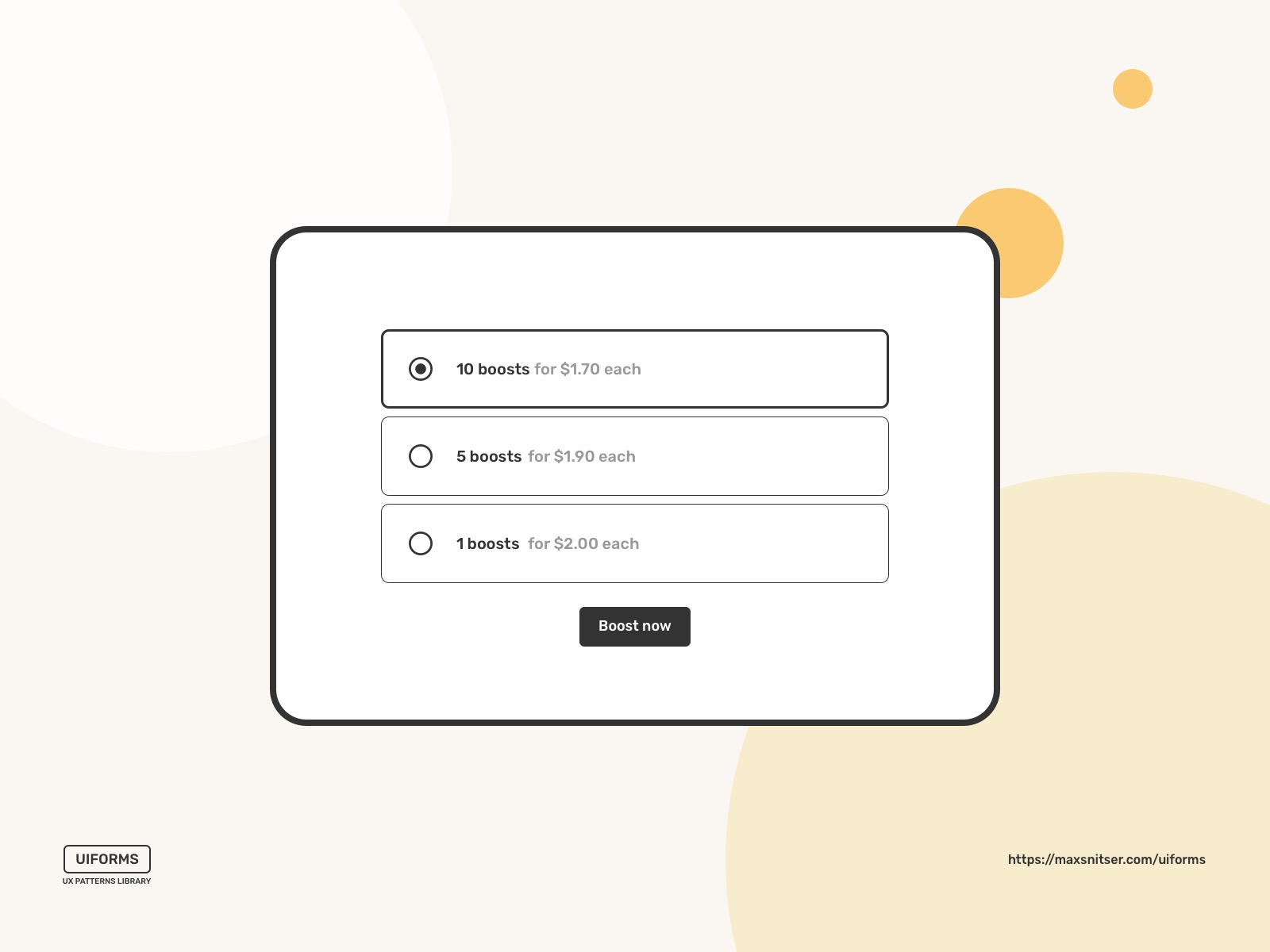
Pay to promote
In other words, paid promotion similar to what you can see as Google ads (paid search results on top) and boosted social media posts. This pattern's main goal is to gain increased reach and traction by skipping the content prioritization algorithm.
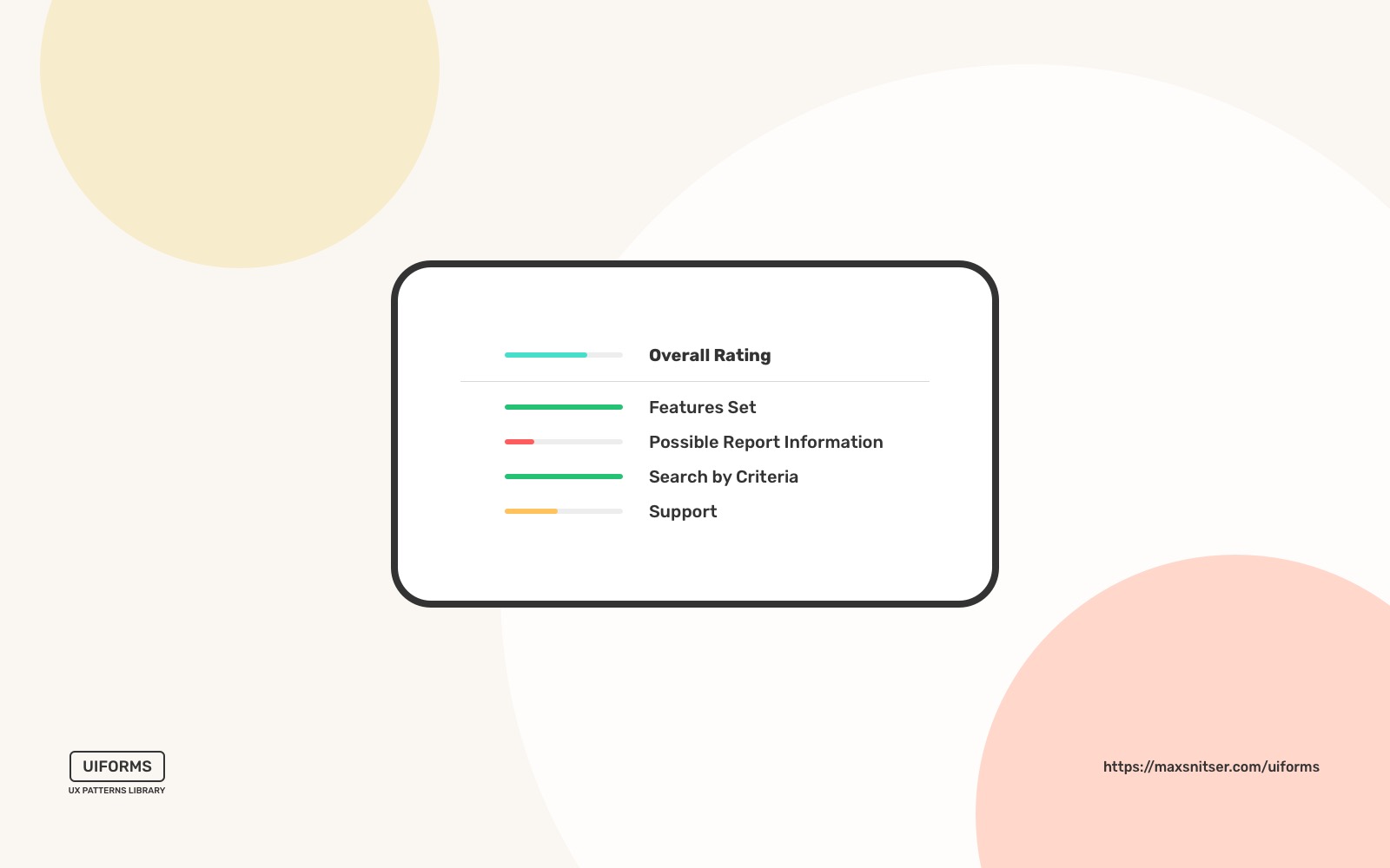
Rate content
This design pattern helps your users understand if a specific piece of content is worth spending time and/or money on. It’s an important part of any rating system you use on your website or app. Of course, it works best if you have a large user base. Also, ratings help businesses to understand what content or product performs the best.
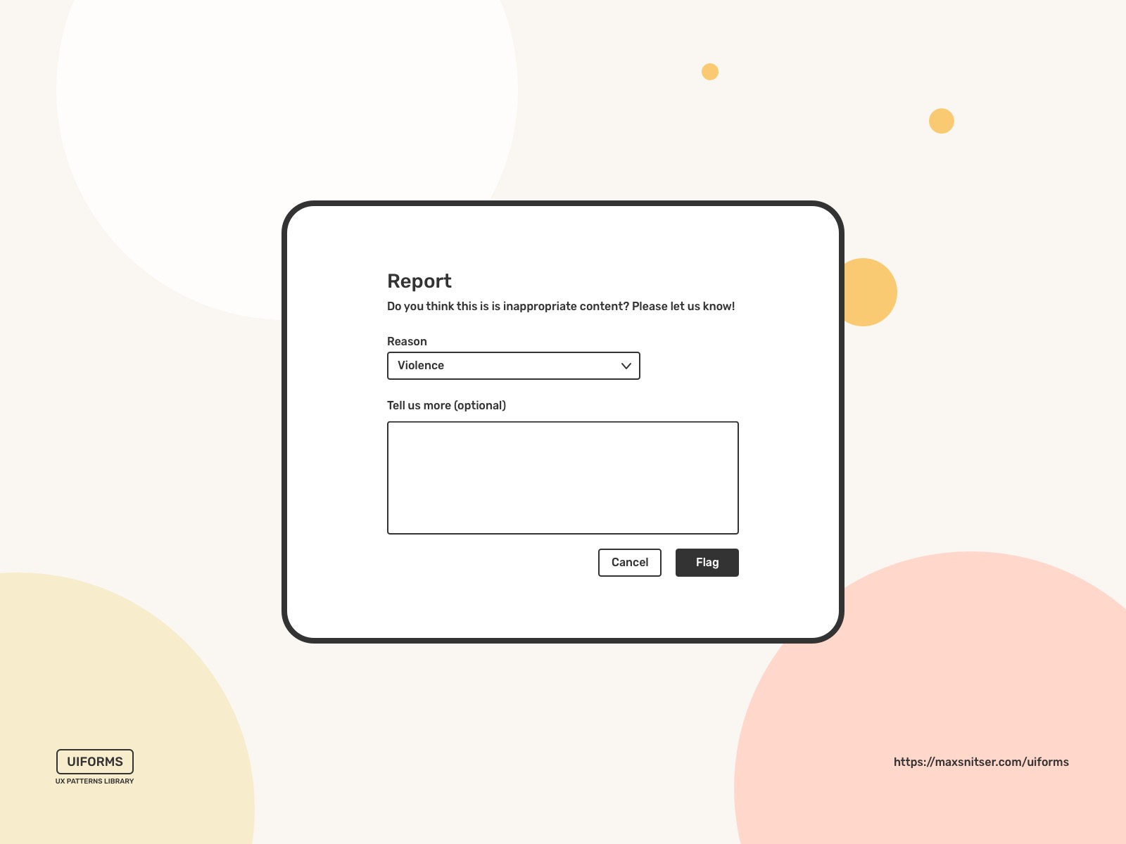
Reporting
Often big platforms and resources have a ton of user-generated content, and it’s almost impossible to moderate everything yourself or with a couple of moderators. A user interface for flagging and reporting inappropriate content solves the issue with moderation.
Wiki
It helps to keep updated a collection of documents and add or edit the content of a website.
All of these patterns are widely used around the web as well as in mobile apps. Tech companies and startups that take their products seriously develop their own documentation, style guides, libraries of components, and even design systems.
It becomes more popular to start with an existing solution like a design patterns library or a framework. A product or a company that is on its start doesn’t have many resources to build a product where best user experience practices are incorporated on a basic level.
A product that works well for its customers doesn’t need a fancy branding and visual appearance.
A website that has valuable content or works as a service doesn’t need a complex design.
Any process that plays a role in your product impacts your business metrics. If we talk about cases where your customers need to fill out a form, go through a questionnaire, or interact with other community members, they need a simple set of tools or features to do that. Data input design patterns I went through in this article help achieve this without too many visual details.
Here are several types of Design Patterns packages that might help you.
Packaged Design Patterns
- Libraries of components
- Design patterns libraries
- UI Kits
- UX Kits
- Design systems
- Plug-ins
These packages can make product design processes easier, mostly because the design process is boosted by ready solutions and backed by patterns emerging for years. It will actually be difficult to make mistakes in your product design if you use a library or kit that fits your needs.