The Future Of Dark Mode Interfaces

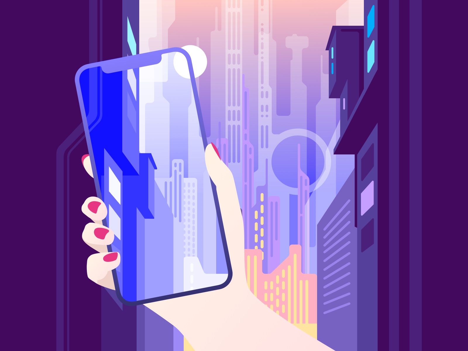
We are now aware of what's happening with interfaces nowadays. The dark mode is becoming more and more popular on different platforms and apps.
Existing Dark Mode Interfaces
Slack

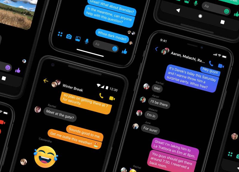
Facebook Messenger
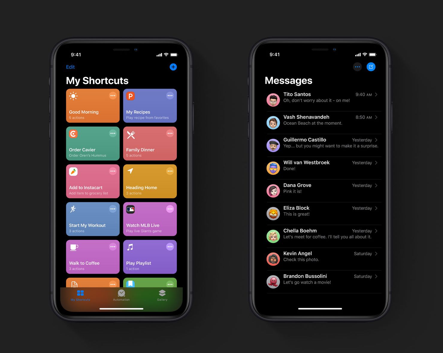
Apple introduced dark mode in iOS 13
The dark mode was introduced in Android even earlier.
The dark mode isn't an entirely new concept.
It has been around for quite some time already. Moreover, the first computers with displays and operational systems like MS-DOS had dark terminals by default.
Dark Mode Benefits
There are several reasons for adding a dark mode to apps and systems nowadays.
Evening and night screen time
First of all, we use our screens more and more time. That includes day, evening, and often night time. We now spend an average of 24 hours per week looking at screens compared to only 9 hours in 2000.
Having a dark mode makes it easier for the eyes to scroll through your feed, check messages, read articles one last time in bed before going to sleep. Moreover, it can take a couple of hours of screen time. Your eyes will say thank you if you use a dark mode.
Health benefits
The bright screen can disrupt natural sleep cycles because the body's natural clock gets pushed back. It might not be a big issue initially, but it leads to some health issues in the long run.
Dark mode can benefit some users with specific health conditions irritated by bright lights. Photophobia is a condition that makes people sensitive to light. Using dark mode can also help those who suffer from migraines.
OLED screens
Another reason is innovations behind screens. In most cases, the latest flagship models of phones have OLED screens that don't require a backlight, as with LCDs.
Battery life
Also, this is something that improves your battery life. So dark pixels do not drain your battery that much as on LCD, where it's pure light the entire screen, even though most of it is black.
Looks cool
So if you or your users are into Sci-fi and Cyberpunk movies, then Dark mode makes your apps look cool and futuristic. I believe this is something that we can use in the marketing strategies of products.
Thinking about others
Using Dark Mode is an excellent way to do what you do, and it prevents disturbing others in places with dim light like planes, cinemas, and other places with a dim light or completely dark environment.
Dark Mode Design Specifics
Dark vs. Pitch black
The most common misconception is that dark is equal to black or #000000, but that's not actually true. Pitch black color is n for UI elements on it. For example, you can't use shadows on a pure black background.
Also, since completely black pixels temporarily switch off these parts of the screen, it cannot work so smoothly because the technology of the OLED screen still requires some time to turn these pixels on. So in cases like scrolling fast content or switching between screens, it can look dirty.
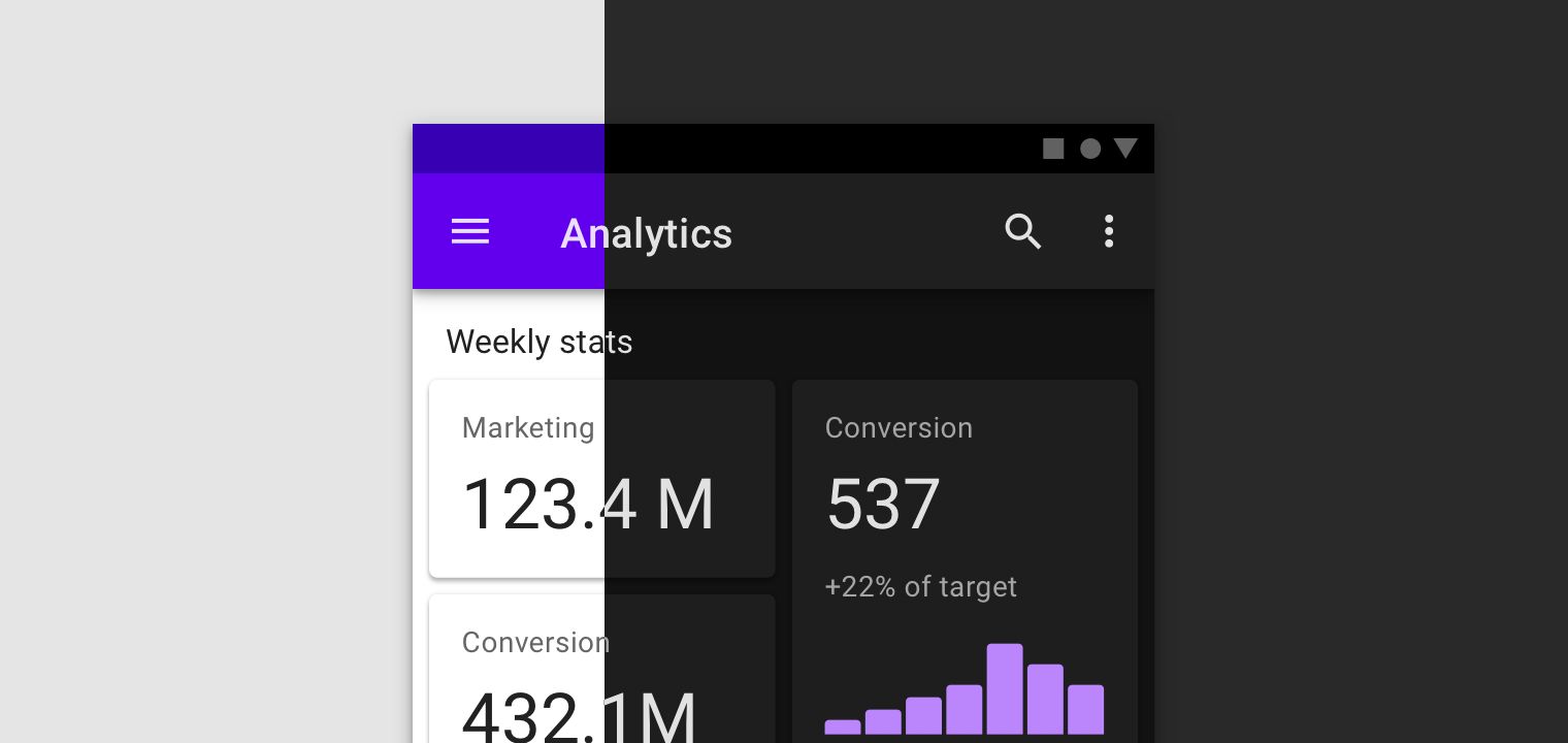
Using the same colors as in the light version of an app
In most cases, the good news is that you don't need to think about an entirely new color palette for your app, specifically for the dark mode. However, sometimes it's impossible to leave the same colors, and you need to tweak them a little, so they work correctly for the dark mode.
There is a quick hack that you can use to convert your color palette to make it work for the dark mode. Try adding an extra 40% white layer on top of colored elements like buttons, texts, messages, and in general. It is not the only thing you can do, but you can try this as a starting point and then continue tweaking colors and testing everything, so it has a good contrast ratio, the text is readable.
White text in a Dark mode interface
The only problem here is that if you put 100% white text on a pure black background, it can decrease the readability of the text. The same goes for a pure white background on a 100% black text because it reflects too much light to focus on the words. So in the case of a dark mode, try to decrease the intensity of the white text. 95% or 90% should work. It can help to prevent eye strain.
How does an OLED display save power if pixels are not pure black?
Considering use cases about eye-straining and text readability I described above, you might think that there is no point in having a dark mode on OLED screens after all. However, on and off are not the only two states of OLED screens pixels. As the colors change from black to white, power consumption gradually increases. So at the end of the day, a white screen generally ends up consuming more power. Dark themes perform better than light themes in terms of power consumption.
Can an app be completely dark without a light theme?
It might be the case in the future when we have the next generations of OLED displays or even better screen technologies.
Currently, it's quite challenging to use dark mode in the daytime, notably in a bright environment and if you have reflections from shiny objects. The solution here can be improved brightness of OLED and a way to reduce reflections on screens. It is something that might make it possible to use a dark mode all the time.
We can't change it with a design only, but we can prevent poor user experience by providing users with two versions: light and dark, at least for now.
Latest Dark Mode Design Examples
Dark Mode in iOS 13

Nightfall Dark Mode Design System

Dark Theme in Material Design
Summary
Our eyes are not used to so much screen time. Especially late in the evening. The dark mode is a solution, and it's better to have it to cover all the use cases people might have.
The only reason not to implement a dark mode is if you are 100% sure that your users are using it only in a day time, but I think it could be a rare case.
Also, I recommend you to think about the way of how to have the ability to switch to dark mode automatically when the time is right.
For example, if you use the Nightshift feature in iOS, you might know that there is a way to automatically switch it on during sunset time and switch off on sunrise.
Another example is the Twitter app. The Dark Mode in the app switches automatically. I found it useful in cases like if you, for instance, didn't use your phone for a couple of hours during sunset hours and then decided to check Twitter. Instead of killing your eyes with the bright screen, it automatically shows the dark version of the app, which is gentle on your eyes and feels like it should be this way everywhere in iOS.