Top 10 Most Popular Form Design Patterns

We use forms almost on a daily basis, whether we want it or not. Every website and app has at least one form, and if you are the owner of the product, you want to make sure that this part is done right.
In this post, I'll describe the most popular form design patterns and ways of implementing them well in your product and business.
What can be wrong with forms?
One well known booking website Expedia lost $12 million per year by requesting users to fill out one additional field (company name) in their booking form.
In most cases, forms play a significant role in interaction with website visitors and app users. For example, people need to register in your product to use all the benefits of it, or they need to fill out some information in order to proceed with the tasks they do on your websites or mobile application. Last but not least, they want to reach out to a support team to ask their questions and get some help.
Having a bad user experience in this part is the common reason why websites and apps become abandoned or have an unhappy user base that is looking for alternatives.
You can add a form to your website or app taken from other places and believe it will work, but the crucial part is to make sure that the taken form is well designed. I'm going to describe the most common use cases and show examples of forms that are well designed. Which is I think can significantly improve the user experience of your product.
Common Form Patterns
Contact Forms
imagescape.com increased their conversion from 5.4% to 11.9% by reducing their Contact form from 11 to 4 fields.
The main point here is to stick to the most necessary information you require. Things like asking for age reduce conversion rate by 3%, a telephone number causes 5% dip, city and state fields reduce the rate by 2%, street address reduces the rate by 4%.
Of course, it depends on the type of contact form you want to implement.
Delivery form
Delivery forms must have address fields.

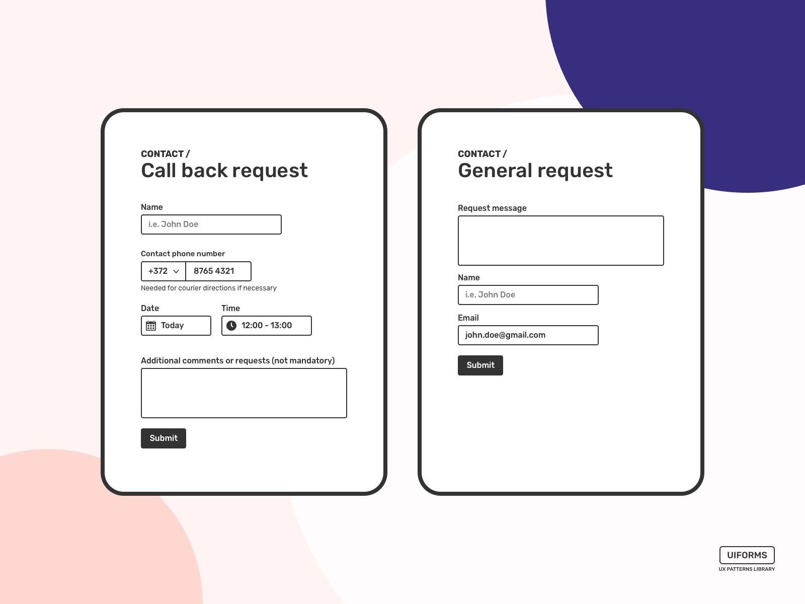
Call back request
Forms like Call back request must have a phone number as a mandatory field.
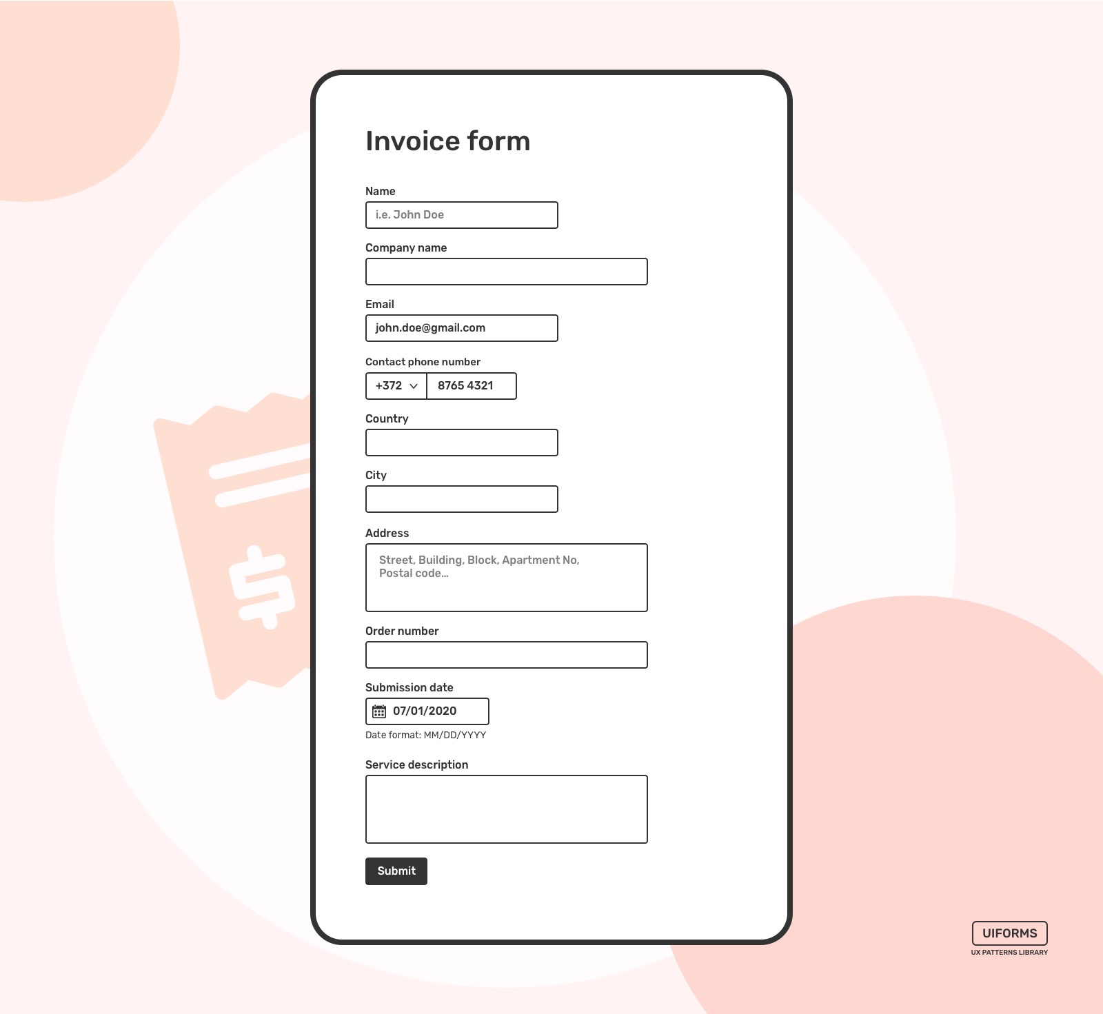
Invoice Form
The example here for general invoicing purposes. However, the main idea remains the same, to keep your Invoice form lean without fields that do not have any value or at least significant value.
Order Form
Any form that is in a payment process has to be as simple as possible. As usual, a one-column design works the best. However, product information can be designed as cards. That might save some space and reveal more form fields in the first scroll of a screen, whether it's a mobile or desktop screen.
Arranging fields from easiest to hardest mentally help users to accomplish tasks like this.
Don't ask for a phone number unless it's necessary for your payment process. I'd even eliminate fields related to location and address. Email is enough if it's for ordering digital products, not those that you're going to ship.

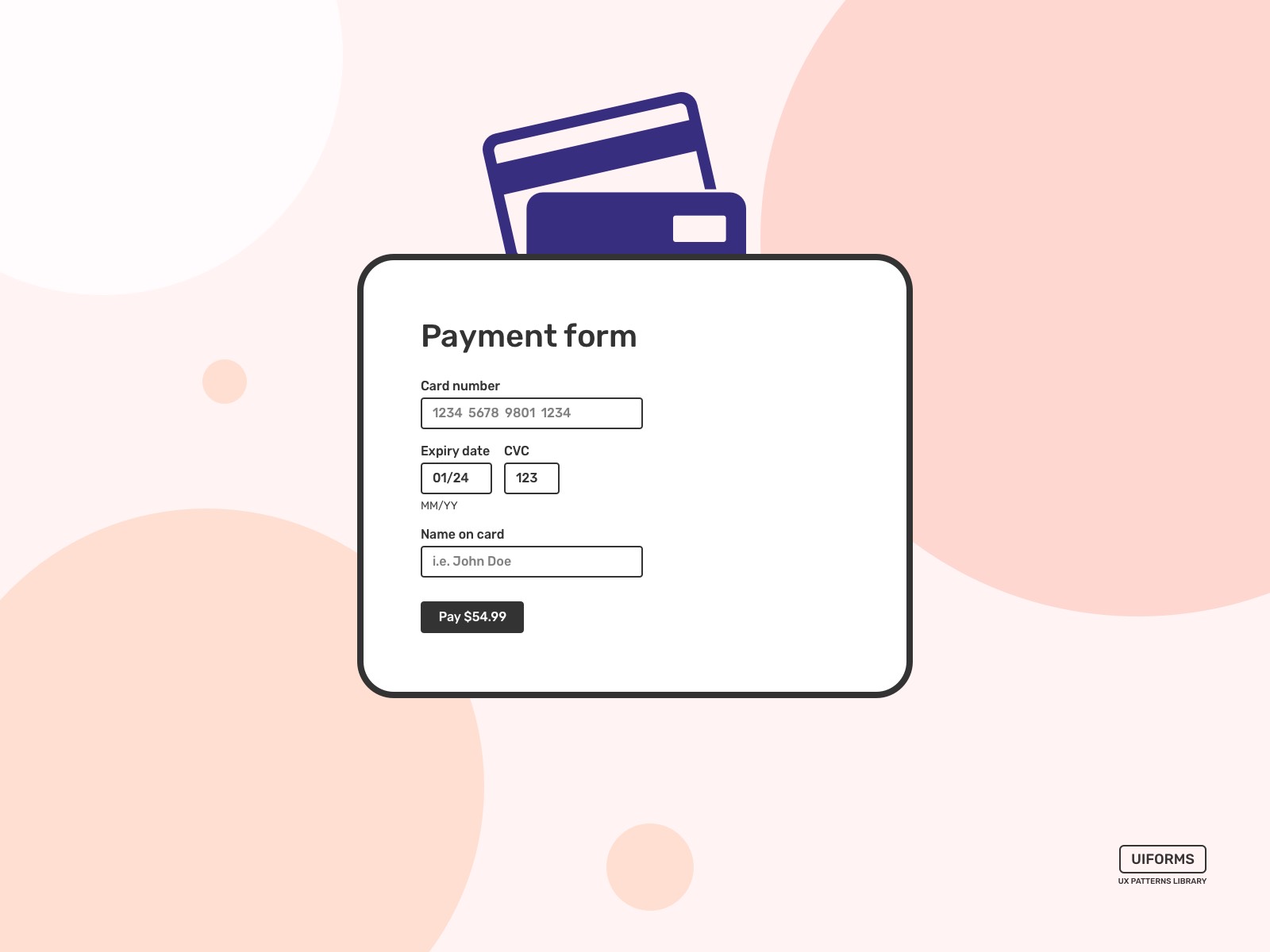
Payment Form
I recommend using the same order of the data inputs as on a physical credit card. It became a standard and things like card number, expiry date, CVC code, and Cardholder's name usually have the same order perhaps on the majority of cards that are being issued around the world.
A good UX practice is to use a pattern or mimic similar experiences. Even tho the form below doesn't look exactly as the physical card it's ordered in the same way except for the CVC code. So it's pretty much straightforward to enter this data from your card.
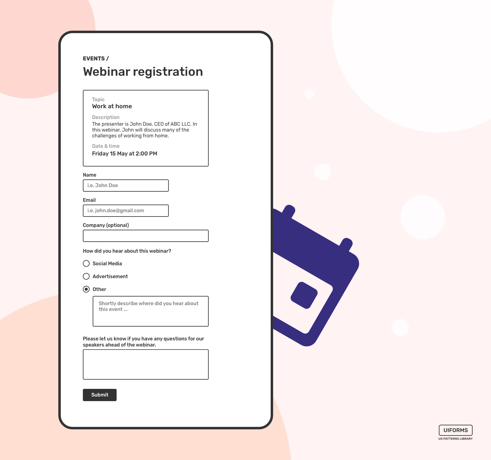
Event Registration Form
It's important to show some snippet information about the event itself before the fields that are requested in order to register for the event.
Again, I recommend using only fields that are important. You can always ask for more data from your guests later. Huge and bulky forms have a lower conversion. Meaning, fewer people will attend the event.
Some fields like the "Other" radio button can temporarily hide fields for additional info. That way, the form will look much easier to fill out, and at the same time, if a visitor wants a slight complication or be creative – additional options might be presented.
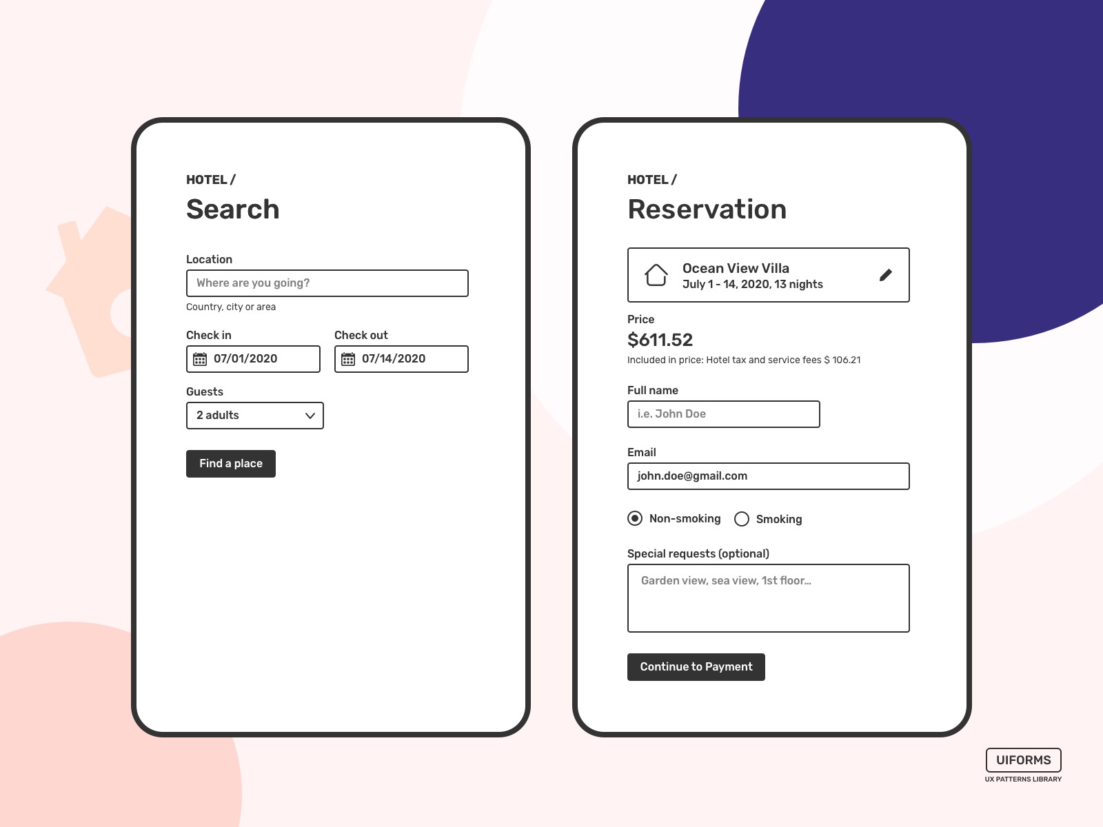
Hotel Booking Form
Of course, this is not a complete booking flow, and it's just to highlight the ease of use of a couple of essential forms in this process.
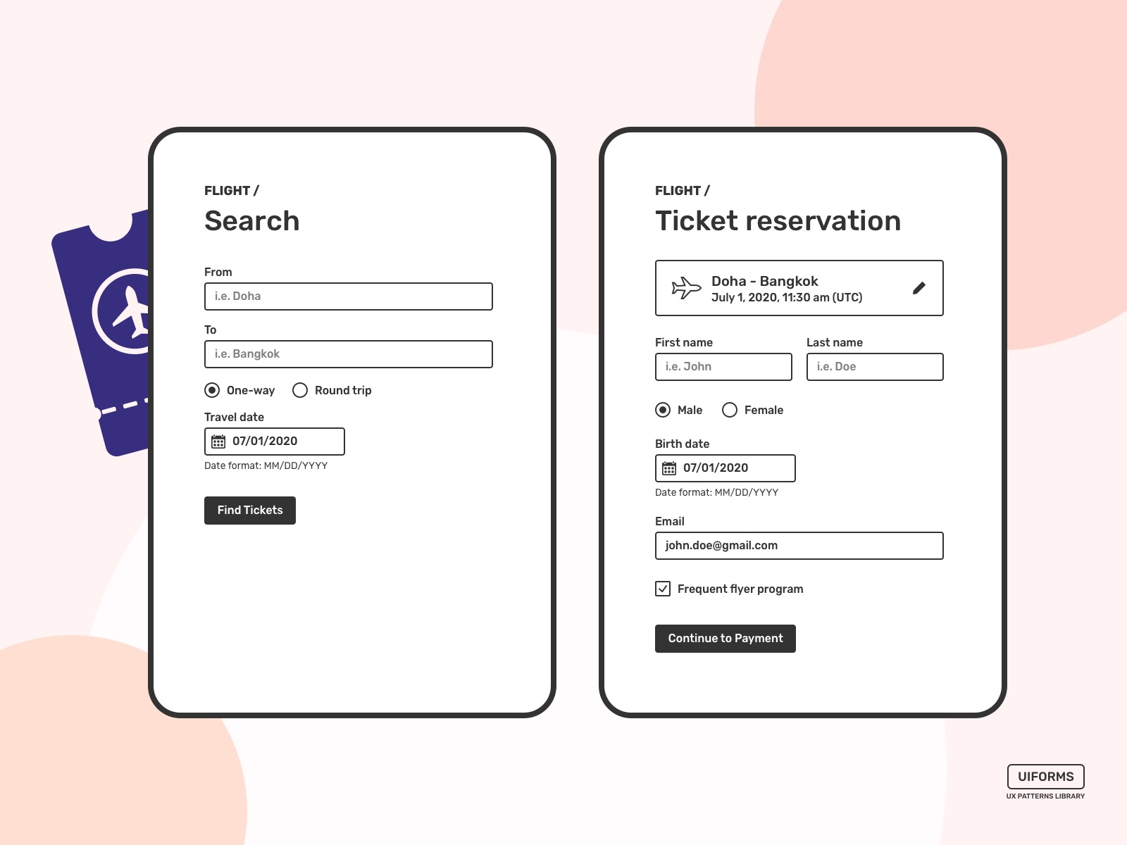
Flight Booking Form
The flight booking process in some way similar to the hotel booking. However, there are some differences. For example, airlines are more strict, and tickets must be reserved on a correct First and Last name to avoid any troubles in the check-in and boarding processes. So these two fields should be separate to avoid mistakes already on the first steps.
You can see that there are no fields for a passport number and similar details. That's because things like that can be asked later in the check-in process. The purpose of this is to make the process faster and easier for people to book the tickets and provide more info later if necessary.
Train Booking Form
Train companies have slightly different policies and usually older interfaces, but they all request almost the same information in most of the cases.
This view doesn't have tickets selection and only forms that are necessary to reserve a ticket.

I've described the most popular use cases. Basically, you can see several design patterns that are consistent across all of these forms.
- One of them is predominantly using a one-column layout, perhaps maybe with a couple of exceptions.
- Placeholders are good, but they do not replace labels that explain what's requested in a field.
- Smaller forms convert way better longer forms. Multiple steps might help, as well.
- Request only valuable information. Drop those fields that are not necessary at the beginning and can be requested later.
- Minimalistic look and visible call to action elements.
Of course, there are a lot more form design patterns that can be used for new products like websites and mobile apps. Using form patterns can be an advantage for any kind of product. So forms don't look very unfamiliar, and it's always easier to fill out standard forms than those that request a bunch of new information or even request it differently.
These cases and forms have been designed with the help of UIForms library.
How To Improve Existing Forms?
One website blocked the 4 out of 5 users because the phone number they entered did not contain dashes.
Frustrating cases like that can have a very real impact on your growth.
Firstly, it is to analyze the existing product and get as much as possible feedback from your users. This will help make the right decisions regarding the changes. Sometimes customer feedback doesn't give much insight, or the product is new, and there are no customers yet. So well known patterns are the way to go in cases like this.
This is something that has been successfully used in other solutions and businesses. So why don't you use it on your website or app?
A well-designed registration form can improve conversion and reduce costs per lead. I believe this is one of the core business questions that should be raised regarding your website or app.
Max Snitser
Whether it's website design and development, app design and development, digital product design, or luxury branding and upscale design, my goal is to create designs that are aesthetically pleasing, visually appealing, and functionally intuitive. With a mastery of user experience (UX) and user interface (UI), I craft solutions that bring ideas to life, produce high-quality work, and build strong relationships with clients.
Contact Max