What Content Is Appropriate For Index Pages And Start Screens

It's a common question for informational websites and mobile applications as well. Should it be the main screen of your product or just a list of content? What information is appropriate for a starting point?
The main concern is that people actually ignore the Index section. Since they are more focused on functionality, features, and how content is organized on inner pages, landing pages, and places, we talk about conversion.
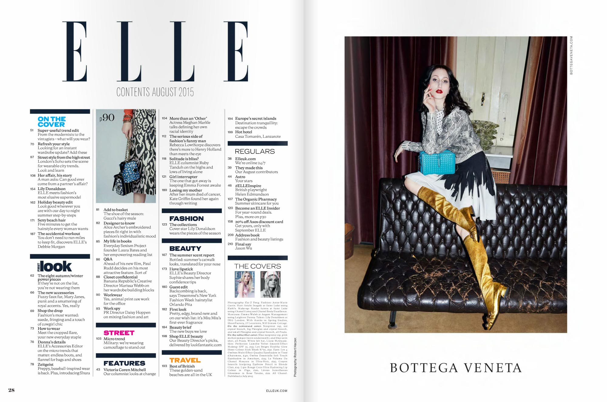
Before making the first steps in this topic, I'd like to show you how magazines design their index pages. They have a lot of experience in this area...
Scanning index pages of the big players in the world of magazines is quite an interesting process. It can be hard to find dry content and use a linear approach to reading. It's the opposite of a boring list of all the content that the magazine consists of.
They use an interactive approach to navigating you through all the topics.
Take a look at ELLE centrefold. They use all the space and make scanning of contents not so boring.
The starting point of a website or application should be interesting, as well as the example above. It should motivate users and show directions where they can go and what's interesting they can find here.
In the case of mobile or just apps, I think it should have an onboarding process to educate and show how to create an account, do specific actions, and show features and benefits. Again, it should contain all the necessary information. At least briefly with links on sections with detailed information.
However, in the case of websites, we should consider that not all users open a website from an index page. They can go directly on one of the inner pages from search engines (requests) or other websites.
Anyway, we need to pay attention to the index page. Since they can go back to the first position anytime, users want to access other areas, explore the latest content, see the most popular features and deals, etc.
I do like how New York Times website organizes the content. Their information design and information architecture results are astonishing, in my opinion.
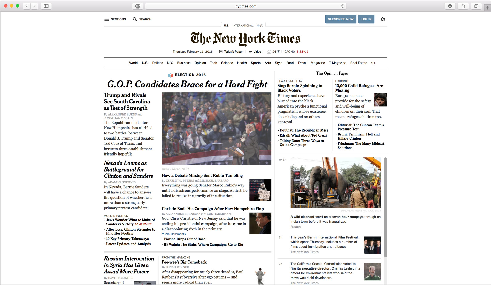
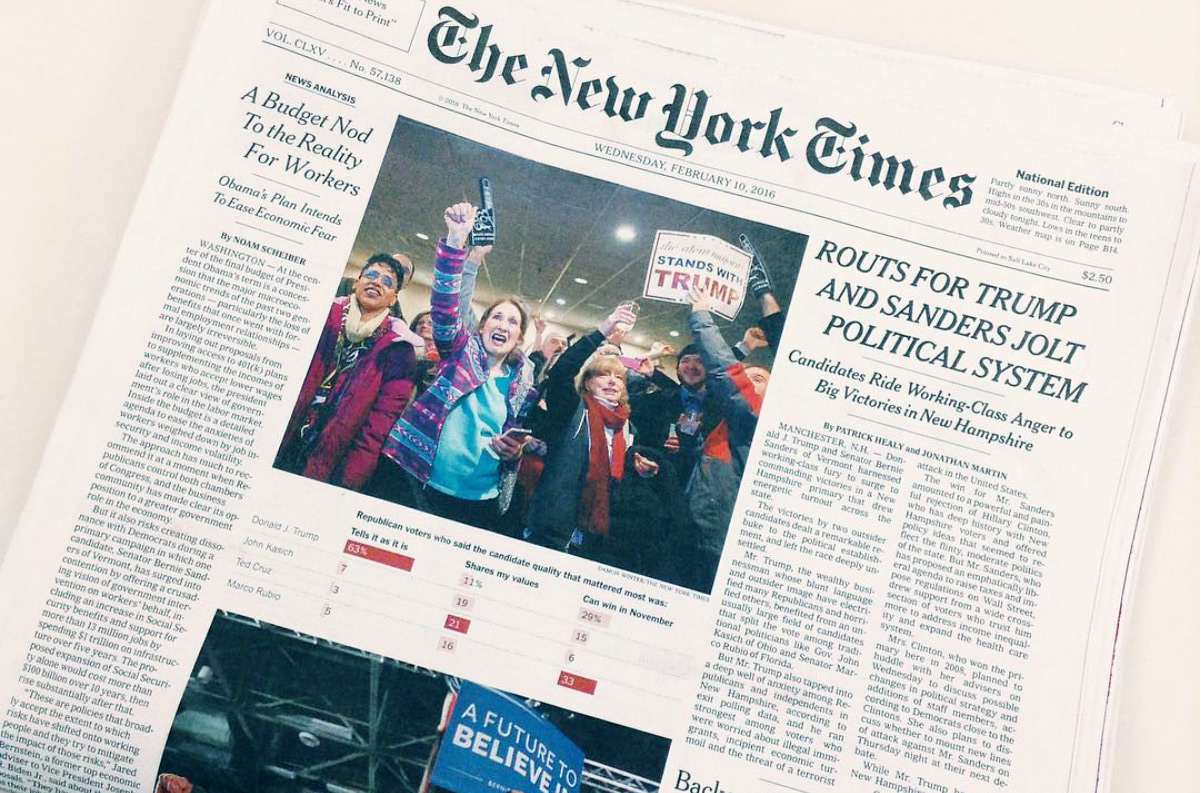
Well, yeah... Sometimes it seems like they mimic the printed newspaper (medium). But, at the same time, they pretty much take advantage of interactivity that's possible to make on the web.
It makes sense to learn from the user experience they created on their website or maybe any other alternative publisher that invests in the design and content organization.
We are living in a digital age, and physical mediums like newspapers and magazines have become irrelevant.
It's easier to grab your smartphone and google something or use an alternative search engine that does pretty much the same... But we also need to take think about the transition between paper materials and digital experience.
Sometimes we need to think about a smooth transition and imitations before we apply all the laws of a new environment to make sure that users' transition is comfortable enough. So, people can understand how to use your products and find what they are looking for easily. Or have a clear understanding of what you suggest on your website, app, or digital product.
This experience of interaction with the website from the starting point is pretty similar to reading a book...
When I visit a bookstore and find myself attractive one of the book covers, I take this book, open the contents page, search for an interesting topic for me and go on the page to read 1-2 pages. Then I go on the contents page again and search for another interesting topic... And only then I'll read about this book, the author, etc.
I've heard from many people that not only do I do it in this way. So, the question is should we say something about the starting point of a website or app? Or we need to think about the prioritization of the information that we give. And make sure that contents are not in the bottom position of this priority list.
Reading books and magazines is not reading websites. We deal with an interactive medium where we can go wherever we want in just one click. The experience of navigation is different. We don't need to spend time on turning pages until we find desirable content.
Quick navigation in websites allows us to make mistakes faster and easier than in physical mediums like books and magazines. In several clicks, we can forget about a starting point, where it is located, and how we can go back to the point where we started to interact with the interface. So, we should think about an appropriate way of navigation.
Navigation should always be clear, consistent, and visible. But when you have a ton of categories, sections, or items, you need to use a hidden design paradigm. So, the navigation is always somewhere close, but it's hidden behind one action, like a menu or a drawer you need to activate first to access it.
Contents should not be only in a text form... If you build a portfolio website or a catalog, why don't you put all your items right on the starting screen?
Of course, you can add special offers and separate items by categories as Amazon or eBay do. Do You want to create a page with a special offer? Fine, you can have as many landing pages as possible. Or you can do it on a product page. But starting point shouldn't be a strong offer unless you have a one-page website.
Let people know what do you have on your site or in the app. Think about them as visitors to your office. For example, imagine you are going to visit a company, and you have an address. You go there by the address, look for a building, go inside it, and the first thing you see is a list of offices with information about floors, maybe direction pointers, and sometimes with logotypes. So, you pick one that you need or ask a receptionist to help you find a specific office. It could be similar to a search option on the website where you enter a direct request of what you're looking for...
As you can see, it's pretty similar to the real-life experience of basic navigation and how you deal with information that helps you find what you need.
Thus, we need to start from the basics. Analyze a piece of information that you already have and figure out the purpose or multiple purposes. Then it's a great idea to start working on priorities and content organization. Try to make it as easy as possible for a broad audience or specific type of people using your end product.
Try to always think about people that will be using the result of your work. It's a good starting point for every commercial design process. Things should be clear and straightforward, easy to navigate, and work well on all possible screen sizes and platforms if you plan to support those (you can read about this in one of my previous articles).
Look for examples from key players in your market that already have good experiences, such as magazines, big data websites, popular resources, and products.
At the same time, think about your product as something new and try to be one step ahead.