What Is Prototyping

Prototype /ˈprəʊtətʌɪp/
The first, original, or typical form of something; an archetype.
The prototype is a word that means a model or a mockup or an early version of anything before the real thing is built.
This can be a website or an app, a physical product, or even an architect building an entire city in miniature.
The idea is to experiment, test, and communicate your ideas before spending money and time investing in something that might not work or need improvement.
Hearing something described in words is completely different from seeing and interacting with it, even if it's not quite like the real thing.
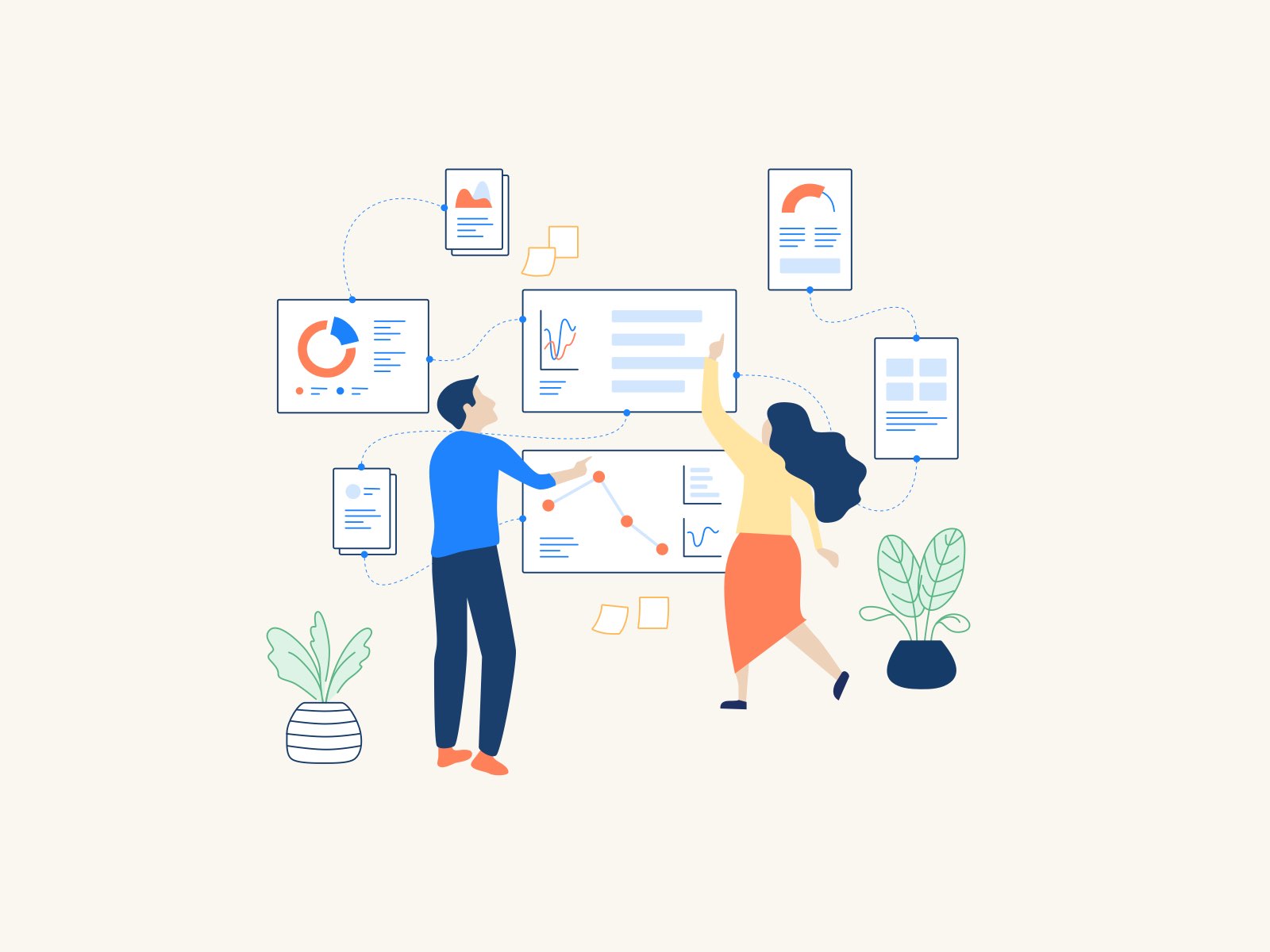
A prototype makes things tangible, something to base conversations on, which is especially important for digital products, where the key focus is users interacting with something.
Prototypes can come in many forms. The type of prototype depends on where you are in the design phase, how much budget you have, and the goals for that particular prototype.
Generally, they'll be shallow in detail early on, maybe on paper and just as sketches.
Where to start with a prototype?
The best starting point is user journeys as raw sketches of each of the steps in that flow.
I'll be writing a separate article on user journeys to expand on what it is, why you need it, and how it can be done.
Let's say you already have user journeys, and the next step will be to link them together to see how the journeys flow. Basically, this is about interactions your user might have in the app or a website.
The benefit of doing this is that you can make changes quickly, even on the spot in front of users, if possible when you're doing usability testing.
It's kind of good that it looks low-level and unfinished because it means you can focus on how it works in the flow and not get caught up with how it looks.
Wireframes
The wireframe is a common term for a drawing of a digital screen. It shows where things are and how they link together. It's called a wireframe because it consists of simple lines and boxes linked together.
I recommend using the black and white color palette and sticking to this simplicity on detailed wireframes and prototypes.
It shouldn't contain any graphics or the exact pictures and text that will be there.
Colors and visual details like imagery or unnecessary icons can be distracting, and it will be hard to concentrate on the main goal.
The goal is to take your user journeys, describe the goals and the steps then explain what's there and how it works by creating basic wireframes.
It's important not to get too detailed too soon.
The more detail there is in design, the more effort it takes to make a change. And at this stage, you're going to be moving things around a lot.
Fidelity means the level of detail.
Starting at low fidelity means things are elementary sketches and flows. As your design progresses, you move to higher fidelity, and you add more details, refine your design, and come closer to the real experience.
You can do user testing with wireframes at all stages of fidelity. But more on this will be in a separate article on user testing specifically.
Wireframes are made up of a few standard elements that we use to plan how everything fits together.
First of all, navigation and menus. The content will come from your information architecture, and now is the time to plan where it will be on the page and how everything will be linked.
Different screen areas where pictures or blocks of text or videos can be designed as boxes for simplicity. It would help if you also thought about the input fields. So you have elements where a user can type in something. When you're at low fidelity, you might just put a placeholder block to mark a space for specific needs, for example, card payment details.
As you move through to higher fidelity, you'll want to specify actual labels and the exact fields you would use.
You should also add any other things that a user interacts with on the page and links to other places.
In most cases, your design should be responsive.
We are now at an age where people use different-sized mobile and tablet screens just as much as traditional desktops. There is a way for designing for all of these at once.
Simple wireframes can be a great way to understand how things fit together to fulfill your user journeys. But it can become complicated if you have lots of different journeys or lots of different links. You can't really see how the real experience and flow will be.
Here is a wireframe example I did for one of my client projects:

Interactive prototypes
Creating an interactive prototype means drawing it in a design tool and actually adding actions into it, meaning if you click on a button, it takes you to another page or a screen. Or a user can really type into the input field.
There's no real system behind it. But you can actually create a very real-life experience for your users.
Interactive prototypes can go from elementary wireframe-style drawings through to a perfect replica of how your website will look.
They're beneficial for testing the logic and flow and finding gaps or inconsistencies that you wouldn't have noticed in static wireframes and sketches.
Also, it's handy for communicating your design to your users and usability testing, to your technical developers who might have to build the thing, and any other business stakeholders you might have.
Individual UX designers can do prototypes.
This is not something that only agencies can provide due to more resources than individual specialists. Also, product managers are not always aware of all platform architecture specifics, such as iOS guidelines and human behavior in apps.
Technologies these days allow solo UX/UI designers to do this part of the project by themselves.
Different software, UI kit libraries, and Frameworks help to automate this process significantly.
Here is an example of one library that helps automate a designer's process and significantly speed up the prototyping process.
Of course, paper prototypes can be done even faster and do not require any hardware or software. They are good on the idea level as a low-level visual concept, but it's far away from a real product that you can interact with.
Max Snitser
Whether it's website design and development, app design and development, digital product design, or luxury branding and upscale design, my goal is to create designs that are aesthetically pleasing, visually appealing, and functionally intuitive. With a mastery of user experience (UX) and user interface (UI), I craft solutions that bring ideas to life, produce high-quality work, and build strong relationships with clients.
Contact Max