What The Difference Between UX Design For IOS And Android
Written by

Max

Sometimes, I have clients who want to create a mobile application. But they do not specify a platform. iOS applications could be different from Android applications, especially from the UI design perspective. We have different guidelines and design principles for both platforms.
In this post, I want to highlight those design principles. And talk about how we can create a design that will work for both platforms. And what mistakes can we have on the way of doing this kind of work?
"Back" Button
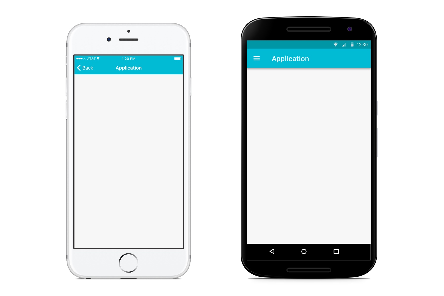
iOS users are familiar with seeing a distinct "back" button on the upper left of the navigation bar. It appears when users proceed past the first level hierarchy of the app. And serves as a way to get back to the main or previous screen. Normally, it appears with the left edge shaped into an arrow pointing left.
Android doesn't have a "back" button in the top area. Instead of this, it has a navigation bar at the bottom of a device. And "back" button serves as a global control to go back whenever you are located in the app or Android native apps.
Some sources tell us that we should not make the "back" button different from our guidelines. Since by pushing our concept, we are forcing our users to relearn. But if we create a cross-platform app, we need to think about what we are building from the UX point of view. We'll explore several examples later in this article.

Tab Bar
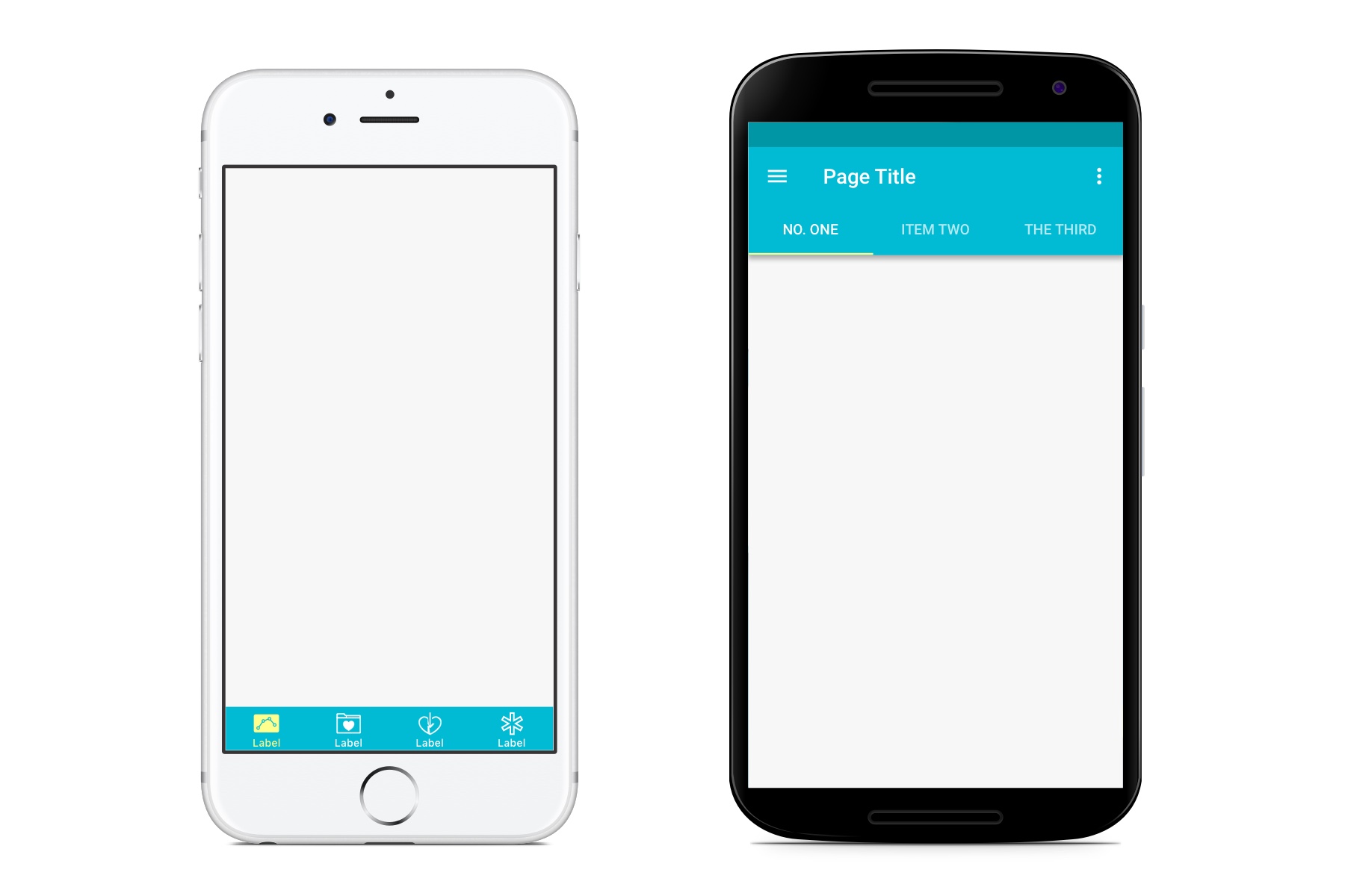
Avoid using bottom tab bars on Android. Instead of this, you can place it in the top area. It could be text buttons, icons, or icons with text labels as a type of tabs. Depends on your target audience and the complexity of a design solution.

Screen sizes
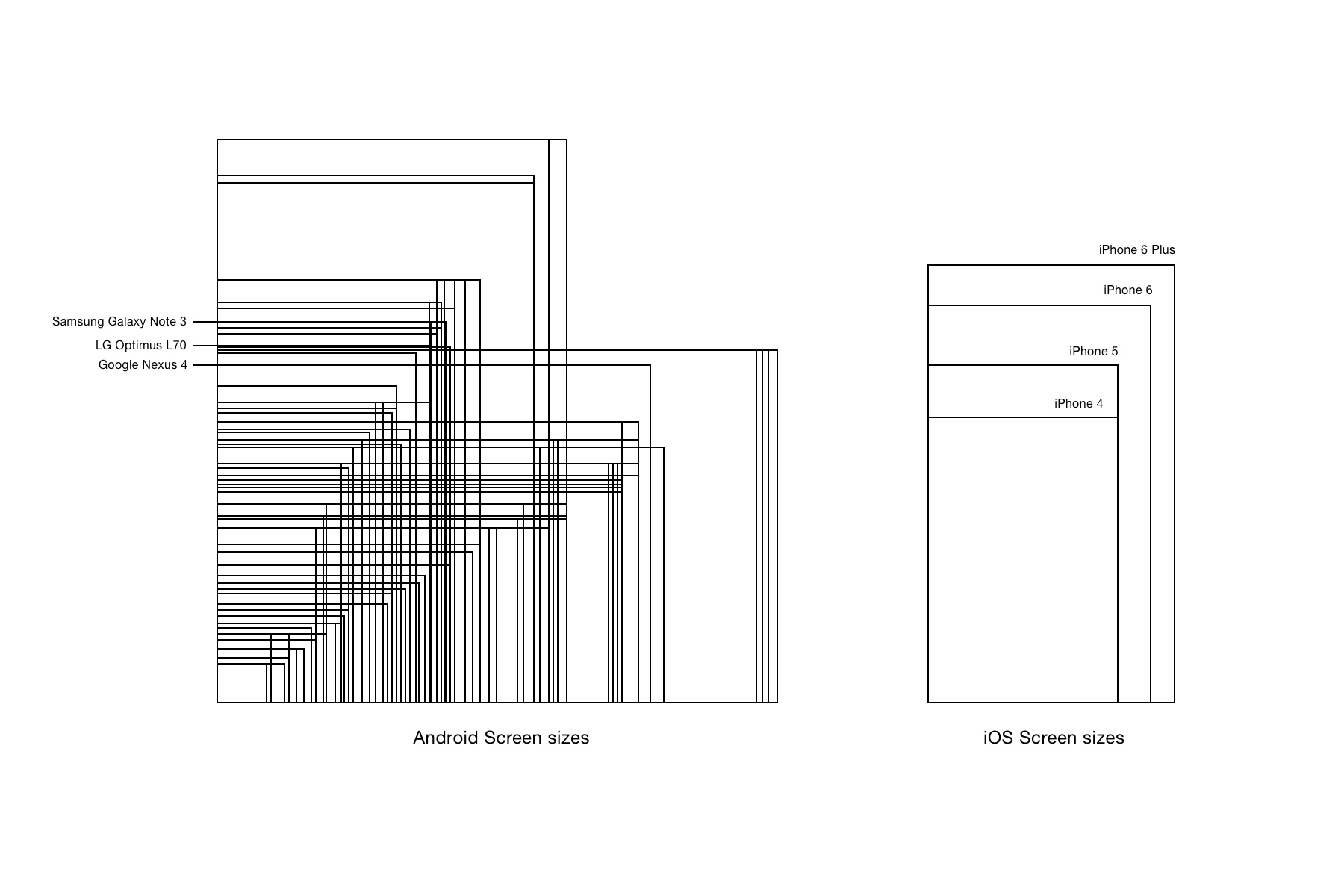
Look at the scheme below with a bunch of screen sizes of Android compared to iOS mobile devices. It's a mess on the left side.

But still, we can work with it. All that we need to do is have a little bit more patience, a clear head, and the ability to search for a simple solution.
Let's make it simple.

As you can see, we use several terms, such as Retina, Non-Retina, HDPI, XHDPI, etc. On Android, the key unit of measure is the density-independent pixel. The purpose of this is to make sure that the design has a consistent physical size across a bunch of devices.
The definition for DPs on Android is simple: 1dp = 1px @ 1x in case when 1x Android device has 160dpi screen).
iOS has only 2 types of screens. The first type is "Non-Retina," The second that we commonly use nowadays is "Retina." It's more simple for understanding since retina displays have a density of 2 times bigger than non-retina. And if designers prepare graphics for iOS, they just need to export two versions of it (@1x and @2x).
It's better to design these graphics using vector software like Sketch or Illustrator. This approach makes math a lot easier. And prevents us from the poor quality of graphics that we normally get from raster images.
Common Display Sizes For Both Platforms
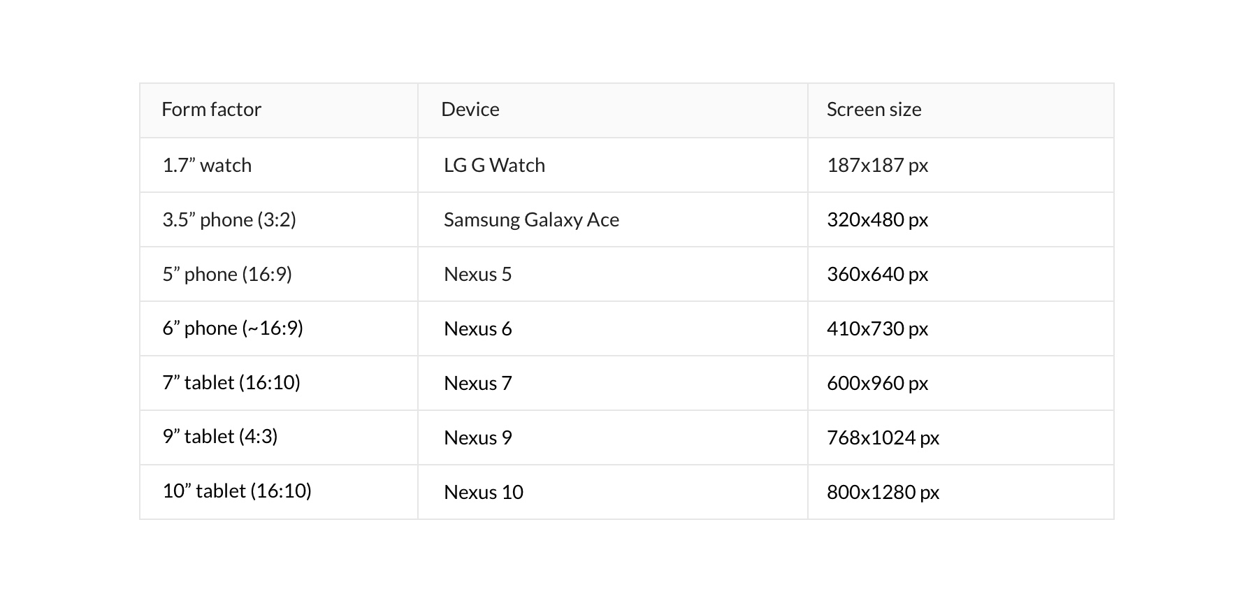
Take a look at the table below with the screen sizes for the most common Android devices.

And the table with screen sizes for iOS devices.

Export Of Graphics
Make sure that you have graphics like icons or other static assets for the key densities.

Material design Or New Android Guidelines
Google announced Material Design on June 25, 2014. And nowadays, we can see a lot of apps using this style. It has specific terms and restrictions, mostly in the case of animations. It's a good experience, and Google has good ideas for design. Moreover, I think Material Design is great.
"Material design is about interactions with layers and components in a fluid, intuitive way. When it's implemented well its truly pleasant to use."
However, I don't think that we should take it as a common rule for the design of our apps. Especially in the case when we develop an app for both platforms, iOS, and Android.
Cross-platform Apps Design And Guidelines
I like flexible design that looks similar on both platforms. I'll show you several examples of apps and how they look like on both platforms. But this is my point of view. The best thing that we can do is to learn our target audience before we start work on a design since we should know what kind of people will use and what devices they use in the majority.
Android users think a little bit differently from iOS users because both platforms have distinctive cultures in their apps and UX.
When you provide a solution for different form factors and people collaborate with your app with different hardware - it's another story. It would help if you worked on a solid solution that looks similar for different devices as much as possible. You build your own user experience and use different platforms because of the broadened target audience. Or you develop a solution for team players. It makes sense to focus on a solid cross-platform solution.
I think that Instagram did a great job with its app. Instagram looks almost identical for both platforms. And it makes sense because they build their own user experience.

More Examples Of Cross-platform Applications
Airbnb uses guides of both Android and iOS. They placed a tab bar in the top area on the Android version and the bottom area on the iOS version.

Kayak doesn't use Tab bar in the bottom area for its app either. They use the main navigation on the very first screen, which is not good for UX.

Resuming all that said above, designers of mobile applications should know guidelines. Or, at least, the most common patterns and interactions. But the key factor is still good research of a target audience. It's good for design, and it's good for a business. Do not forget about devices requirements when you develop a cross-platform design. And be consistent.