Five Points Learning
UX/UI Design
We've built an interactive app to improve communication between students and schools, speed up the process of testing, logging the data etc.
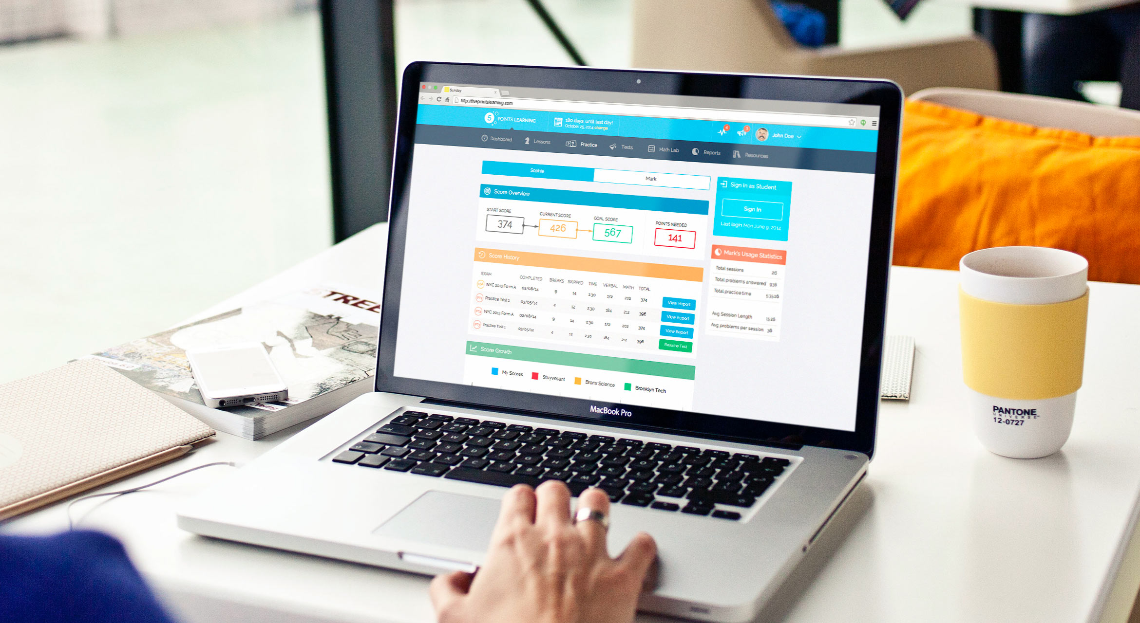
Dashboard
This is the main the screen that students start from and it required special attention to design it. Basically, it consists of the main important metrics of the app and students can go on lower levels of interaction with the app. So and with their education entity.
To avoid using a dry language and facts we’ve focused on showing data in a visual way where it’s possible. And we wanted to build a certain atmosphere around the UX we built. So all types of users feel it vibrant and fun to use and achieve any results with the app.
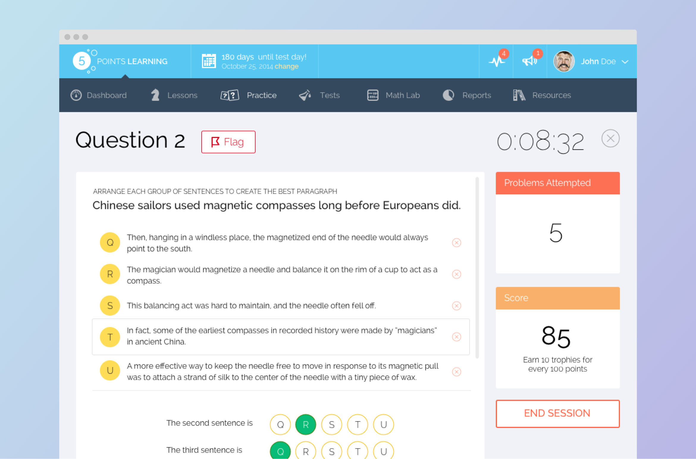
Question
This is the testing area where students can be tested on their knowledge of a topic. We’ve continued the same approach with cards and widgets that we established on the dashboard. It makes the user interface consistent and easy to use. Everything in the place and serves its purpose.
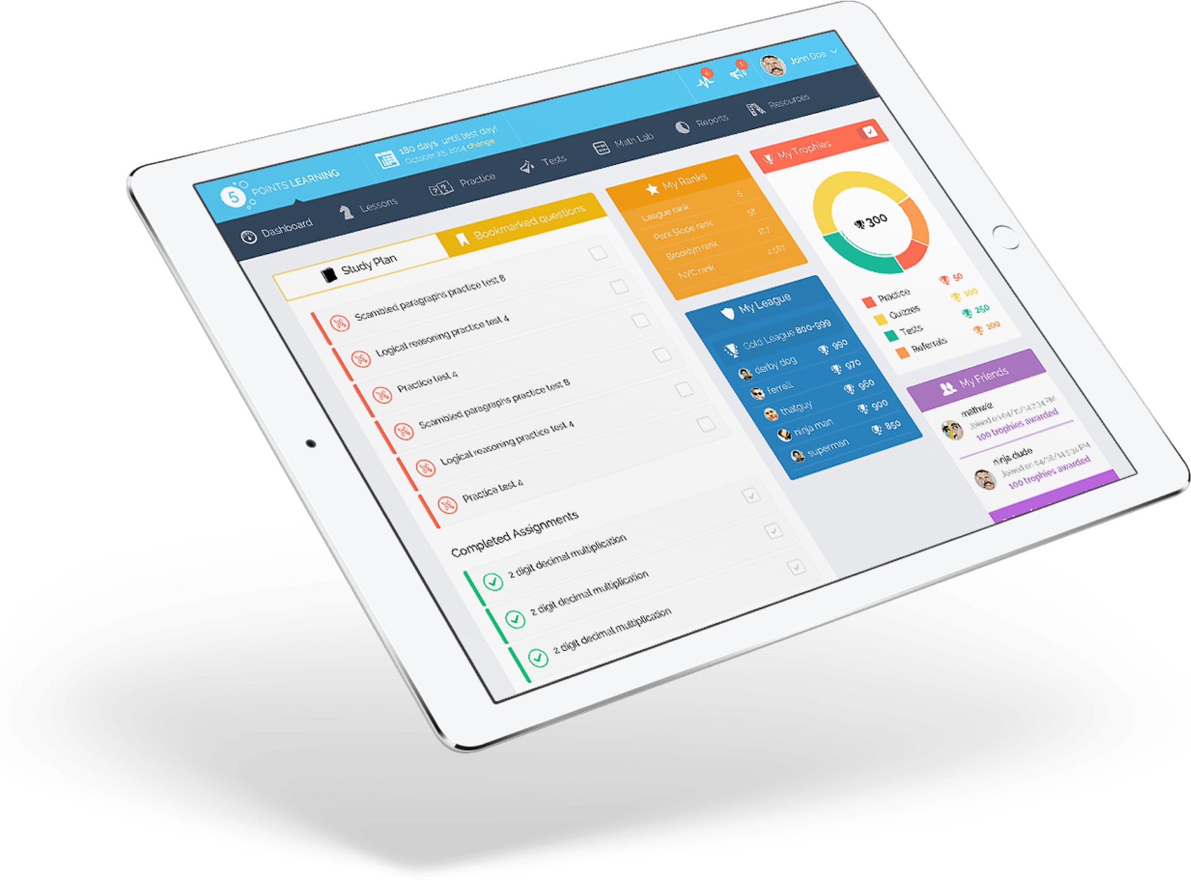
Test Results
After the testing, you can check the results and progression of scores to have an idea about strenghts and weaknesses. Alos, we’ve worked on showing up such insights as score history, score growth etc.
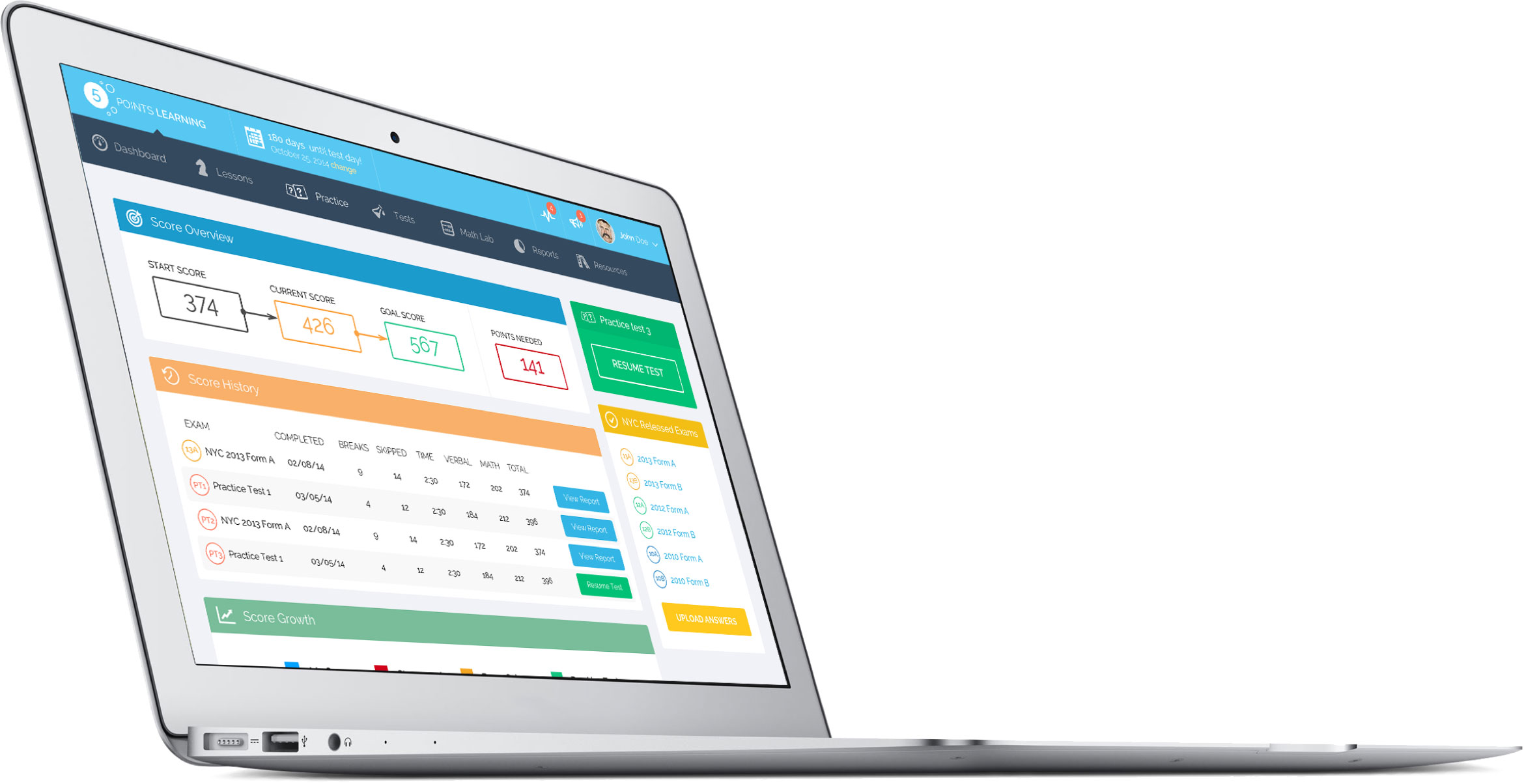
Detail Report
On the lower level of reports, you can see detailed info. We’ve pushed hard to make as detailed as possible. The main challenge was to gather all the necessary data and organize it in easy to consume and understand format. The other challenge here and on the upper level was the navigation between different types of data and going up and down between levels of interaction.


Settings & Other screens
We’ve created a bunch of different flows, supportive screens to cover every case that can emerge in the app. Also, delivered the UI with all the states and consulted Five Points Learning about the best way to implement it with their development team.