Visual hierarchy on landing pages: design tips to guide user eyes to convert

Let's talk about something that separates amateur landing pages from the ones that actually make money: visual hierarchy. You know those pages that just feel right? Where your eyes glide effortlessly from headline to CTA button without conscious effort? That's not magic—that's intentional design at work.
After years of building landing pages for various projects, I've learned that visual hierarchy isn't just about making things pretty. It's about creating a silent conversation between your design and your visitor's brain. And when you get it right, conversions follow naturally.
Why Visual Hierarchy is Your Secret Weapon
Here's the thing: people don't read landing pages the way we designers wish they would. They scan. They skim. They make split-second judgments about whether your offer is worth their time. Studies show you have about 50 milliseconds to make a first impression—that's faster than a blink.
Visual hierarchy is how you control that chaotic scanning process. It's the art of arranging elements so that the important stuff screams while the supporting details whisper. When you master this skill, you're not just pushing pixels around—you're orchestrating an experience that naturally guides visitors toward conversion.
The wealthy brands you admire? They've invested heavily in understanding this principle. Their landing pages don't just attract eyeballs; they direct them with surgical precision.
The F-Pattern and Z-Pattern: Your Foundation
Before we dive into specific tactics, let's talk about how people actually look at screens. Eye-tracking studies have revealed two dominant patterns: the F-pattern and the Z-pattern.
The F-pattern happens on text-heavy pages. Users read across the top, scan down the left side, then make shorter horizontal movements as they go. Picture the letter F. This is why your most critical information needs to live in that top-left quadrant and along the left margin.
The Z-pattern works better for simpler, more visual layouts. Eyes start at the top-left, travel to the top-right, diagonal down to the bottom-left, then across to the bottom-right. This pattern is perfect for landing pages with minimal copy and strong visual elements.
Understanding these patterns means you can strategically place your headlines, value propositions, and CTAs where eyes are already going. You're working with human psychology, not against it.
Size and Scale: The Obvious Power Move
Let's start with the most straightforward tool in your arsenal: size. Bigger elements attract more attention. Simple, right? But here's where designers often trip up—they make everything big, which creates visual chaos and dilutes the hierarchy.
Your headline should dominate. I'm talking 48px minimum for desktop, often pushing 60-72px for hero sections. This isn't being loud for the sake of it; it's acknowledging that the headline carries your core value proposition. If visitors miss your headline, they miss everything.
But here's the nuance: your subheadline should be noticeably smaller—maybe 60% the size of your main headline. This creates contrast and establishes a clear reading order. Then your body copy drops down further, perhaps to 18-20px. Each step down in size tells users what to prioritize.
I constantly see designers make the mistake of treating all text elements equally. Your CTA button text, testimonial quotes, benefit statements—they all need their place in the size hierarchy. The goal isn't to make everything readable (though that matters); it's to make the right things impossible to miss.
Color Contrast: Drawing Eyes Like Moths to Flame
Color is emotional, psychological, and incredibly powerful for directing attention. High contrast creates focal points; low contrast recedes into the background. It's that simple and that complex.
Your primary CTA button should have the highest color contrast on the page. If your background is white and your brand colors are blue, that button better be a vibrant blue (or an accent color) that pops off the page. The button shouldn't blend—it should demand clicks.
But here's a pro move: use color sparingly for emphasis. When everything is bright and colorful, nothing stands out. I like to work with a mostly neutral palette (whites, grays, maybe a soft background color) and then deploy bold colors strategically on CTAs, key benefits, or important statistics.
Think of color like seasoning. A well-aligned design palette might use one or two accent colors consistently throughout the page. This creates visual cohesion while maintaining clear hierarchy.
Dark backgrounds with light text can work beautifully for creative agencies or tech products—they feel modern and premium. But make sure your contrast ratios meet accessibility standards (WCAG recommends 4.5:1 for normal text). A gorgeous design that's hard to read converts nobody.
Typography: More Than Just Pretty Fonts
Typography is where artistic sensibility meets functional design. The fonts you choose and how you deploy them communicate tone, establish hierarchy, and guide reading flow—all simultaneously.
Here's my typical approach: one font for headlines, another for body copy. Sometimes I'll use a single font family but play with weights—bold for headlines, regular for body, light for captions. The key is creating clear distinction without creating visual discord.
Headlines should feel substantial. Display fonts, bold sans-serifs, or heavy serif fonts work well here. They command attention and set the tone for your brand. Body copy needs readability above all else—clear, familiar sans-serifs or traditional serifs work best. Save the decorative fonts for accent elements.
Line height matters more than most designers realize. Cramped text feels claustrophobic and difficult to process. I typically use 1.5-1.7 line height for body copy, giving the text room to breathe. Headlines can be tighter (1.2-1.3) since they're shorter and larger.
Letter spacing (tracking) is another subtle tool. Increasing letter spacing in headlines or CTA buttons can make them feel more premium and easier to scan. Decrease it too much, and text becomes a blurry mess. The skills required to fine-tune typography come with practice and lots of squinting at screens.
White Space: The Ultimate Luxury
White space—or negative space—is the most underrated element of visual hierarchy. It's not wasted space; it's breathing room. It's what makes your design feel expensive, intentional, and easy to navigate.
Premium brands use white space generously because it signals quality. Cramped designs feel cheap and overwhelming. When you give important elements space, you're telling visitors, "This matters. Look here."
I constantly remind myself: every element doesn't need to be visible above the fold. Scrolling is natural now. What matters is that the most critical information—your headline, value proposition, and primary CTA—have enough white space around them to stand out.
Use white space to create visual groupings. Elements close together feel related; elements with space between them feel separate. This is basic Gestalt psychology, but it's incredibly powerful for organizing information hierarchically.
Strategic Use of Imagery and Visual Elements
Images aren't just decoration—they're hierarchy tools. The right image in the right place draws attention and reinforces your message. The wrong image clutters and confuses.
Hero images should support your headline, not compete with it. I prefer images where the focal point directs eyes toward the text and CTA. For example, if your hero image features a person, have them looking toward your headline or CTA button. Human faces attract attention, and the direction of gaze influences where visitors look next.
Product screenshots, mockups, and demo videos are powerful social proof elements, but they need to be strategically placed. I typically position them to the right of key copy on desktop (playing into the F-pattern) or below copy on mobile.
Icons can reinforce benefit statements and break up text, but use them consistently. If you're using line icons for your features section, don't switch to filled icons elsewhere—it breaks visual cohesion.
One creative trick: use directional cues. Arrows, pointing gestures, or even abstract shapes that lead the eye toward your CTA. These subliminal guides work incredibly well when subtly integrated.
The CTA Button: Where Hierarchy Meets Conversion
Everything we've discussed builds toward this moment: the CTA button. This is where visual hierarchy directly impacts whether you make money or lose visitors.
Your primary CTA should be the most visually prominent element after your headline. Large enough to notice immediately (I rarely go below 50px height), contrasting enough to pop off the page, and positioned where the eye naturally lands after reading your value proposition.
Button copy matters too. "Submit" is boring and vague. "Get Started," "Claim Your Spot," or "Start Creating Today" is specific and action-oriented. The language should be aligned with your brand voice and the specific action you want visitors to take.
One design pattern I use constantly: the primary CTA is bold and bright, while secondary CTAs (like "Learn More" or "Watch Demo") use ghost buttons or more subtle styling. This creates a clear hierarchy of actions.
Repeat your primary CTA strategically throughout longer landing pages. After explaining key benefits, after showing social proof, at the end—but make sure each instance is consistently styled so visitors recognize it immediately.
Creating Visual Flow with Layout
Layout is where all these hierarchy principles come together into a cohesive experience. The way you structure sections, position elements, and create visual pathways determines whether your page guides or confuses.
I typically work with a clear sectional structure: hero section with headline and CTA, problem statement, solution/benefits, social proof, secondary CTA. Each section should have a clear purpose and focal point.
Grid systems help maintain alignment and create professional-looking layouts. I usually work with a 12-column grid on desktop, which gives flexibility for different layout combinations. But don't be a slave to the grid—breaking it intentionally for emphasis can create powerful focal points.
Asymmetry can be more dynamic than symmetry, but it requires skill to execute well. One large element balanced against several smaller ones creates visual interest while maintaining hierarchy. The key is ensuring the design still feels balanced and intentional, not random.
Motion and Animation: The Advanced Hierarchy Tool
Subtle animations can reinforce hierarchy by drawing attention to specific elements as they enter the viewport. A gentle fade-in or slide-up animation on your CTA button as users scroll can boost conversions.
But here's the trap: too much motion becomes distracting. I use animation sparingly—perhaps on hover states for buttons, a subtle parallax effect on the hero section, or staggered animations for benefit cards.
The animation timing should feel natural, not sluggish or hyperactive. I typically stick to 0.3-0.5 seconds for most transitions. Fast enough to feel responsive, slow enough to be perceived and appreciated.
Testing and Iterating: Where Design Meets Data
Here's the reality: visual hierarchy isn't one-size-fits-all. What works for a SaaS product might fail for an e-commerce store. The only way to truly optimize is through testing.
I constantly run A/B tests on hierarchy decisions. Does a larger headline convert better? What about moving the CTA above the fold versus below? Different CTA colors? The data doesn't lie, and it often surprises me.
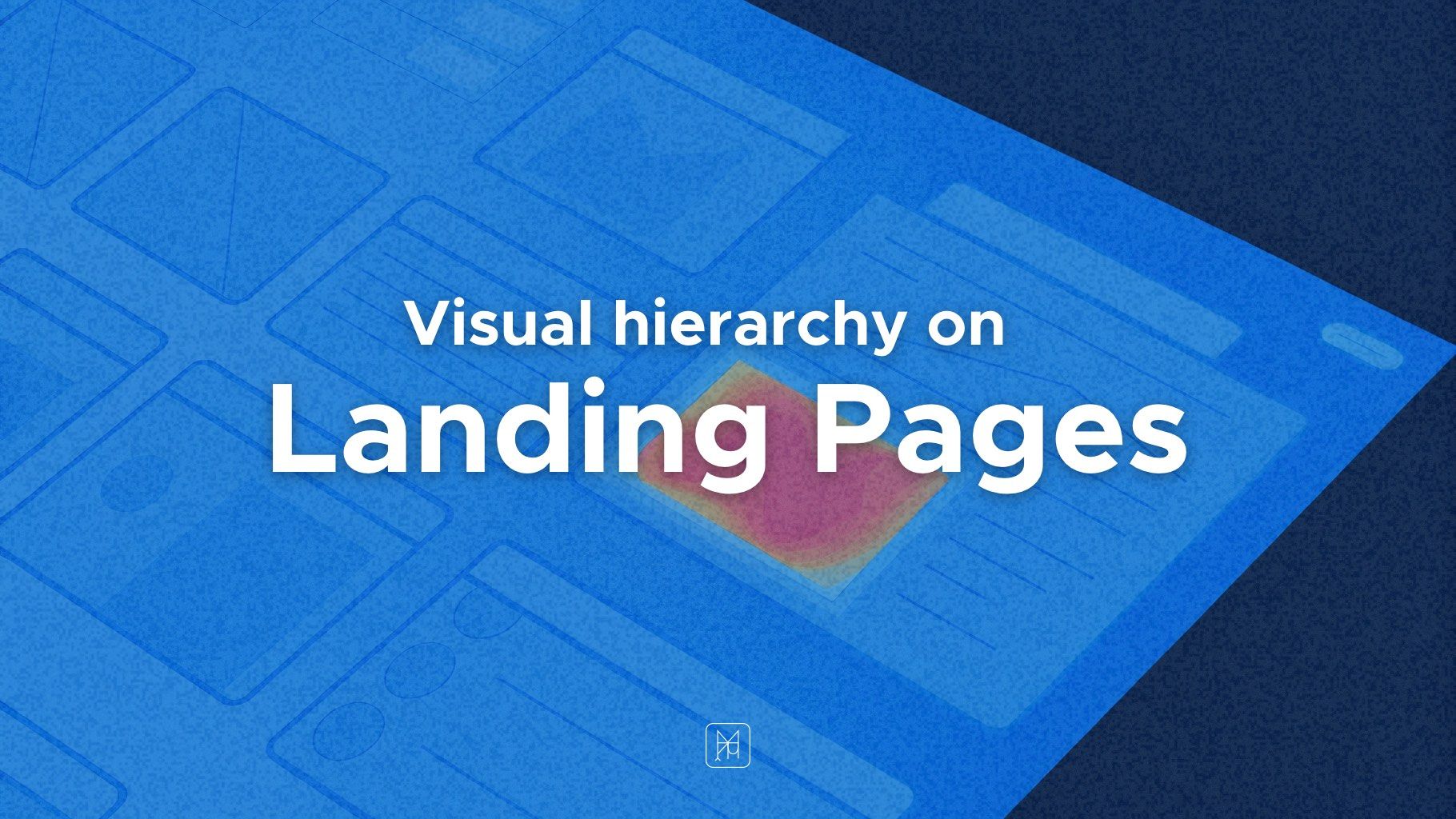
Heatmap tools like Hotjar or Crazy Egg show you exactly where users are looking and clicking. This feedback is invaluable for refining your hierarchy. If important elements are being ignored, you need to make them more prominent. If users are clicking non-interactive elements, you might have accidentally created a false hierarchy.
Mobile-First Hierarchy Considerations
Everything changes on mobile. That carefully crafted desktop hierarchy needs to adapt to vertical, thumb-driven navigation.
On mobile, hierarchy becomes even more critical because screen real estate is limited. Your headline, value proposition, and CTA need to work together in a much smaller space. I typically make text sizes relatively larger on mobile (compared to the screen size) to maintain hierarchy.
Thumb zones matter. The bottom third of the screen is easiest to reach, which is why sticky CTAs at the bottom of mobile viewports work so well. But your primary CTA should still appear naturally in the content flow first.
Simplify on mobile. Elements that worked as supporting details on desktop might need to be deprioritized or even removed on mobile. Every element should earn its place by contributing to the conversion goal.
The Wealthy Mindset: Investing in Hierarchy
Premium brands understand that visual hierarchy is an investment, not an expense. They allocate budget to skilled designers, conduct extensive user testing, and constantly refine their landing pages based on data.
This wealthy approach to design—prioritizing quality, investing in the right skills, and viewing design as a conversion tool rather than a cost center—is what separates six-figure landing pages from amateur efforts.
When you approach design projects with this mindset, you're not just pushing pixels. You're creating strategic experiences that attract qualified visitors and guide them smoothly toward conversion. You're building assets that compound over time, generating returns long after the initial creative work is complete.
Bringing It All Together
Visual hierarchy isn't a single technique—it's the orchestration of size, color, typography, white space, imagery, and layout working in harmony. When all these elements are properly aligned, they create a silent but powerful conversation with your visitors.
The goal is always the same: make it easy for people to understand your offer, believe in your value, and take the desired action. Every design decision should serve this goal.
Start with your most important message—usually your headline and value proposition. Make that impossible to miss. Then build a clear path from that headline through your key benefits and social proof, culminating in an obvious, compelling CTA.
Test your hierarchy by stepping back and squinting at your design. What do you notice first? Second? Third? If that order doesn't match your priorities, you need to adjust.
Remember, you're not designing for other designers or winning awards (though those are nice bonuses). You're designing to convert. Visual hierarchy is your tool for making that happen consistently, predictably, and profitably.
Now go forth and create landing pages that don't just look good—they perform. Your future clients and your bank account will thank you.
Max Snitser
Whether it's website design and development, app design and development, digital product design, or luxury branding and upscale design, my goal is to create designs that are aesthetically pleasing, visually appealing, and functionally intuitive. With a mastery of user experience (UX) and user interface (UI), I craft solutions that bring ideas to life, produce high-quality work, and build strong relationships with clients.
Contact Max