Landing Page Designed to Unlock Careers for 10,000+ Accountants
- Client
- GME Accounting,
University of Greenwich - Audience
- Qualified accounting professionals
- Type
- B2C
- Tools
- Figma
- Framer
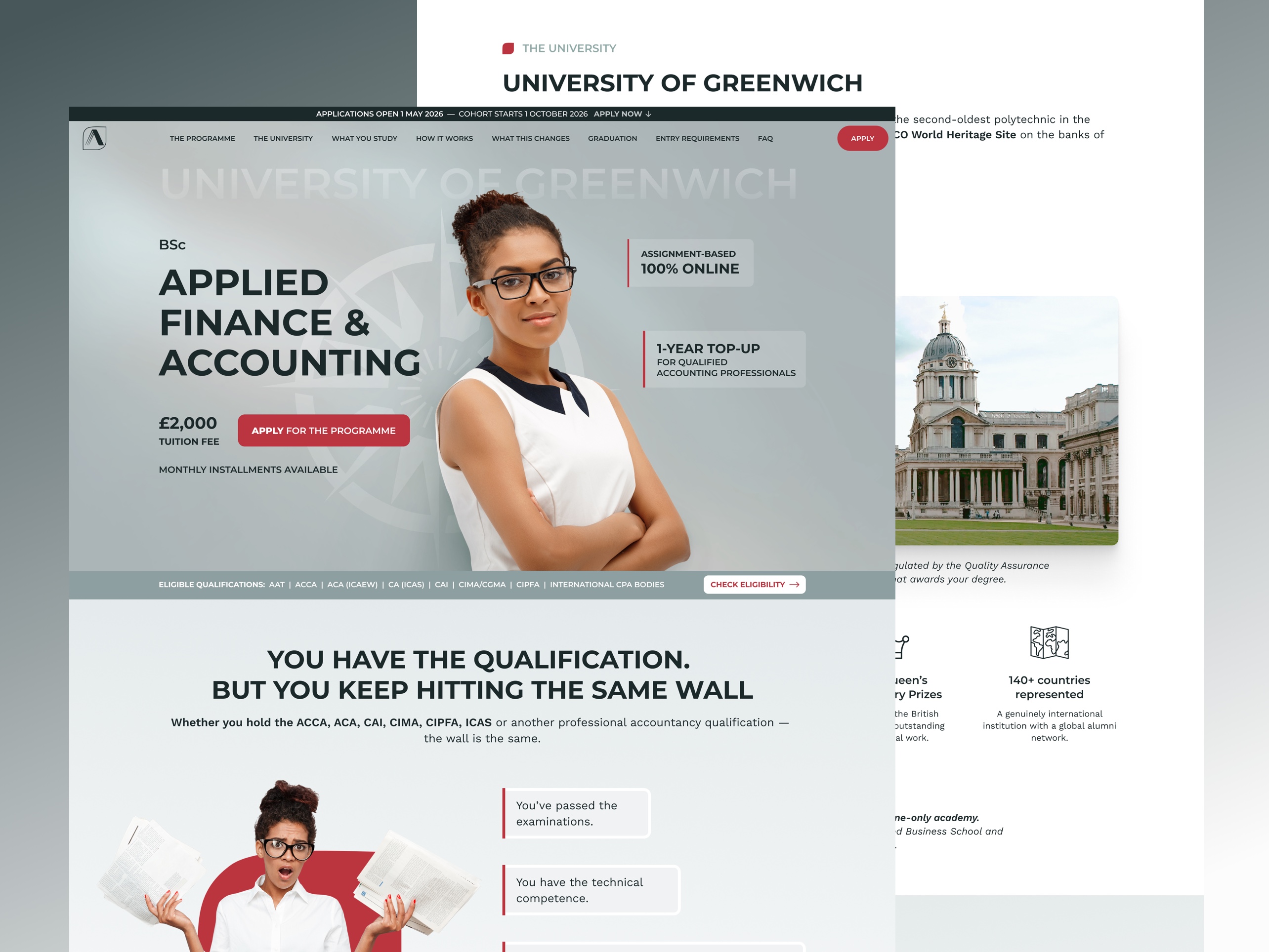
A single-page admissions site for a 1-year online BSc top-up programme targeting qualified ACCA, ACA, CIMA and AAT professionals worldwide. Designed to convert a highly specific audience who already know their problem — and need to believe this is the solution.

The Challenge
Employers, postgraduate institutions, and visa systems require an academic bachelor's degree
Qualified accountants holding prestigious professional credentials and have proven technical competence through rigorous examinations but cannot access senior roles, MBA programmes, or skilled worker visas without an academic credential.
The market gap was clear, but the audience was sceptical — they needed proof that a 1-year online programme was legitimate, affordable, and worth their time.
Solution
The design tackled five core conversion barriers
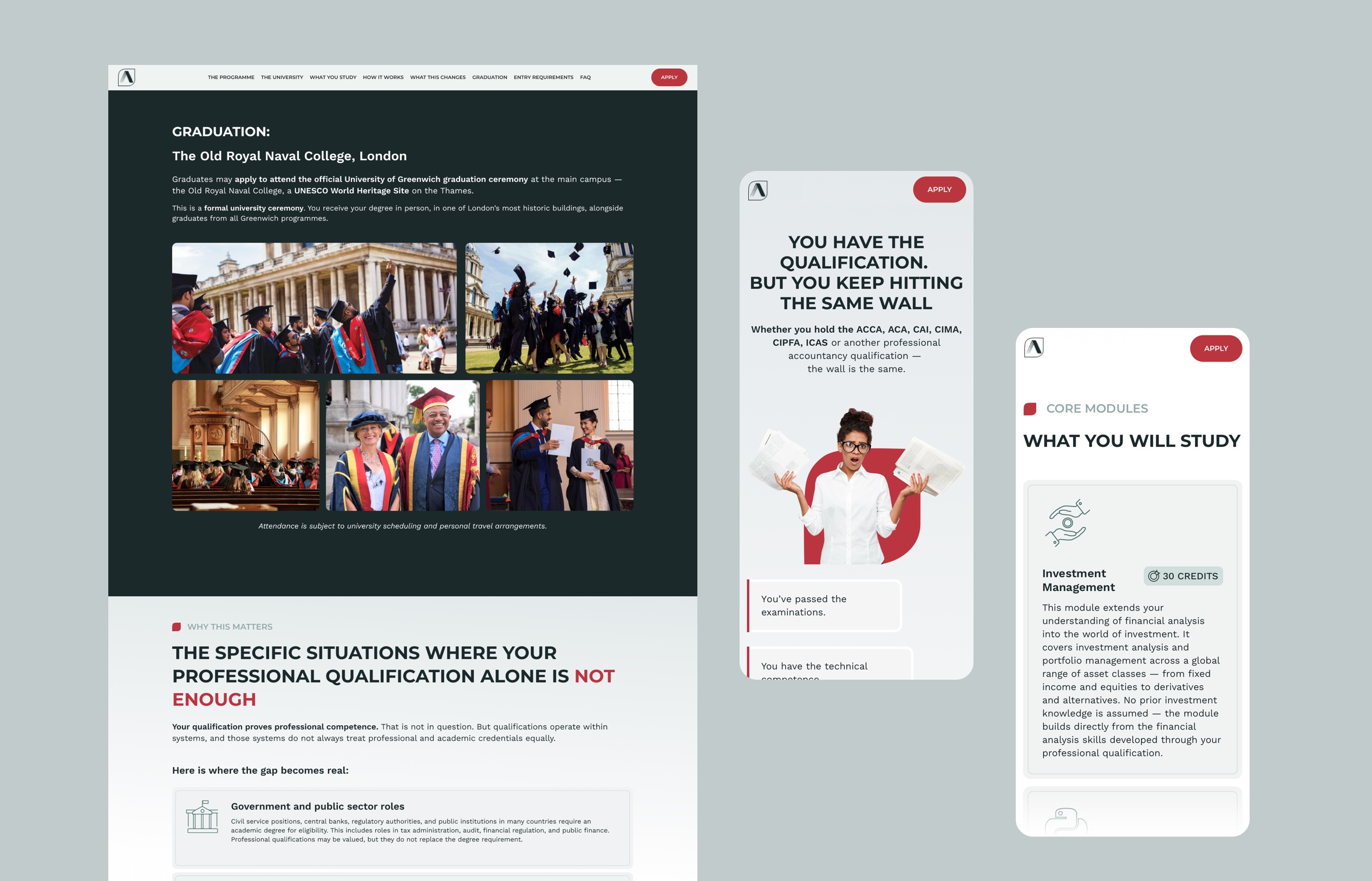
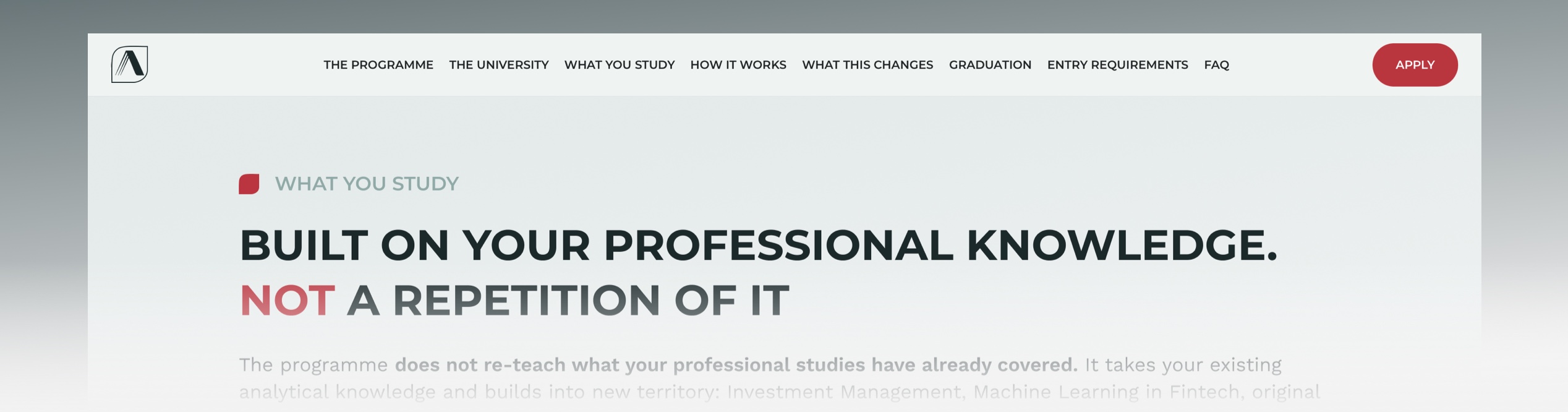
- Problem Recognition & Validation — opened with the user's specific pain point rather than product features to build immediate recognition and trust before any sales pitch.
- Credibility Through Transparency — layered trust signals throughout.
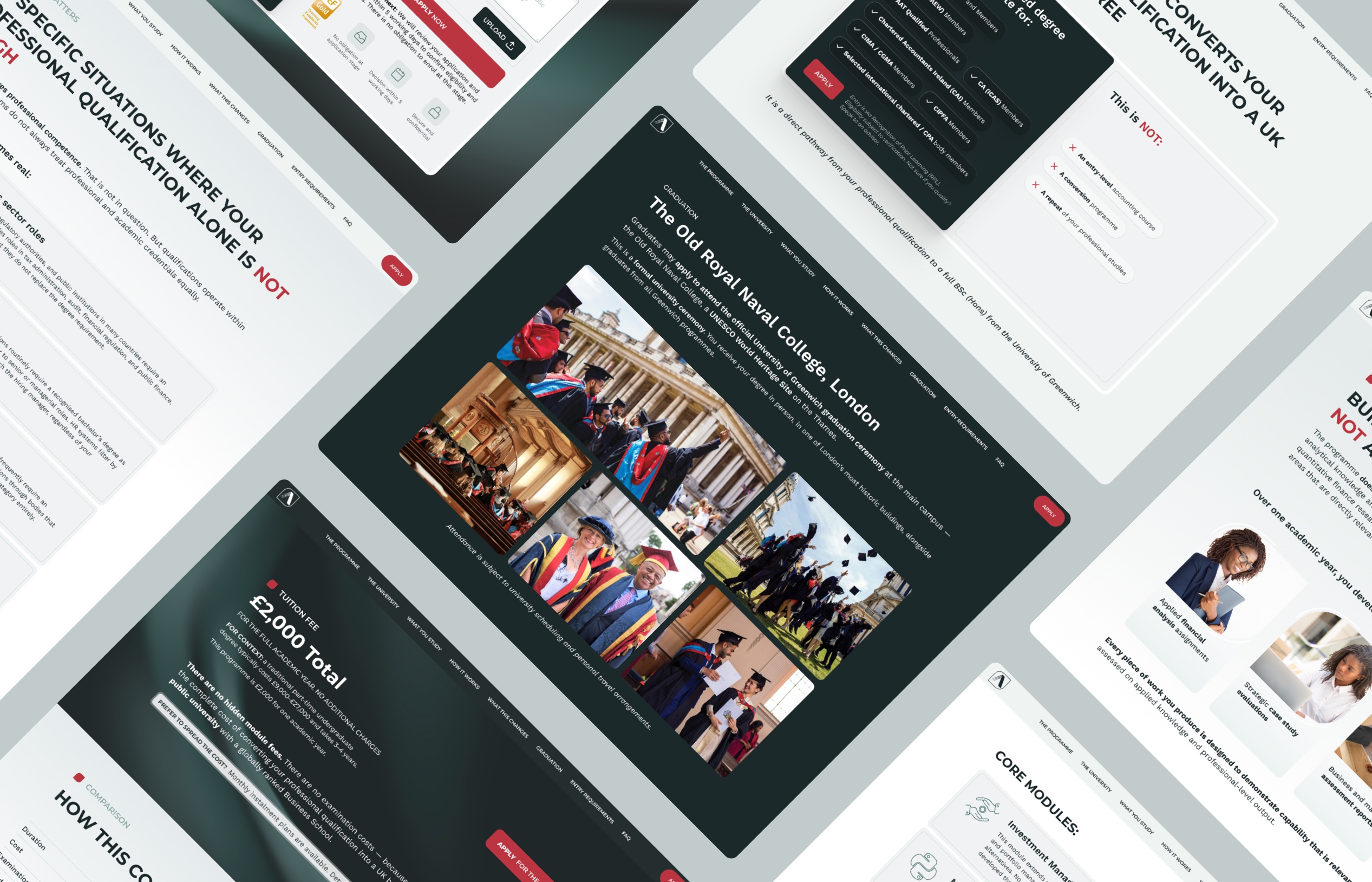
- Price as a Differentiator — displayed the £2,000 total fee prominently with a direct comparison table showing traditional part-time degrees cost £9,000–£27,000 over 3–4 years. This reframed cost from an objection into a competitive advantage.
- Low-Friction Entry Point — the application form requested only three fields (Name, Email, Professional Status) with explicit messaging.
- Contextual CTAs — rather than a single "Apply Now" button, the page offered multiple entry points.
VISUAL DESIGN
Clean, credential-forward, and built for a professional reading at pace.
LAYOUT & SPACING
High density, no wasted space — professionals read fast
Unlike a consumer education site, GME Accounting is intentionally content-dense. The audience will read it, not scan it. Section padding is generous enough to separate content clearly, but the page is not padded with breathing room that would force additional scrolling on a long page. Every screen of scroll should contain something worth reading.
NAVIGATION
Persistent anchor nav header
Nine anchor sections with a sticky top navigation allows a non-linear reading pattern — an ACCA professional who arrives already convinced of the premise can jump directly to Entry Requirements or How It Works without reading from the top.
PHOTOGRAPHY & IMAGERY
Campus architecture and finance-context visuals
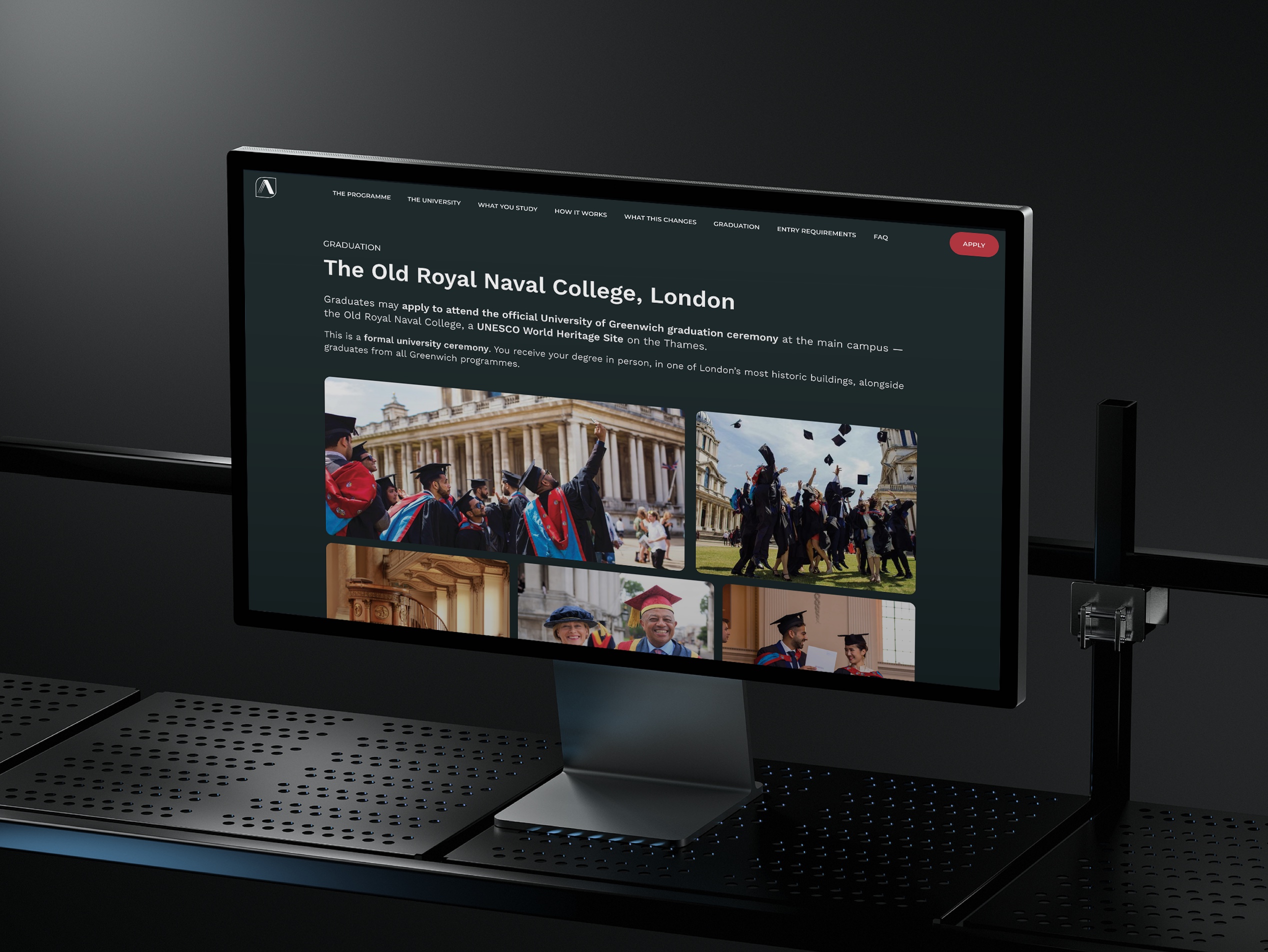
Full-width photography of the Old Royal Naval College — the same iconic London campus that anchors the university's credibility. This places the institution's physical reality. A professional accountant who has never heard of University of Greenwich sees a UNESCO World Heritage Site on the Thames and recalibrates their prior assessment of the institution.
LAYOUT & SPACING
High density, no wasted space — professionals read fast
Unlike a consumer education site, GME Accounting is intentionally content-dense. The audience will read it, not scan it. Section padding is generous enough to separate content clearly, but the page is not padded with breathing room that would force additional scrolling on a long page. Every screen of scroll should contain something worth reading.
12 Columns Grid System
Precision-engineered flexibility. The 12-column grid system ensures every element of the site is positioned exactly right. Content adapts fluidly across devices while maintaining visual harmony and professional polish.
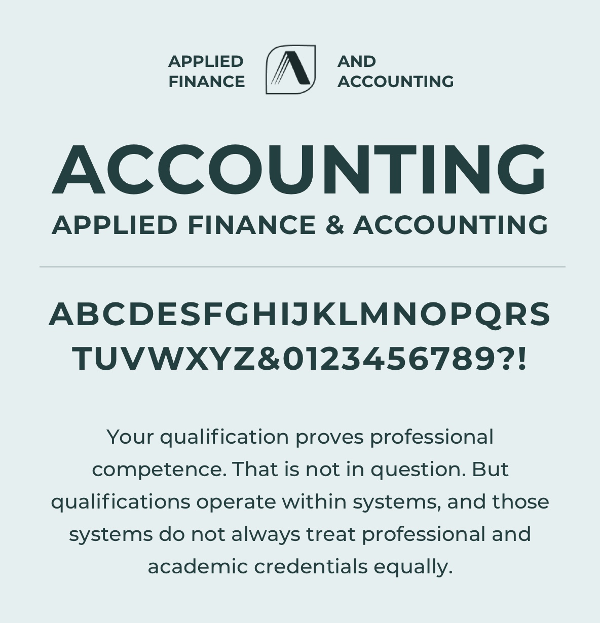
Typography
Uppercase mono labels + serif display + light sans body.
web design overview
A conversion-focused single page built for a professional audience with a specific, urgent problem.
The visual language was chosen to match the seriousness of the audience and the institution. Near-black primary surfaces with clean white content areas carry the weight of an established academic institution rather than an EdTech platform.
The site is built entirely in Framer, designed to perform on mobile first — the audience is globally dispersed. It is designed to do something difficult: convert a highly intelligent, professionally credentialed, and appropriately skeptical audience on a programme that is genuinely unusual in structure and genuinely exceptional in value — without ever sounding like it is trying too hard to do either of those things.
Key Takeaway
This case study demonstrates how problem-first design, radical transparency, and preemptive objection handling can convert a sophisticated, sceptical audience by addressing their specific barriers to trust and action — rather than leading with product features.