GME — authority at scale, for a B2B audience
- Client
- GME, Dubai Marina
- Audience
- Governments, universities, institutions
- Type
- B2B
- Tools
- Figma, Framer (multi-page)
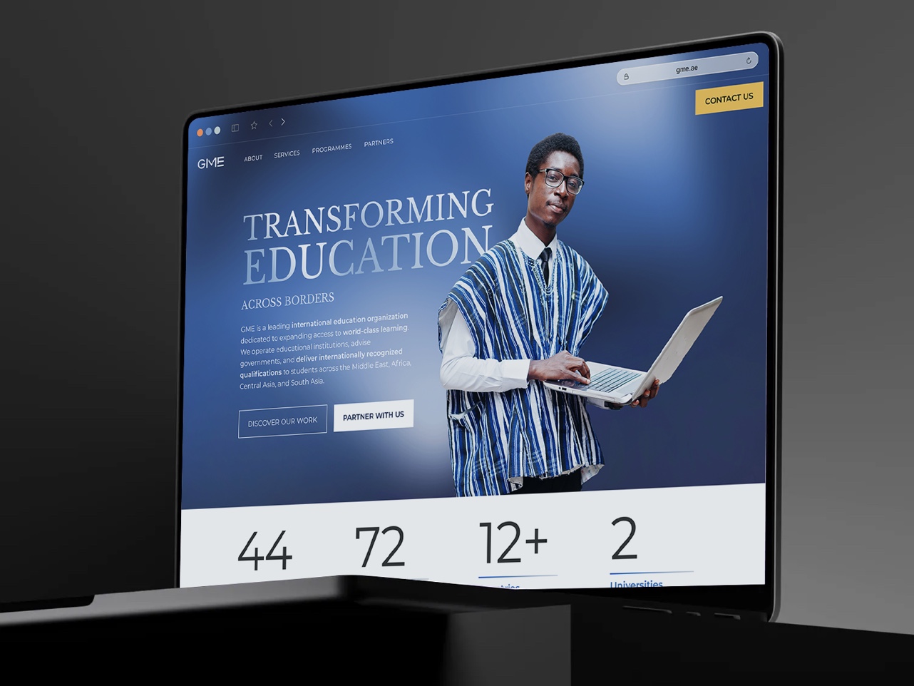
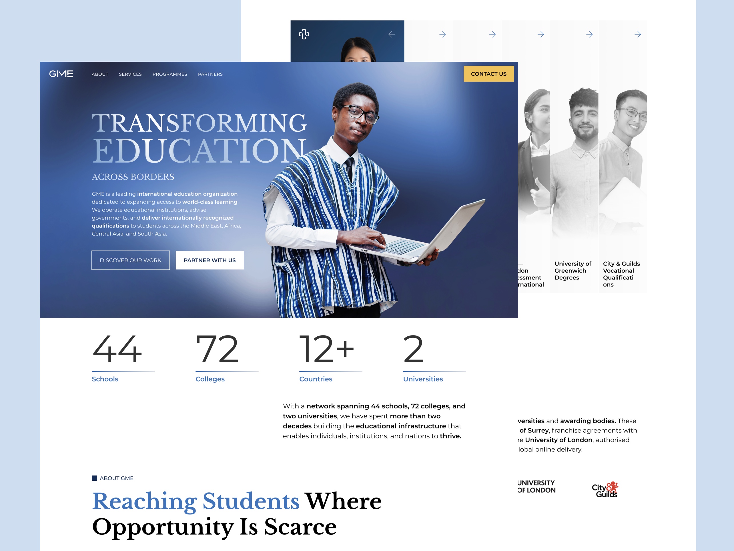
A multi-page corporate website for a Dubai-headquartered international education organisation operating across 20+ countries. Designed to earn the trust of governments, ministries, and university decision-makers — not students.
The Problem
The audience doesn't want to be sold to — they want to be convinced.
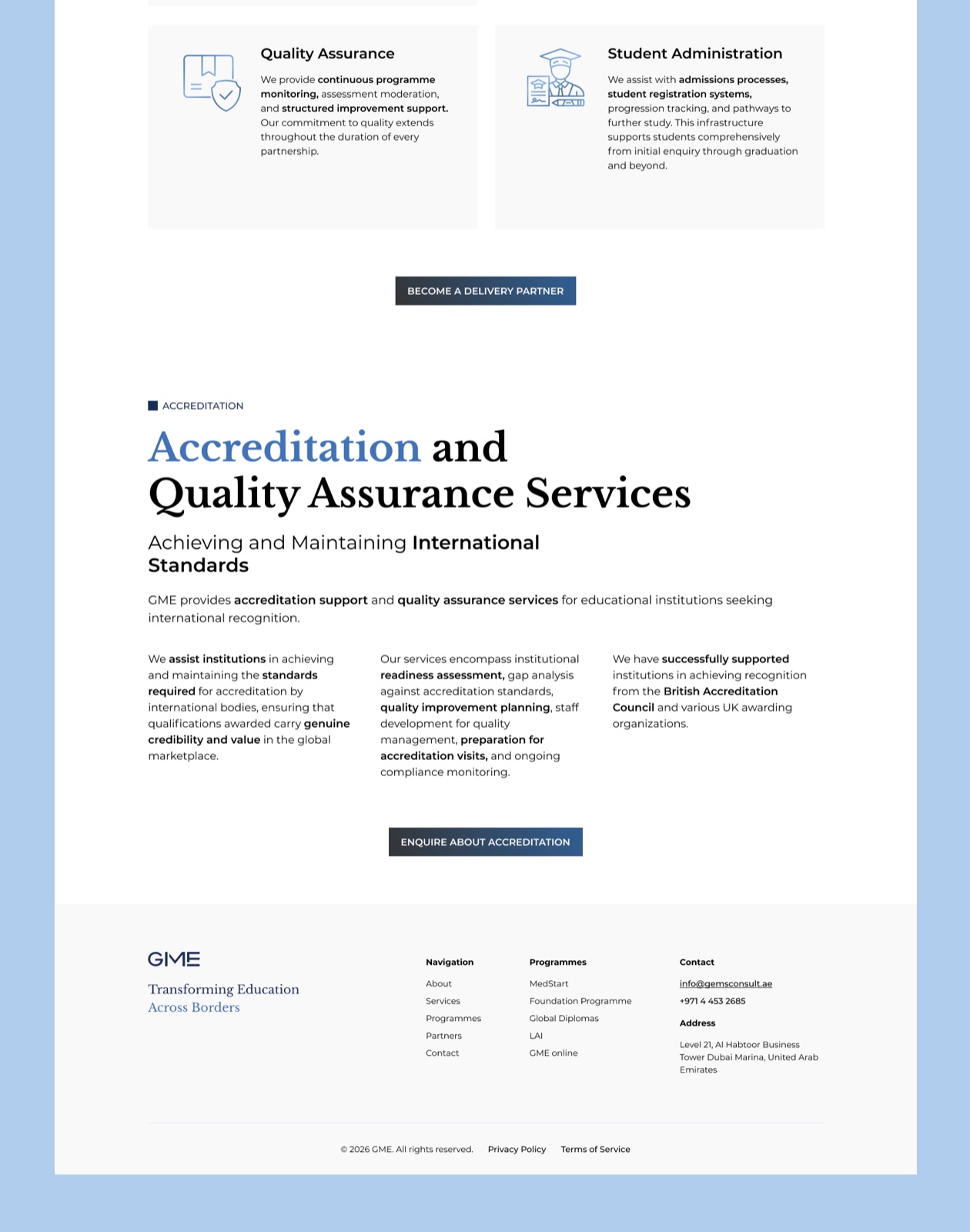
GME's buyers are institutional. A ministry official deciding whether to engage a strategic education advisor doesn't browse the way a student does. They read. They look for evidence of depth, regional knowledge, and track record. They will open the About page and read every line of the leadership section. They will look at the case study and ask whether the challenge described resembles theirs.
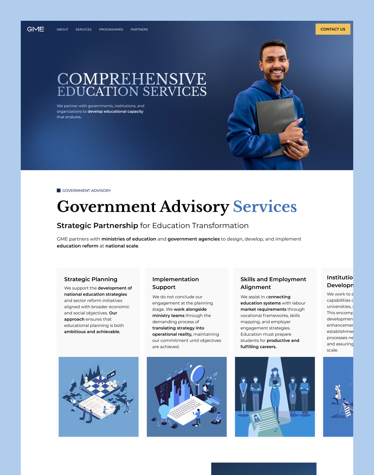
How do you present an organisation with three distinct service lines (government advisory, institutional partnerships, programme delivery), a 20+ year track record, and a genuinely complex offer, to an audience that will give you exactly one careful read?
STRATEGIC DECISIONS
Choices that shaped the architecture and tone
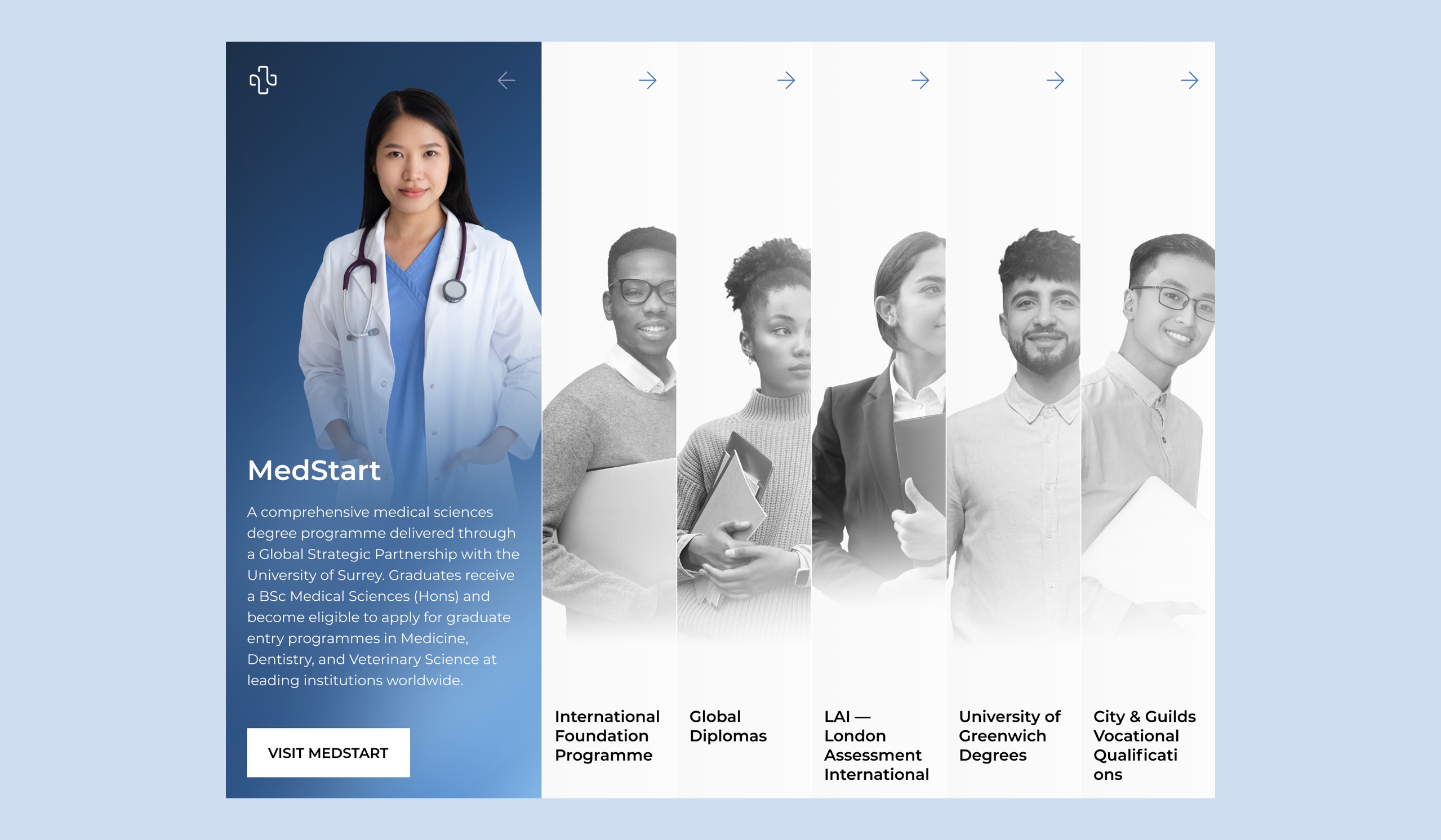
- Multi-page structure to let each audience find their entry point.
- The hero makes a statement, not a pitch.
- The British International University case study as the centrepiece credibility proof.
- The leadership section as trust infrastructure.
- Partner logos placed before the services detail.
- The primary CTA across every page is "Begin a conversation." Not "Get in touch," not "Contact us,"
VISUAL DESIGN
Formal, and built for credibility
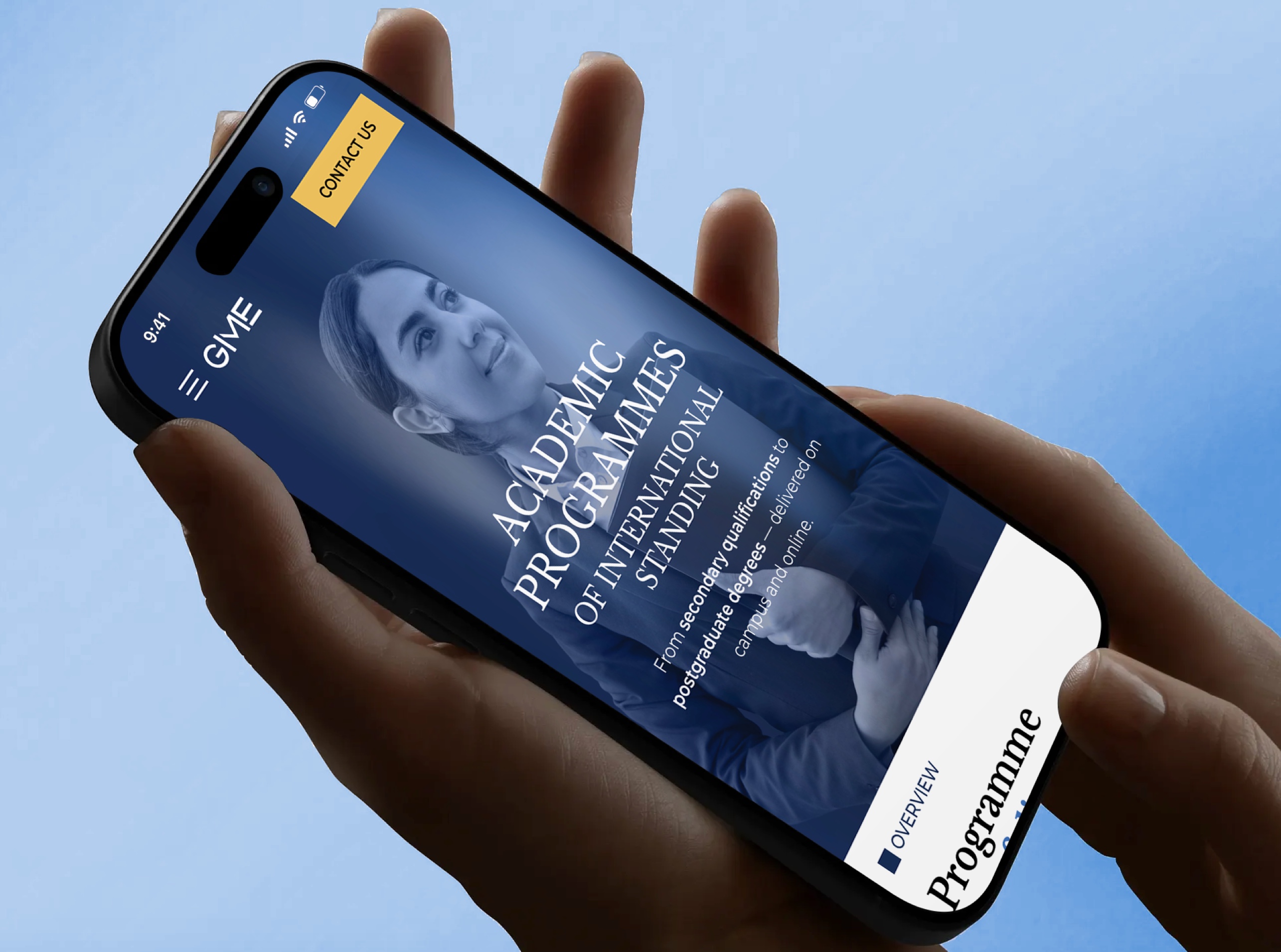
Editorial, responsive ready, looks great on any device
Single column layout where long-form content stays fully readable. It was tested and carefully adjusted at small sizes to ensure readability without zoom. A ministry official reviewing the site on a phone during travel should get the full argument, not a degraded version of it.
Interactivity
Typography
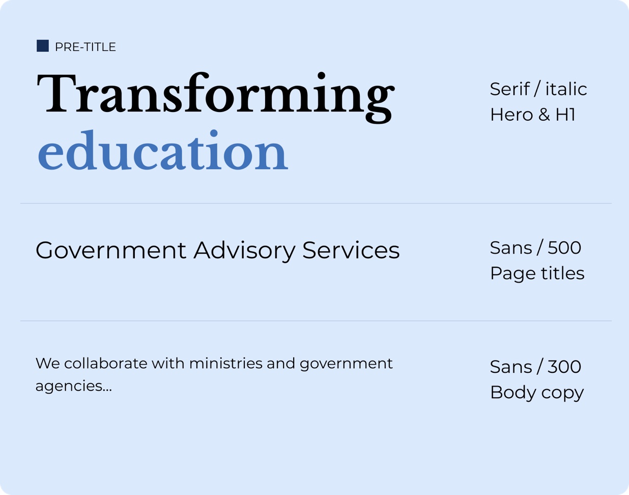
A four-level type system — serif display, sans medium for section heads, light sans for body, mono uppercase for numbered labels and categories.
The mono label style (01, 02, 03) gives service sections a structured, systematic quality that signals organised thinking. Body copy is set at a generous 15–16px with wide line-height: this is content meant to be read carefully, not scanned.