HomeStack — Real Estate App Design
- Client
- HomeStack
- Audience
- Real estate Agents & Firms
- Type
- B2B, Real estate
- Tools
- Figma, Sketch
Real estate seamless user experience, long-term collaboration and multiple iterations of the design.
We created UI design that blends simplicity, clarity, and user focus to deliver seamless, intuitive digital real estate experiences effortlessly.
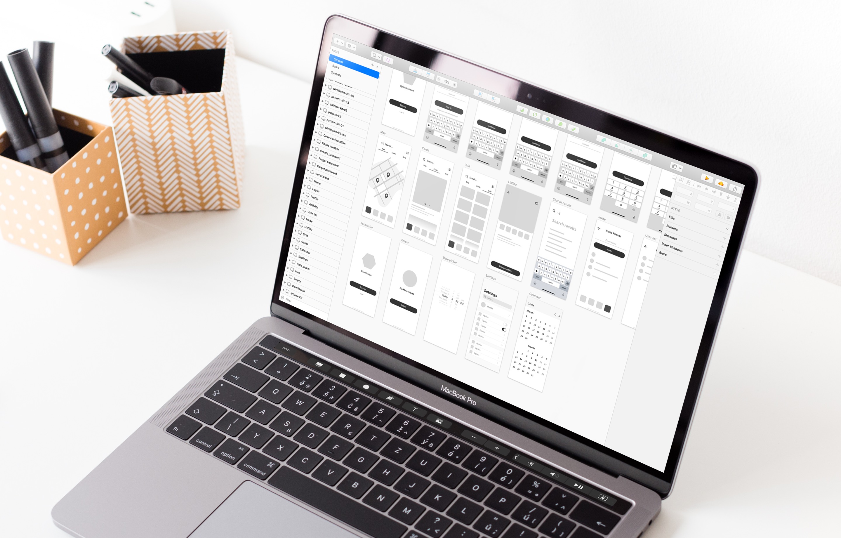
Product Design in Stages
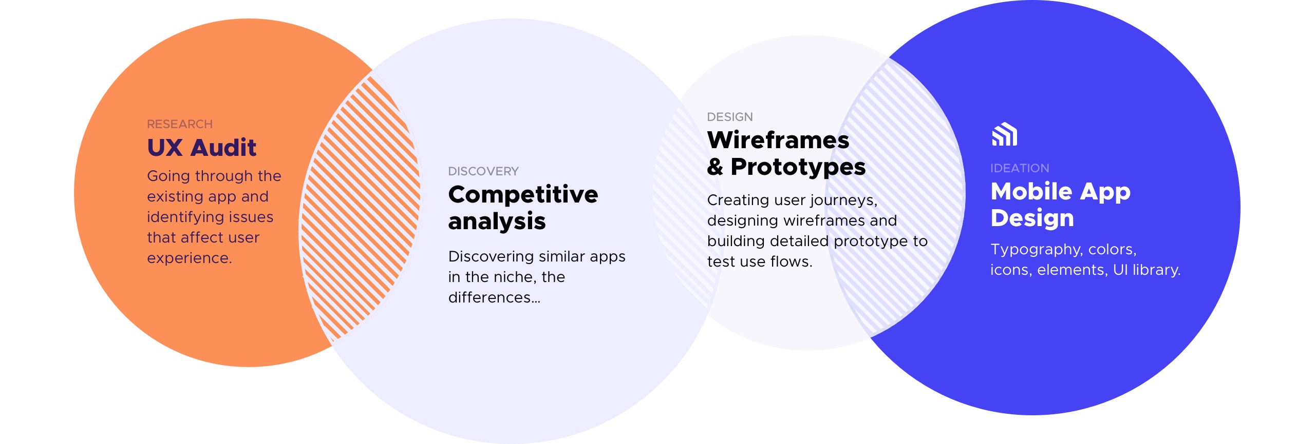
The preliminary research flow involved evaluating and comparing various apps to identify key strengths and weaknesses. Next stage was designing wireframes and it was a gradual process of low-poly conceptual wireframes to high-fidelity wireframes with interface details. Then everything was connected and tested multiple times as interactive prototypes. Then the main focus was on the look and feel of the app.
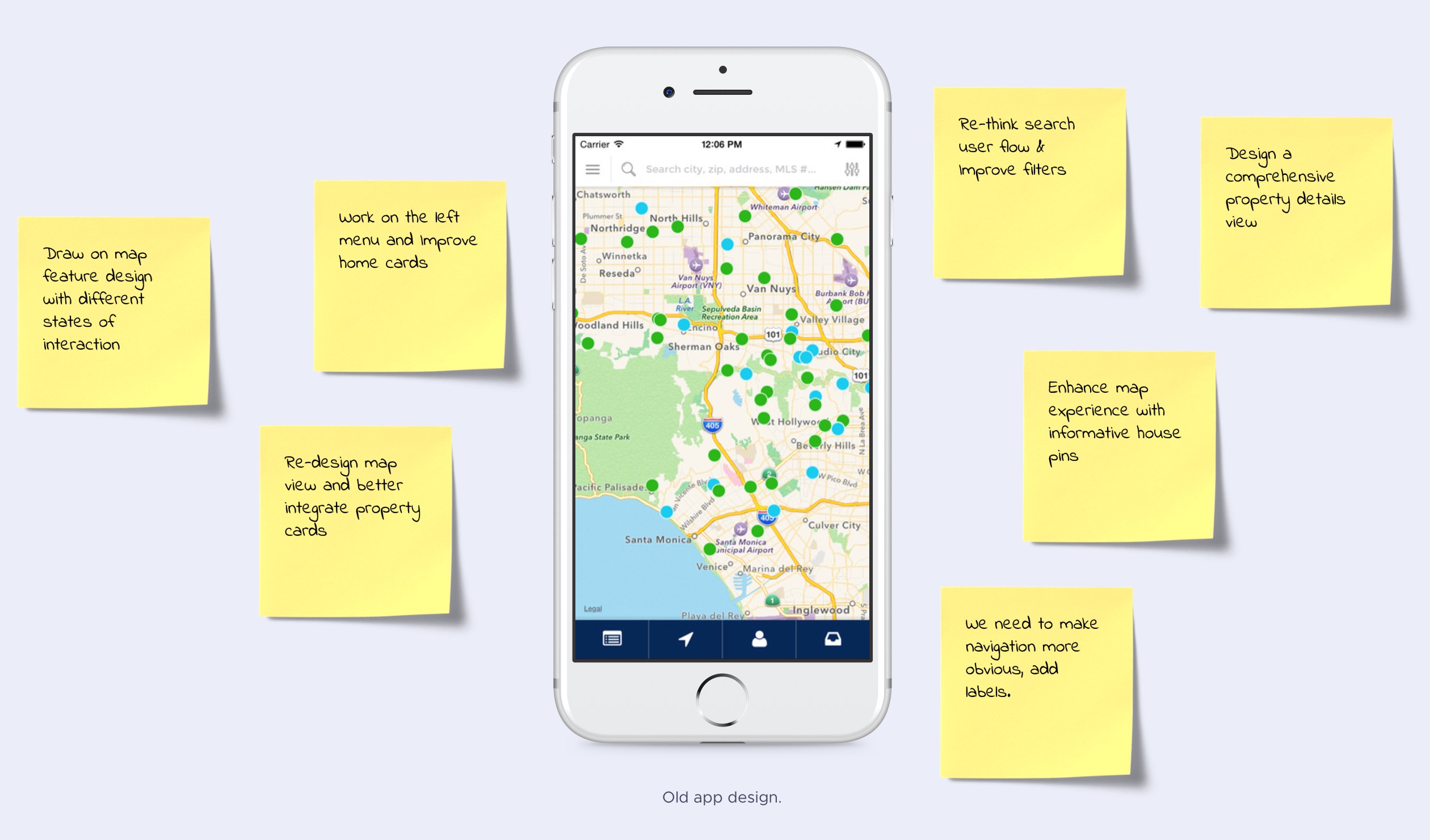
UX Research & Audit
Here is the old app and other apps was researched before the initial design phase.
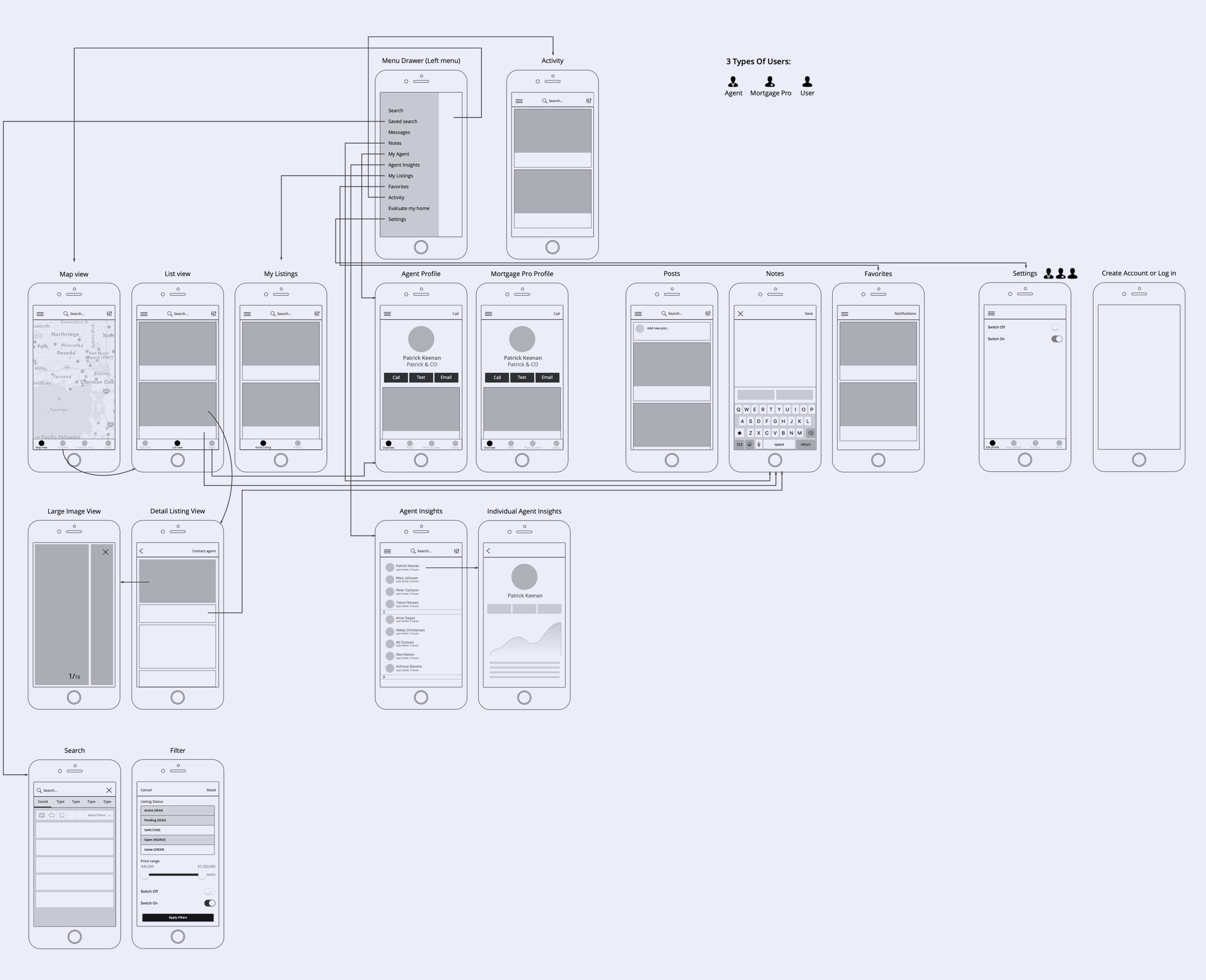
Initial User Flow
The very first version of a user flow diagram which covers multiple types of users.
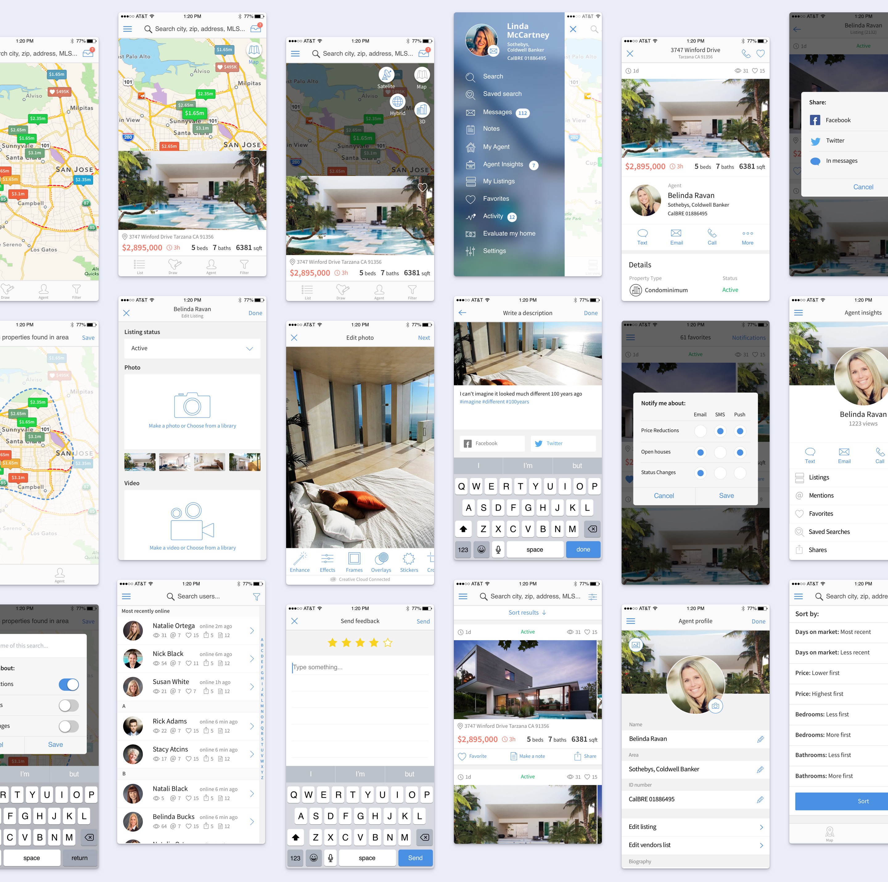
The 1st Version of the App Design
All the business requirements, competitive analysis and user research data was taken into account to create this new app design.
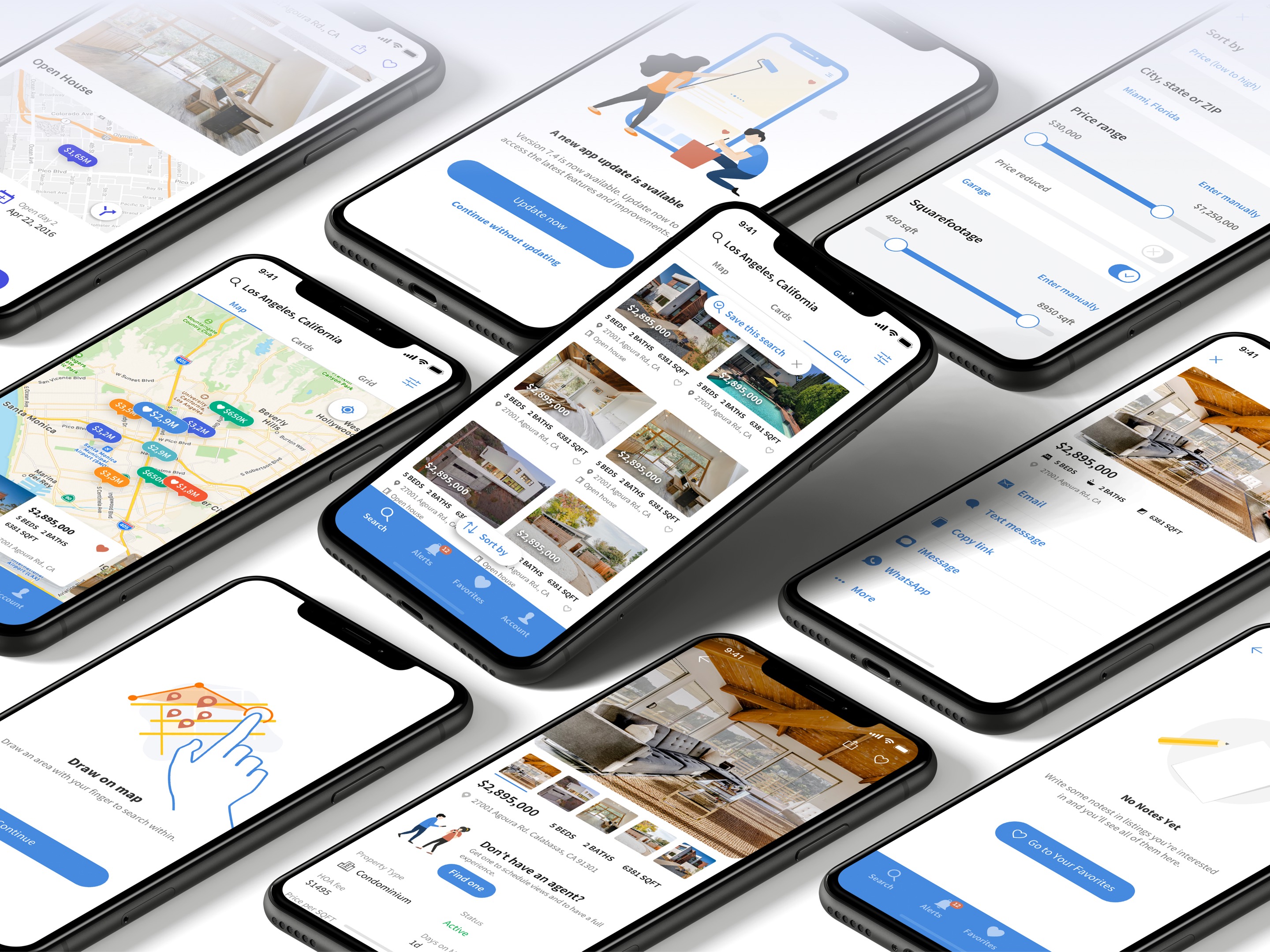
The 2nd Iteration of the App Design
After measurements of the perfomance of the 1st version of the app design and changing trends with how the apps used on smartphones, iOS updates, I’ve got a request on updating the app design in many aspects of how it looks and works taking into account new formfactors and iOS changes.
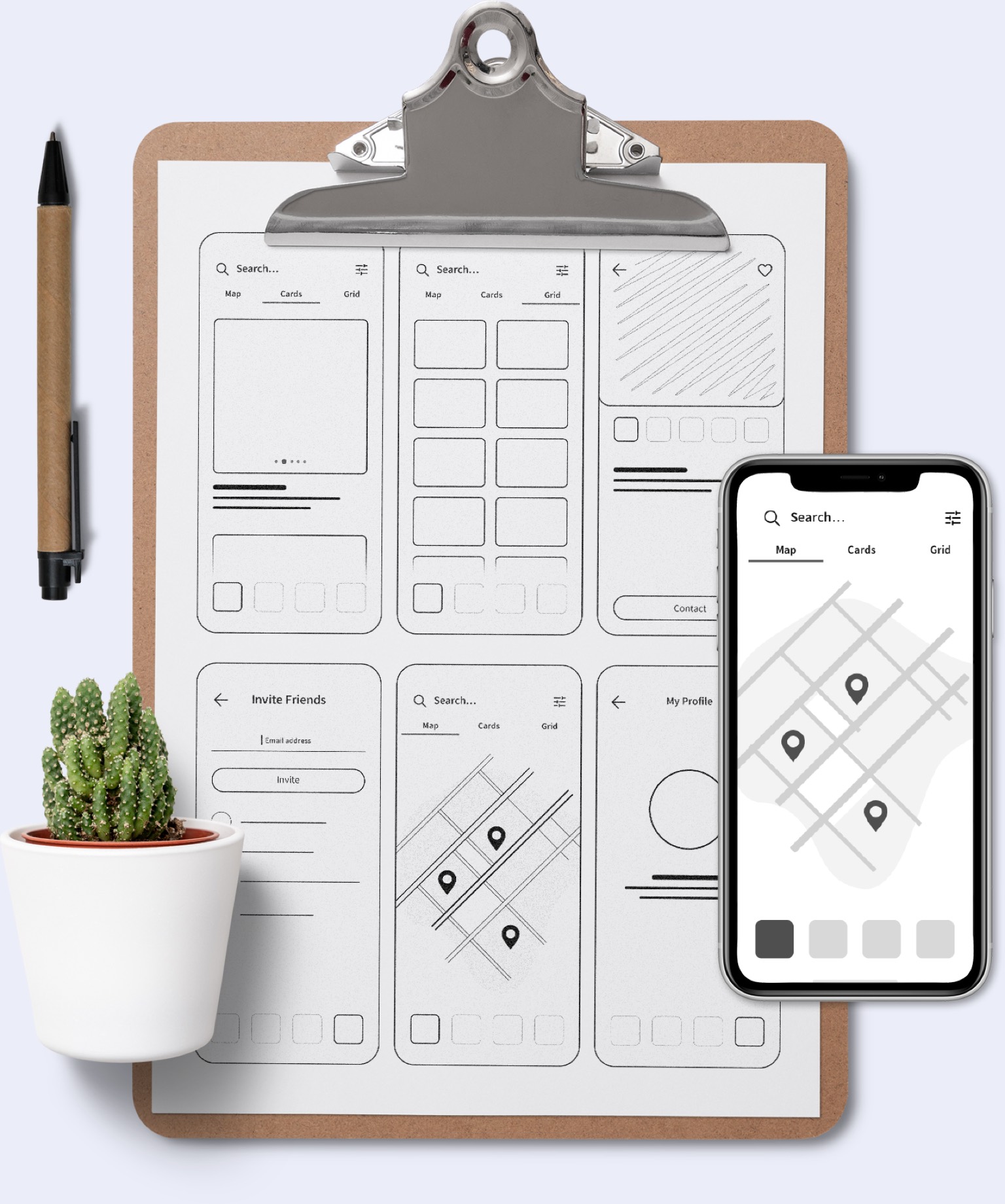
Low-fidelity Wireframes in the form of sketches
It was decided to first create low-fidelity wireframes on paper to mark up the main scope of work as well as having a birds eye view of things that should be done for the new design experience in this version of the app.
Updates in the User Flow
and Introduction of New Experiences
New things such as Onboarding UI, Search updates, Alerts interface, Favorites and Agent side updates were introduced in this version of the app design.
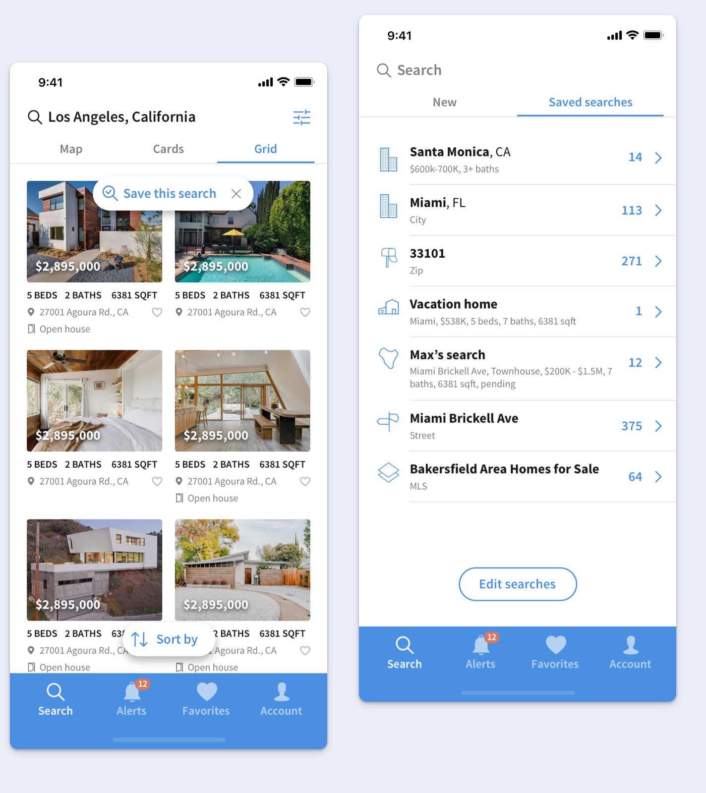
Re-designed Search
A new User eXperience has been added where you can search for homes and then save your search settings so next time you open the app you can see previously searched properties.
That improved usability of the app and users now have more incentive to go back in the app because saved searches work as bookmarks that are stored in the app.
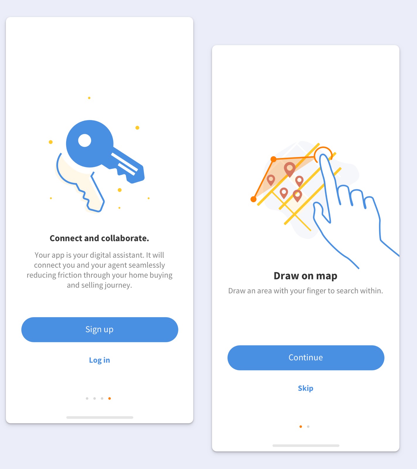
Onboarding Experience Design
The onboarding flows turned out to be a crucial part as an introductory stage in the app for new users.
This interactive and educational interface design helped to automate the process of building a rapport with new customers so they know what exactly to expect from the app experience and it’s clear how to use the features of the app.
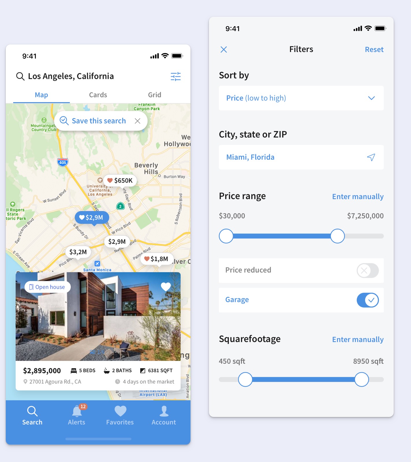
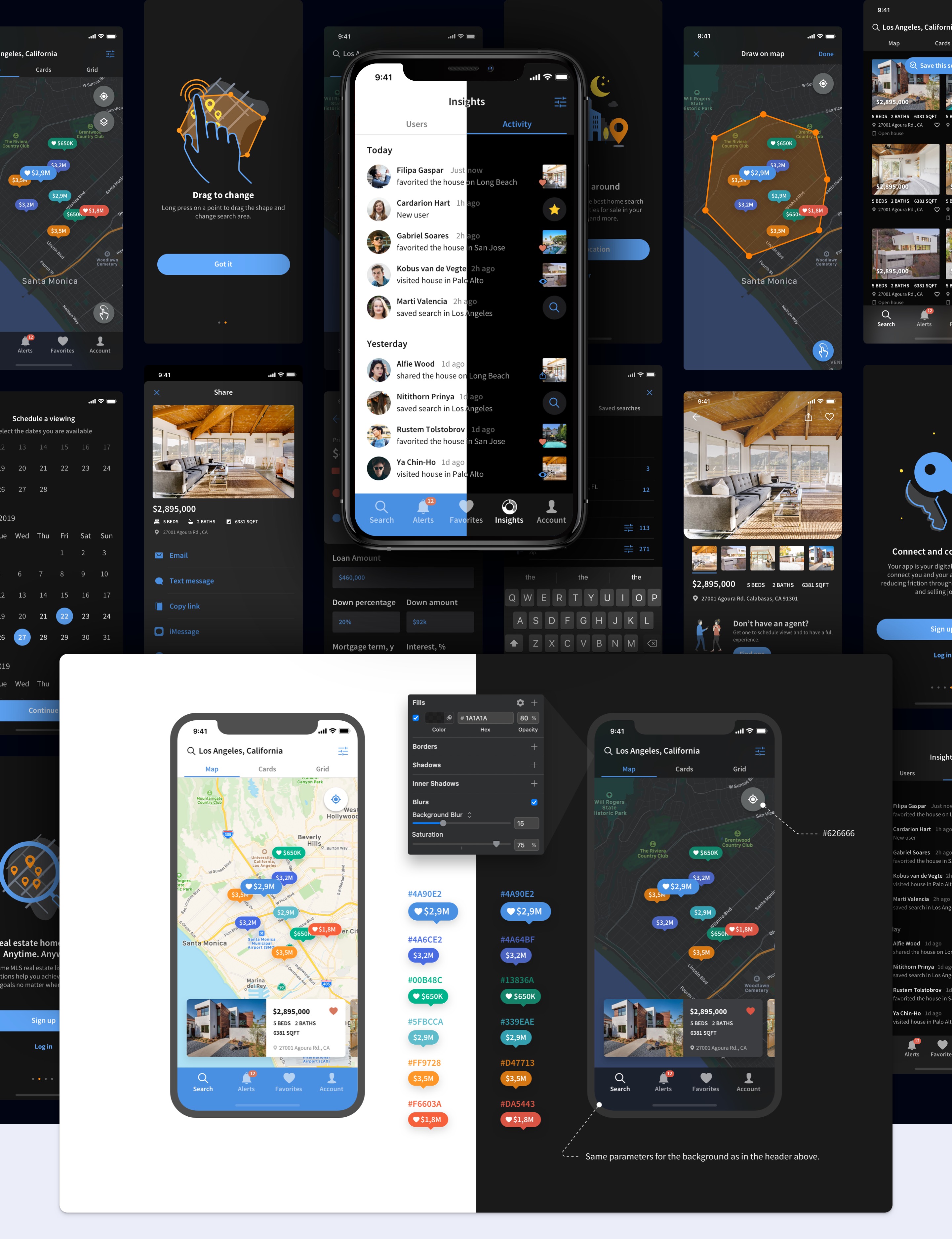
Updated Map View and Filters
The main flow where homes are browsed was updated accoding to the latest screen resolutions which allowed to design differently in bigger real estate and take advantage of the app being browsed on bigger screens.
As a result it was possible to fit a large property card in the bottom part of the map.
App Dark Mode Design
To better adapt for user needs and different environments where the app can be used I’ve designed the dark mode version of design.
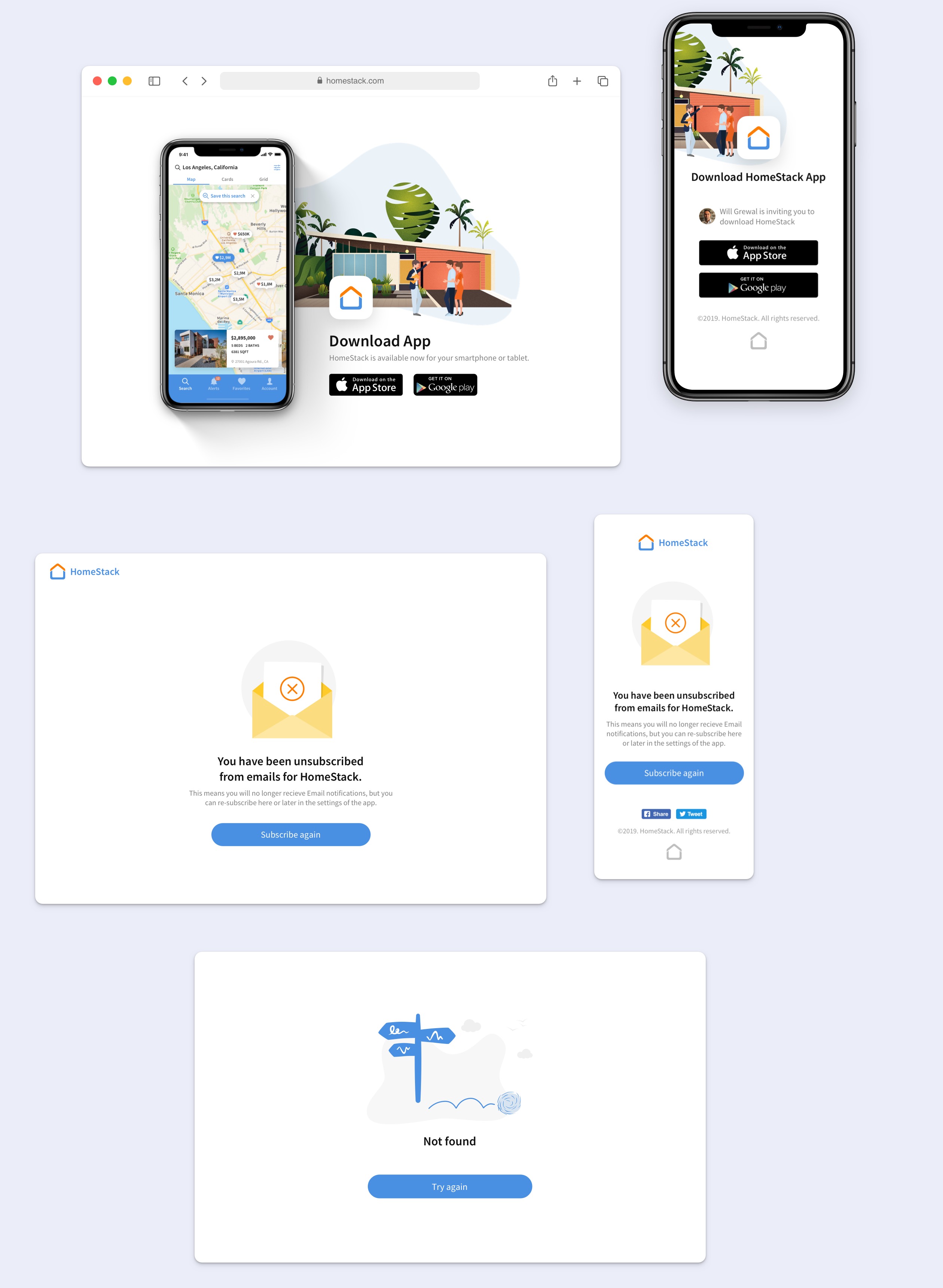
Service Pages Design
Since User eXperience goes beyond the experience that users have within the app we’ve covered such cases as visiting related to the app content on the web.
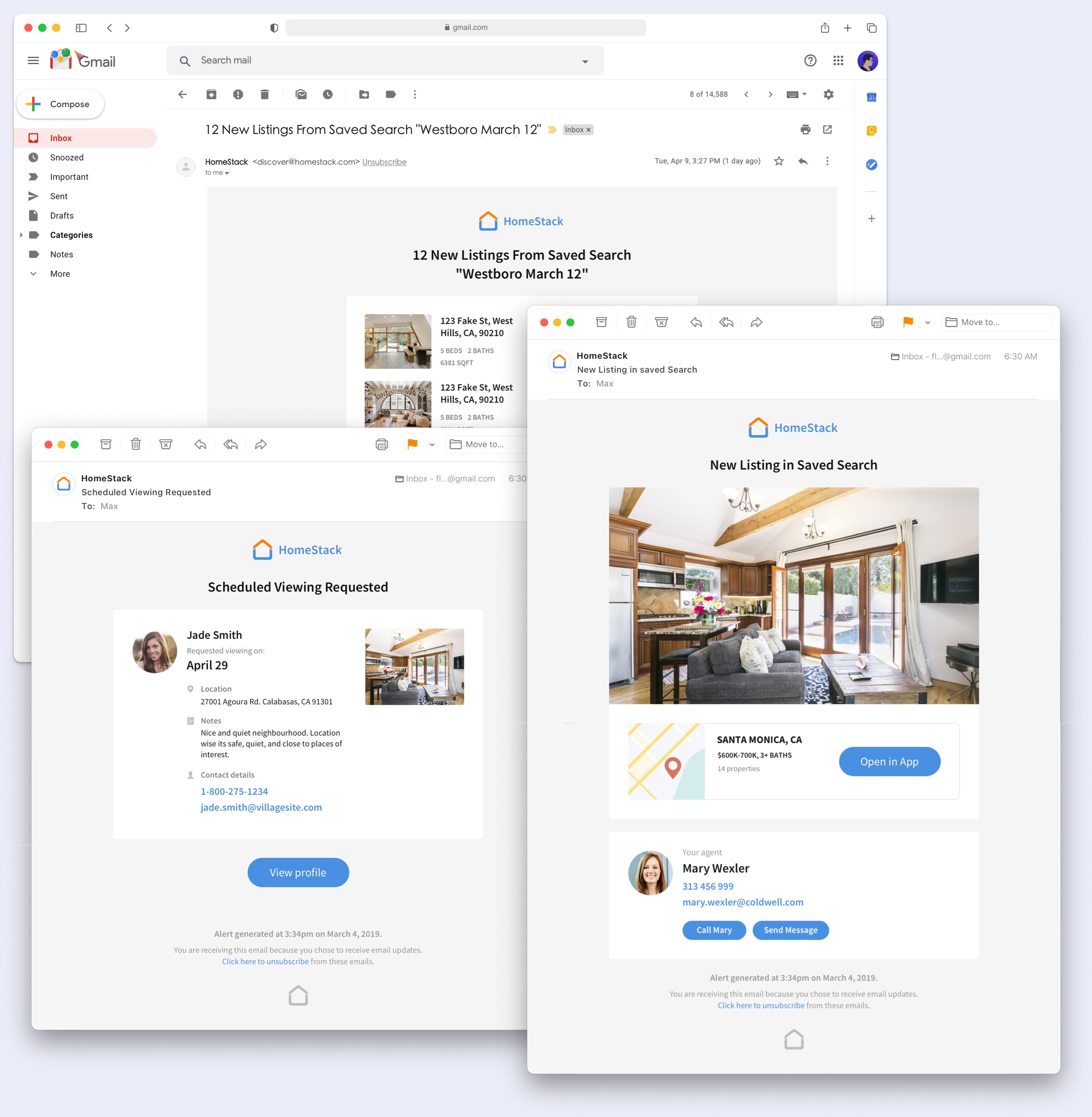
Email Templates
A series of email templates were designed for the implementation of email sequences as a powerful marketing tool that helped to automate communication between agents that are using HomeStack and their customers.
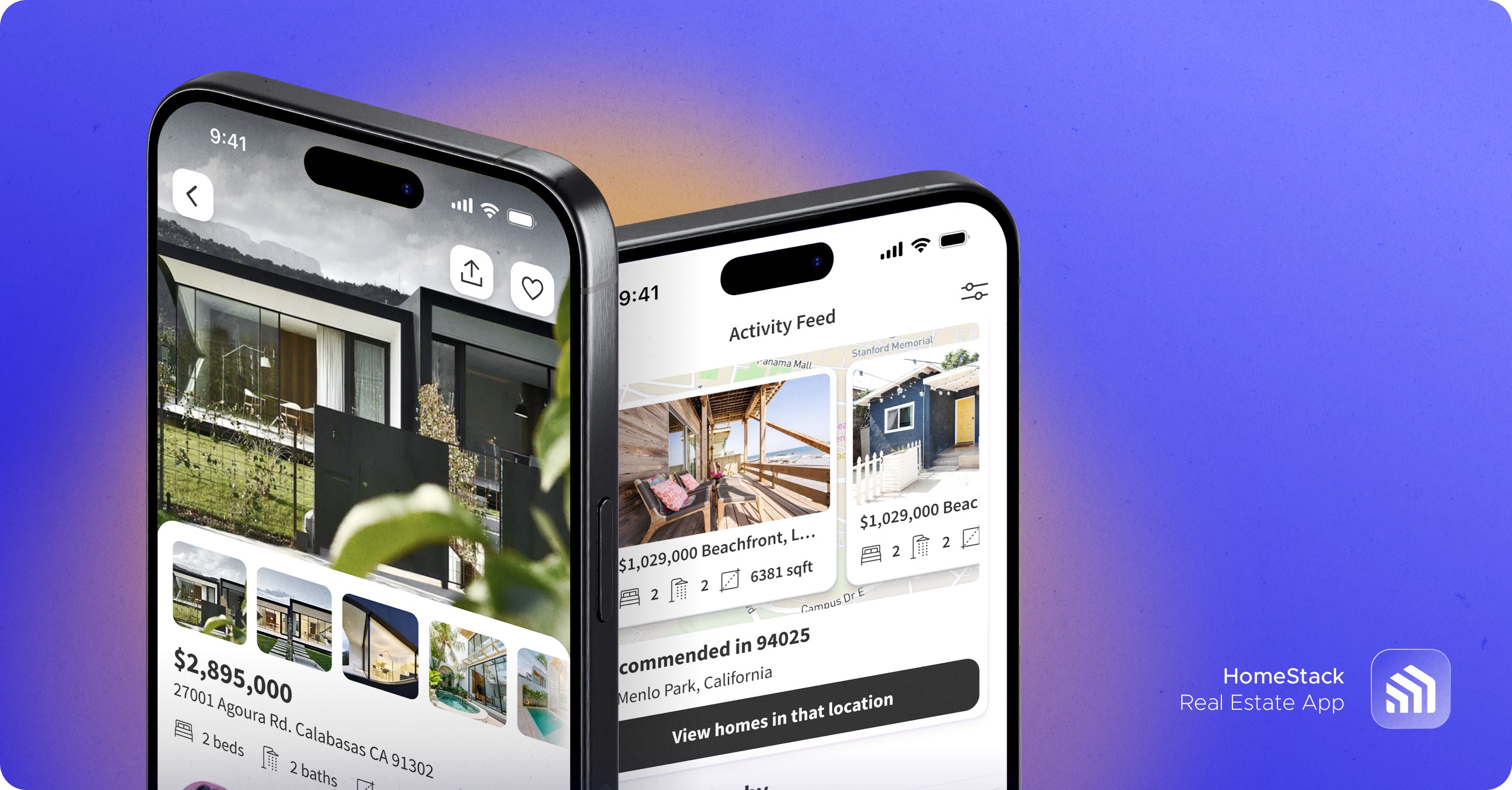
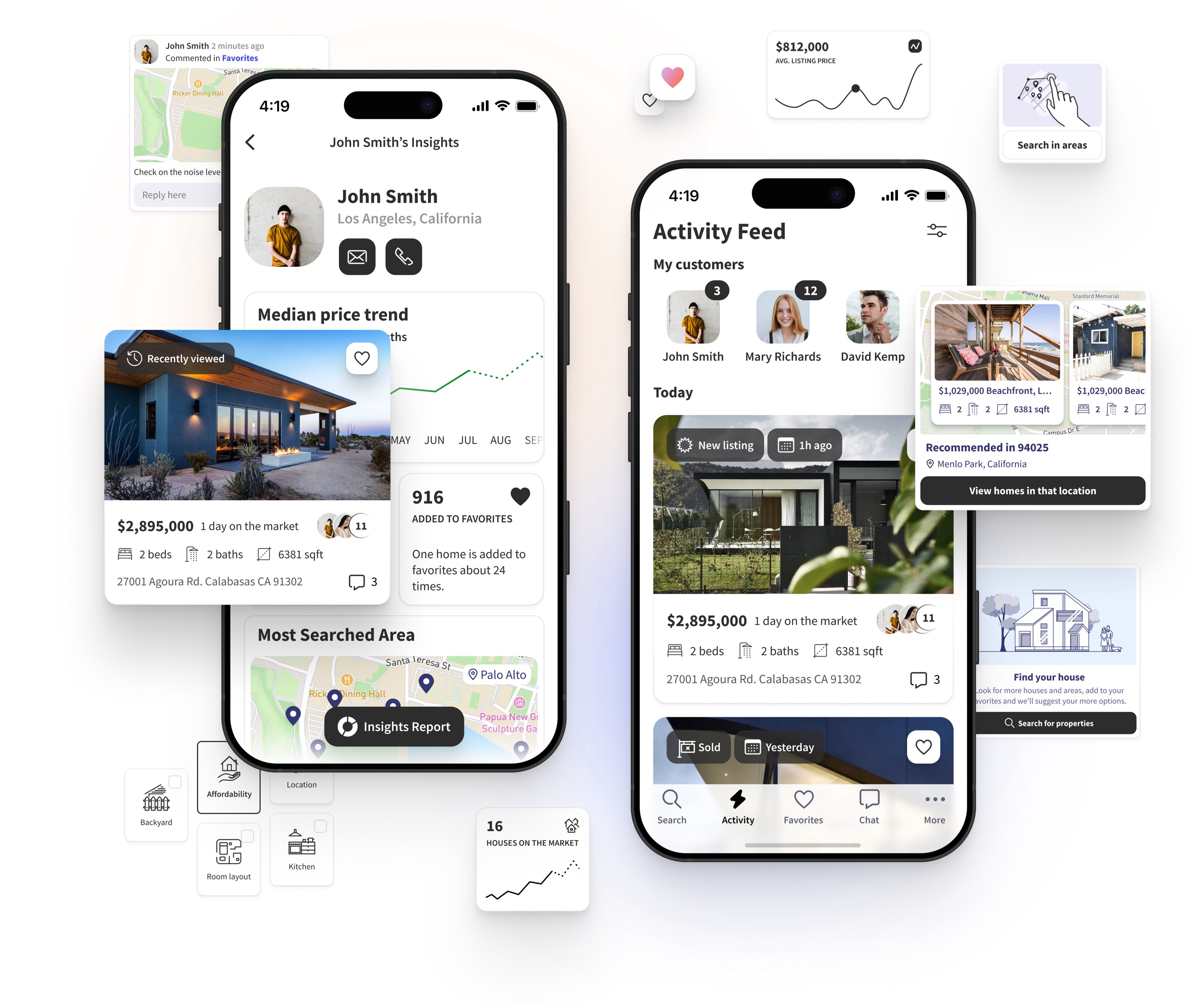
The 3rd Iteration of the App Design
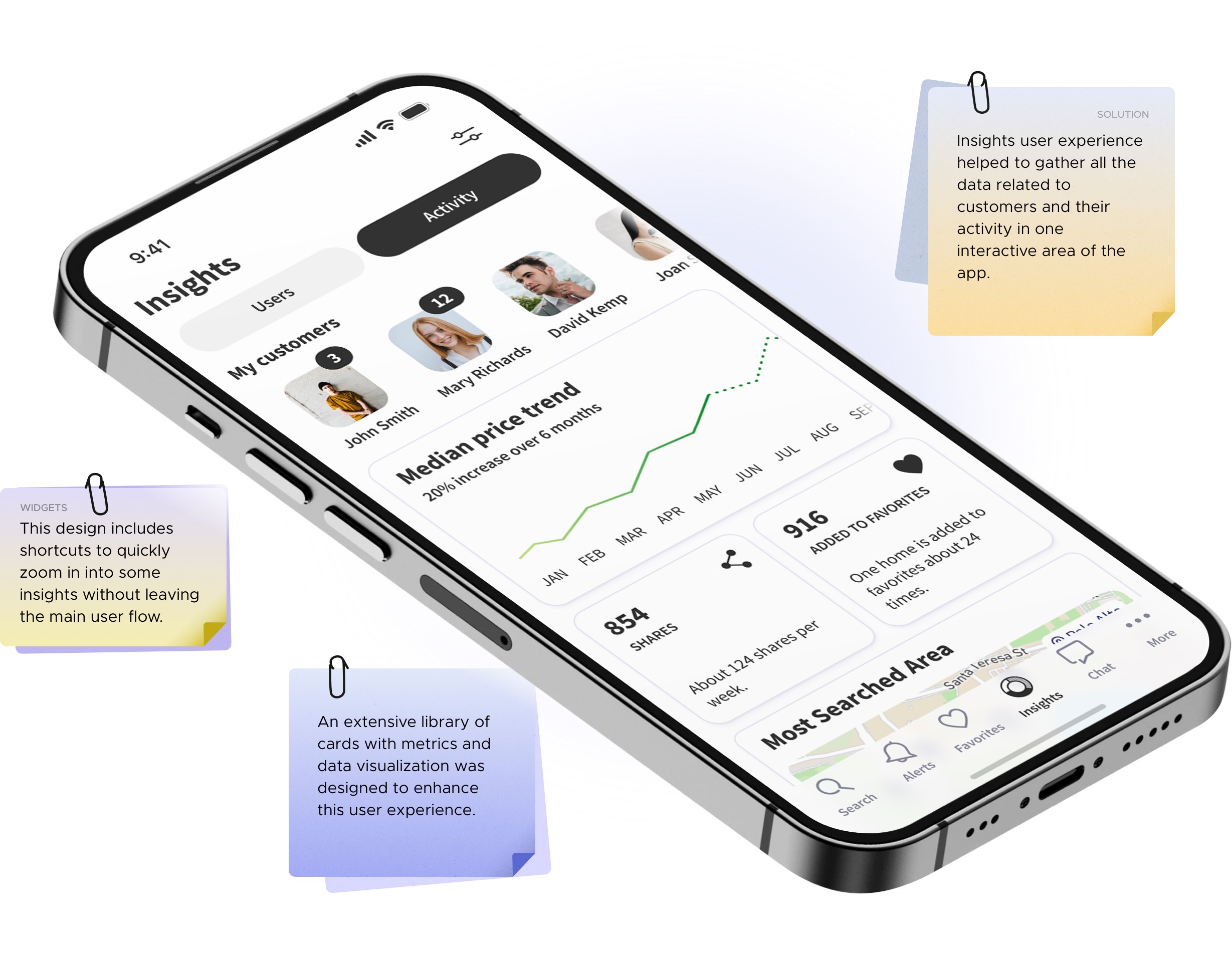
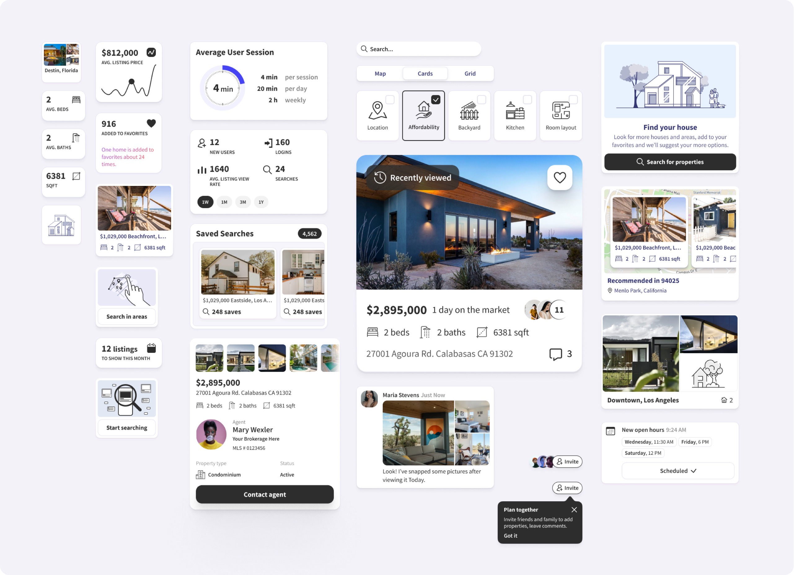
Agent Insights and more
This part has been very challenging and required several lengthy design phases that included layouts, cards and UX design of the main and supplemental user flows. Although, it significantly improved the interaction between agents and customers.
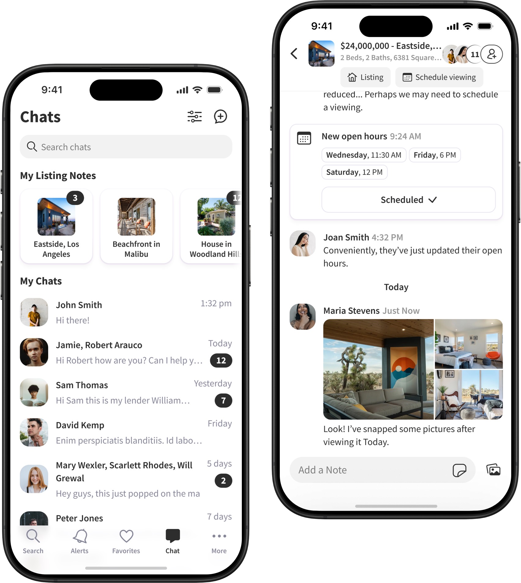
Notes & Chat Experience
The conversations and chat screens were designed taking into account best practices. The chat UI design incorporates ability of having multiple users in a chat and interactive messages that allow to do such actions as scheduling open houses or viewing listings right in the chat interface. The fluidity of such user experience allows keeping conversations productive and right to the point.
Components and Building Blocks
All UI elements in the design are part of the library which consists of cards, building blocks, different states, iconography and supplemental elements. That helped to achieve consistency across the app interface and speed up design process. Also, it helped to conduct experiments and make the whole experience faultless as much as possible.
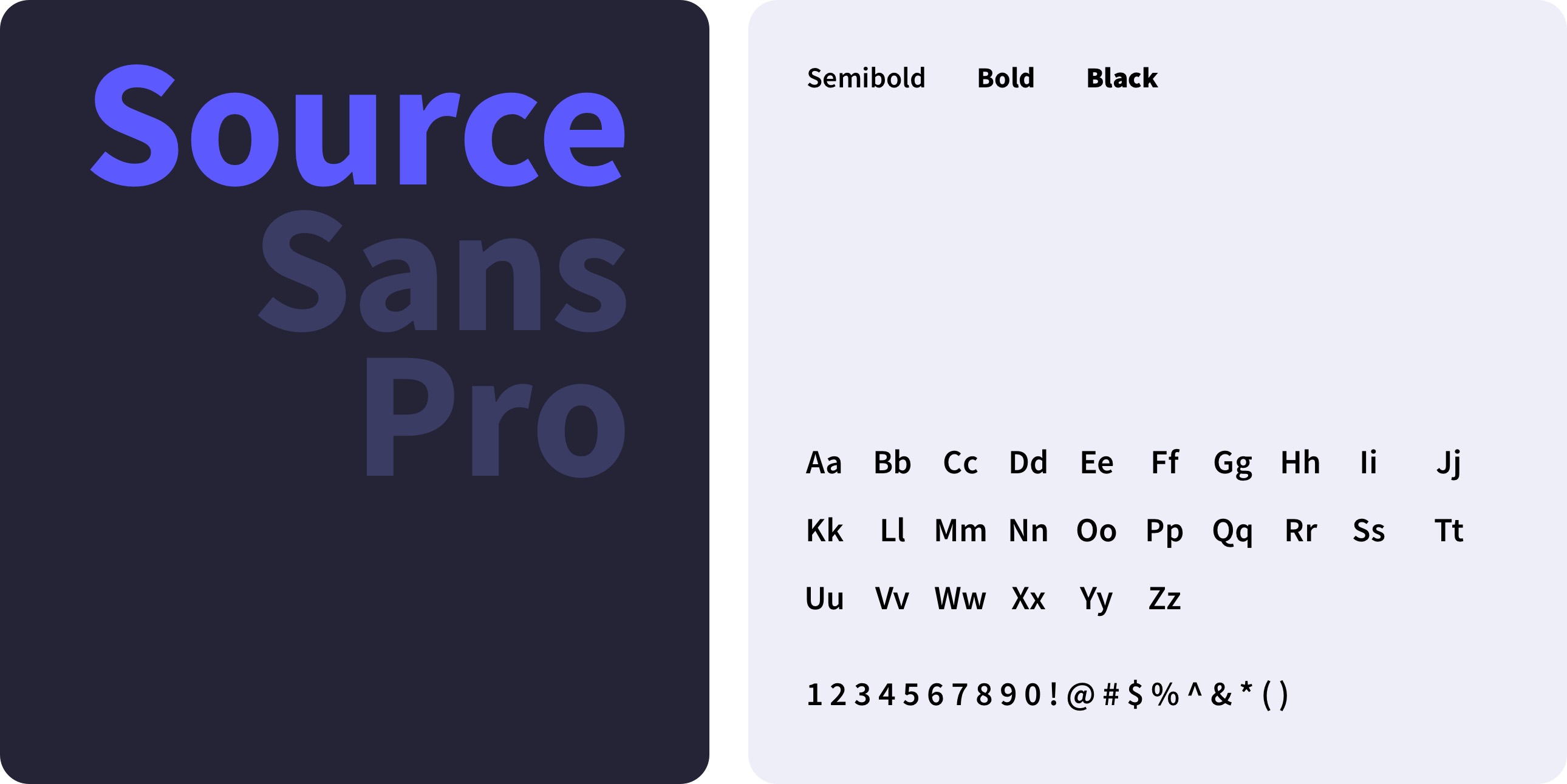
Typography
Iconography: Visual Elements
to Enhance User Experience
App Icon