SaaS Landing Page Design
- Client
- Milestack
- Audience
- Tech companies
- Type
- B2B, Landing page design,
UI Components design - Tools
- Figma
A landing page design that respects your time, makes the product crystal clear, and leads you naturally toward taking action.
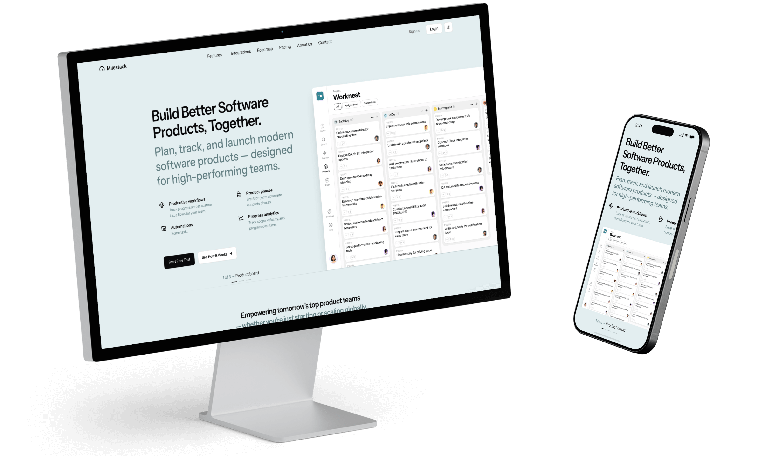
Hero section
We kept the layout clean and minimal to make sure visitors aren't overwhelmed. The goal is for them to understand what the product does within seconds of landing on the page.
Text is structured with clear hierarchy – meaning the headline is bold and attention-grabbing, the subheadline provides context, and the calls-to-action stand out. This guides the user naturally through the content without them needing to think too hard.
The CTA button uses a contrasting color so it grabs attention and makes the next step obvious.
Whitespace is used generously, creating space around content blocks. This gives everything room to breathe and avoids that cluttered, chaotic feeling you sometimes get on tech sites.
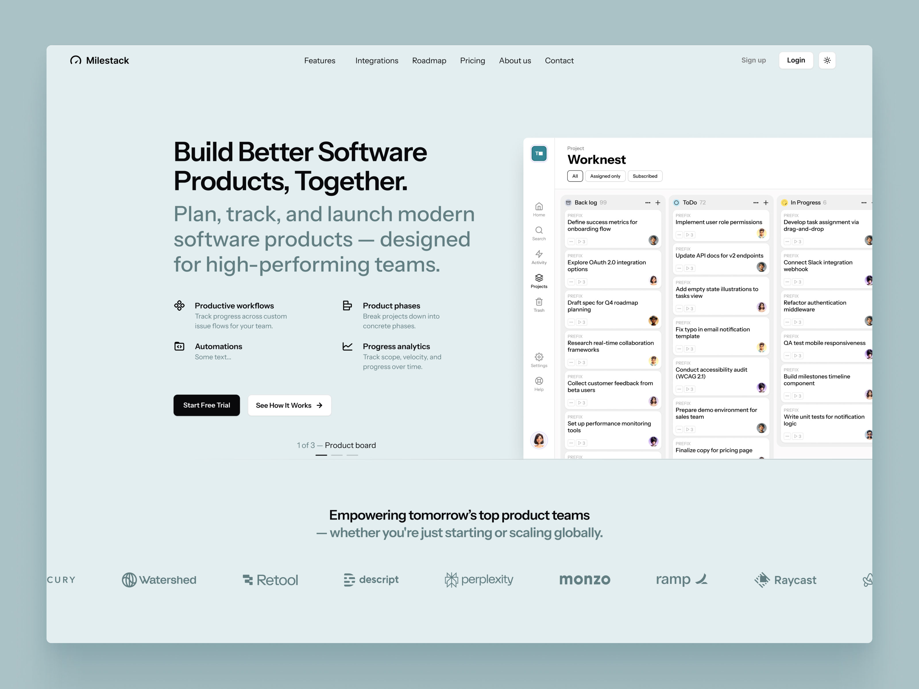
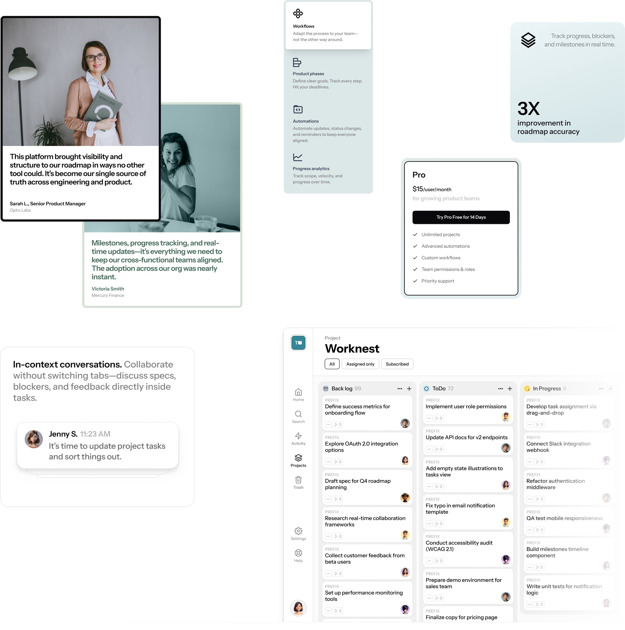
Complete view of the Landing page design
This design stands on two pillars: we’ve got clean, compelling text — and a sharp product screenshot showing project board. Strong, confident headlines tells visitors exactly what this product does: it helps them plan, track, and launch modern software. Nothing vague, nothing fluffy. Just straight to the point.

The design is minimal but smart. There’s breathing room. Visual hierarchy is on point.
Scroll down, and the Features section dives into what the product actually does — but again, without overwhelming the user. Each feature is paired with a simple icon or a small UI snippet. No long paragraphs, no tech jargon — just benefits explained clearly and quickly.
After features come the benefits — and this is where we flip the lens from what the tool is to what it does for the user.
Testimonials section is bold, confident, and positioned with intention — because nothing builds trust like other real users saying, “This changed the way we ship products.”
The result? A landing page that respects your time, makes the product crystal clear, and leads you naturally toward taking action.
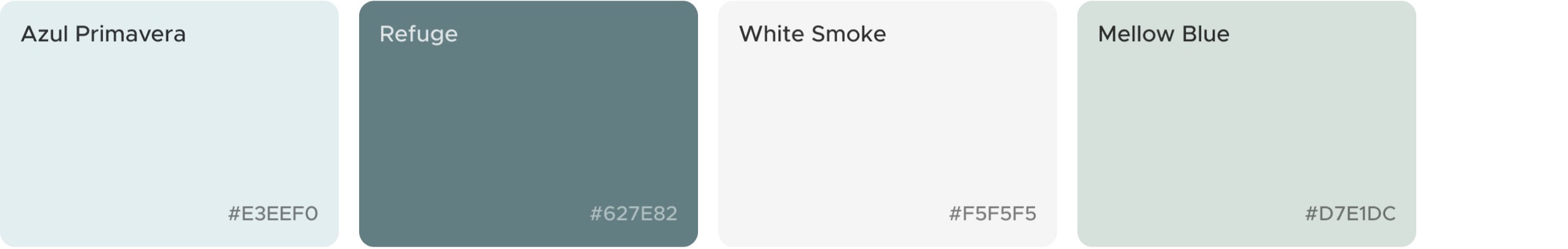
Colors and typography
The chosen color palette should project a work friendly environment, professional activity, productive behavior. So the chosen colors are subtle to support key visual elements and make the overall user experience smooth and frictionless.
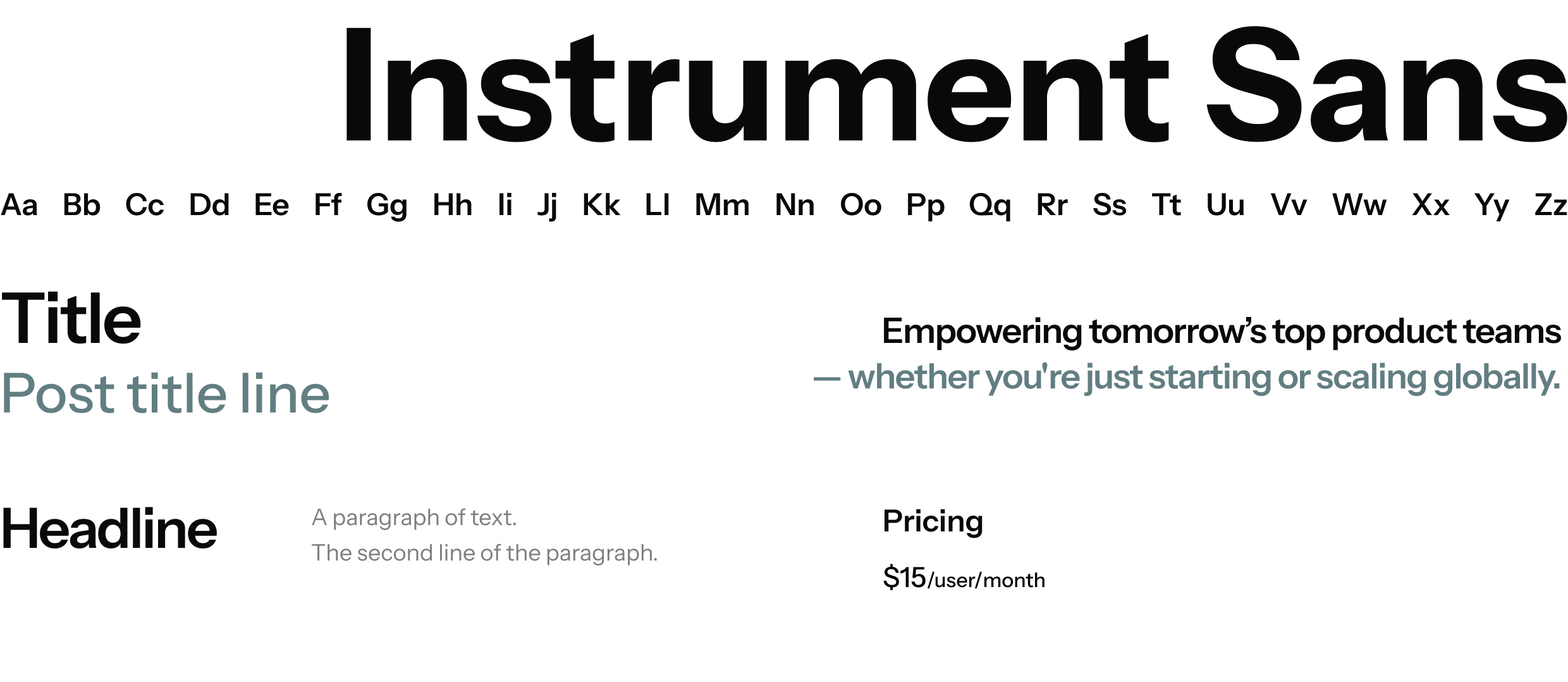
We’ve chosen Instrument Sans font for Milestack — it combines strict, typewritten letters and subtle manner of delivering content. It looks simple, professional, and easy on eyes.
Components
and design elements
Creating consistent design components during the process — like buttons, cards, typography styles, and layout grids — makes everything faster and more efficient.
When everything from the buttons to the font sizes follows the same rules, the whole site feels cohesive and professional. That consistency helps users feel more confident.
Having a solid design system makes the brand look intentional and trustworthy.

Let’s make
something great
- Direct access to designer
- 1-3 days delivery time per request
- Always high quality and on time
- Flexible delivery options