Nexus Medical Network — Website Strategy, UX, and Framer Build
- Client
- Nexus Medical Network
- Audience
- Attorneys, Medical service providers
- Type
- B2B
- Tools
- Figma, Framer
Website strategy, UX architecture, and Framer build for a personal injury medical coordination platform serving attorneys and provider practices across Pennsylvania, New Jersey, and New York.
where it’s started
A Working Product UI but No Website
Nexus Medical Network had a working prototype and a clear product — a centralized coordination platform for personal injury cases — but no website that communicated what it actually did or who it was for.
The core challenge was taking a product that already existed and building a website that positioned it as infrastructure rather than software, without losing the operational credibility the prototype had established.
Website Visual Design
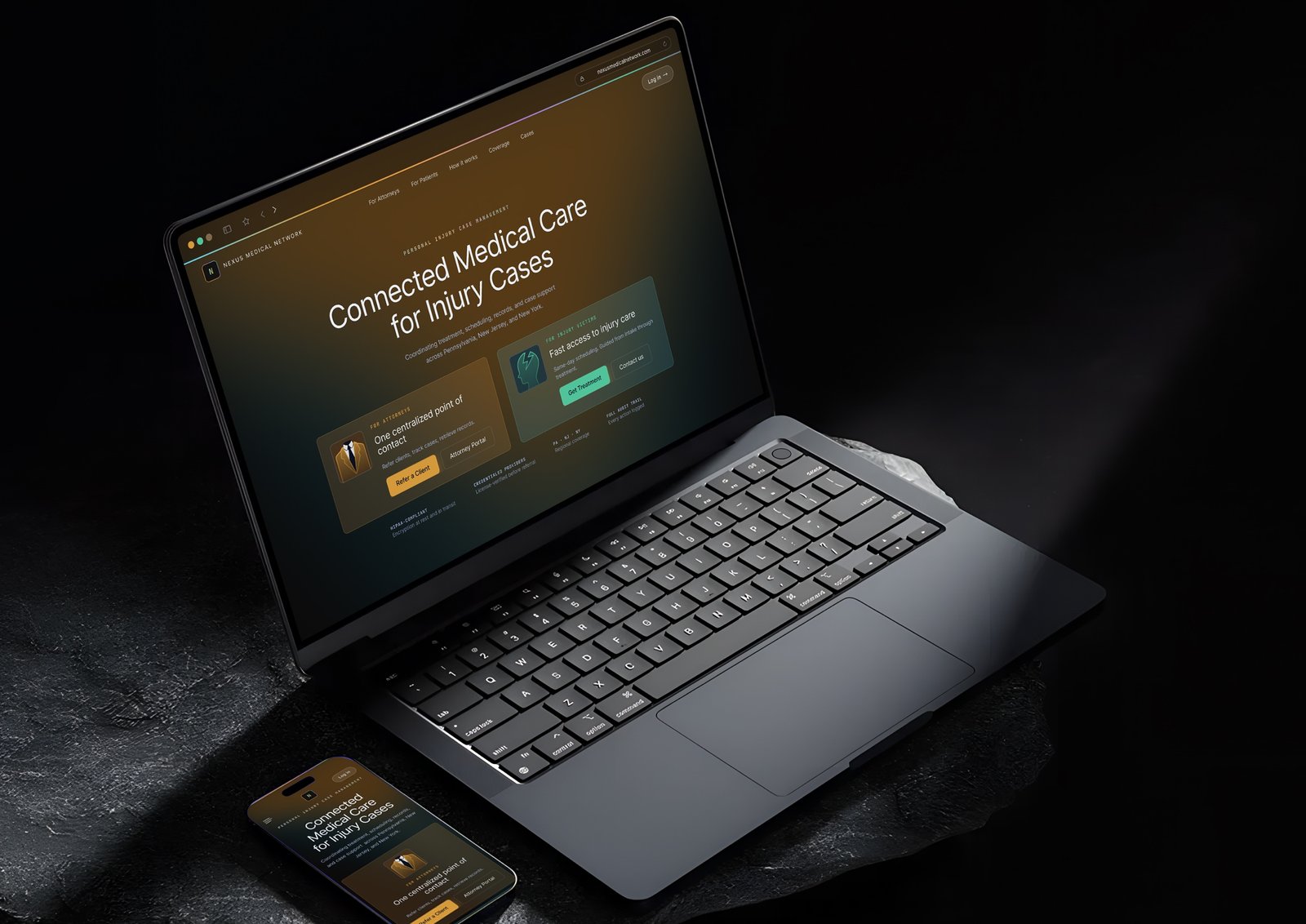
The design direction came from the brief: premium, dark luxury, Stripe/Linear aesthetic. Navy and deep backgrounds with gold accents, strong typography, glassy card panels, and a fast, minimal feel.
The most important visual decision was treating Nexus as infrastructure, not a medical brand. Medical websites typically lead with photography of doctors, waiting rooms, and patients. This site leads with a split audience card, metric dashboards, and operational data — the same visual vocabulary as a B2B SaaS product. That framing was intentional and consistent across every page.
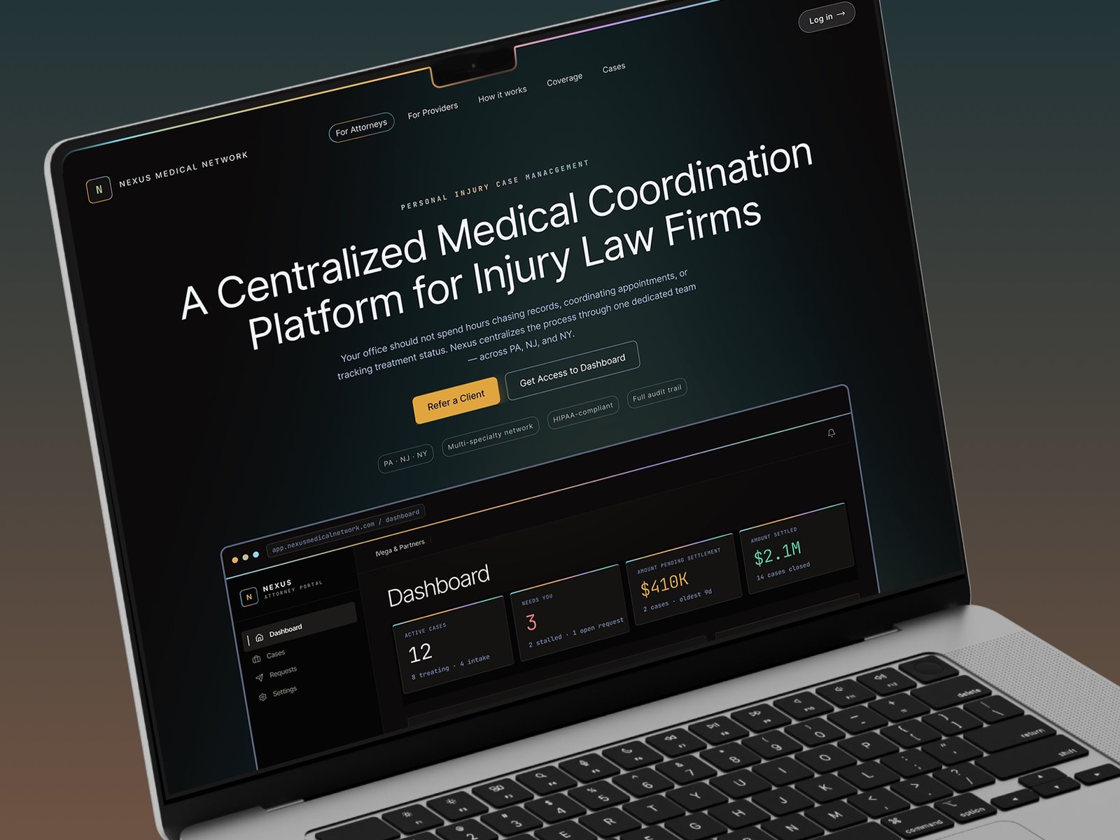
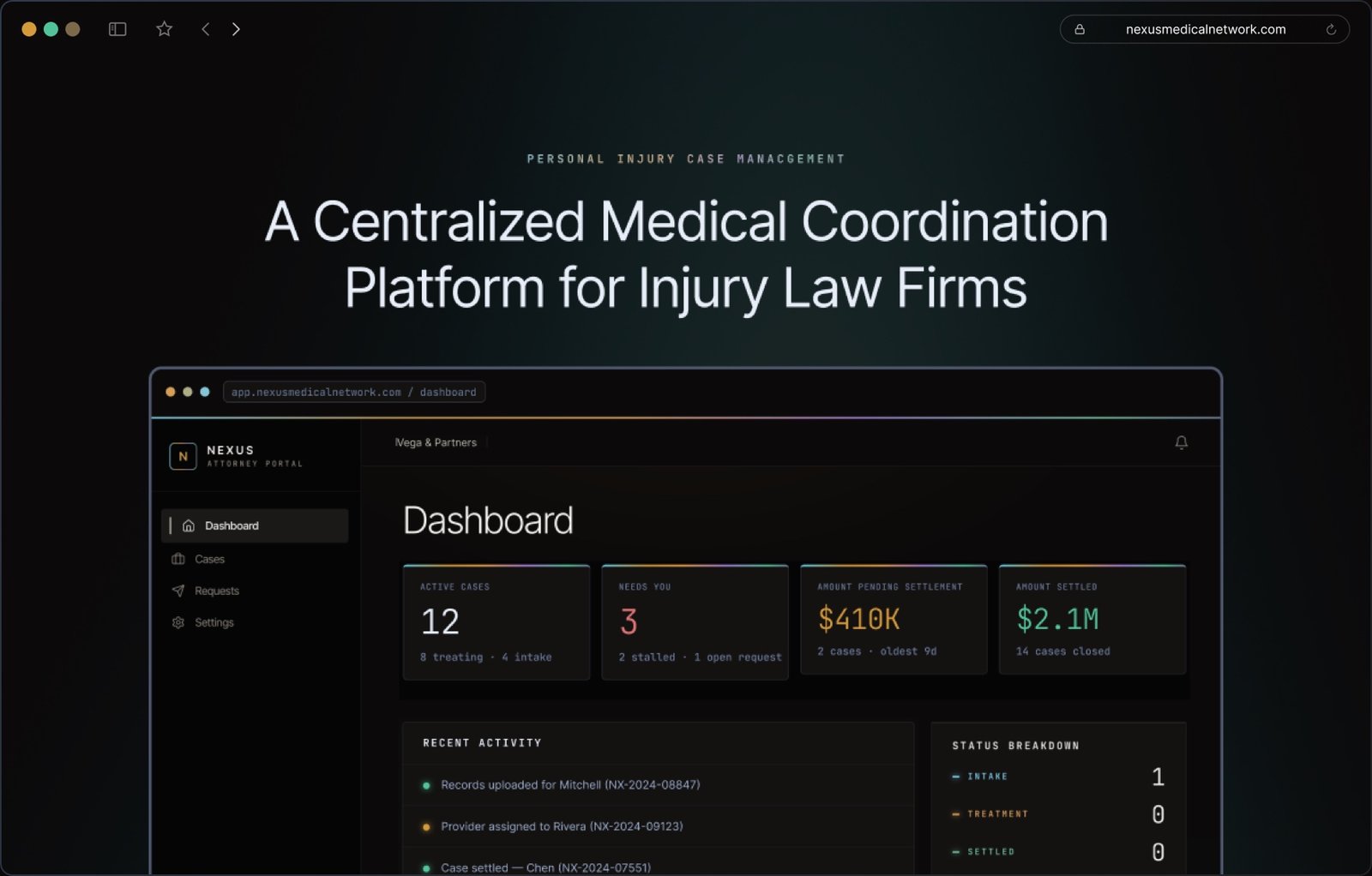
The attorney portal dashboard mockup became the central visual asset on both the homepage and the For Attorneys page.
Rather than commissioning illustration or photography, the prototype's actual UI screens — case status metrics, active case rows, needs-attention flags — were used as the primary visual proof point. This served two purposes: it grounded the premium aesthetic in something real, and it immediately showed attorneys what they would be working with.
Interactivity — functional rather than decorative
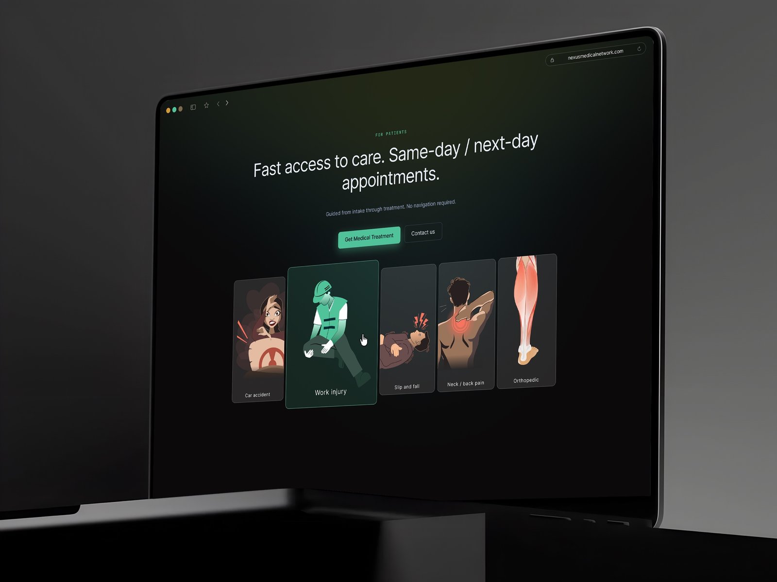
An interactive slider on the homepage surfaces the full scope of Nexus's network at a glance — cycling through personal injury case types for attorneys and patients, and the administrative services available to provider practices.
Each slide links directly into the relevant page, giving both audiences a fast path to the content most relevant to their case or practice.
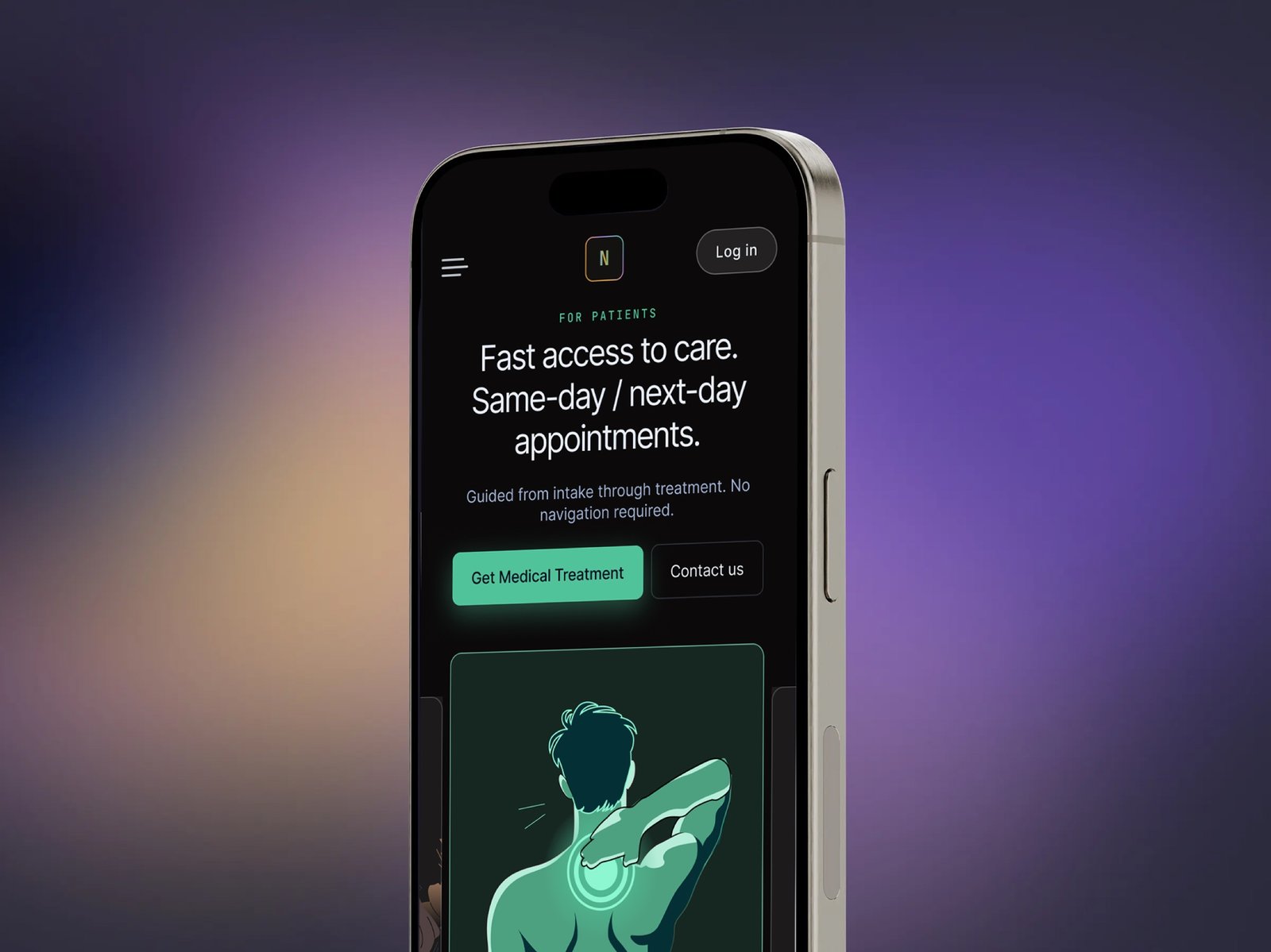
The Patient-to-Provider Pivot
The homepage and overall website architecture was originally designed as a two-path split between attorneys and injury patients. When providers replaced patients as the second primary audience.
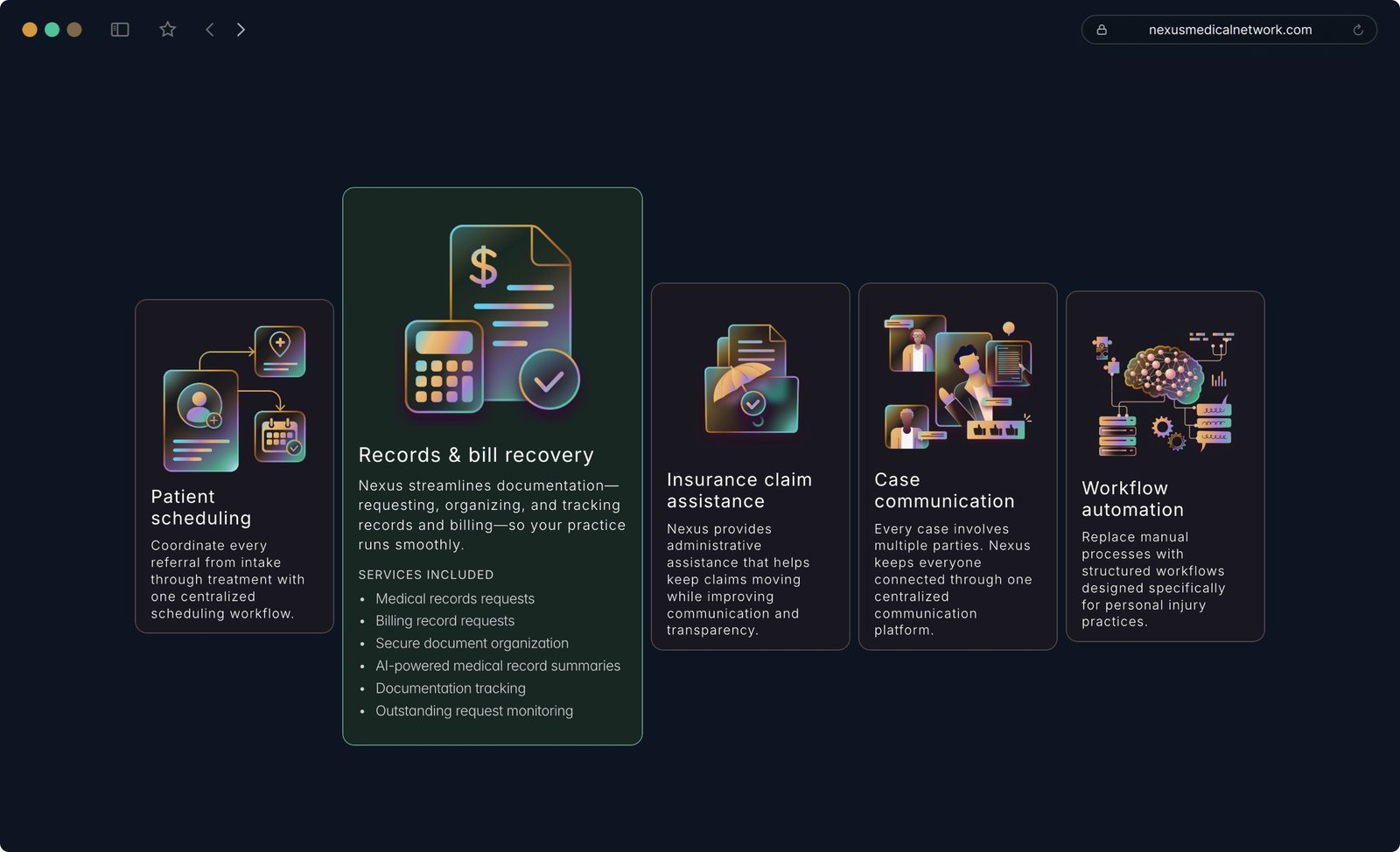
The second structural change was the addition of a For Providers primary page and five service subpages (Patient Scheduling, Records & Bill Recovery, Insurance Claim Assistance, Case Communication, Workflow Automation). This added scope was justified against the budget by removing the full patient funnel build, which was absorbed into lean SEO CMS posts rather than fully designed pages.
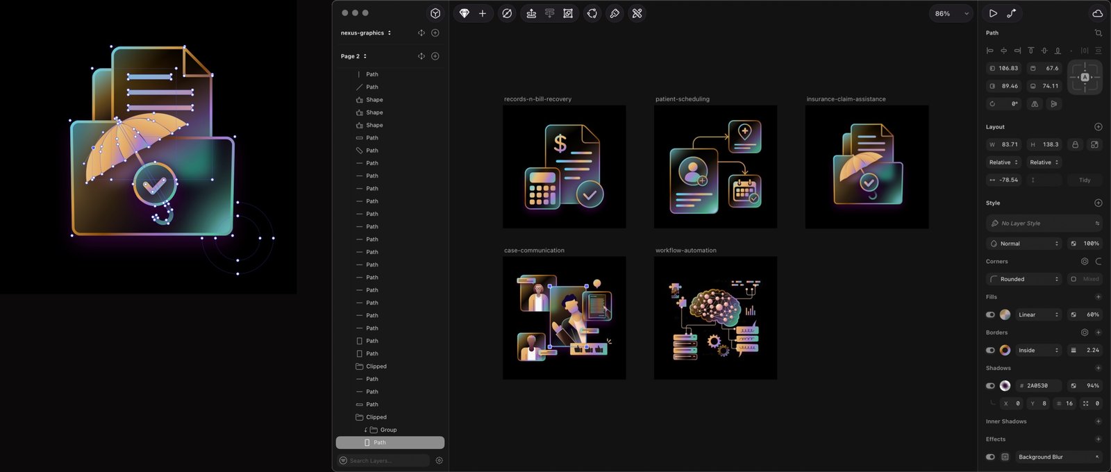
Hand-drawn Custom Illustration
The illustrations were drawn from scratch for the specific purpose of using them accross the website to represent provider services and make the internal navigation interactive. The style is consistent with the platform color palette in a combination with liquid glass effects.