Niche Marketing — Platform & Marketing Tools UX/UI Design
- Client
- Niche Marketing
- Audience
- Internet entrepreneurs
- Type
- B2C, UX/UI Platform Design
- Tools
- Sketch, Figma, Trello, Slack
Full-stack design of the platform that has a main focus in niche marketing community, tools, courses and services.
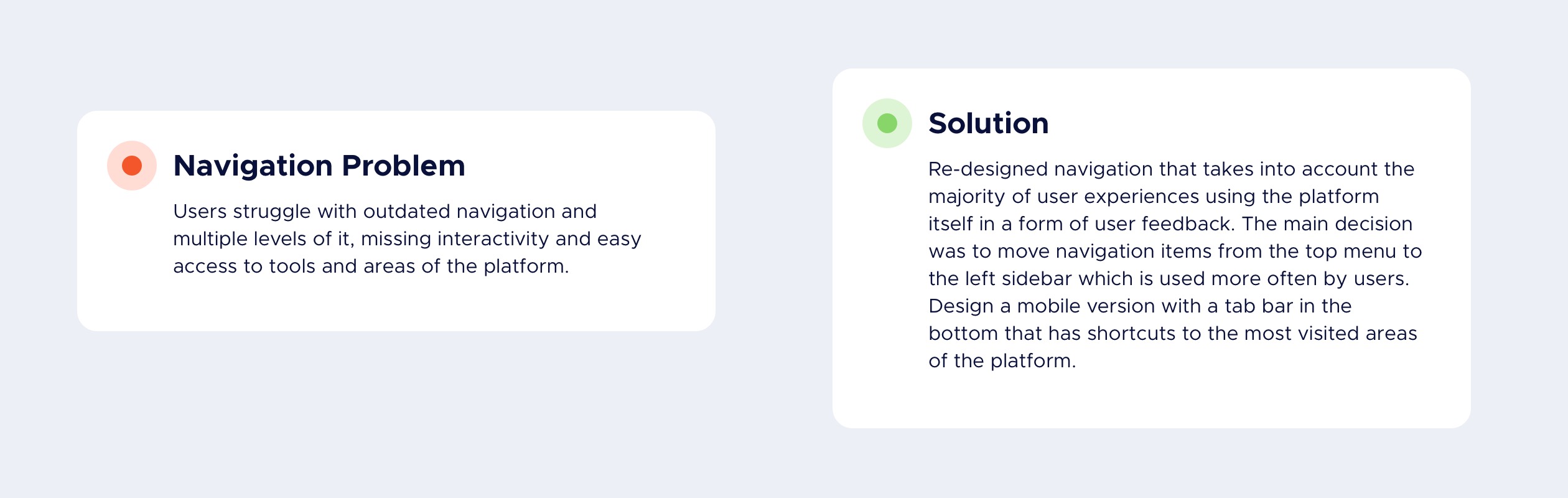
Navigation
Top Navigation Design
The navigation user interface has been designed in multiple stages. First, was visual look enhancement along with the complete UI overhaul. Then on next stages changes were mostly user experience related. Such changes as detailed menu drop-downs that were added which also included recent contetnt and interactive forms so that actions could be taken inside the menu without a necessity of leaving the main flow.
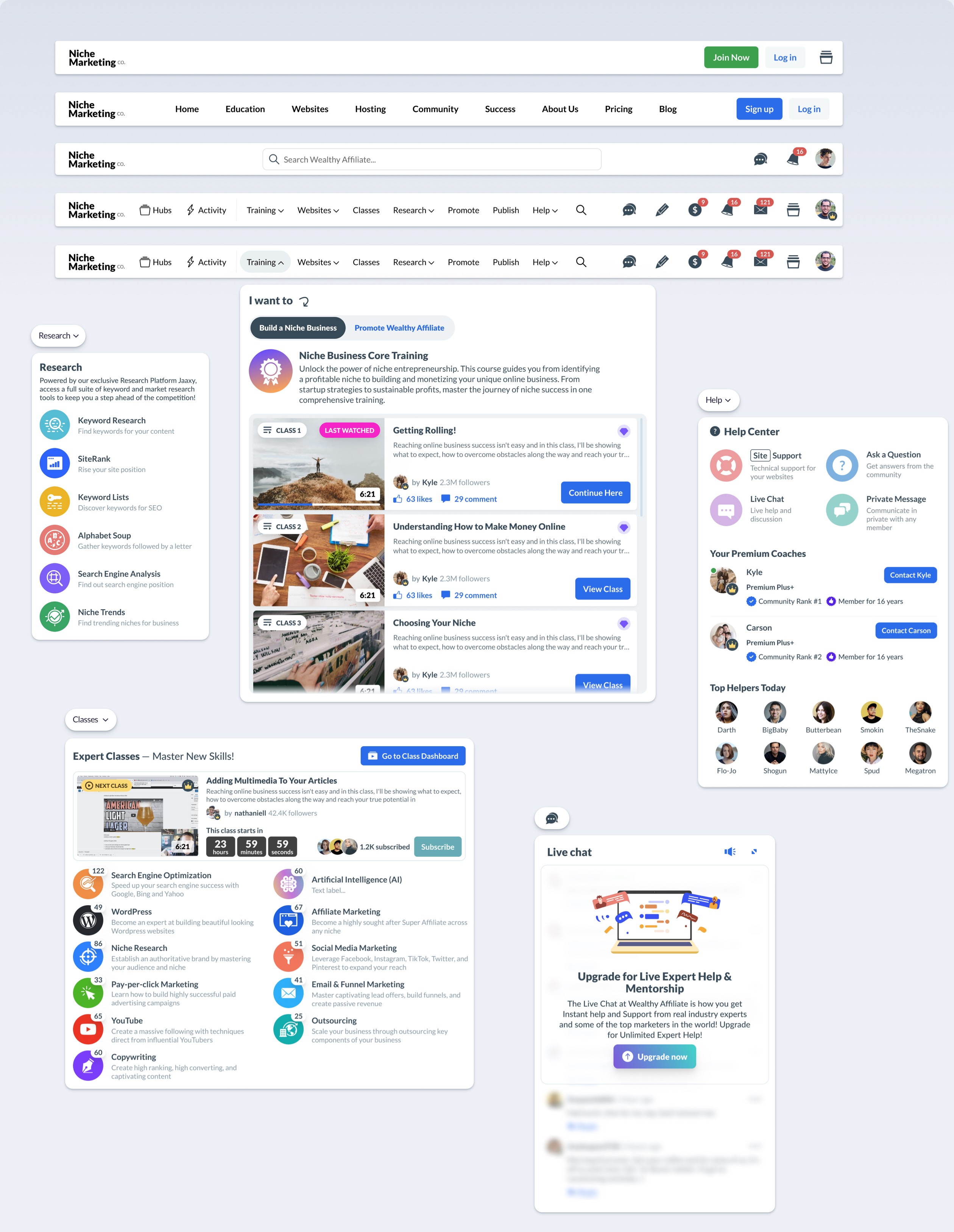
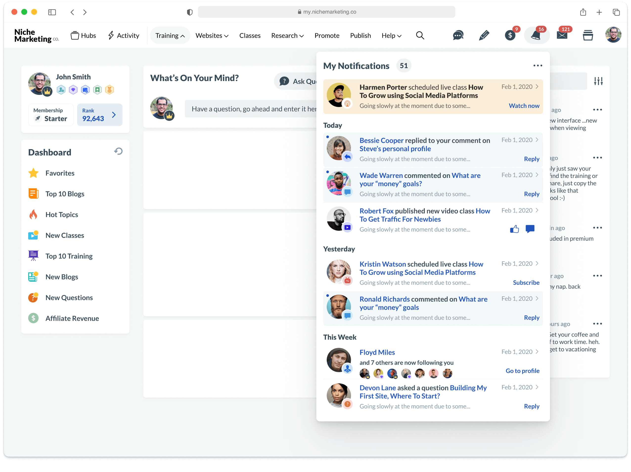
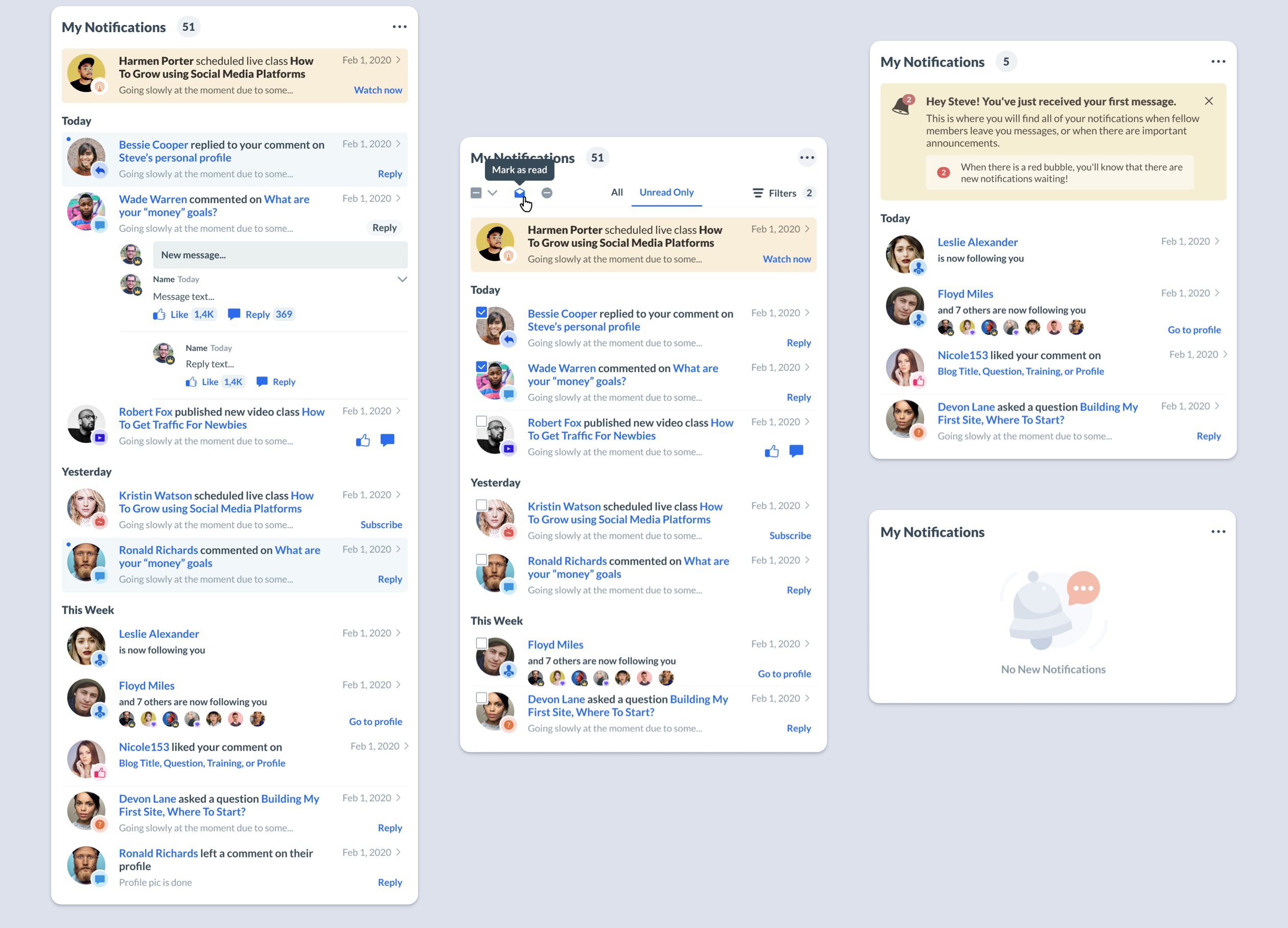
Notification System Design
Complete overhaul of the notification system on the platform which included user experience, and visual look and feel updates.
In-App Menu Design
Sidebar menu design that basically serves as a main menu and it stays always on the side wherever you are on the platform. Also, it changes depending on the area but most of the UI remains consistent. That was achieved with the help of components design and changing states.
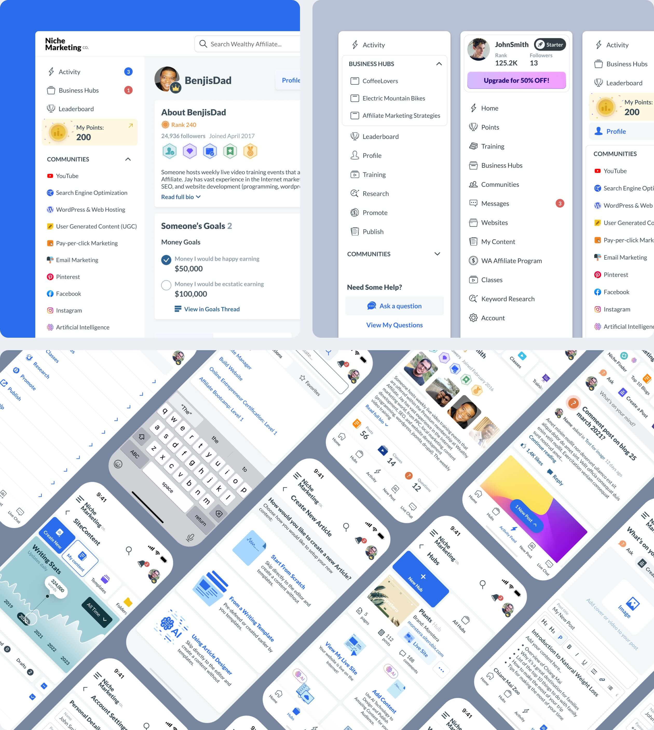
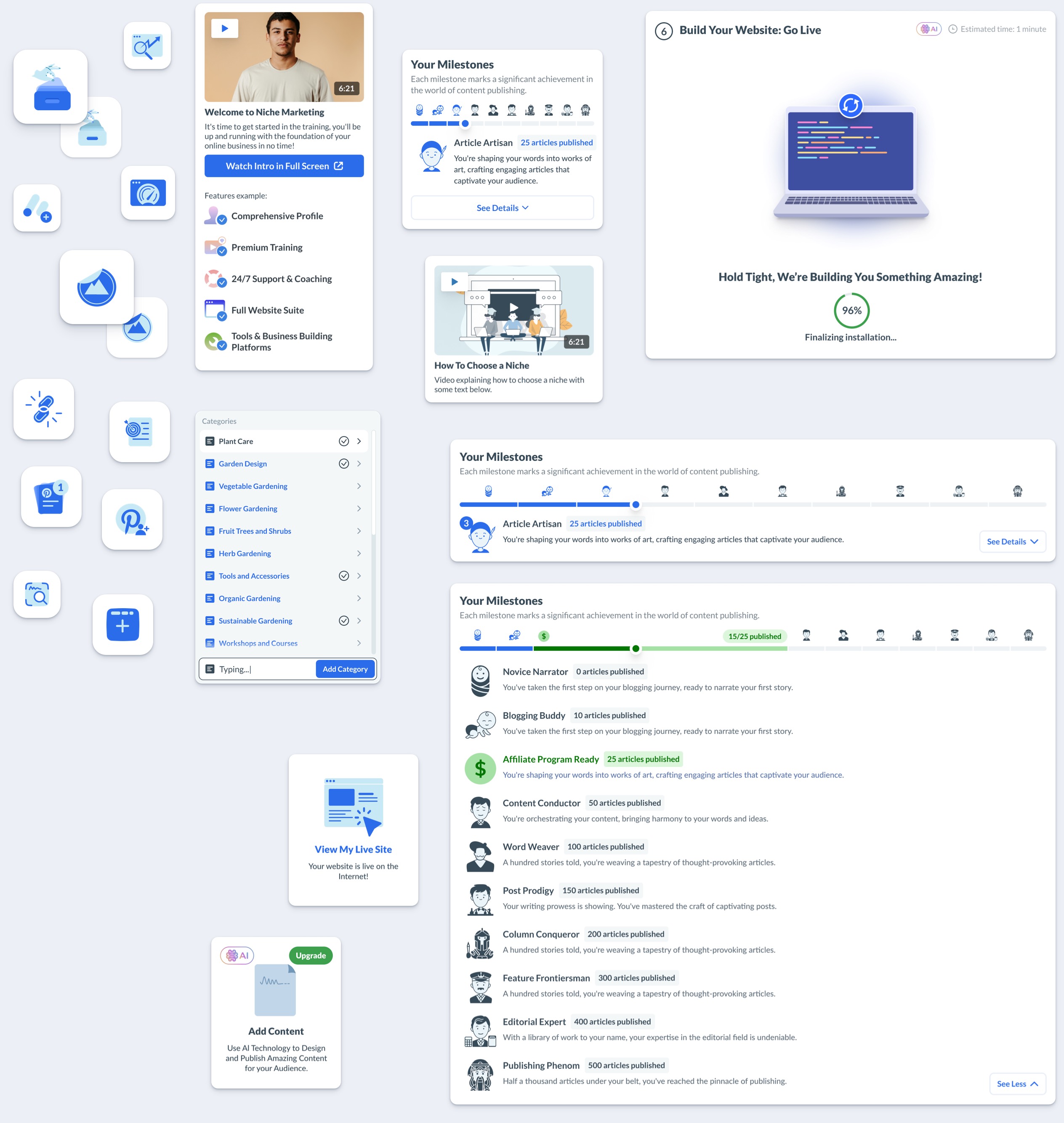
Dashboard Design
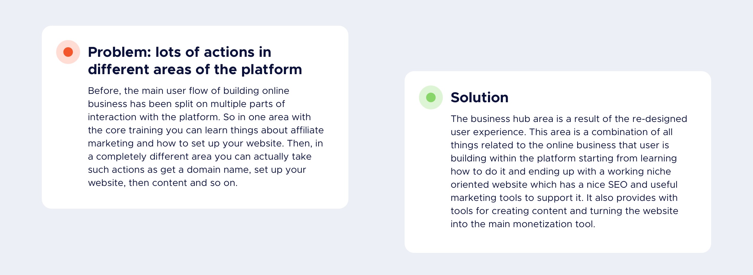
The main challenge of the dashboard design was to have permission based access to the content depending on the type of membership that users on. Even tho users are just visiting and browsing the platform they still can see some of the content. However, it had to be clear what is free, what requires an account creation and what is for premium members.
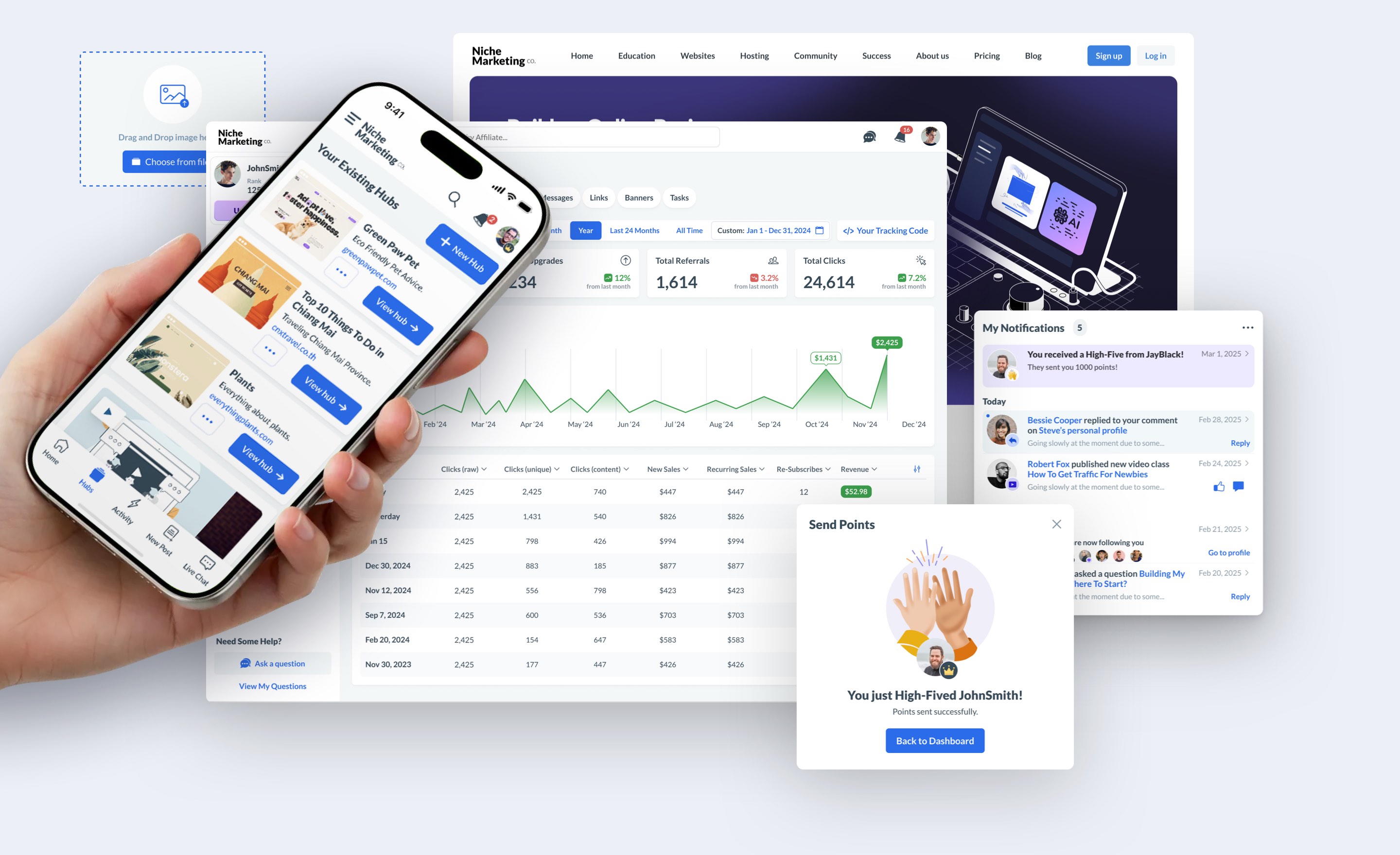
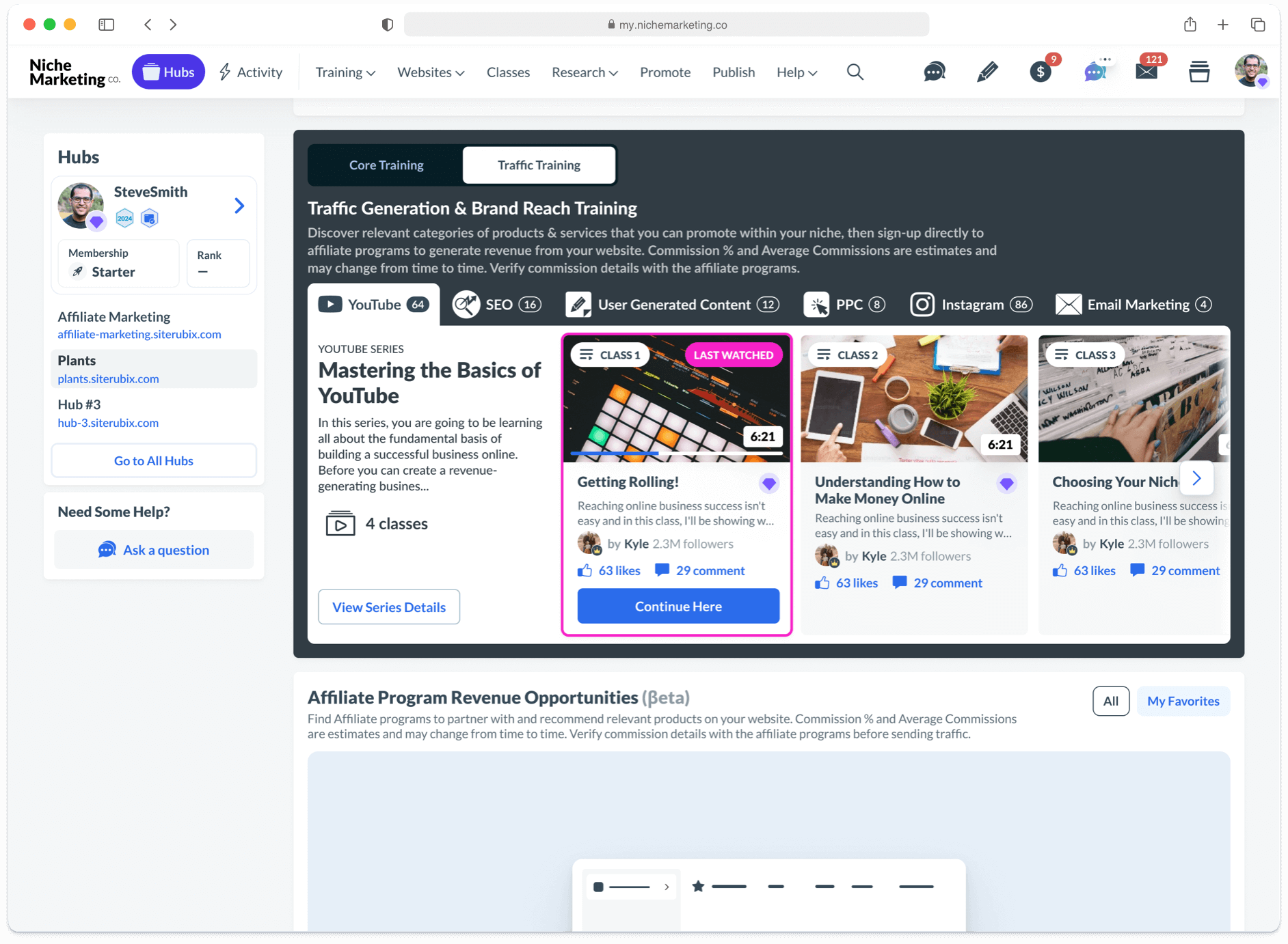
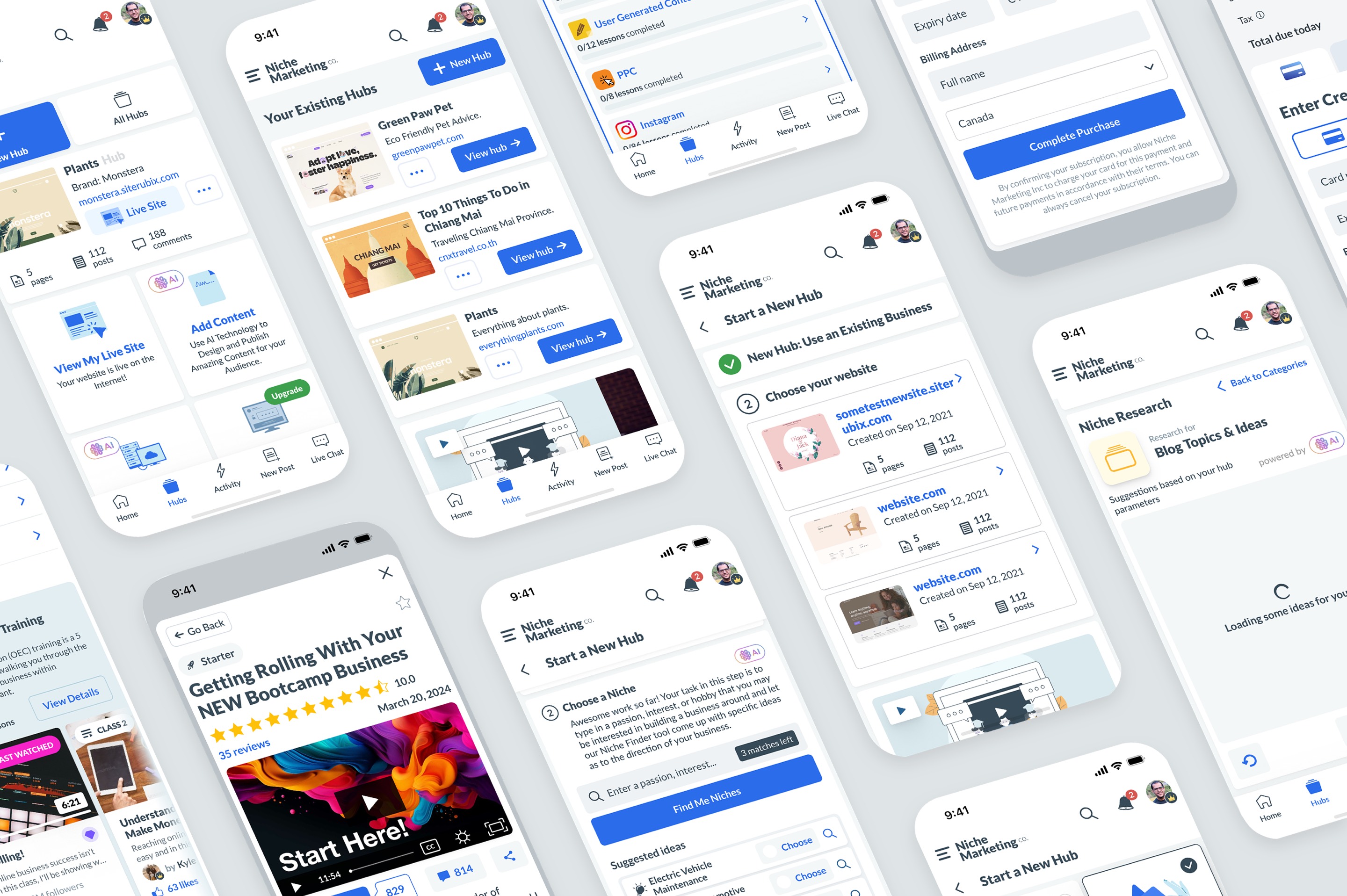
Business Hub
User Experience Design
It became the main area of the platform with all things related to building an online business from scratch, applying marketing tools such as content creation, building links, and learning the best marketing tactics interactively along the way.

Training UI inside Business Hubs
The main design taks here was to integrate the training interface inside the business hubs main area so that users don’t re-focus on a completely new screen on the platform but rather can continue completing tasks realted to their business and learn relevant thigns on the go.
It was designed with the thought of making it compact and at the same time easy to switch training categories and going through the lessons.
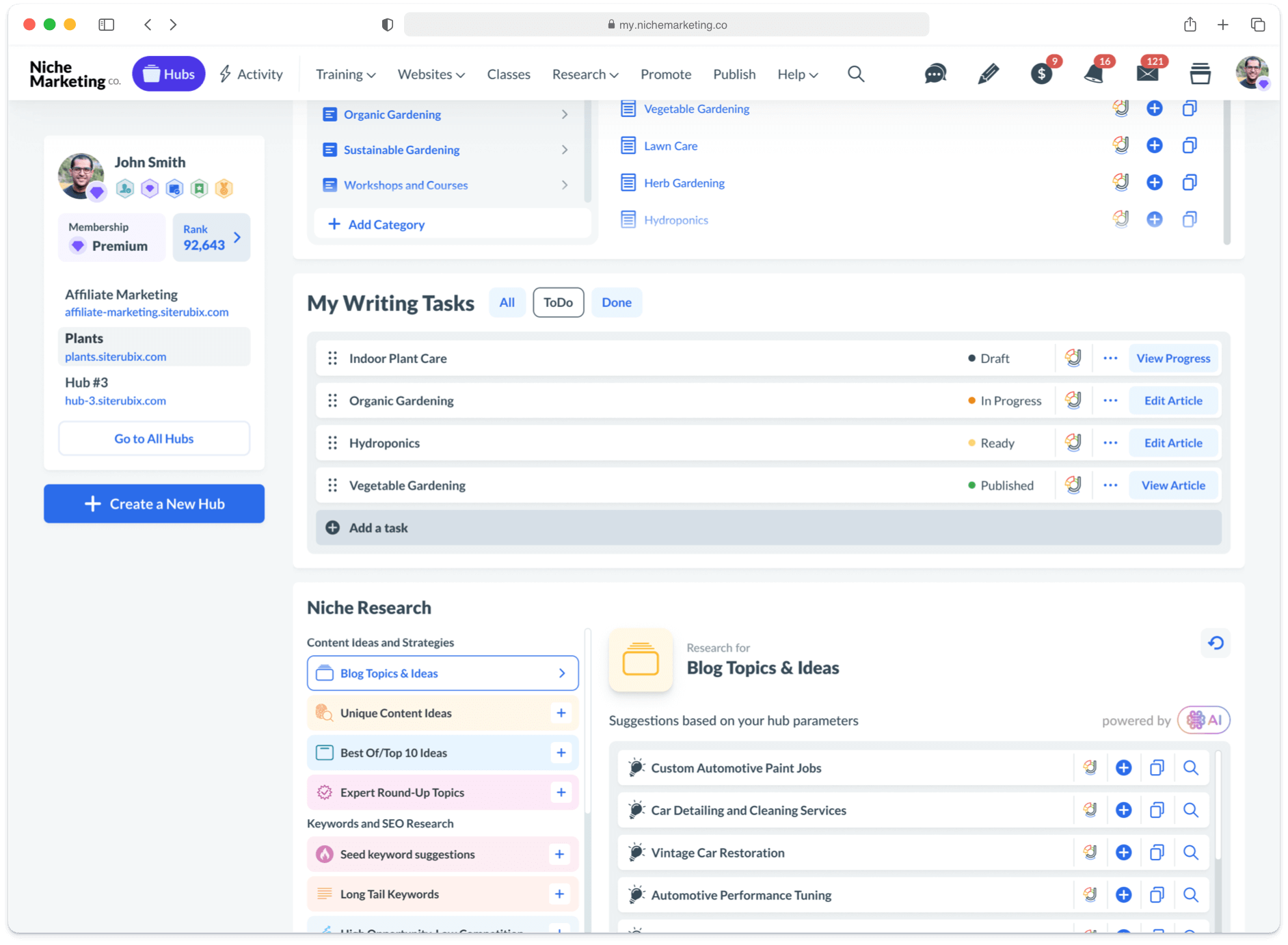
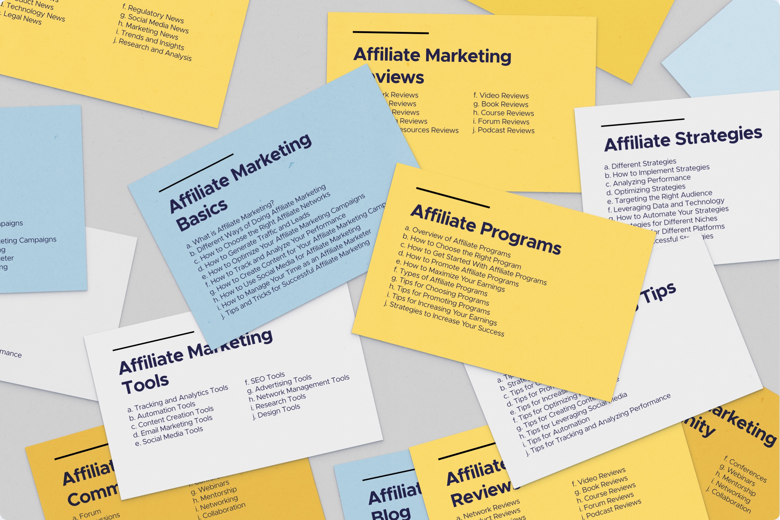
Writing Tasks
& Niche Research
This part of the UI is about content creation. Again, it’s been designed in a compact and functional way. So that users can literally scroll down and see the tasks to complete for their website, and next to it is a block where they can research topics for their blog, keywords, and instantly add those to their task list.
These two blocks a pretty much related and they were designed in consistent manner and close to each other on purpose.
Hubs Mobile Experience
All the main design of the hubs and related UI was adapted for user having a convenient mobile experience and seamless transition between using the web and mobile versions.
Hubs Design Process
Discovery & Cards Sorting
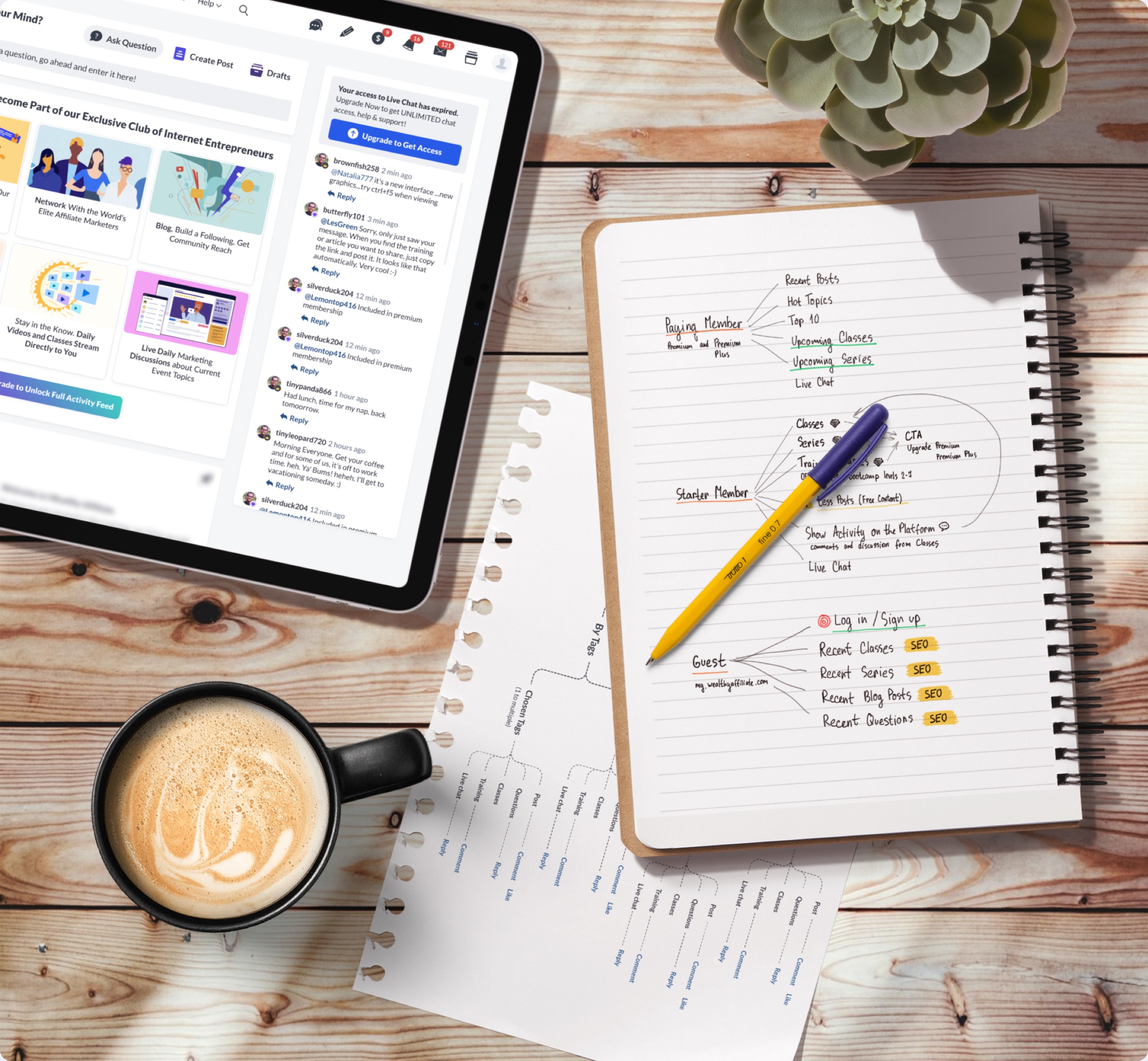
To properly design such a huge area and make an intuitive interface it was decided to start with business and tech requirements to this area. The card sorting design method helped to have a bird's eye view on everything that has to be included in some form and function in the coming user experience.
Hubs User Flow Design
The next logical step after the card sorting, was the user flows design. That helped to identify what steps user might take to complete specific tasks, and what navigation might be. Also it helped to optimize some parts before even creating wireframes.
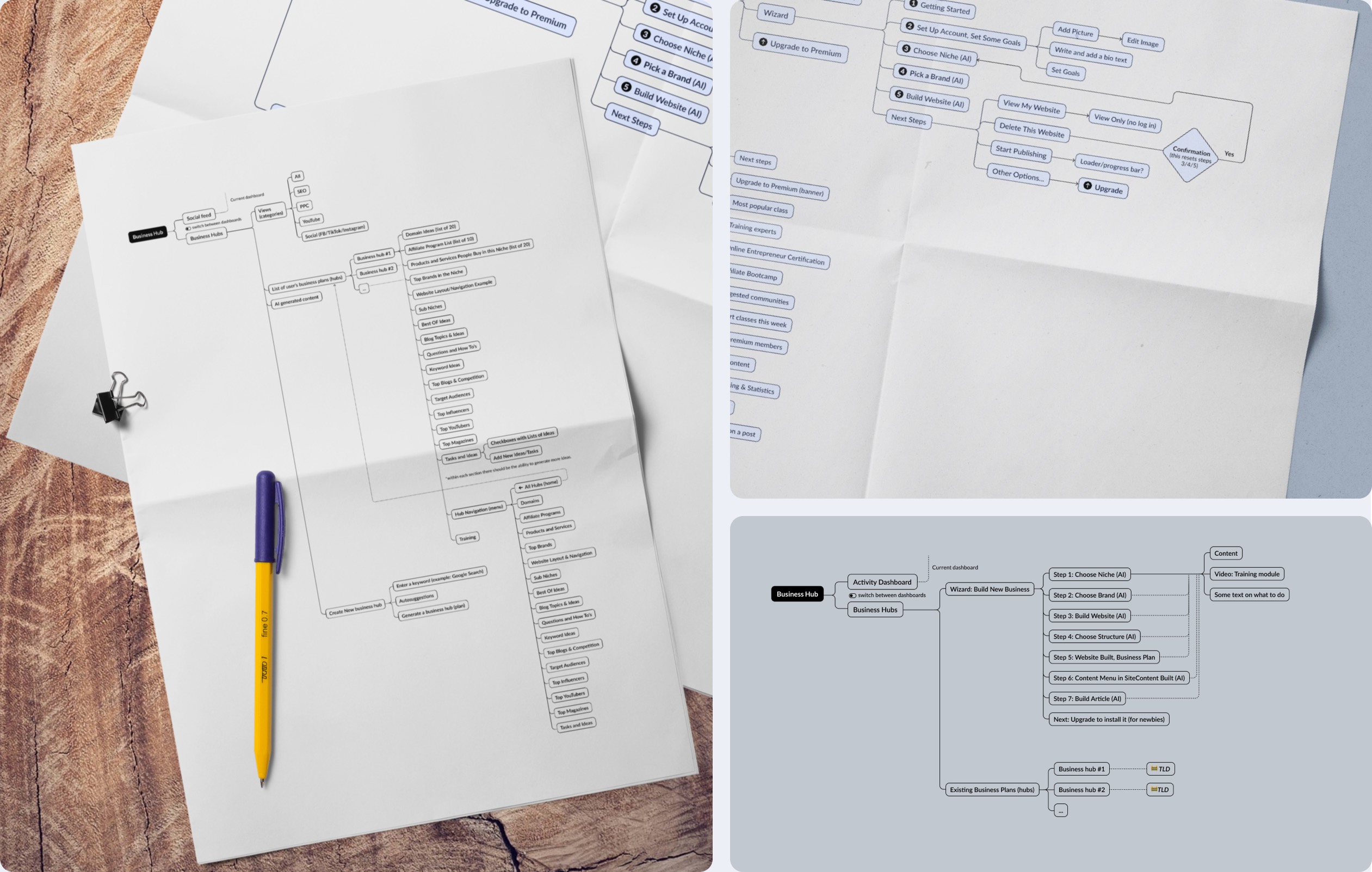
Hubs Wireframes
Several iterations of wireframes design has been done that included dozens of cards, task oriented UI elements to support requriements defined on the card sorting and user flow stages.
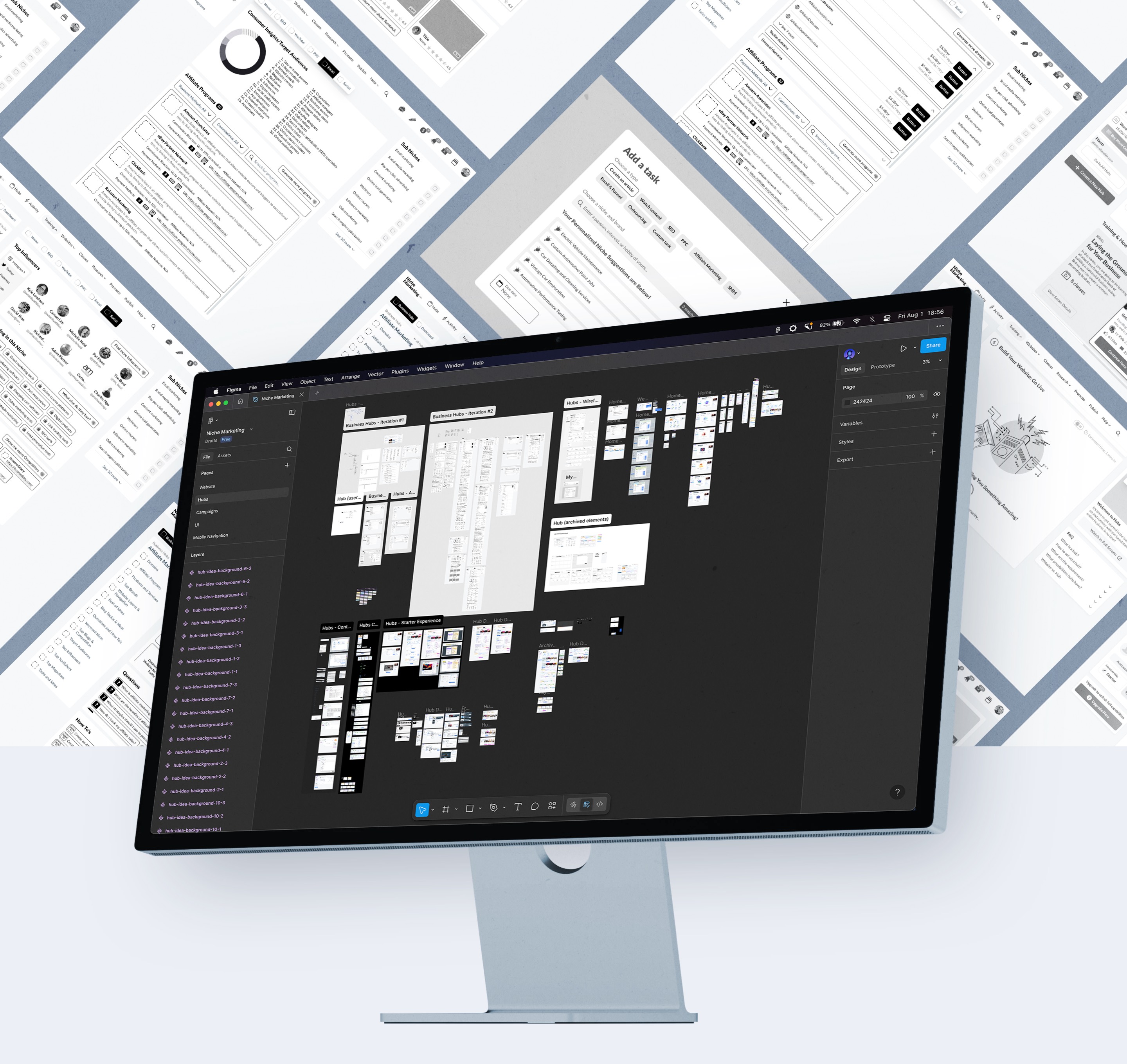
Hubs Components
A set of components and graphics elements were designed and organized to make things dynamic design and development wise. As a result, it turned out to be an in-house design system with components that can be used in other areas of the platform.
Gamification of UI for the increase
of engagement on the platform
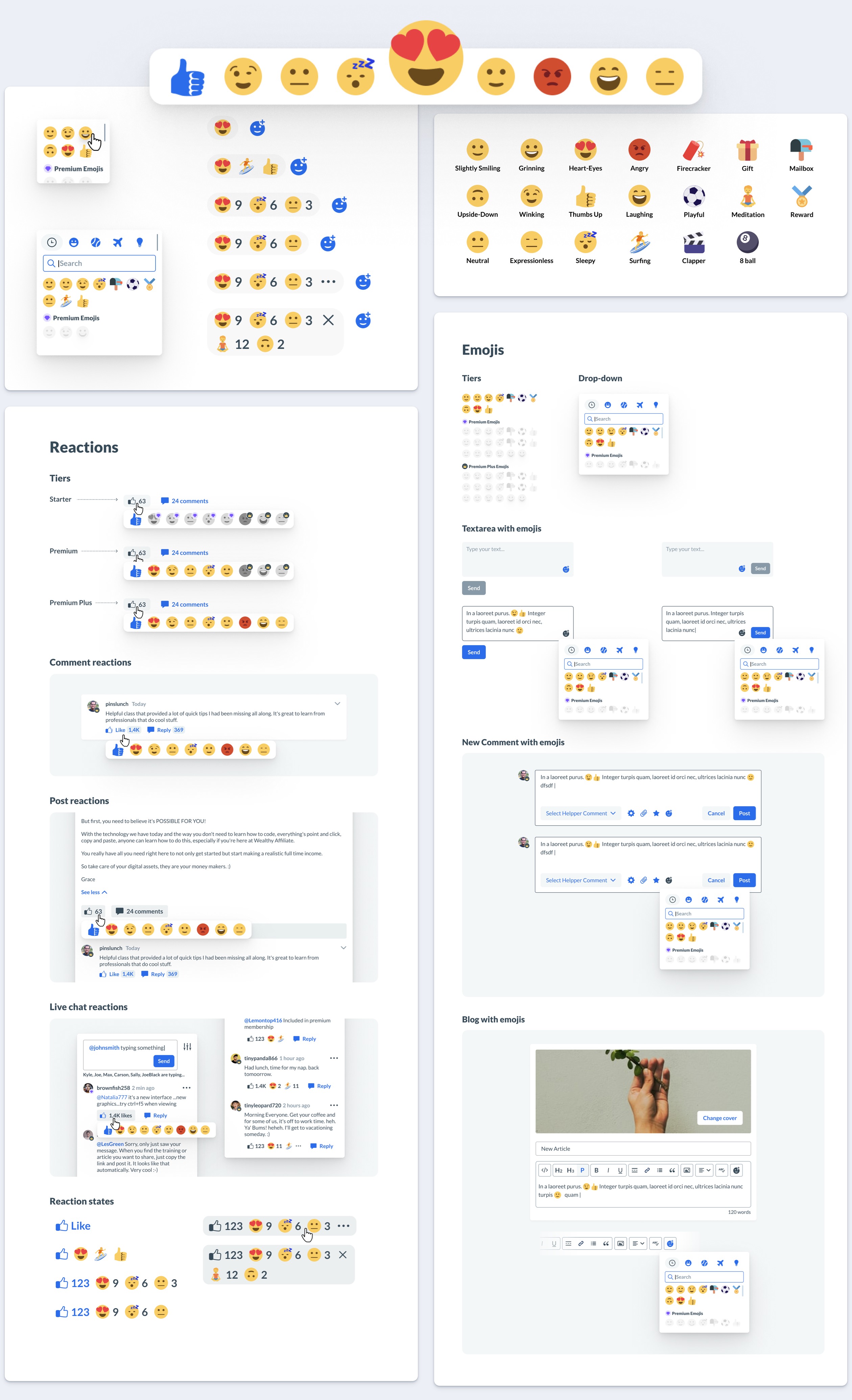
Emojis Implementation
The design and integration of emojis was done with the purpose of improving engagement of users in the platform and generally make the user experience seem more fun and less official.
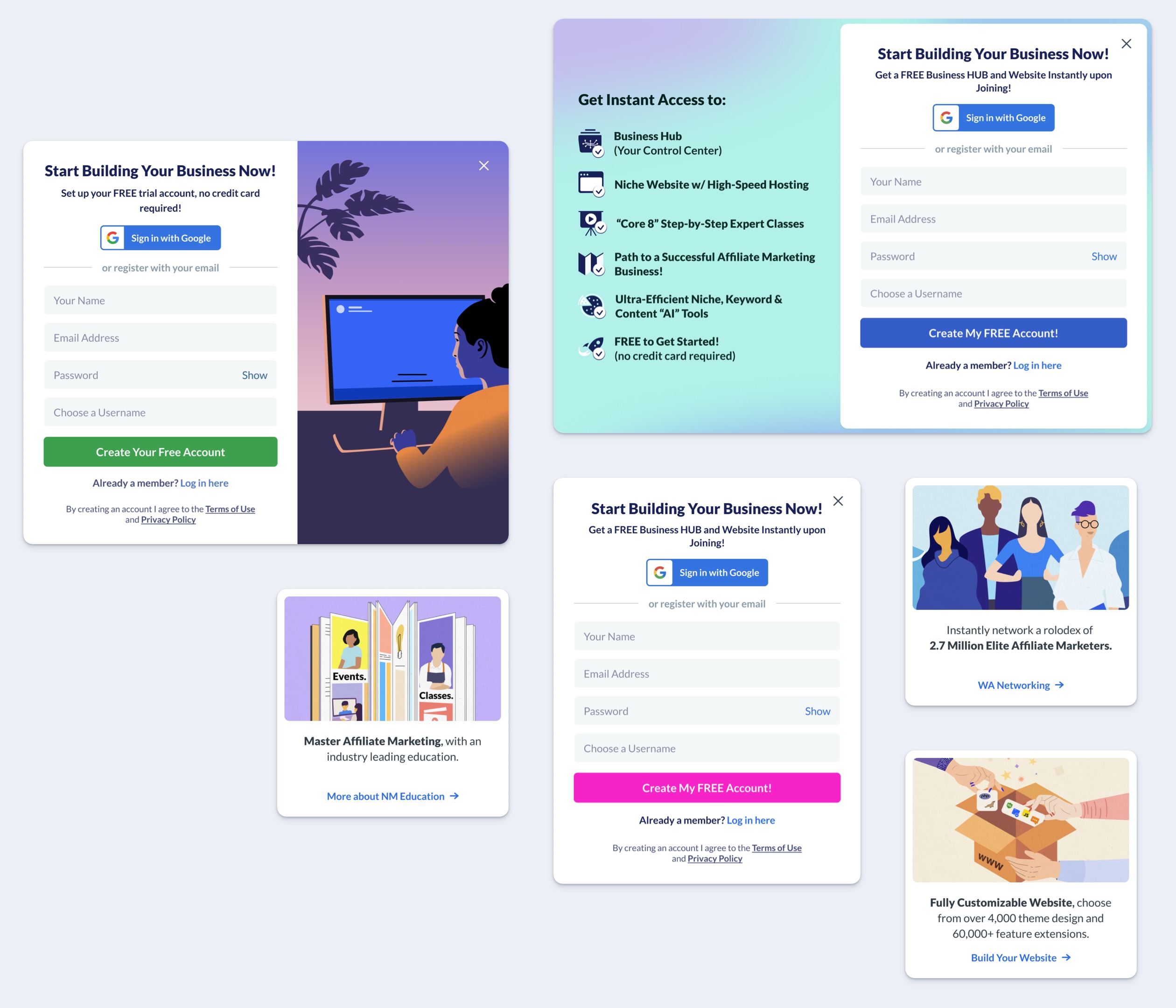
Onboarding Experience
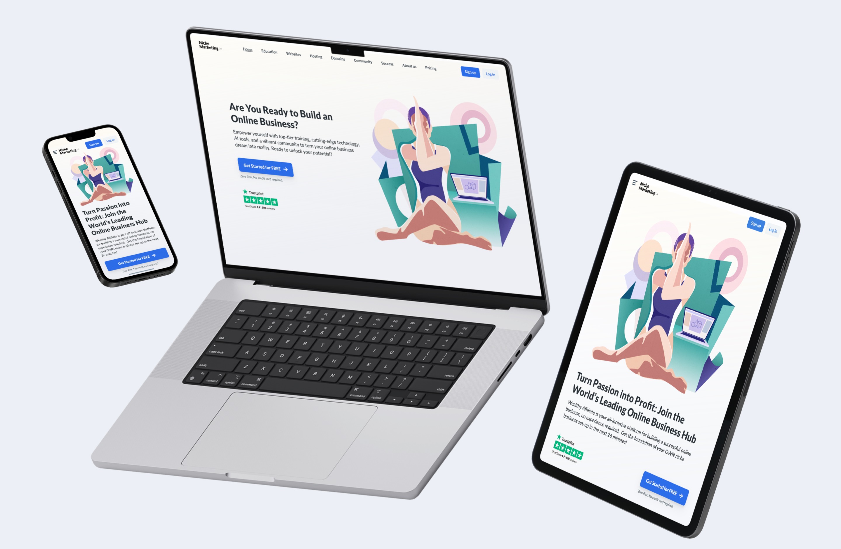
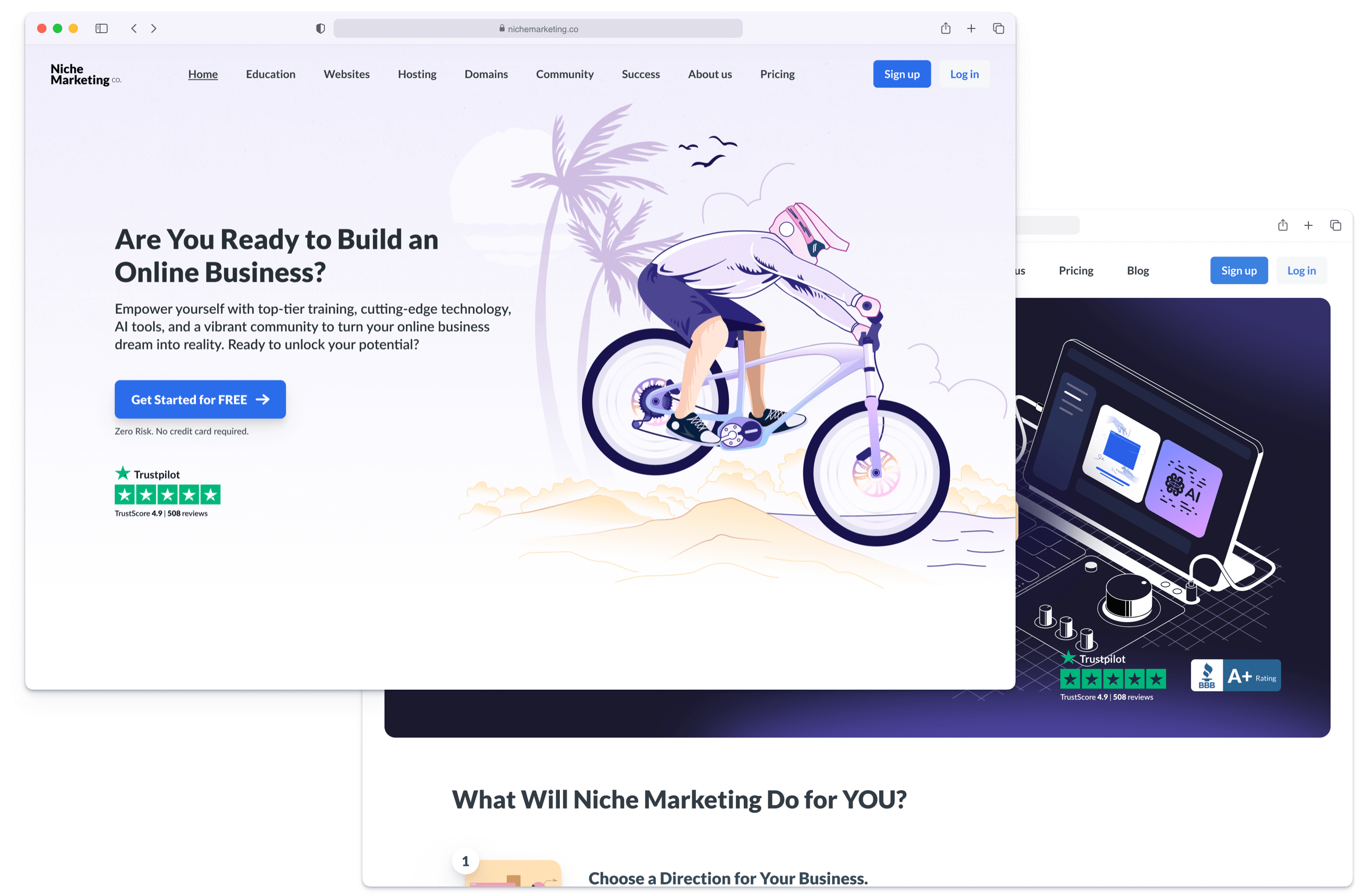
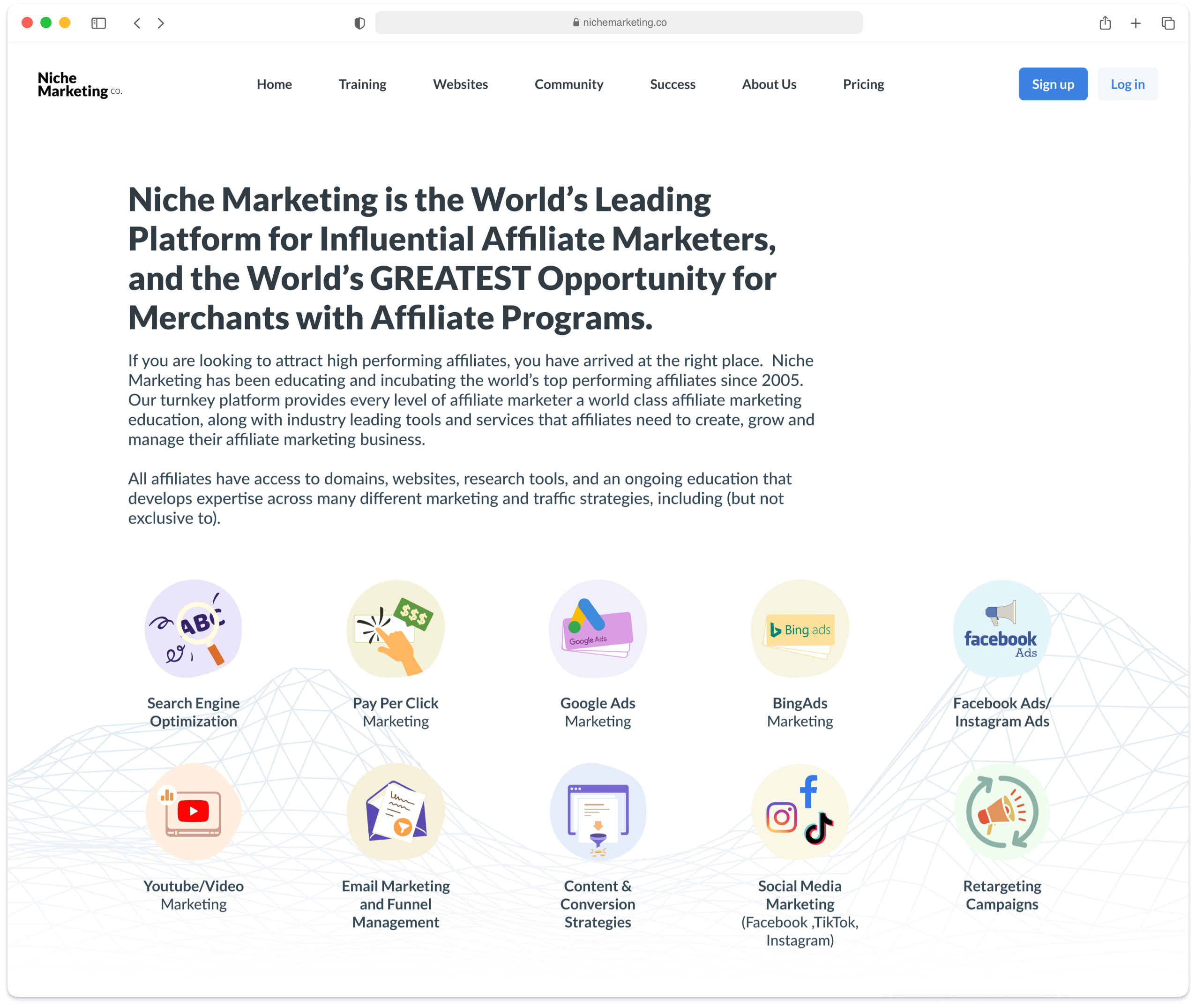
Home page design
I’ve designed different variations of the homepage for multiple reasons. One is, of course, to conceptualize the main marketing message of offering tools and services to people who want to build an online buiness. Another reason is to A/B test these concepts and see which one performs better.
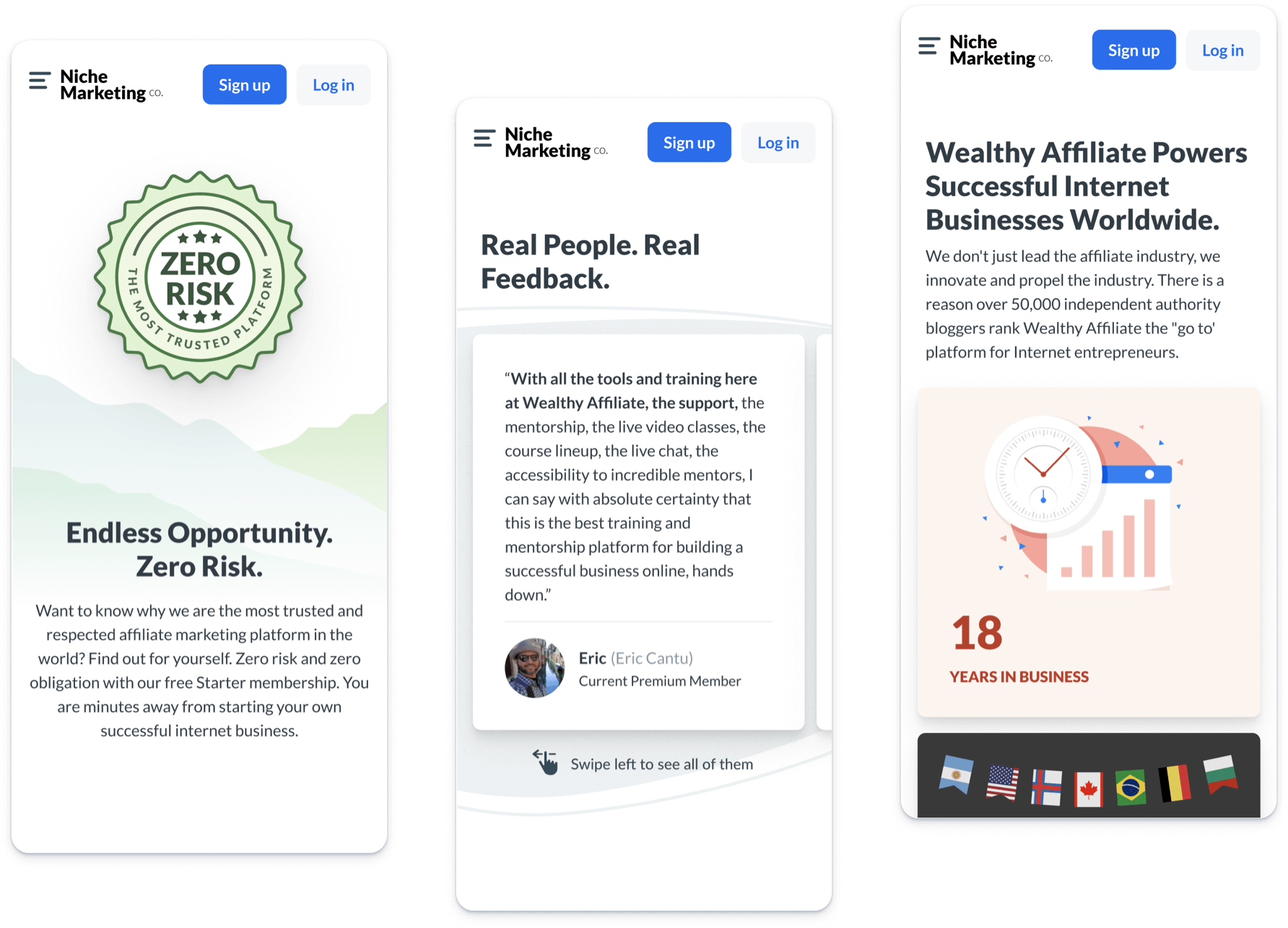
Mobile version of the website
The homepage as well as other website pages were adapted to mobile screens to provide visitors with frictionless experience of browsing the content and getting information about niche marketing and what is offered.
Landing pages design
There were also designed some variations of pages for different use cases to test ideas and to find the best conversion ratio.
Supplemental Blocks
Such elements as pop-ups play a crucial part in user interaction during the onboarding process. So I’ve designed 3 options of the Join pop-up as well as informational blocks that are leading onto other pages to expand more on topics.