Supahouse — property search designed around how people actually live
- Client
- Supahouse
- Market
- Australian real estate
- Deliverable
- UI/UX design, Figma
- Services
- UX strategy · UI design · Prototyping
Designing a lifestyle-first property platform for Australia — from concept and user research through to a complete UI design system, interactive prototype, and developer-ready Figma handoff.
Discovery
The Old Design Had a Poor UX Which Affected The Product On Multiple Levels
The original product was built directly on a framework with minimal design consideration, resulting in a utilitarian interface that prioritized functionality over user experience. This approach created cascading problems throughout the platform—navigation felt unintuitive, information architecture was confusing, and the visual presentation lacked polish and brand coherence.
My Role (responsibilities)
Design Scope
The challenges — and the design questions they created.
01. Competing with deeply entrenched platforms with established UX conventions.
Supahouse had to be different enough to be clearly better than similar platforms, but familiar enough that a first-time visitor could navigate it without instruction. Every departure from convention needed to be justified by a clear UX gain.
02. Making "lifestyle search" feel intuitive rather than gimmicky.
Lifestyle filters needed to feel like a natural part of how search works. The solution was placement: these filters appear directly beneath the search bar in the hero, as the first interactive element after the input.
03. Designing a complete search experience.
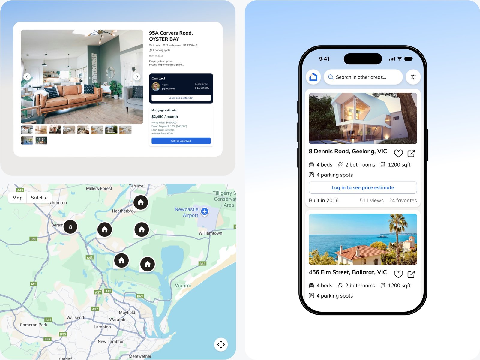
The four core screens — homepage/lifestyle search, results with filter panel and integrated map, property detail with agent contact and mortgage calculator, and mobile list view — were designed as a coherent system using shared components. Every element that appears in one screen is drawn from the same library: the same property card, the same filter chip, the same map pin system..
Before / UX Audit
Notes and Suggestions
User Journey
Five stages — from daydream to offer.
The Australian property search journey is long, emotionally charged, and non-linear. Before designing screens, the full journey was mapped to identify where current platforms create friction and where Supahouse could create meaningful advantage.
EXPLORE
Browsing lifestyle-first, no specific suburb in mind
Current platforms: force a suburb or postcode before showing anything
Supahouse: Lifestyle filter categories enable browsing without geographic commitment
SEARCH
Narrowing by type, size, price, and lifestyle attributes
Sidebar filter: panels are comprehensive but overwhelming and hidden behind an extra tap
Filter panel: surfaces the most-used criteria; advanced filters stay accessible but secondary
COMPARE
Shortlisting properties, checking map location and price estimates
Map and list: are usually separate views, requiring navigation between them
Map is integrated: into the results view as a third panel — no tab switching required
EVALUATE
Property detail — photos, specs, mortgage estimate, agent contact
Price: often requires a call to an agent before a buyer knows if they can afford to proceed
Price estimate : and mortgage calculator built into the detail view reduces inquiry anxiety
ACT
Contacting the agent, saving the property, getting pre-approved
Buyers: who aren't pre-approved feel disadvantaged and often delay contacting agents
"Get Pre-Approved" CTA embedded in the detail view reduces the gap between interest and action
VISUAL DESIGN AS ONE COHERENT SYSTEM
Homepage: Lifestyle Search Entry Point
The first scroll defines the product's entire proposition
The homepage hero contains the search bar, the lifestyle filter chips, and a geometric blue composition — all visible without scrolling. A first-time visitor understands Supahouse's approach before reading a word of copy. Beneath the hero, properties are organised into named lifestyle-category carousels: Water Views, In Need of Renovation, Close to Public Transport.
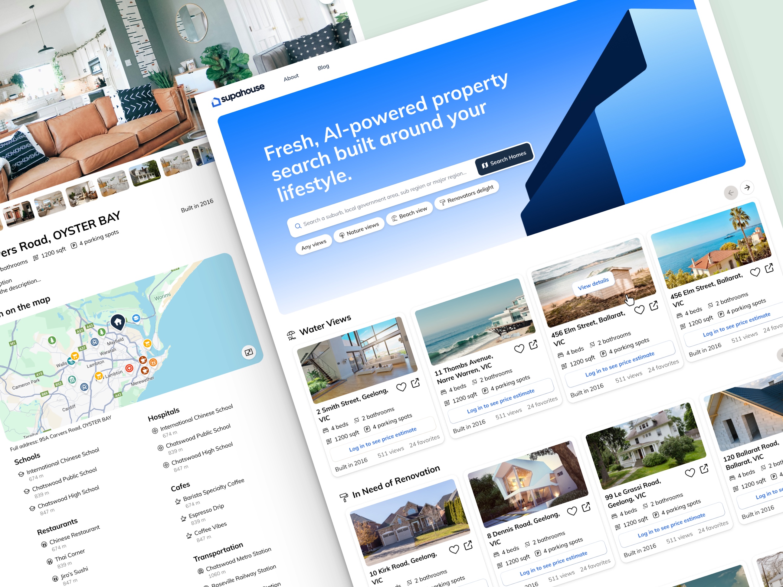
Lifestyle chips directly under the search bar — are the first interactive element after the input. They communicate the platform's entire differentiation in one component.
Geometric hero — no property photography — layered angular navy and blue shapes signal technology product, not listings directory. A deliberate departure from every competitor's hero.
Lifestyle-grouped carousels — horizontal scrollable rows by category mean a renovation buyer and a waterfront buyer never look at the same grid. The platform is already sorting by who you are.
Minimal navigation — Logo / About / Blog / Sign in. No feature mega-menu. Confident platforms don't explain themselves in the nav.
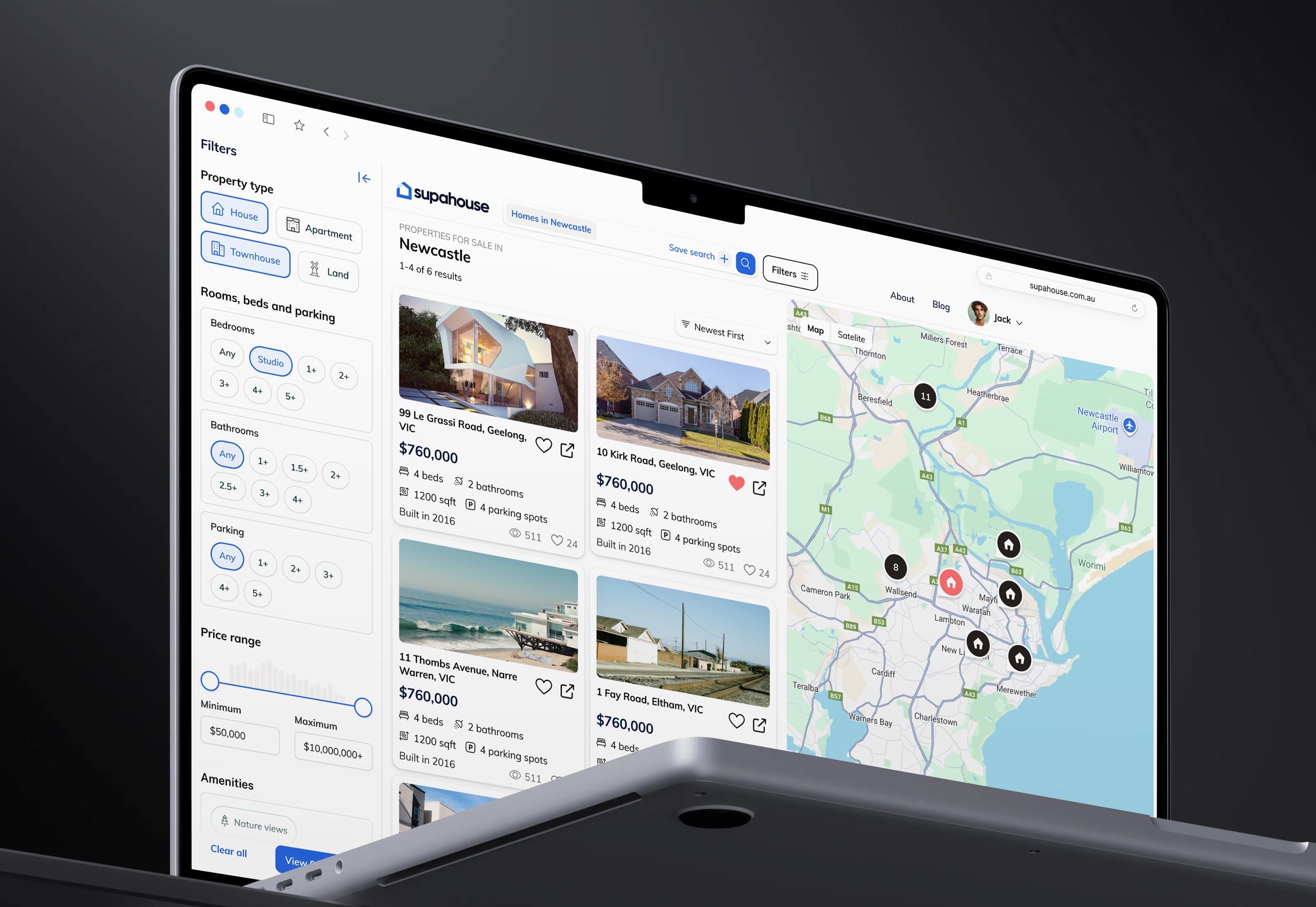
Property Search Results — Layout With Integrated Map
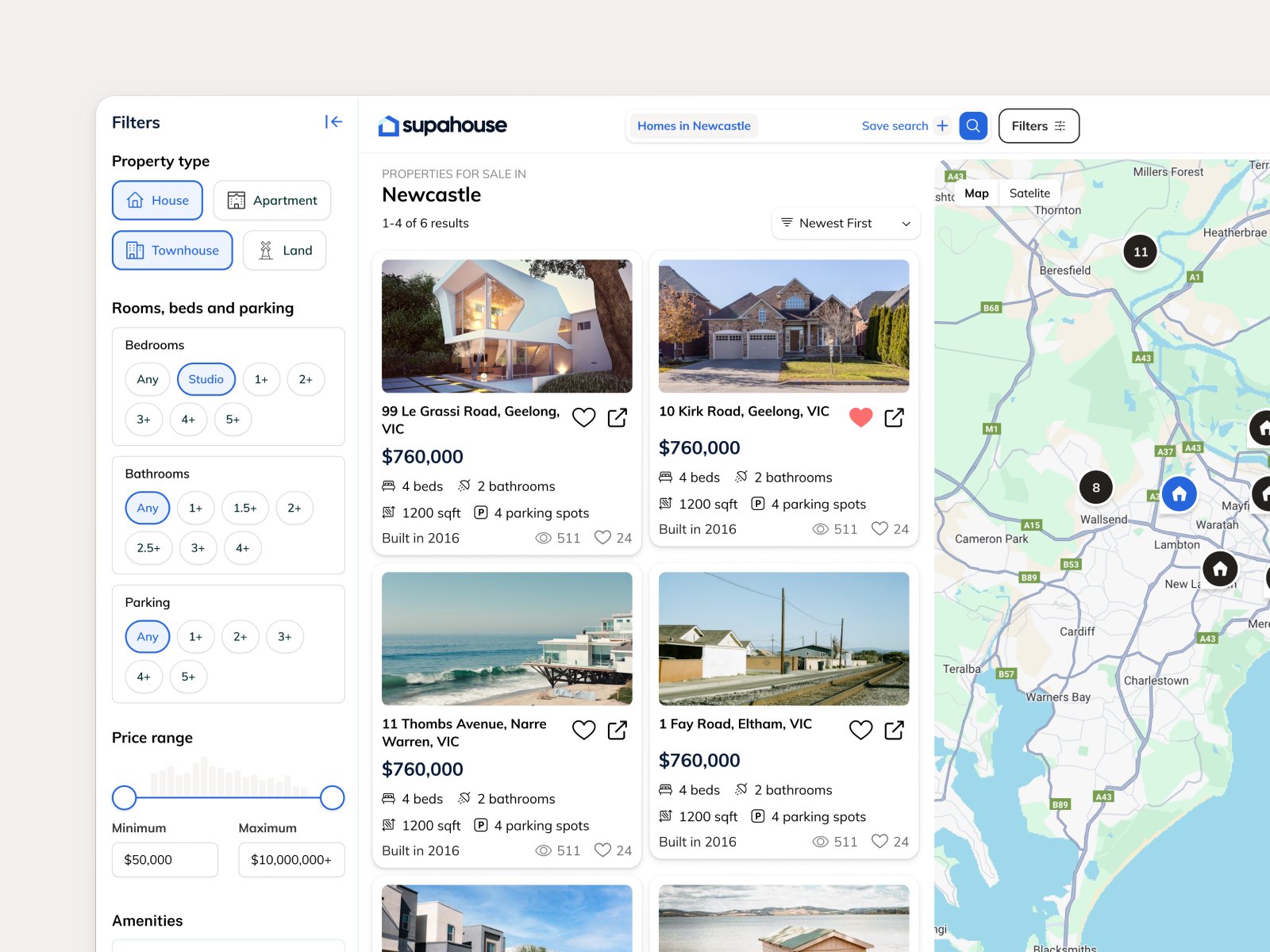
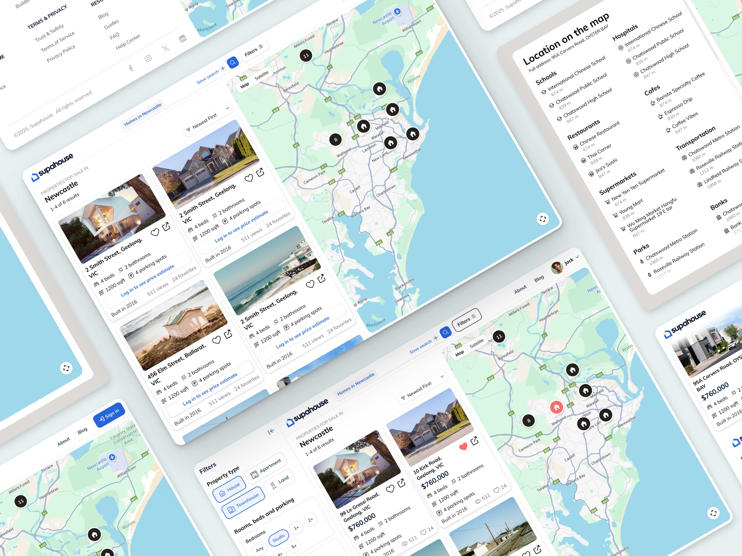
The search results view is a full three-panel layout: a collapsible filter panel on the left, a two-column property grid in the centre, and a live map on the right. All three are visible simultaneously on desktop. A user can filter by property type, bedrooms, bathrooms, parking, and price range, watch the grid update, and see the map pins respond — without navigating away from any of it.
Filter panel — left sidebar, collapsible
Property type as visual toggle buttons (House, Apartment, Townhouse, Land with icons). Bedrooms and Bathrooms as chip-select options (Studio / 1+ / 2+ / 3+). Parking same pattern. Price range with a histogram-style slider showing property density across the range. The histogram is a UX detail — it shows the buyer where properties actually cluster, preventing them from setting a range where nothing exists.
internal screens
Improved Usability & Overall Look Of UI
Each card carries seven data points plus two icon actions (save and share) and the price estimate gate. The layout maintains clear hierarchy: address bold at top, specs in a compact icon row, social proof as secondary introdata, price CTA as the final action. The card never feels cluttered because each row has a distinct purpose and visual weight.
RESPONSIVENESS
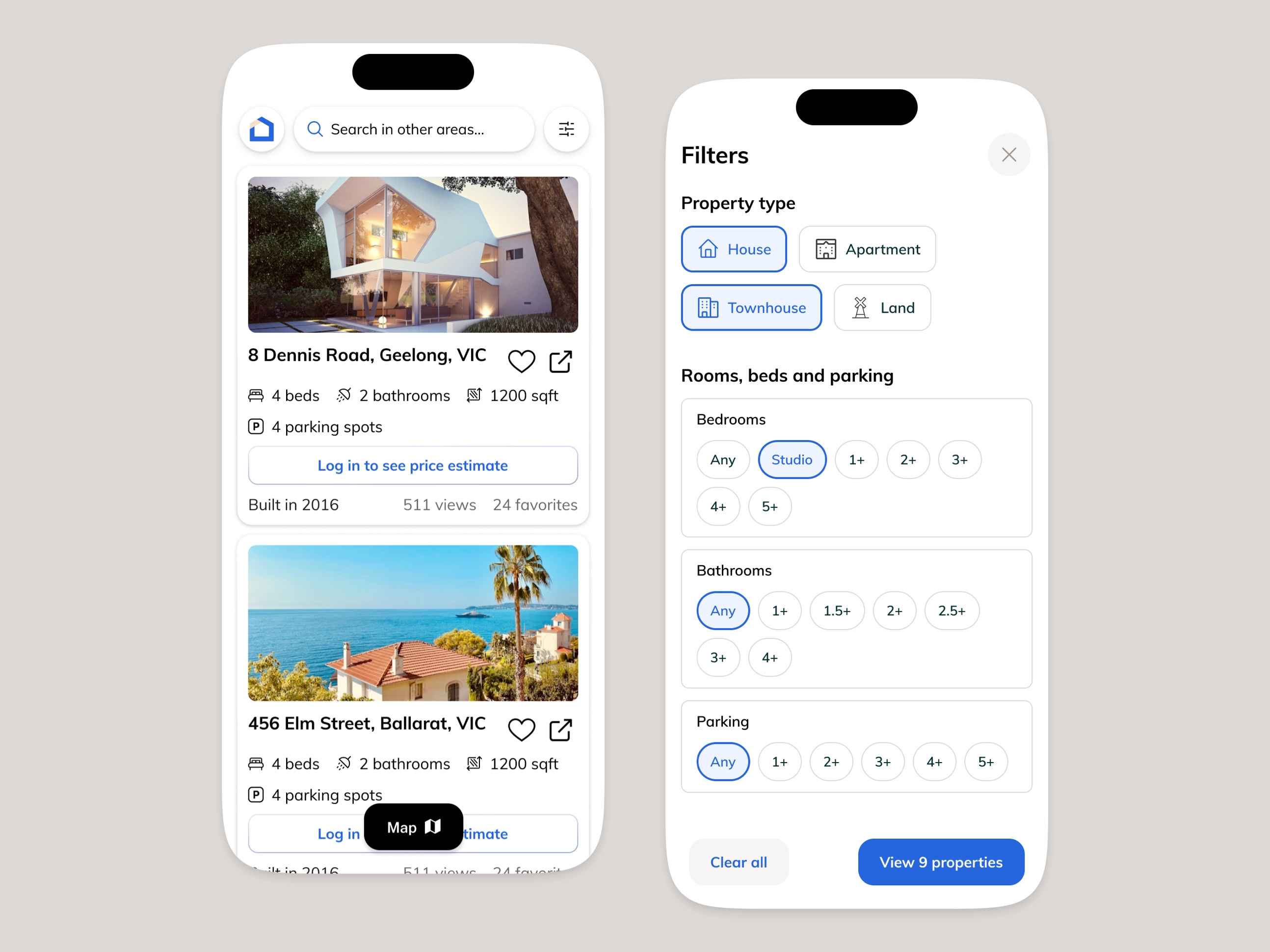
Designed for Australian mobile browsing behaviour
Property search in Australia is predominantly mobile — a buyer commuting past a suburb they like will open a property app on their phone. The card grid compresses to a single column without losing any data points.
EXPECTED RESULTS
Three measurable goals, designed into the product from the start.
Sign-ups ↑
AI price estimate gate on every property card creates a specific, high-value sign-up incentive visible throughout the entire browsing session.
Session depth ↑
Lifestyle-grouped carousels encourage lateral discovery — a buyer who came for Water Views scrolls past Renovation and Transport sections.
Inquiry quality ↑
Mortgage calculator and pre-approval CTA in the listing reduce uninformed inquiries and increase buyer confidence before agent contact.
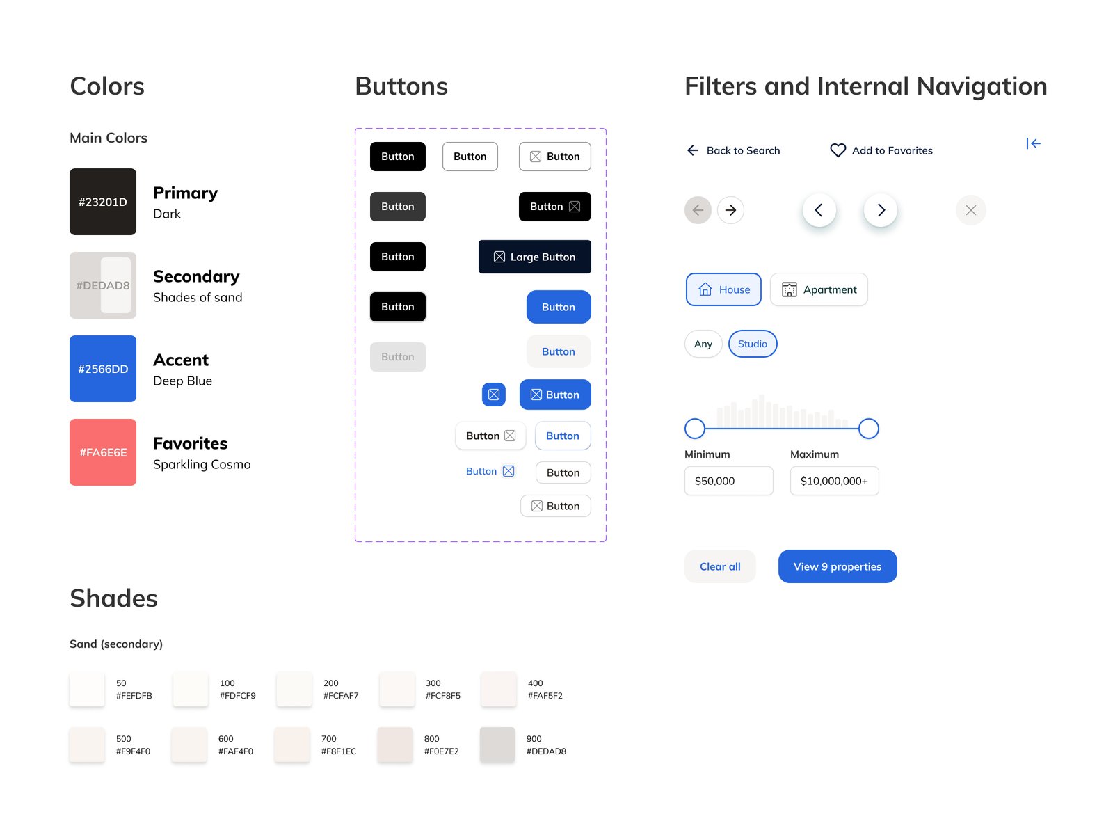
Components Preview
Deliverables
Screens designed
Homepage, Search results, Property detail, Mobile
Design tool
Figma, interactive prototype
Component library
Shared, dev-ready
Responsive
Desktop + mobile, all screens
Market
Australia
Status
Design complete · dev handoff
Let’s make
something great
- Direct access to designer
- 1-3 days delivery time per request
- Always high quality and on time
- Flexible delivery options